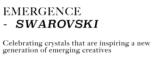
The font I have chosen for EMERGENCE- Is a mix of Big Carlson and Superclarendon. I have chosen this mix to convey a sense of heritage and luxury around the brand as well as communicate the modern and young creative side of the brand that I am exposing through the book, so therefore I felt the fonts complimented each other well and fitted with the ethos and DNA of the book.
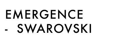
Throughout the process I have also experimented with FUTURA MEDIUM. However, I liked this font as it felt it was fresh and modern, of which I am trying to show the modern side of Swarovski- I felt it did not speak enough of the luxurious art feel that not only Swarovski has but also a feel I want to carry on through EMERGENCE, even when focusing on young and modern creatives. Therefore felt it wasn’t the right choice.
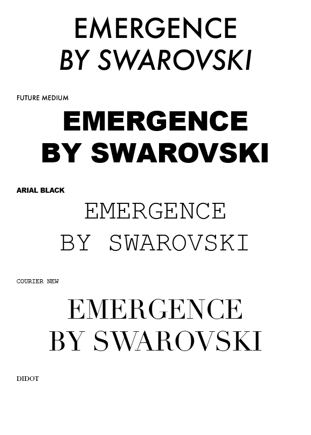
These are all the fonts I trialed when starting to design. I began with Futura, however felt this was too off brand for Swarovski as it was a sans serif font and all Swarovski fonts used are Serif fonts, it therefore almost felt less elegant to use. Arial Black I was trialing to see if something bolder would work to push the idea of emergence however this was too heavy for a luxury book and publication and seemed far to strong and abrupt for the eye to focus on. Courier New is almost like a type writer font and I thought through using this it may give a theme of creativity and almost like a sketch book, however the font looked slightly immature for such a brand like Swarovski, I needed to find the perfect mix of the elegance and creativity. I trialed using the Vogue font Didot to see if this gave a bit more classic elegance, however it looked to my eye to similar to the Vogue font so I went to trial a combination of the Swarovski font ‘Big Carlson’ and a similar font to Didot but slightly italic to give a definition in text with the font ‘Superclarendon’.
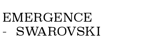
I also tried out the fonts in Superclarendon throughout (I have settled on a mix of this and Big Carlson). I felt that with this being so bold throughout becomes confusing and mis matching to the eye- with all text in this it felt that the levels of the letters were wrong and it didn’t read well, which is what lead me to using it only slightly throughout the book.
These are all the fonts I trialed when starting to design. I began with Futura, however felt this was too off brand for Swarovski as it was a sans serif font and all Swarovski fonts used are Serif fonts, it therefore almost felt less elegant to use. Arial Black I was trialing to see if something bolder would work to push the idea of emergence however this was too heavy for a luxury book and publication and seemed far to strong and abrupt for the eye to focus on. Courier New is almost like a type writer font and I thought through using this it may give a theme of creativity and almost like a sketch book, however the font looked slightly immature for such a brand like Swarovski, I needed to find the perfect mix of the elegance and creativity. I trialed using the Vogue font Didot to see if this gave a bit more classic elegance, however it looked to my eye to similar to the Vogue font so I went to trial a combination of the Swarovski font ‘Big Carlson’ and a similar font to Didot but slightly italic to give a definition in text with the font ‘Superclarendon’.

