Self Reflection: Challenges so far

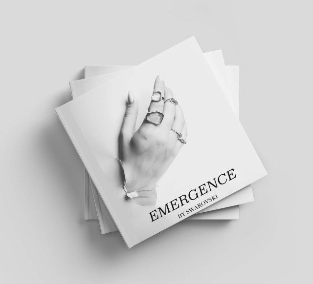
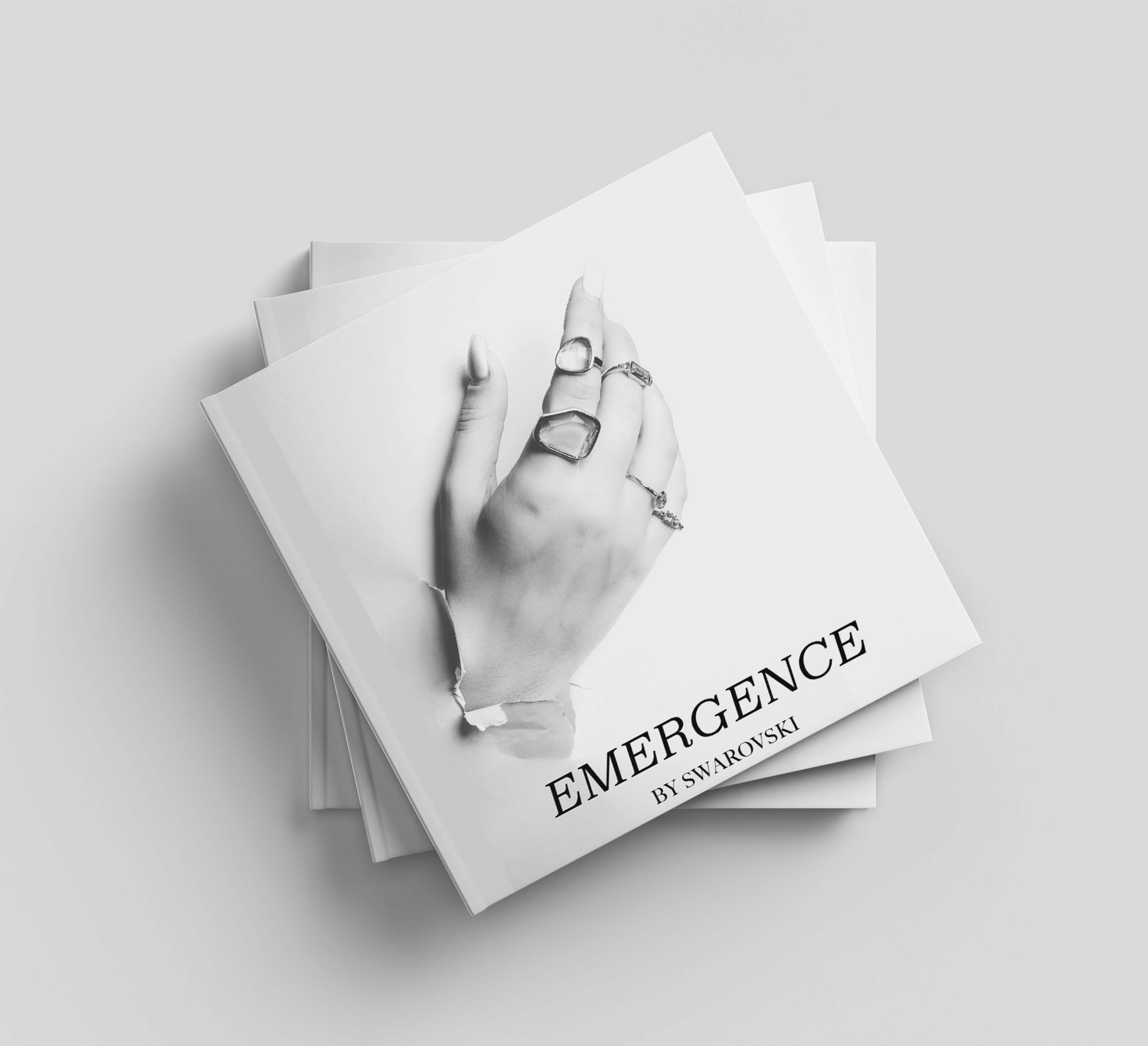
Mock Up of Emergence

Nearing the end of IFCP process I believe it is an important time to self reflect- a process I almost found theraputic during the Fashion Futures module.

This module has taught me a lot about myself, my talents, my work and my work ethic itself- not only these but how I have dealt with issues in the face of adversity. At the final project I can now look back at the girl who joined CNC back in 2017 who was very hidden within her shell, didn’t understand her skills, didn’t know her path or even the route she wanted to go down- I can see how I have transformed into a butterfly in that sense. Even at the start of the IFCP project I never would have thought I would have been able to balance and battle for myself when things went wrong, but I didn’t hold my head down I pushed and pushed until I knew I had done work to my absolute hardest. Managing to balance projects on Lux in the first week really aided me in being able to pull off an industry brief, it built the confidence in myself that I knew if I could be trusted with an industry brief I could conduct my IFCP to everything I wanted. I have also been able to have a mature mindset in telling myself when something isn’t up to my standard of work, like the video.

Some key takeaways I need to work on for when I progress into the future and into the industry is that my work ethic is rigorous and that is something I need to work on I physically and mentally put myself through it. I also need to refrain from comparison, as difficult as it is within a university so small it has not nor will not ever change anything about my own work bar my self confidence.

Looking back now I am so glad I have managed to come through the other side of the IFCP project someone who can work to industry briefs, balance schedules and execute everything on my brief through combining new and old skill sets. As stressful as the last week has been- it really is true that the last 80% of time is when all the learning takes place and my project has truly flourished to what I envisioned months ago, I look forward to seeing it in the flesh.
Reflecting: Following an Industry Brief

mockups-design.com

As the IFCP is nearing a close I wanted to reflect on how I have followed an industry brief. I set myself a brief in coherence with industry practice in combination to a job role described to me by the contract publishing team at Condé Nast which was encompassed on print publishing, editorial, social media, event planning and digital strategy. Through this I have been able to reflect industry outcomes within my final outcomes of: A coffee table book branded publication, a launch plan, a digital strategy and promotional video and imagery.

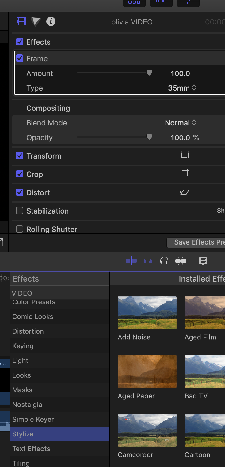
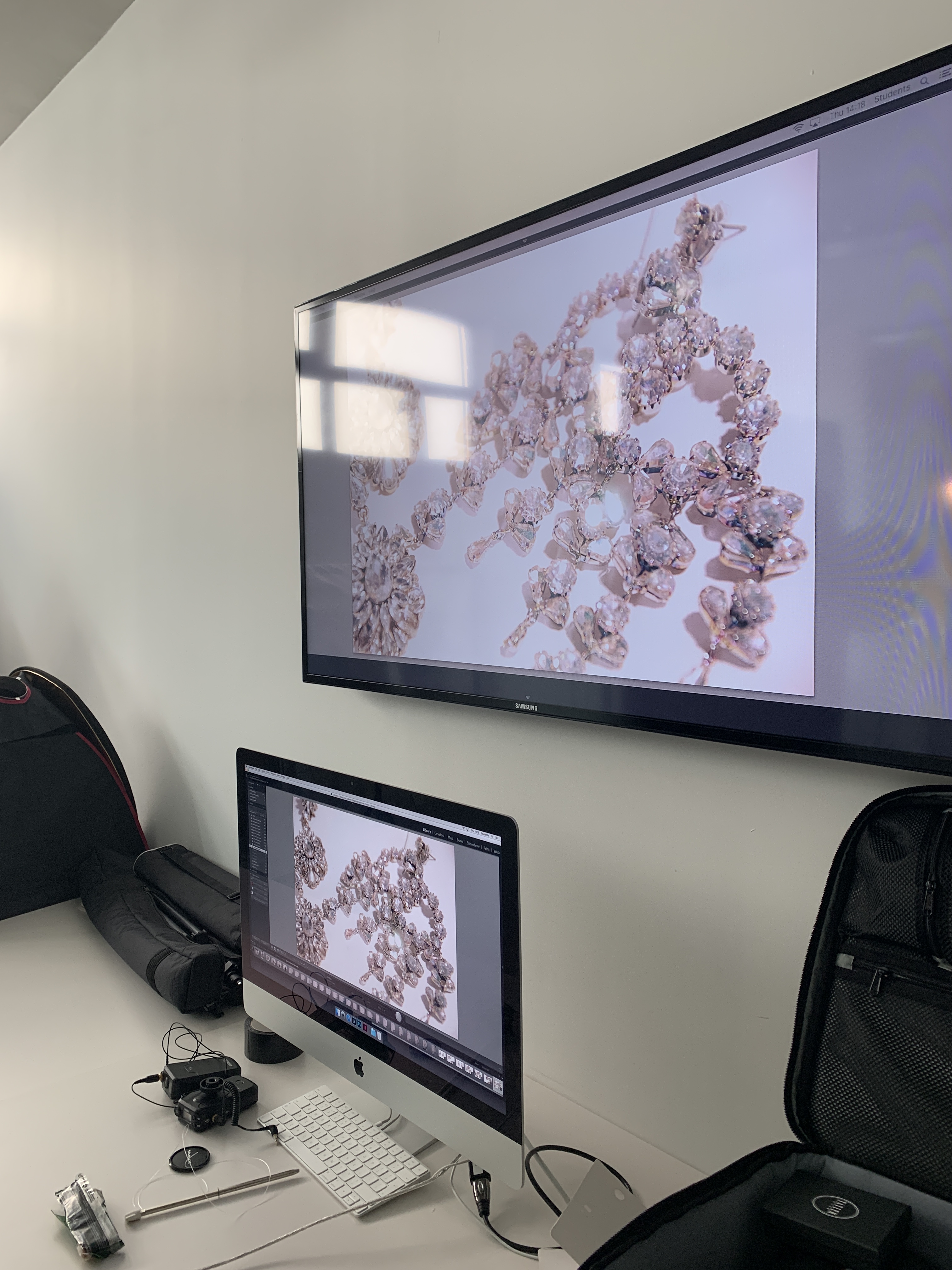
I set myself the task of utilising Indesign and Photoshop as programmes to conduct my project when I first wrote my brief, however now I am at the final stages of my project I have learnt and utilise many more than first imagined- indesign, photoshop, imovie, premiere, final effect pro and lightroom in order to create an industry standard level of work. I had to over come some barriers in order to utilise these however, such as the video applications. I was let down by my video editor meaning that I had to self teach myself the programmes to be order to develop a promotional clip that complimented the book well. I also taught myself light room for editing to make the images with the crystals in a lot brighter and more on brand for Swarovski. I fully believe I now have a much more refined skill set in order to translate myself into a work environment and to be able to fit a diverse industry brief.

It really is true that the majority of learning takes place in that last 80% of the project. Without me being able to take a step back from all the work I had been doing in the first weeks, I wouldn’t have been able to extend my skill set, push my ideas further and know fully what needed more refinement. I made some bold decisions in the last couple of weeks regarding the first video I shot for the promotional video, I scrapped the first one due to it not sitting up there with the rest of my work. I then went away planned another shoot and shot the next day, having to edit and refine it myself and with much dedication to make the video as on brand as the rest of the project, I can now say I am glad I made the bold decision to re shoot (as hard as it was at the time). On reflection, I believe in doing this- I have been able to push every inch of my skills and knowledge to produce a full piece of work in which each aspect compliments each other, a trait I can now take forward into my professional career.

Through the underpinning of my dissertation and primary iFCP research I have been able to generate work that responds to modern luxury publications, consumer requirements and to and industry practice brief from within a luxury contract publishing team.

Luxury Book Printing : Spine

When I went to print my book I asked about how far my budget could stretch in making the book as luxurious as possible to be able to show as a luxury item. I was able to choose thick paper and a matte cover but was advised that to get foiling on the spine that the spine may be too thin.

I just had an email from the printers saying that the spine will be around 10mm meaning that the spine will be big enough for silver foil printing!!! I really think this adds another dimension to the craftsmanship of the book itself and to the cover design.

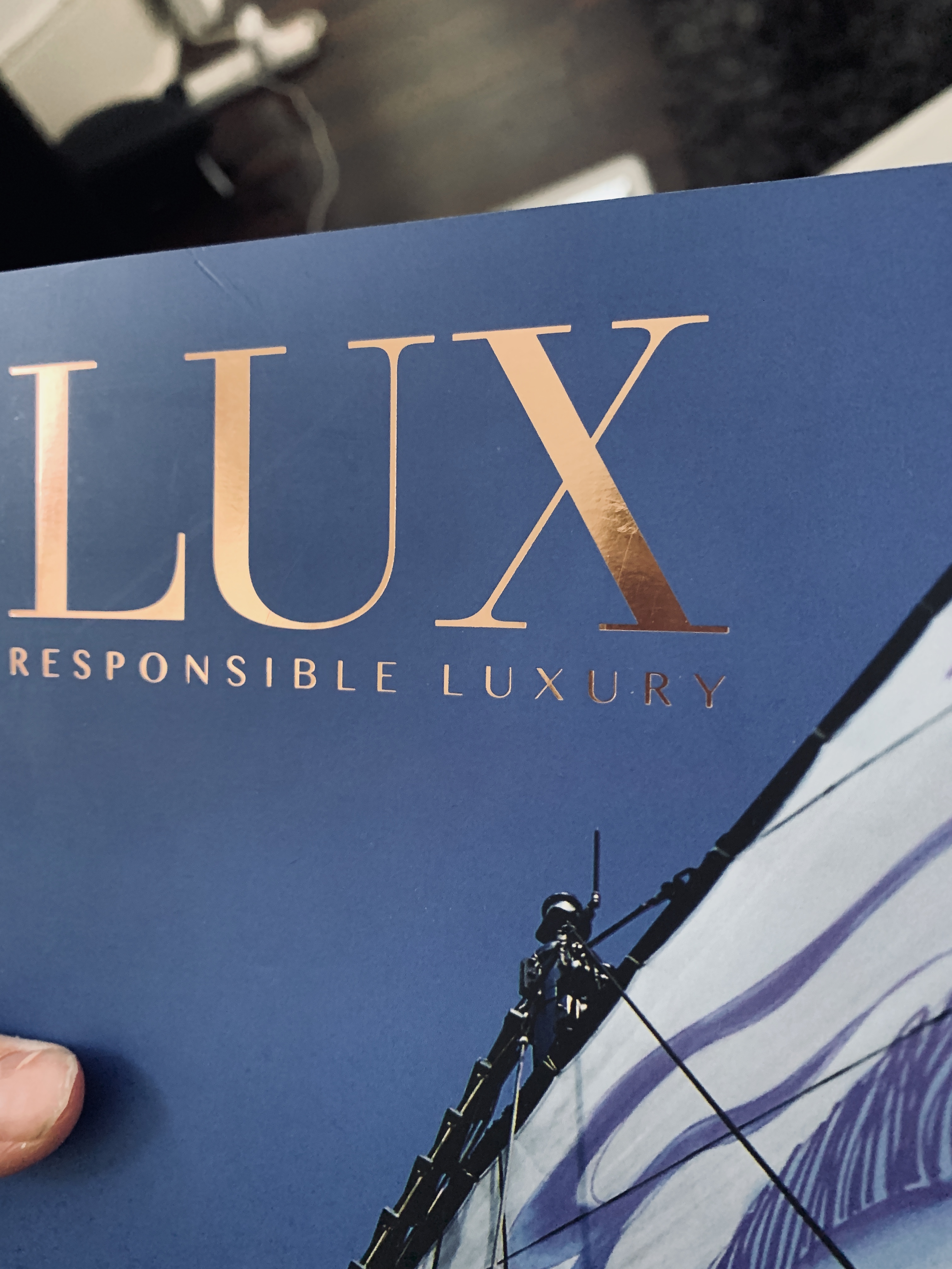
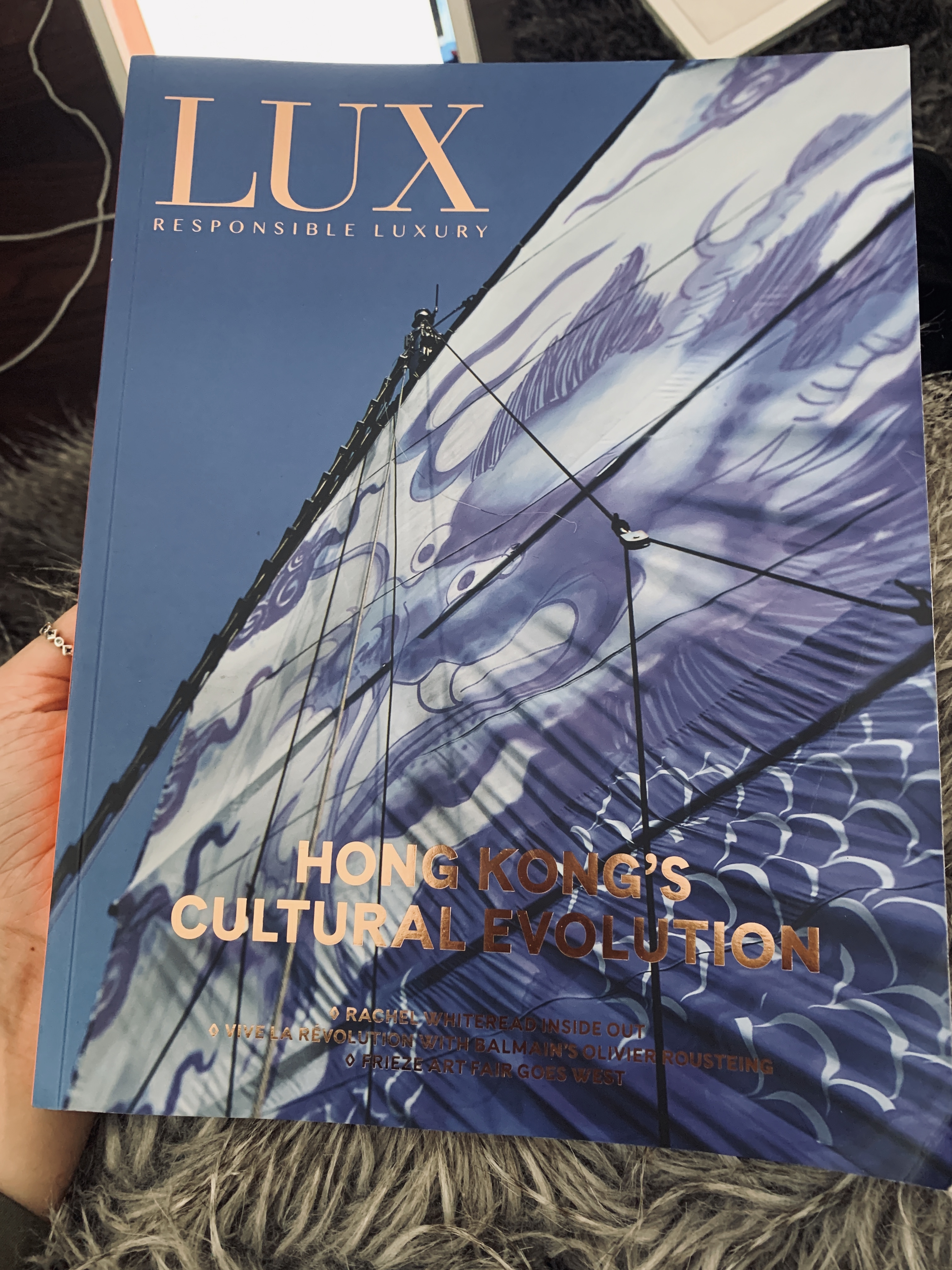
As shown in the Lux cover above, adding a subtle element of designed luxury to the cover- the cover image itself speaks volumes however a silver foil can demonstrate to the viewer the craftsmanship behind the printing of the publication- extra time, effort and design- which is a luxury.

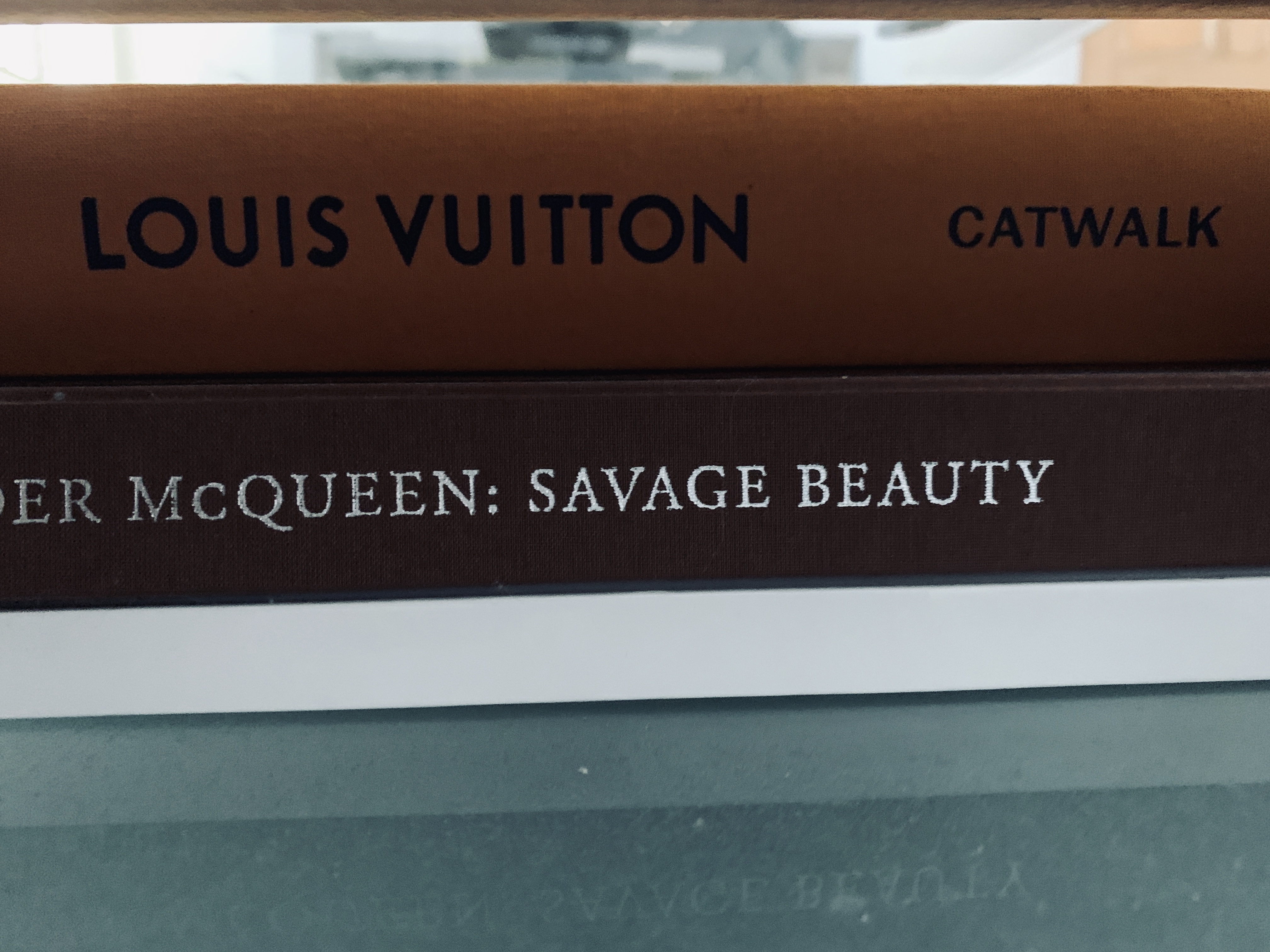
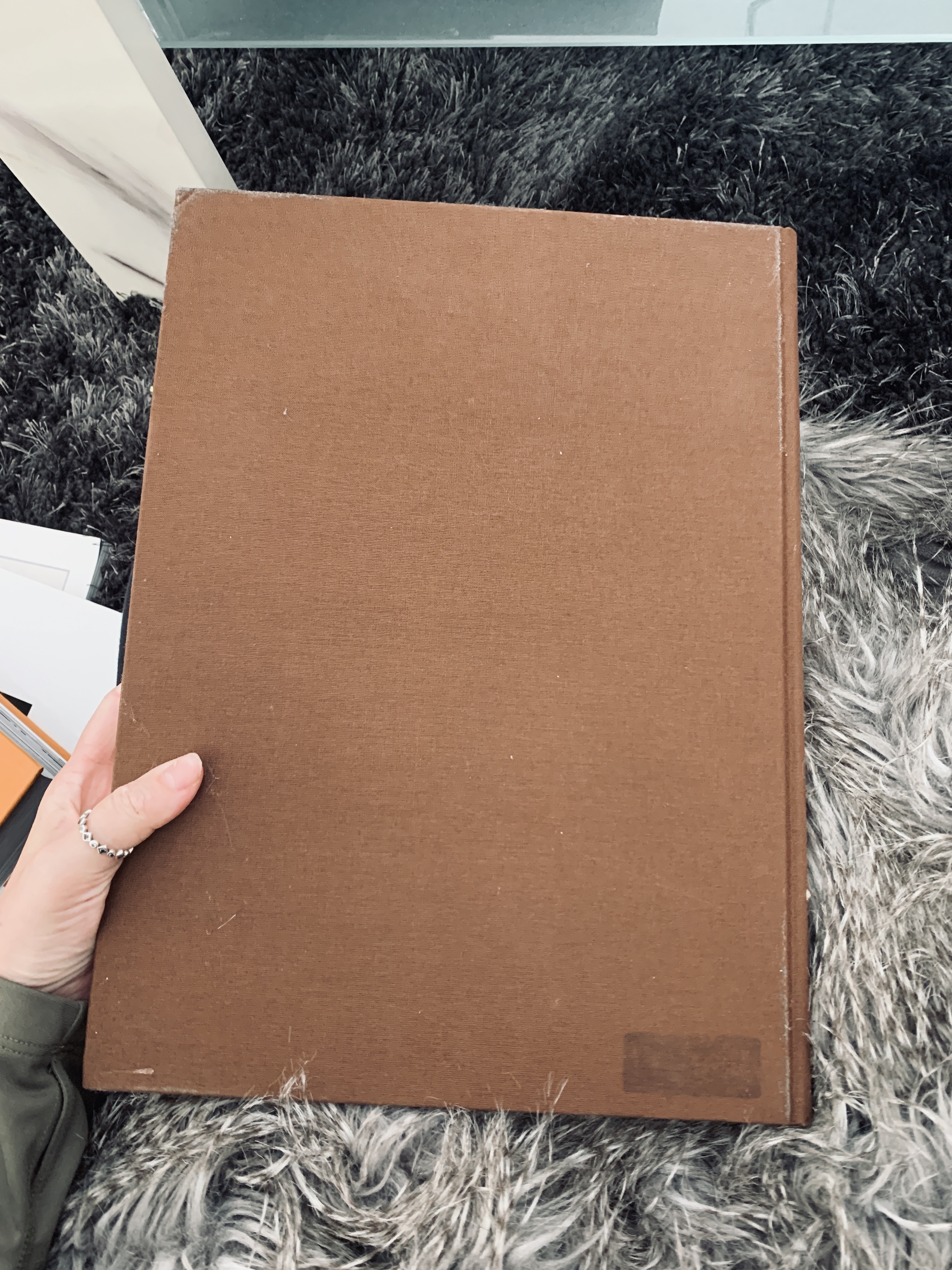
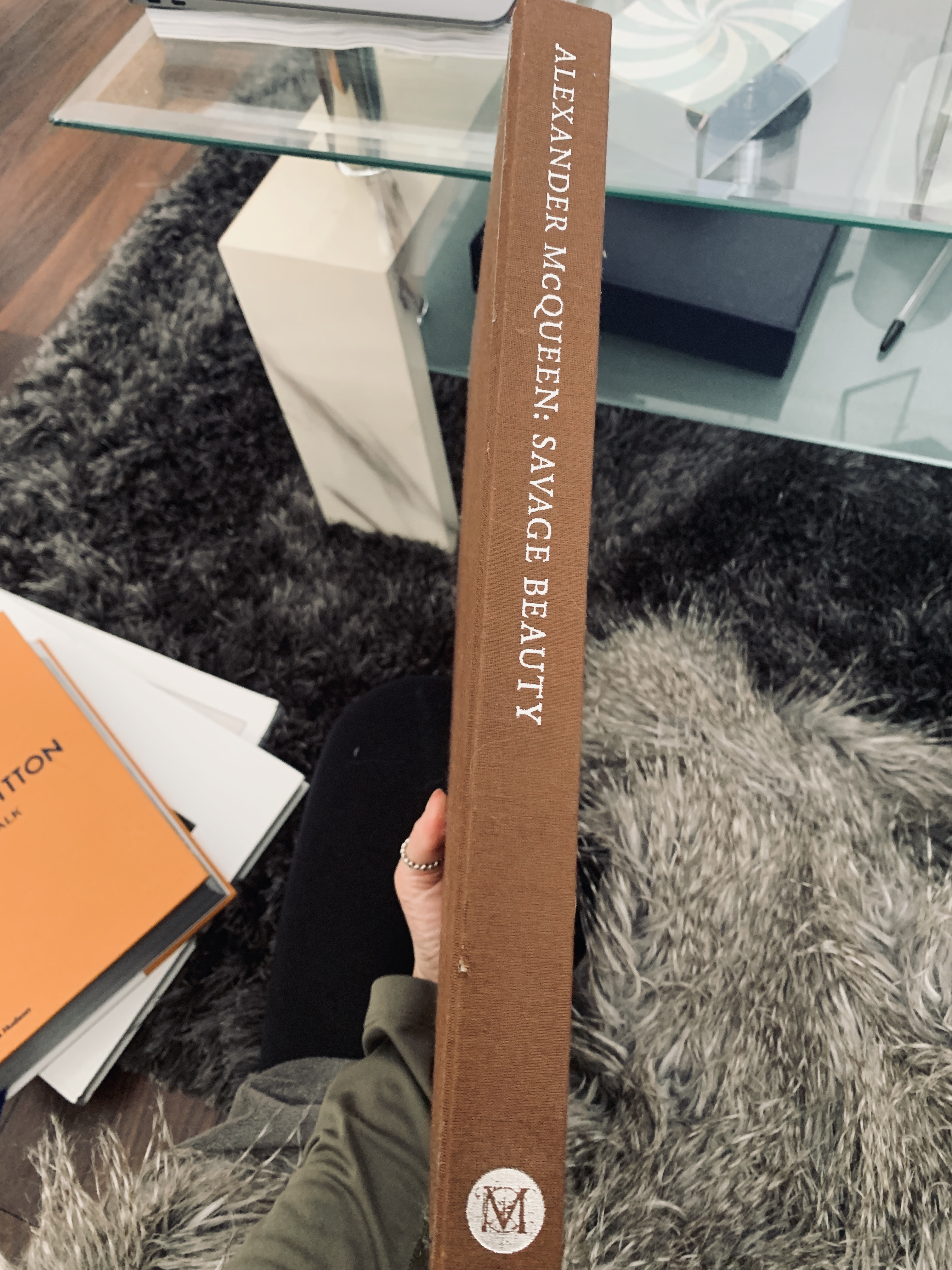
The Savage Beauty book has silver foiling on the spine, adding a real elegance to the dark design of the book.

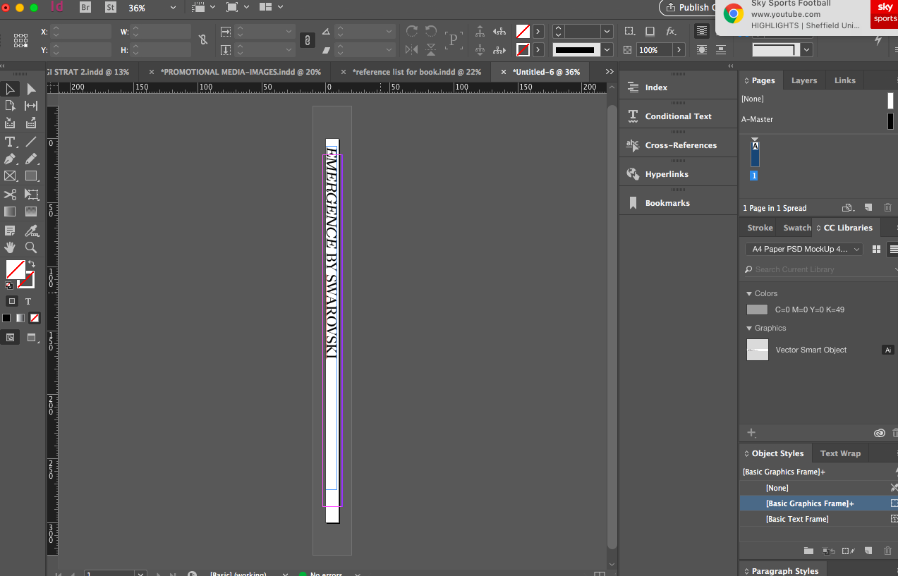
Developing my spine to send to the printers for the foiling:

Creating the spine in Indesign – size 10mm x 300mm

Luxury Layouts, Design and Content

Savage Beauty

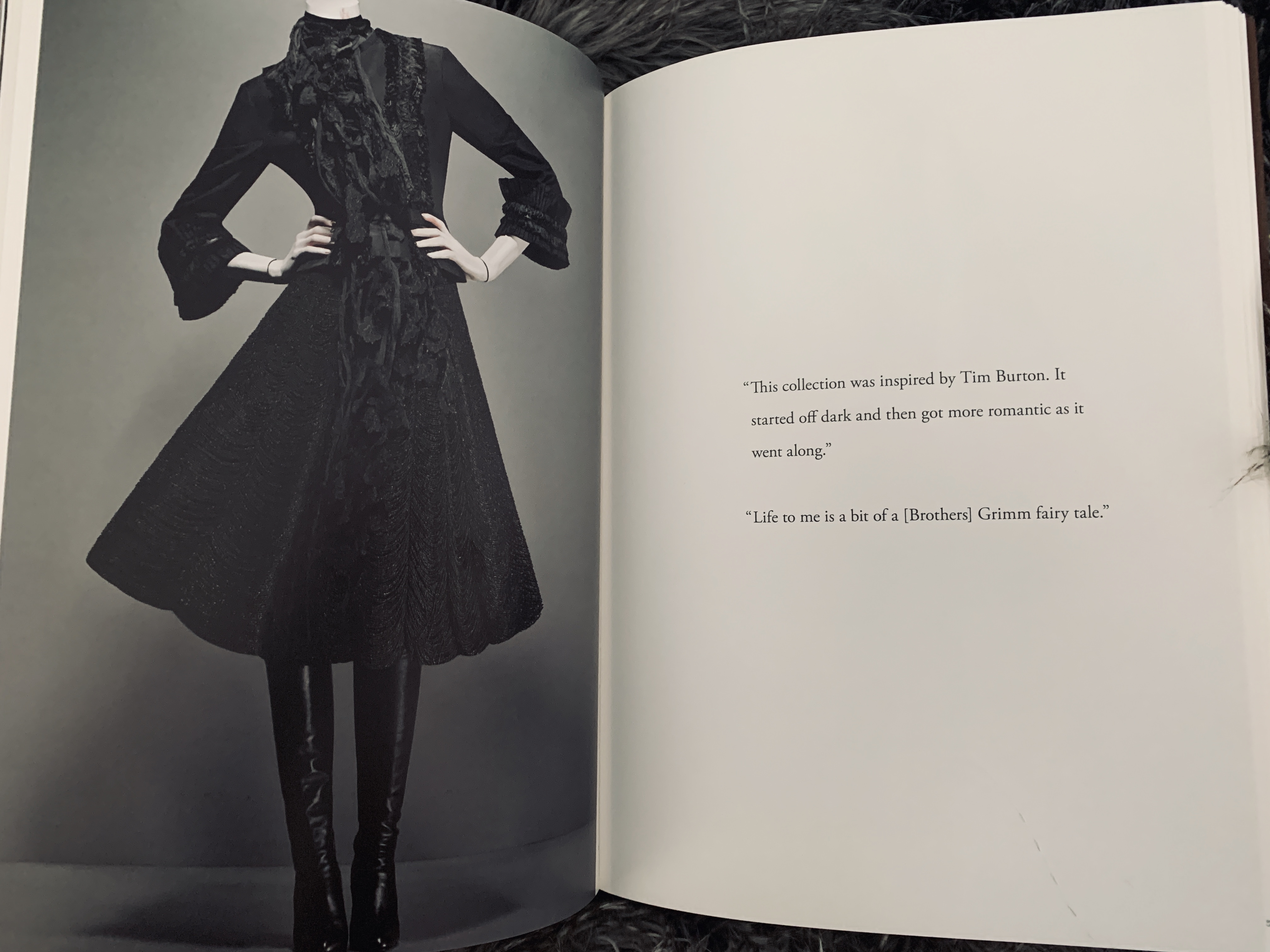
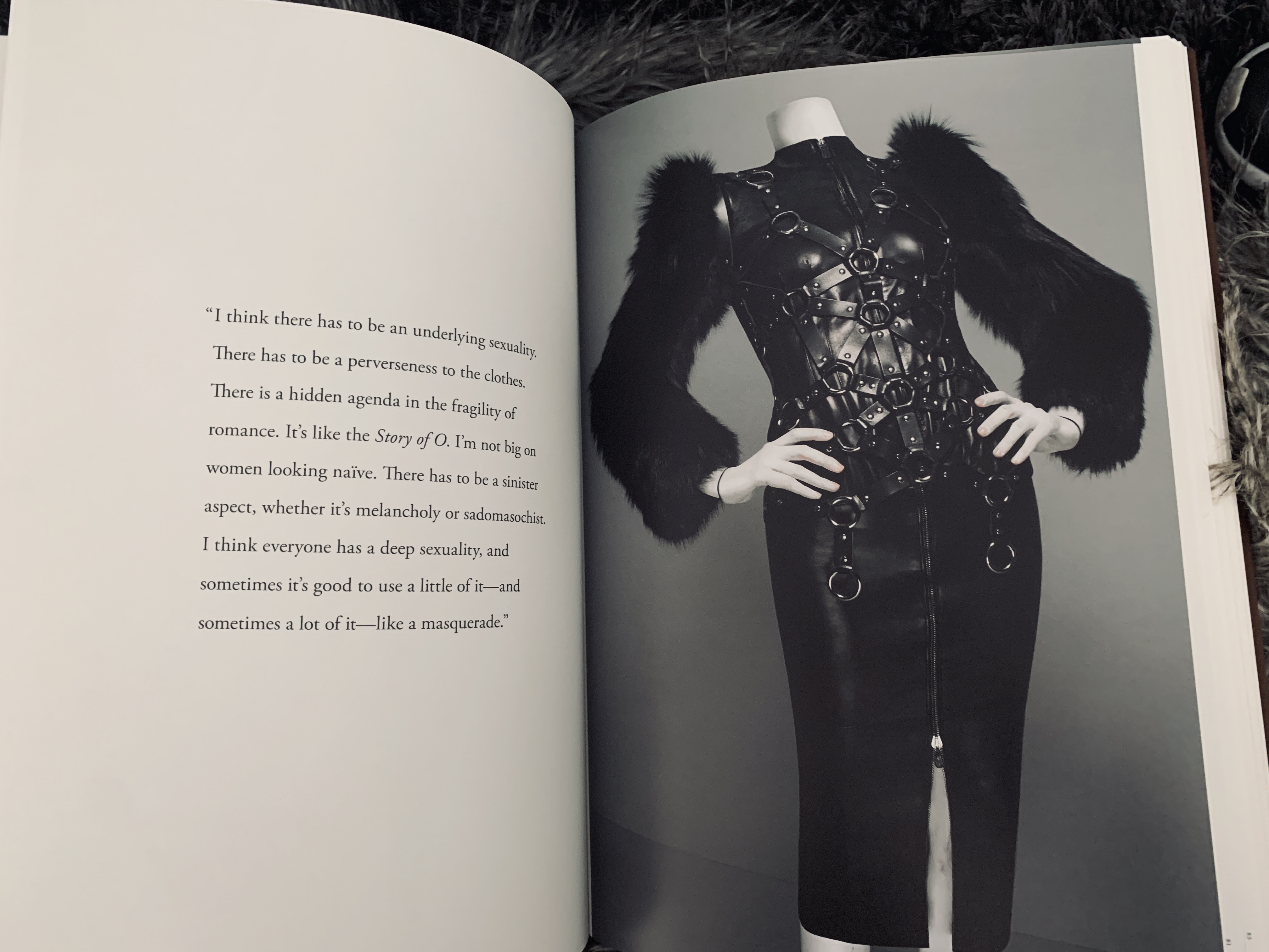
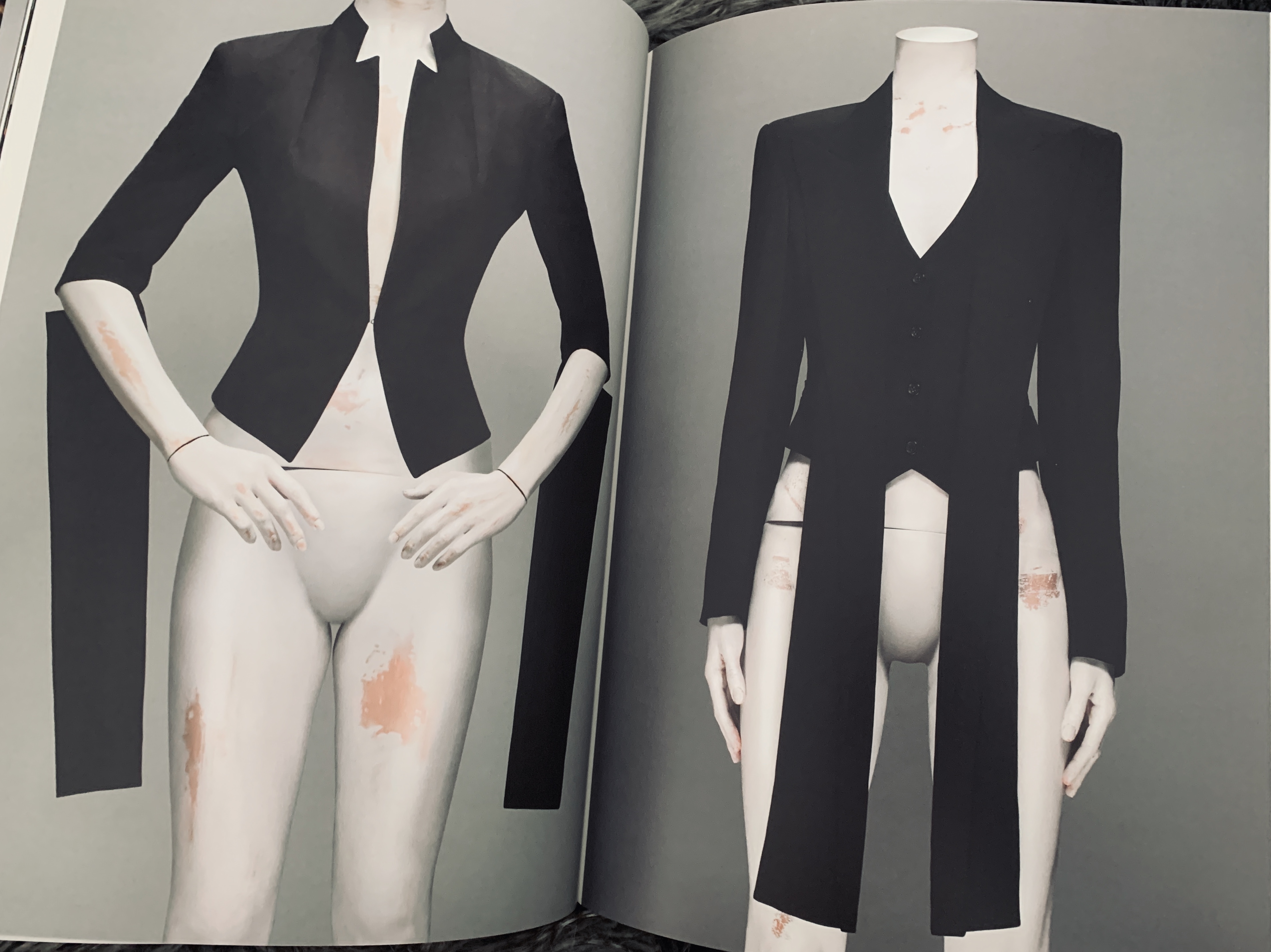
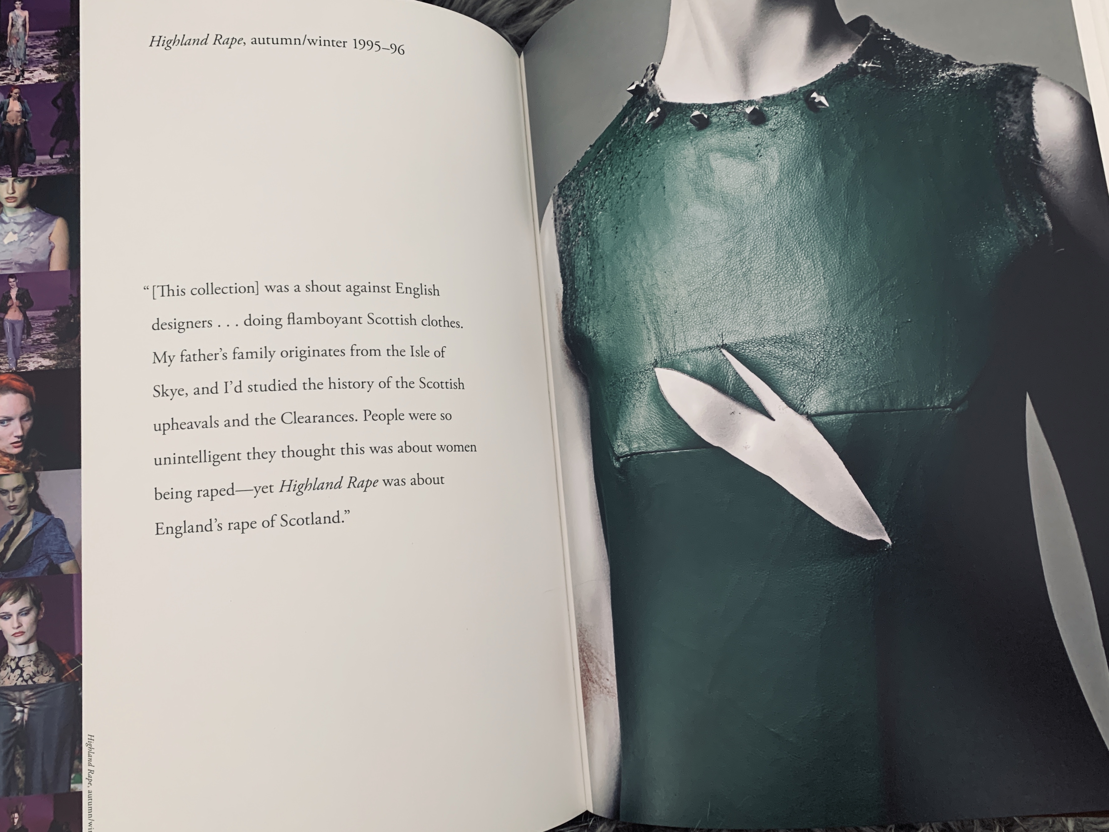
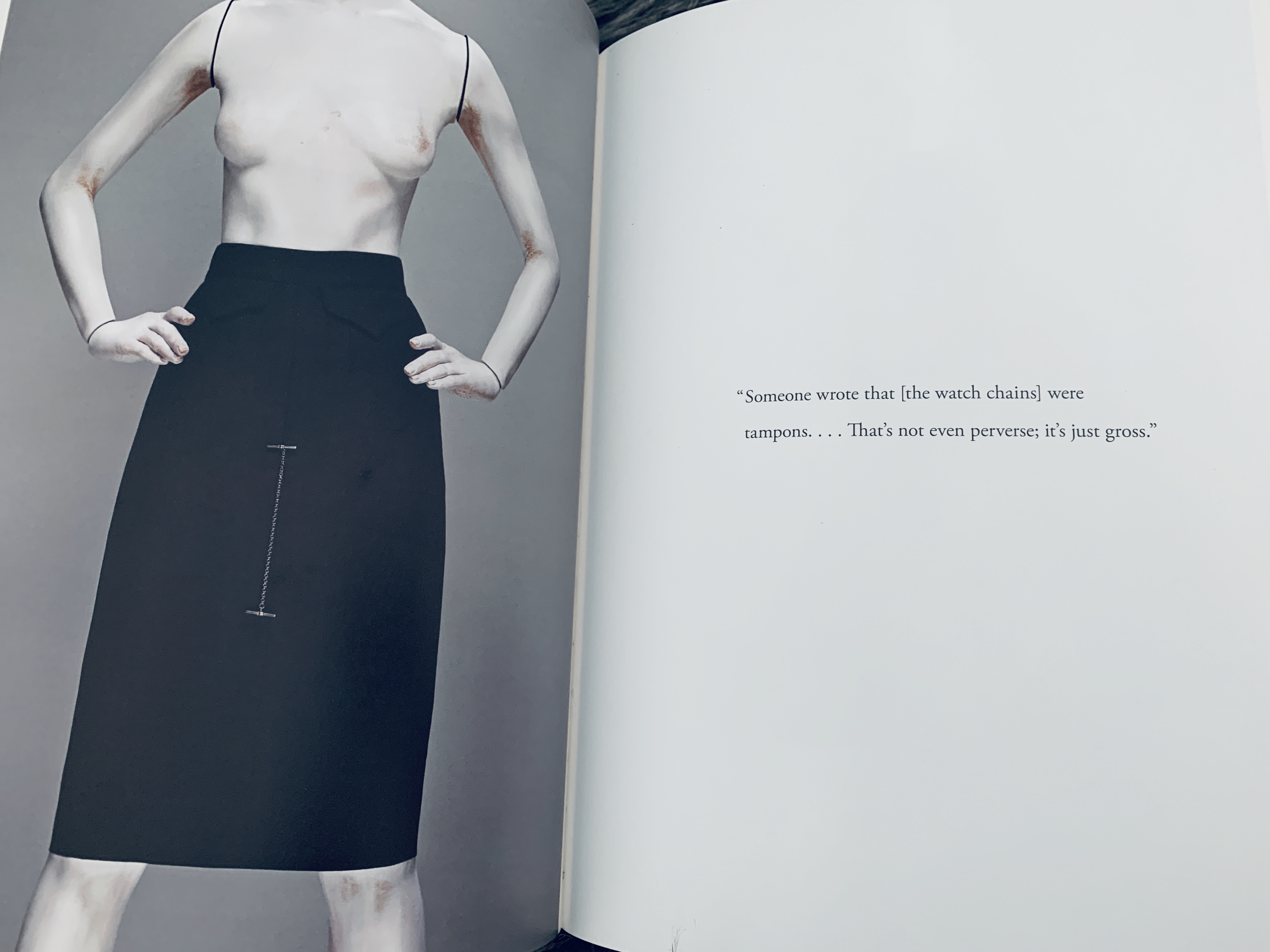
Savage Beauty was my first ever coffee table book- I got given it five years ago for Christmas as McQueen is my favourite designer of all time- I truly love him. McQueen has inspired many things throughout my life, from my textile creations, to my choice to study at Central St Martins and Savage Beauty opened my eyes to the aesthetic and luxury of coffee table books. The main aspect that I love about Savage Beauty was the minimal but highlight executed layout and design. All the images sit to the same or simular size and bleed and some are accompanied per chapter with a quote by Alexander on the collection that is centred within the page surrounded by negative space. What is truly inspiring about the layout of the quotes in this book is the space around that lets the mind occupy a space- a truly powerful way of displaying the work and mind of Lee McQueen. This has inspired me to utilise quotes within Swarovski and really understand the brand and the brand DNA.

Catwalk: Louis Vuitton

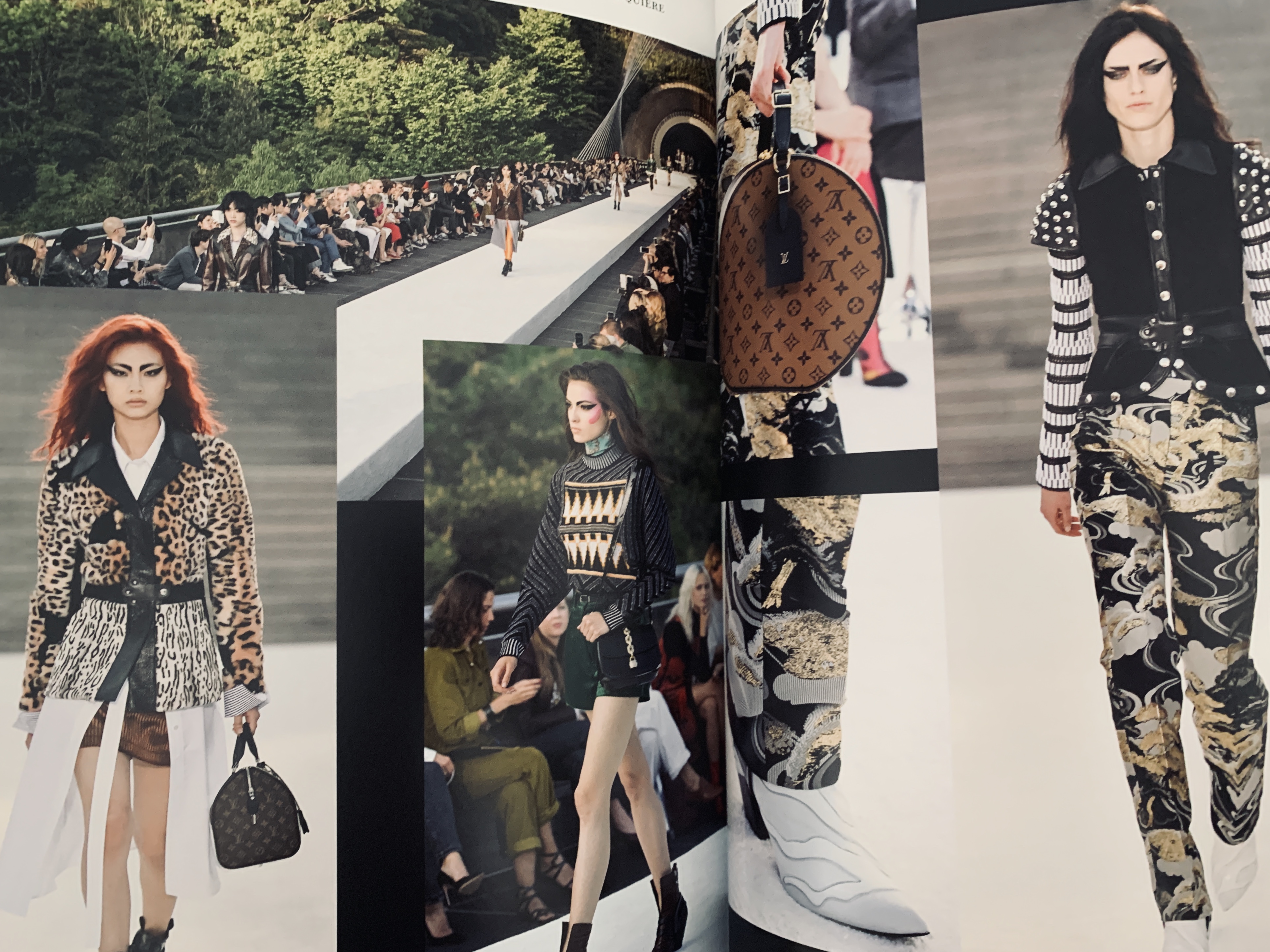
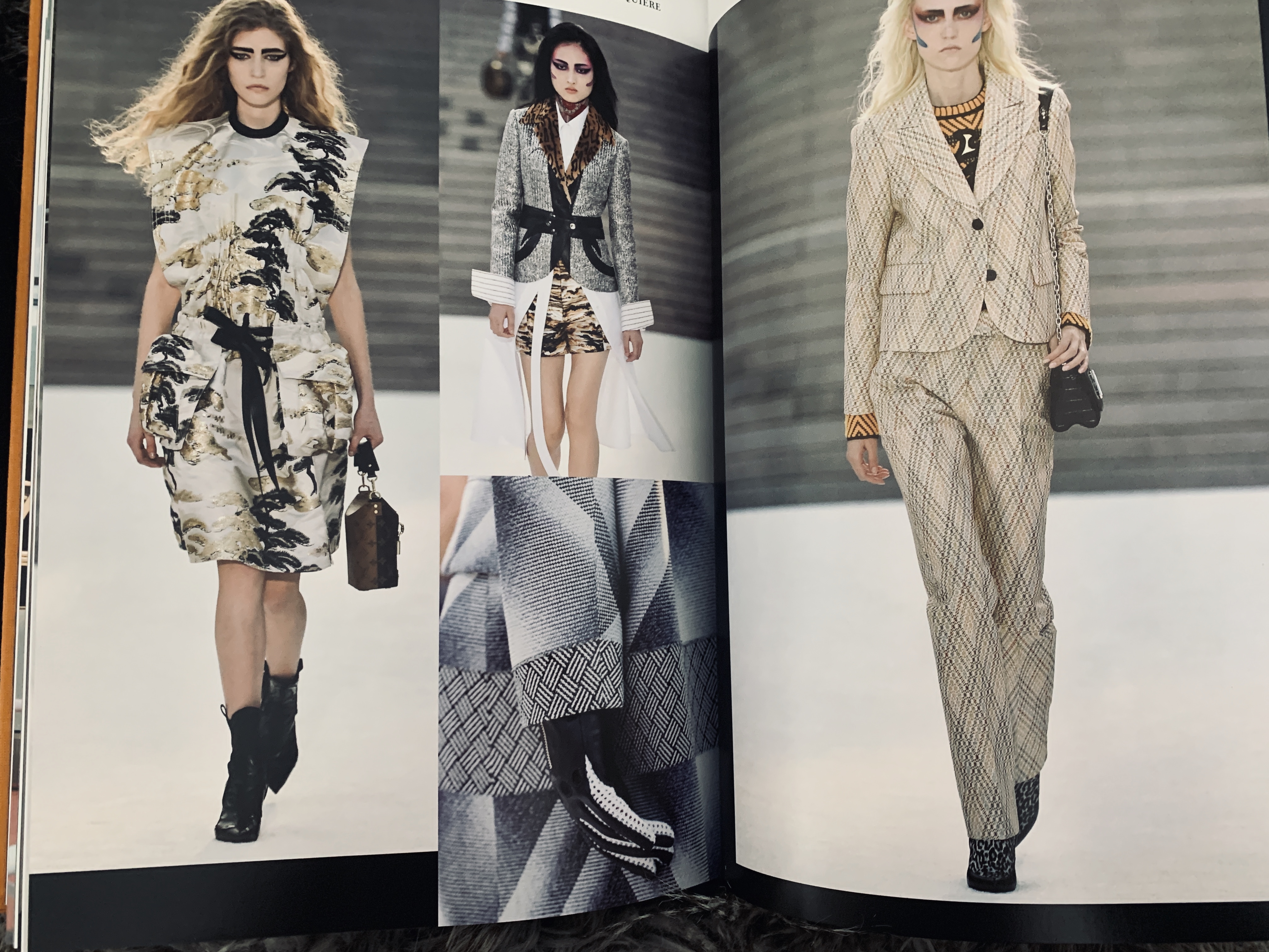
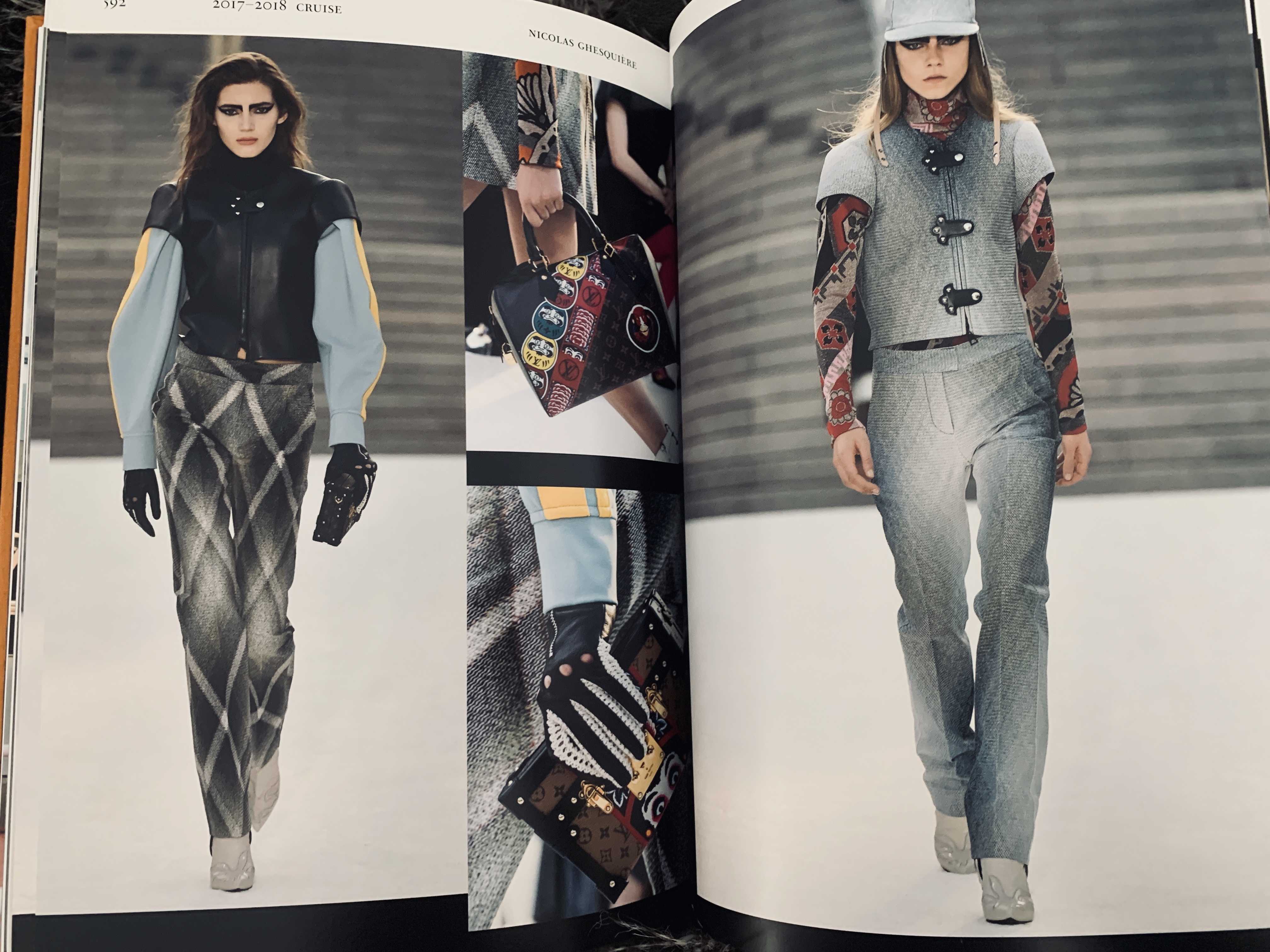
I haven’t owned this book long, however this is a really clever way of feeding timeline like information in a creative manor. Catwalk: Louis Vuitton spans for 1998 – 2016 of 614 pages of all Louis Vuitton catwalk collections. What really stands out to me going through this publication is the use of collaging the imagery together for more of a dramatic look at the collection. There is no words in the book and therefore the imagery speaks for itself through the collaging. What I will take from me from this book is the use of crops on important and special items from that collection, using a crop really draws the eyes in which is something that lets the eye focus on the important aspect of the images.

TWIN

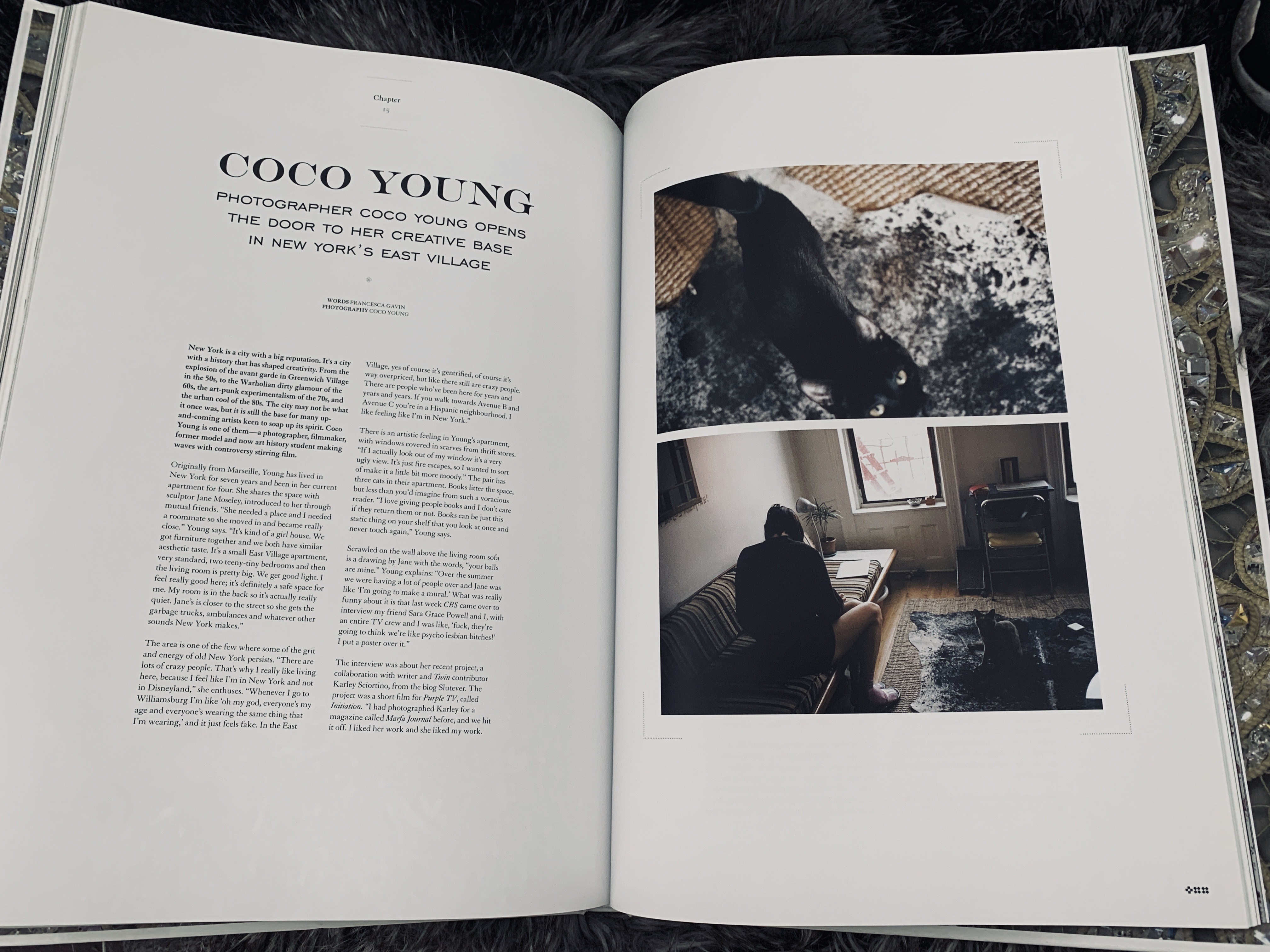
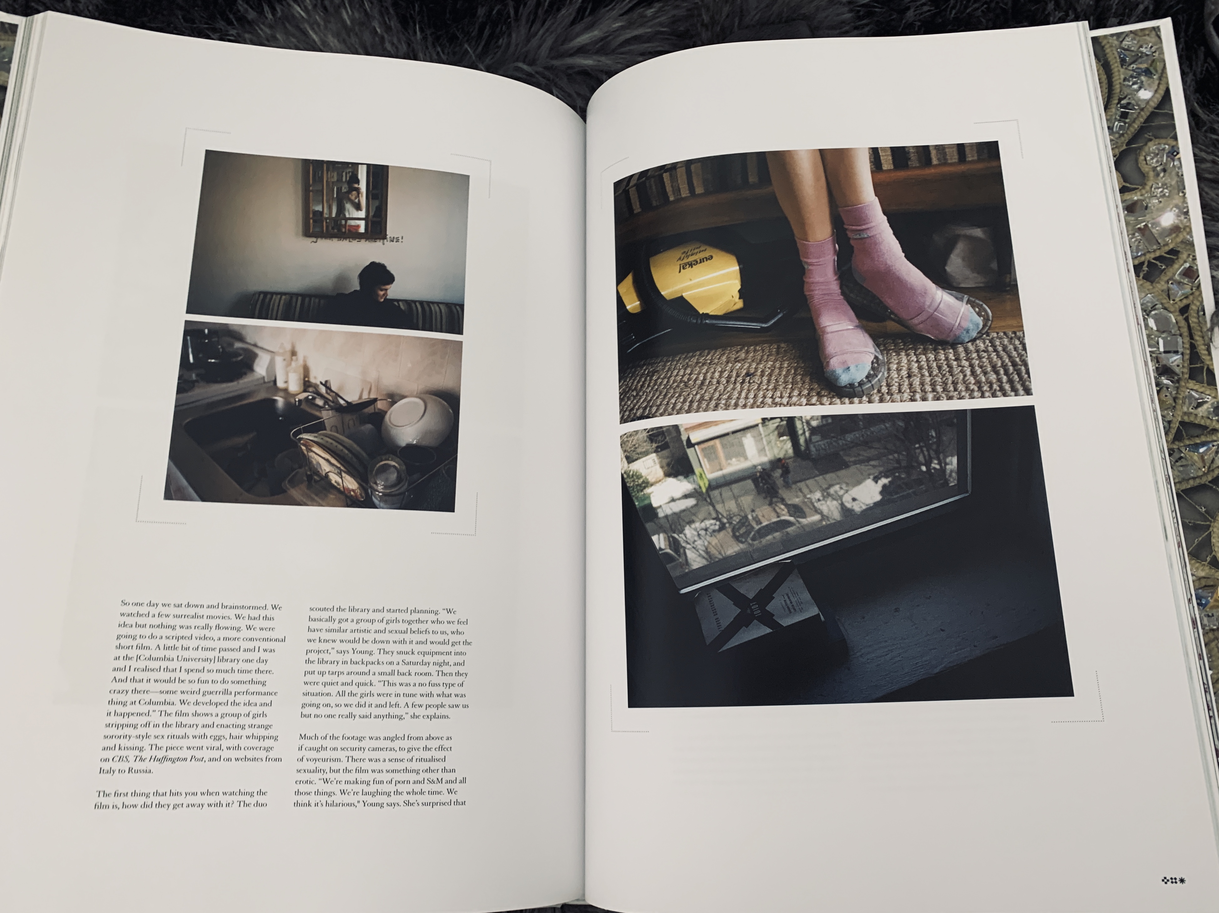
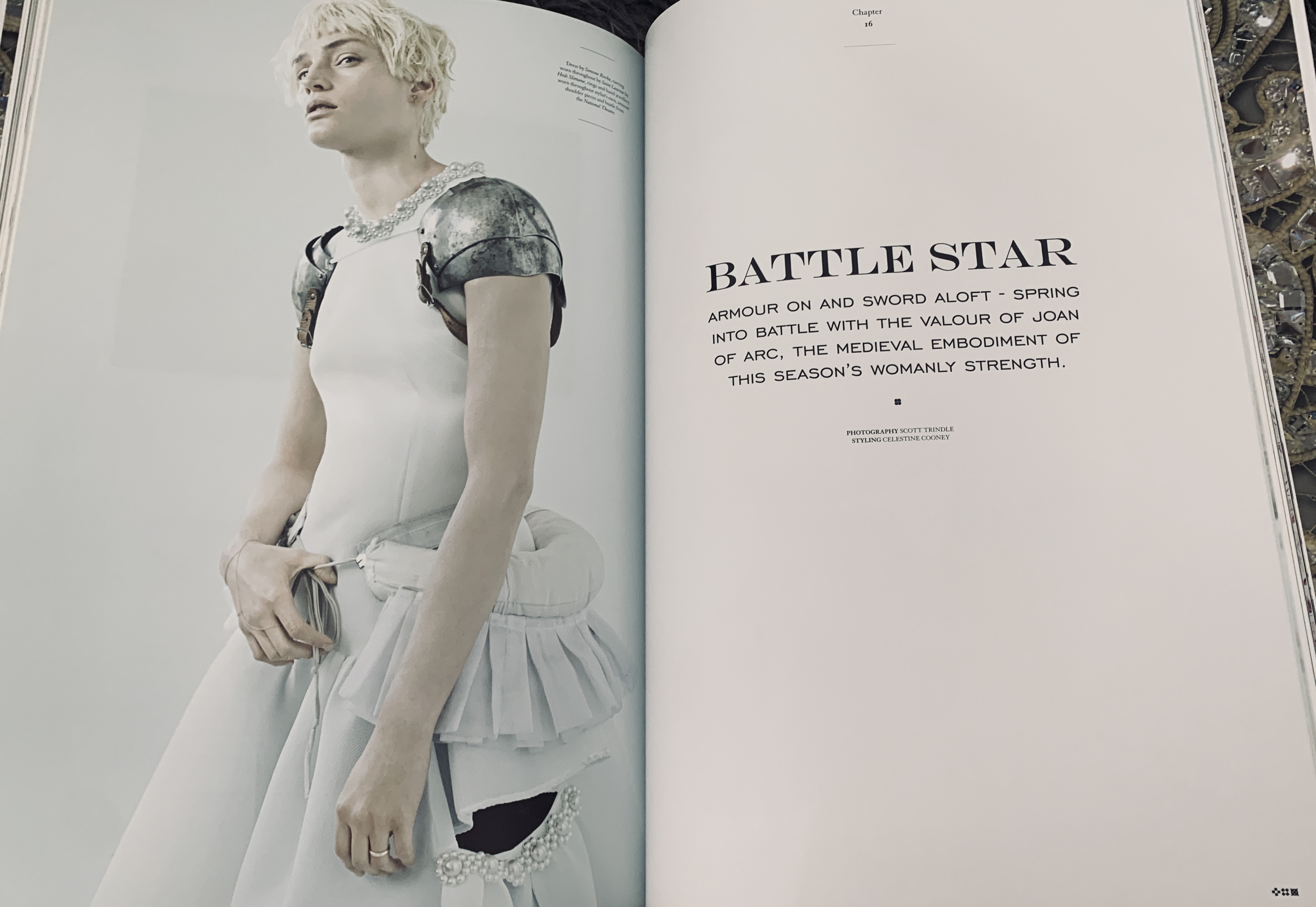
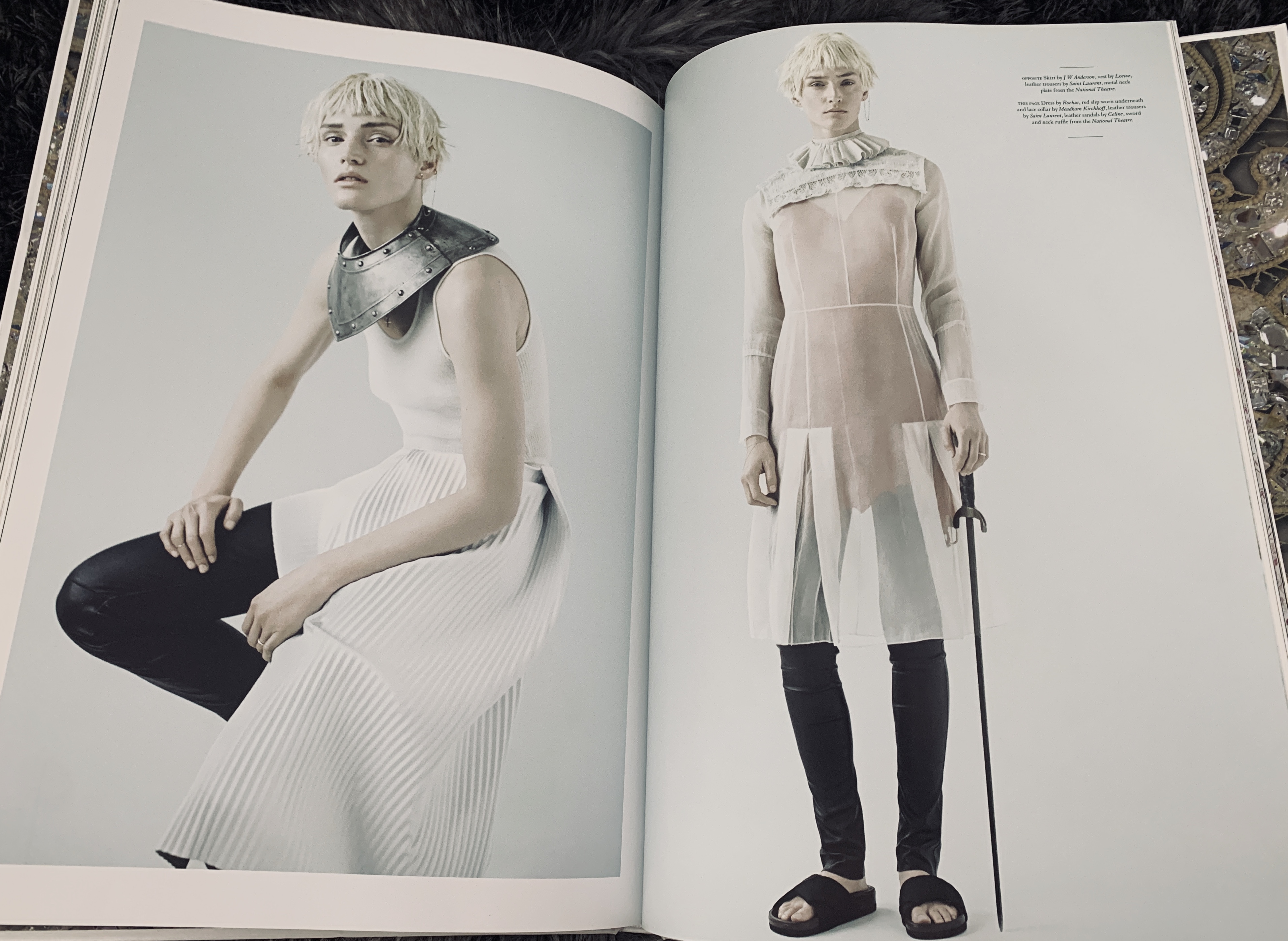
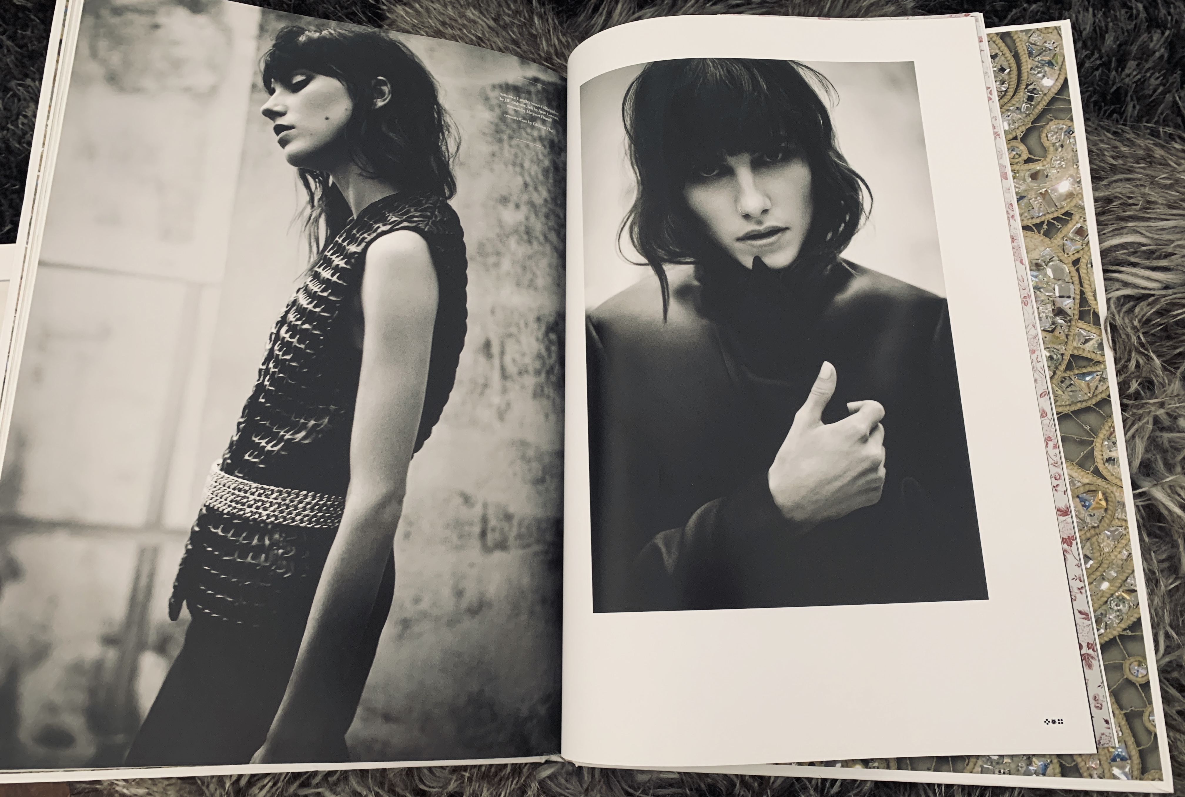
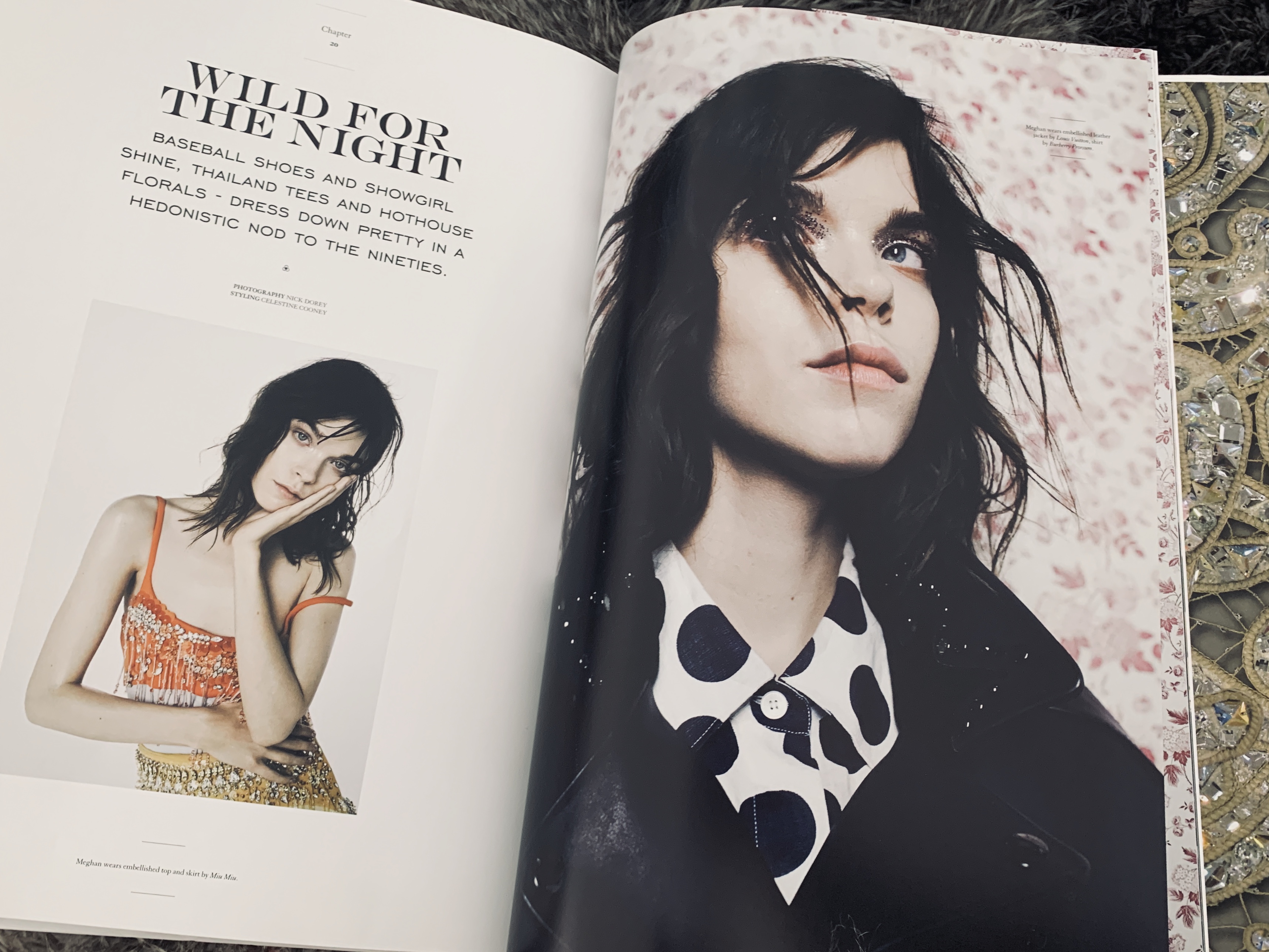
TWIN is actually a magazine, however is hard back bound making it sit more as a coffee table book but with magazine style editorial and features. What really stands out to me about TWIN is the use of full bleed imagery next to imagery with a white border- I think these juxtapose each other really well that they almost compliment each other. I also really like the use of a large heading and a small bite of text underneath surrounded by the white page it is a way of a subtle yet dramatic page layout.

PURE Saint Tropez

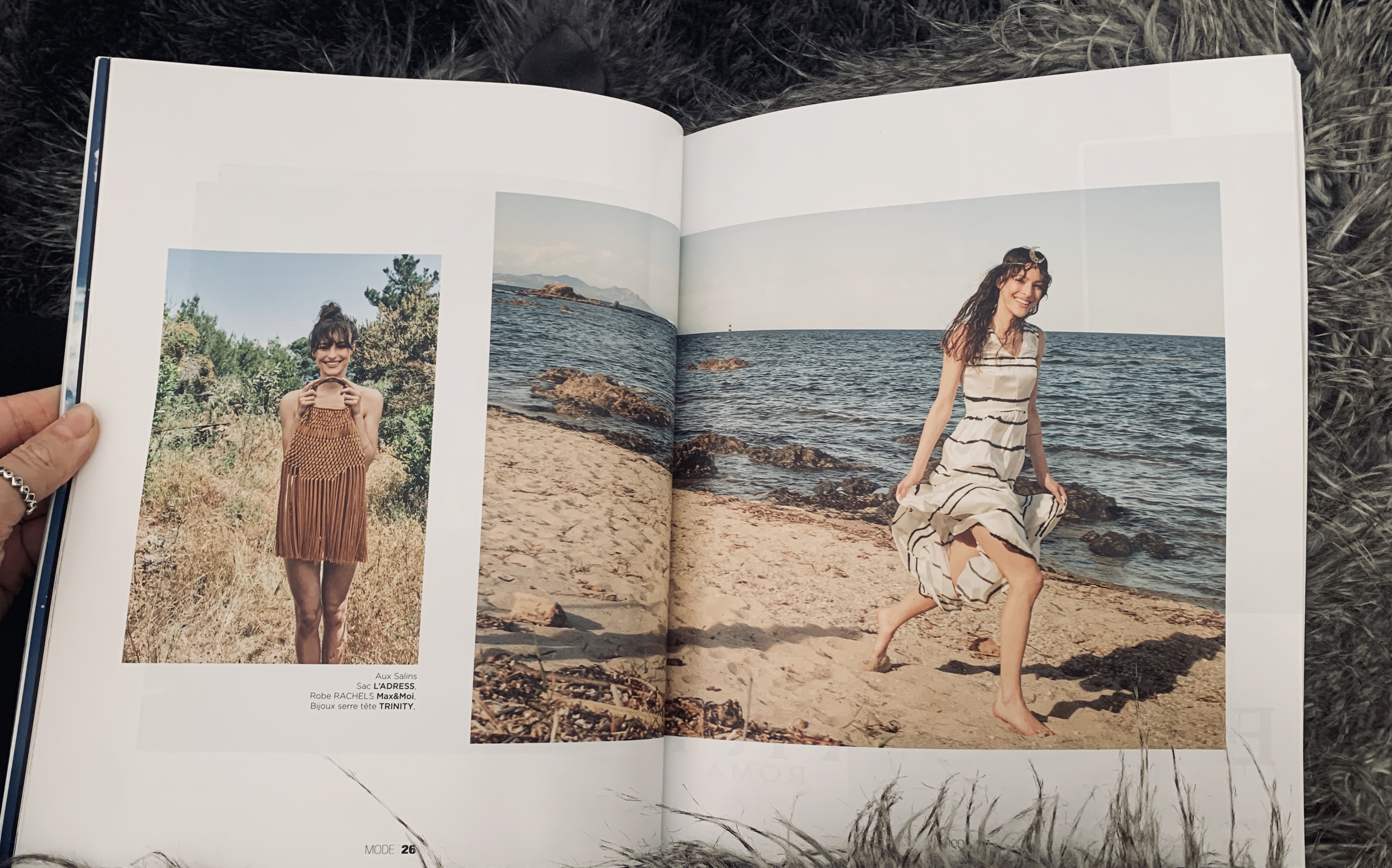
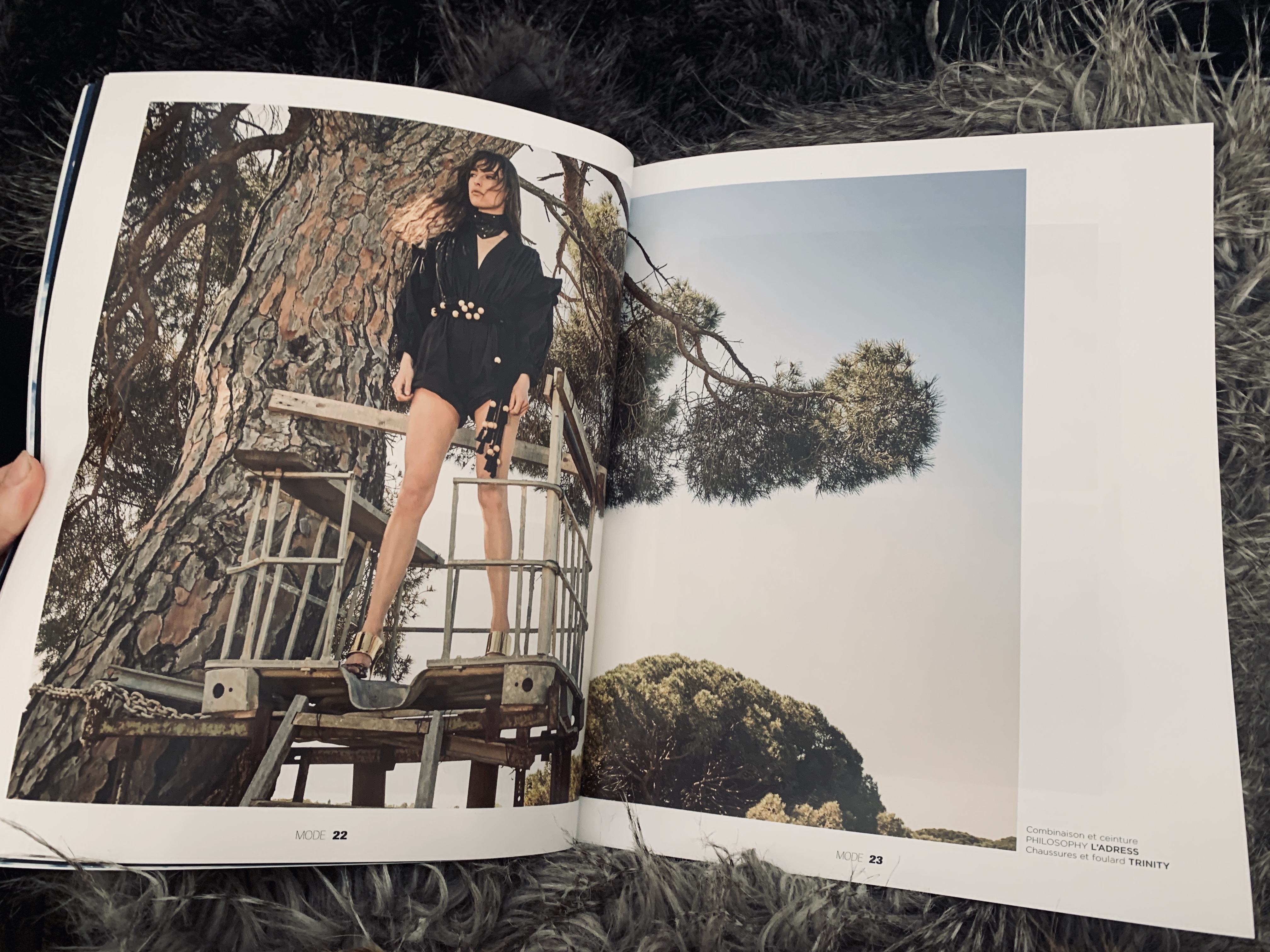
I was recently given this publication by a family member who had been travelling in France- knowing I was passionate about luxury publications. Pure is a publication based in Saint Tropez and features fashion and editorial as well as travel and lifestyle pieces. The photography is actually really impressive and I am a huge fan of how they have laid out the publication on matte paper- I honestly think now matte paper is more luxury than glossy due to the thickness of the matte. The image bleeding over the pages with a slight gap is also really beautiful and takes the eye across the page on a journey.

Video Editing Progress and Reflection on my own skill set development.

After shooting my new video last week I was really happy with the results that complimented the book perfectly- I needed the realisation of that the past video just didn’t quite work 100% with the luxury publication.

I sent the video to my close friend who is a Video Editor at Love Magazine. She said she would try her best to edit and get it back to me as soon as she could. Unfortunately, yesterday she sent me a message at 8am saying she wouldn’t have time to complete the video as she had been given a last minute project by her work, which was a priority, obviously I can understand.

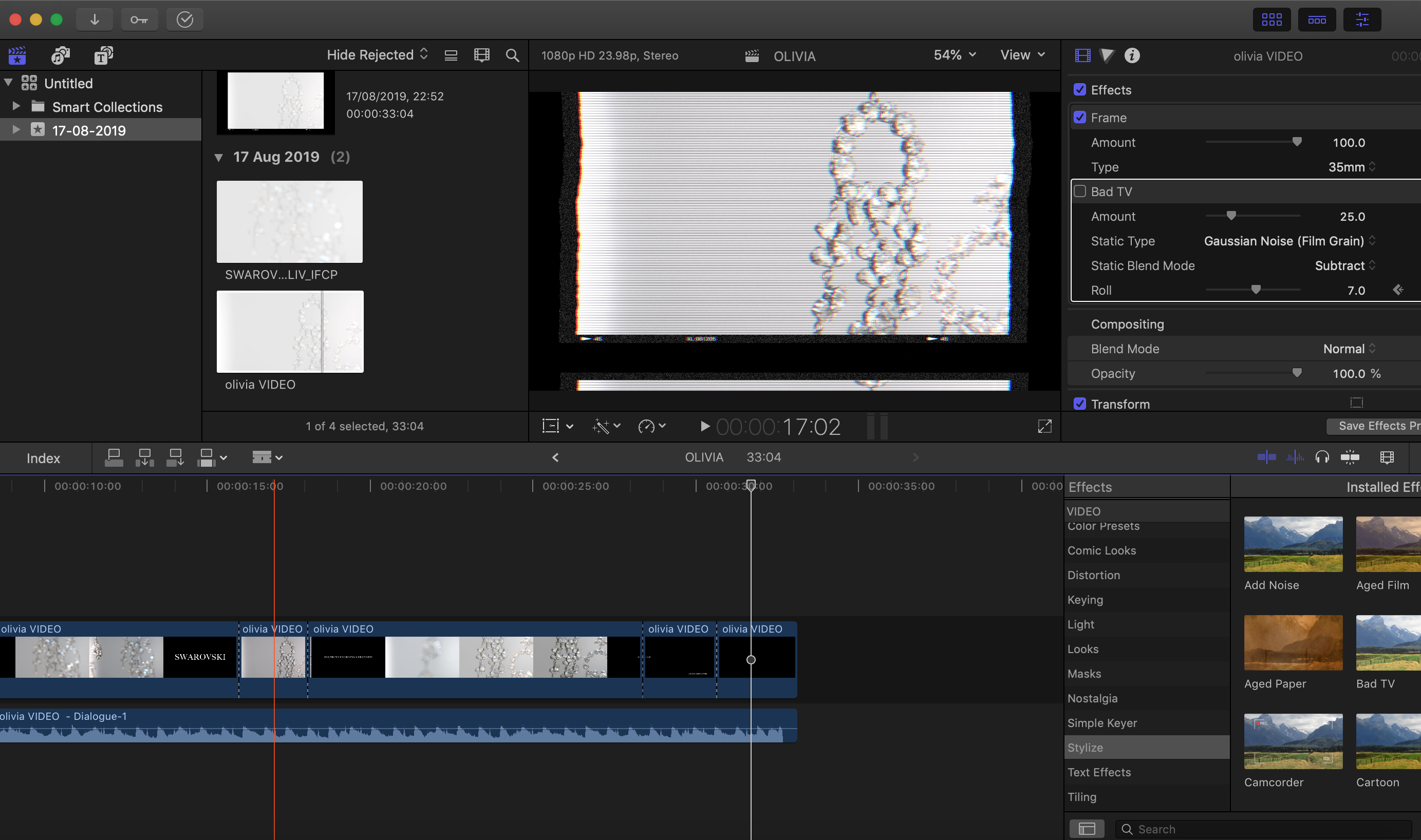
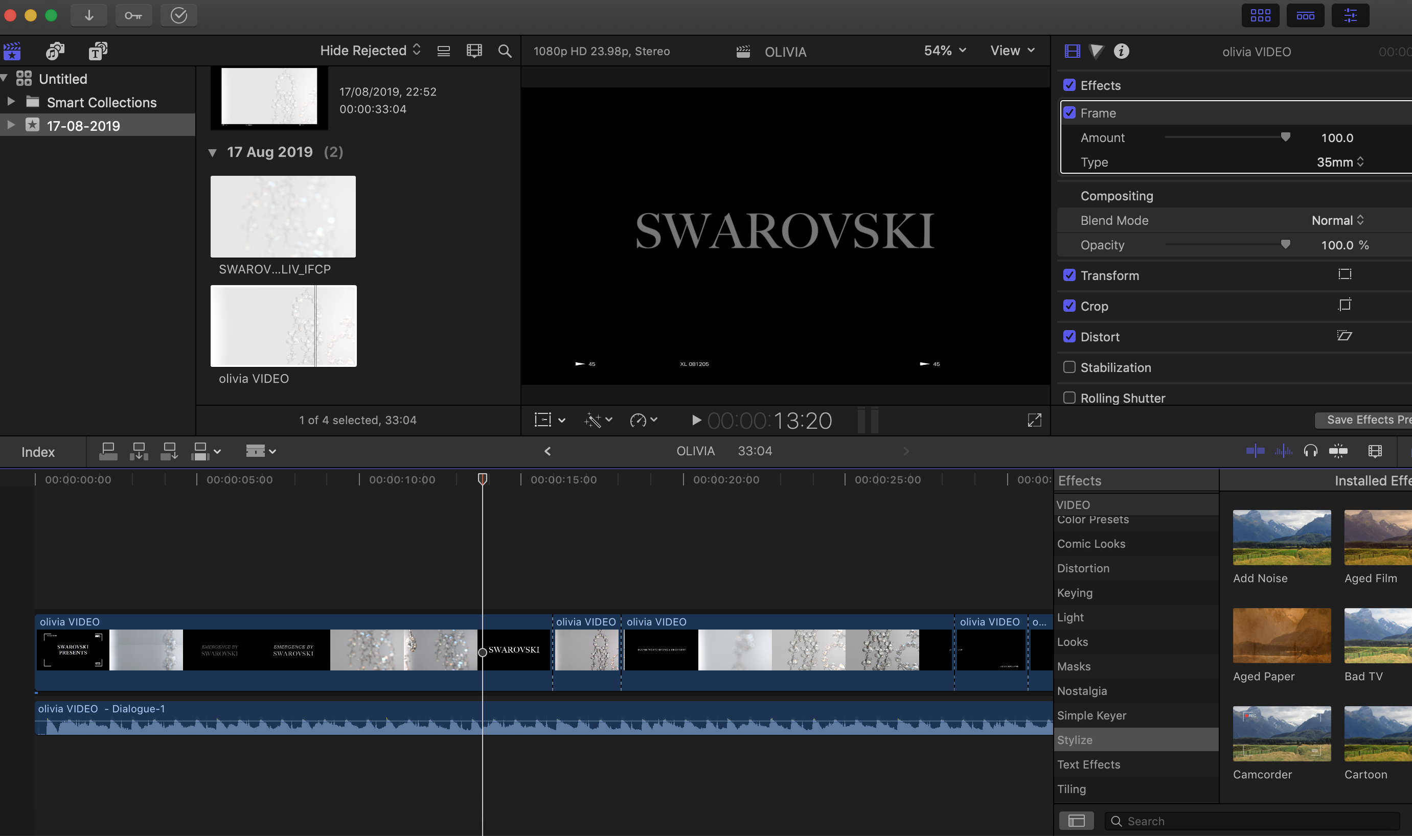
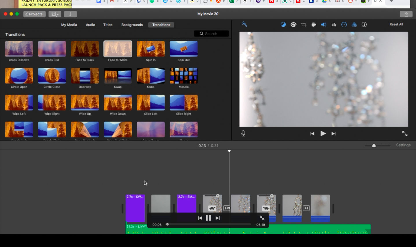
Therefore, it was to me to self teach myself Adobe Premiere in order to be able to execute the video to the standard I know it is. I spent the majority of my day yesterday working on the video and I am SO happy with the outcome, I actually can’t believe I managed to self teach myself and be able to produce an outcome that I am so happy with.
Throughout this process, as there have been so many elements to the brief, there have been bumps in the road I have come across, however, reflecting on this now, it is clear that these bumps in the road have just allowed me to be able to push my skill set a lot further than I could have ever imagined 6 weeks ago. Not only that but these bumps and hiccups along the way have taught me that all the learning for this project has been developed through these difficult situations. Overcoming these big obstacles have not only made my project a much more polished piece of work but have also allowed for a lot more self development and skill set refinement. My brief mentioned that the programmes used would be :indesign and photoshop, however this has been pushed as far as possible with now spanning across indesign, photoshop, premiere, lightroom, final cut pro and PR sites to gain contacts. This has not only allowed me to develop my work but to develop my personal skill set and work standard and I am thankful for those hiccups.
The intersection between art and luxury

“Art and luxury have a long history of influencing each other to create timeless, aspirational experiences,” (sotherbyinstitue,2019).

The intersection between art and luxury has been a partnership that often sits hand in hand, but why do these two entities compliment each other so well, and how can I bring this to light within the book?

Within ‘The Luxury Strategy’ Kapferer maintains a relationship go hand in hand as they have a common importance of aesthetics, which he claims is the “raison d’etre of art and the indispensable condition of luxury”. He goes forward to display a relationship they both hold within sociological markers claiming designer jewellery is a luxury and an art, as is the architecture of a mansion of a museum. Many claim both entities are timeless due to their exclusivity, for example- in recent years luxury conglomerates have established their strong bond and connection to the arts. LVMH established their foundation in Paris, alongside brands such as Louis Vuitton collaboraing with artists such as Jeff Koons for fashion collections.

The relationship is almost a marriage between to entities that brands could cultivate more of to be able to establish brand equity and knowledge for the consumer. Emergence highlighting the work Swarovski do within the emerging arts scene not only shows a philanthropic aspect to the brand but an artistic side to the brand many are not aware of.

(Jn Kapferer,2012)

Illustrative Process

A key aspect of my book are the illustrations I have done of Swarovski pieces. The idea behind illustrations was to add to the idea of creativity and design of which the book is centred around. I also believe it really adds a personal element of intense detail to the book.

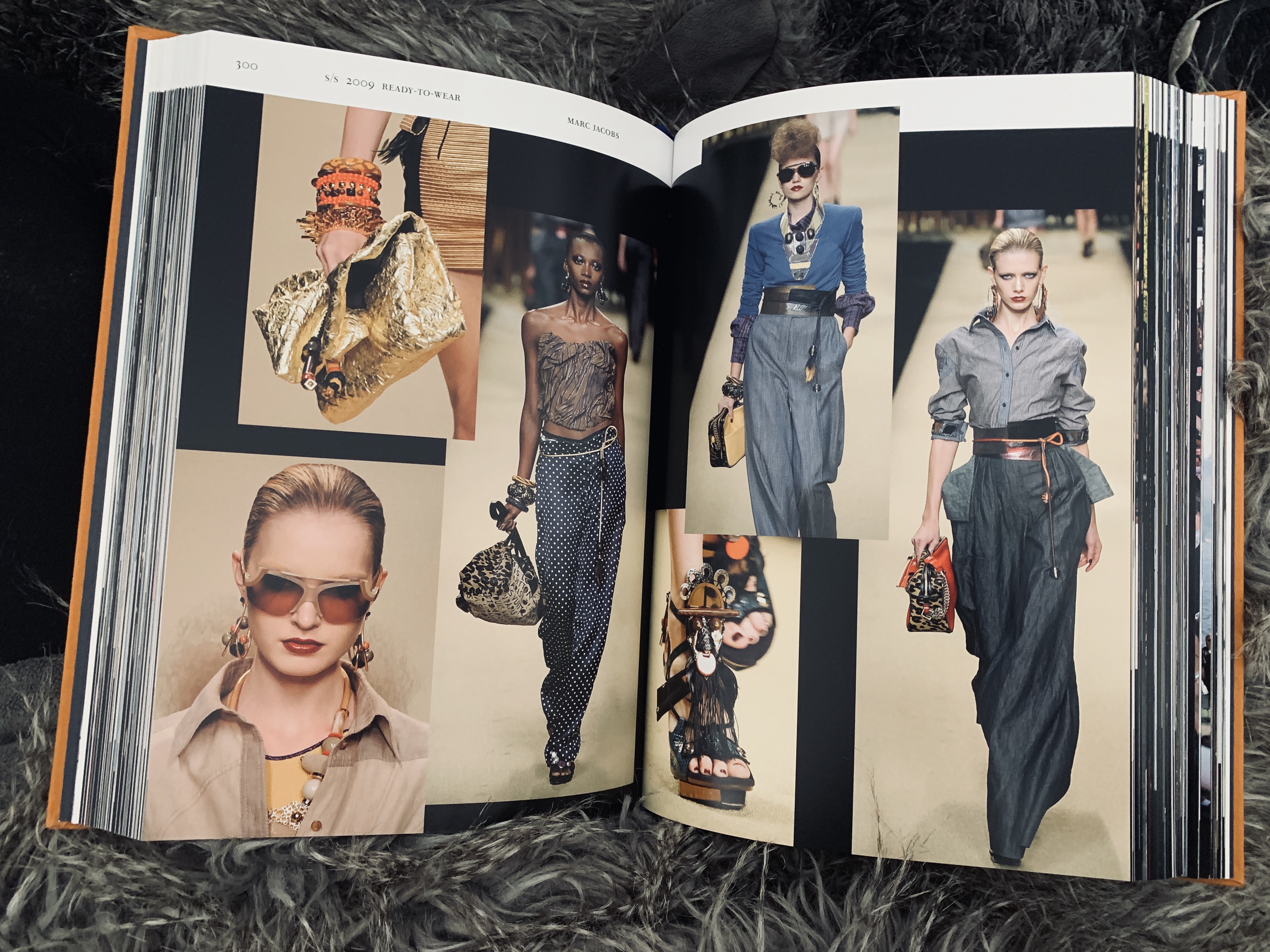
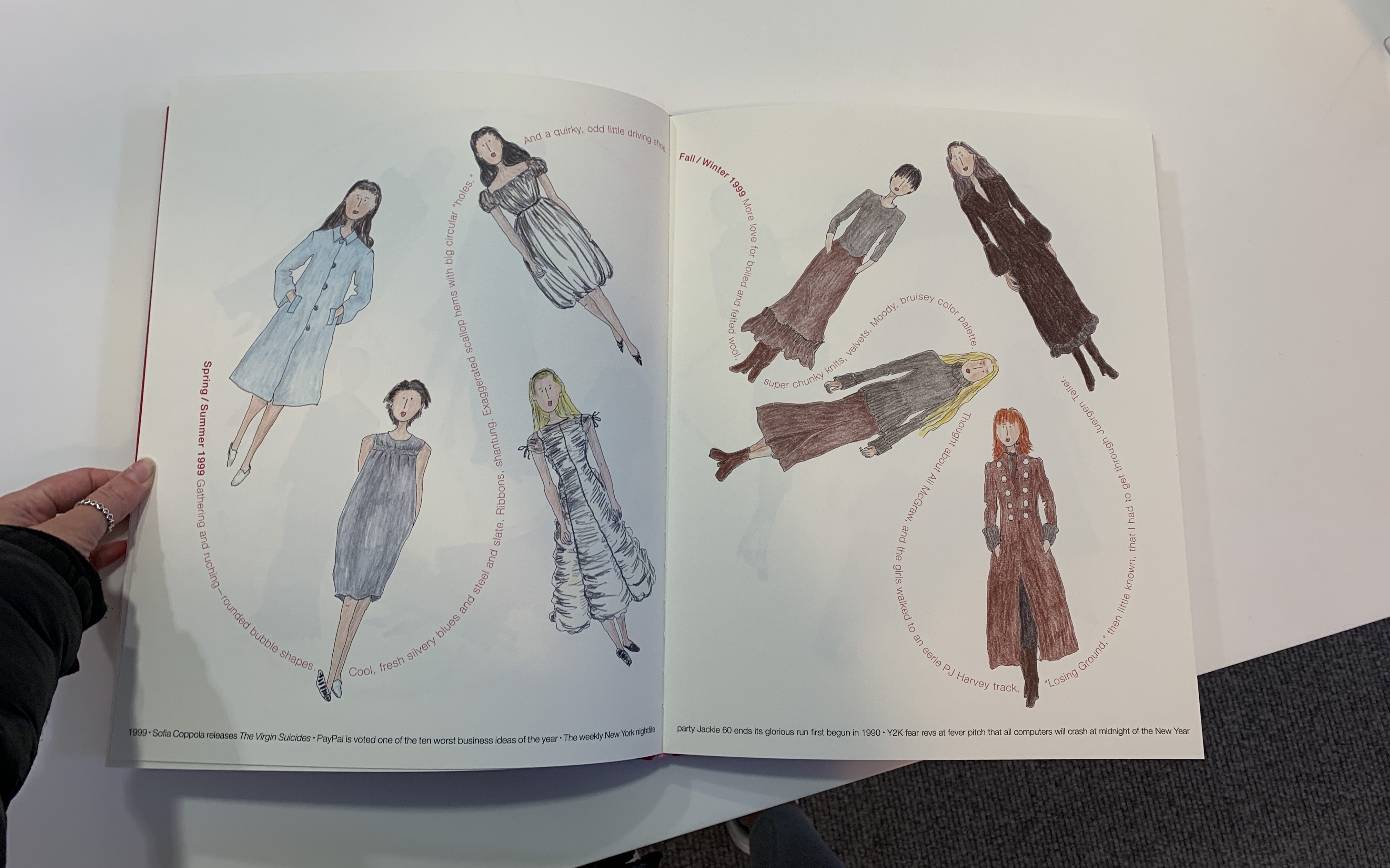
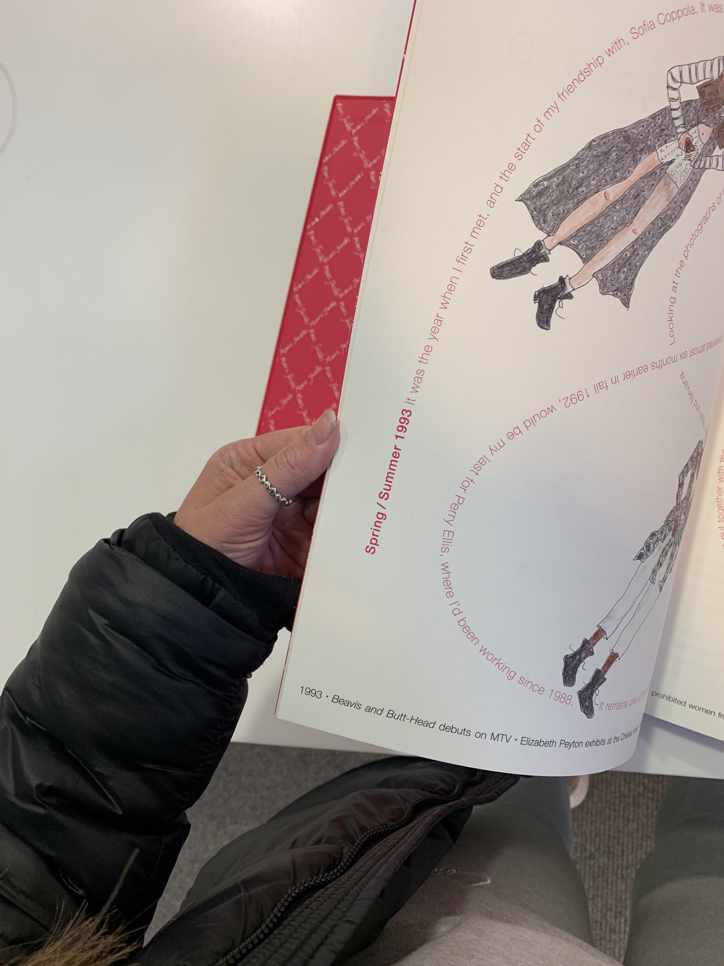
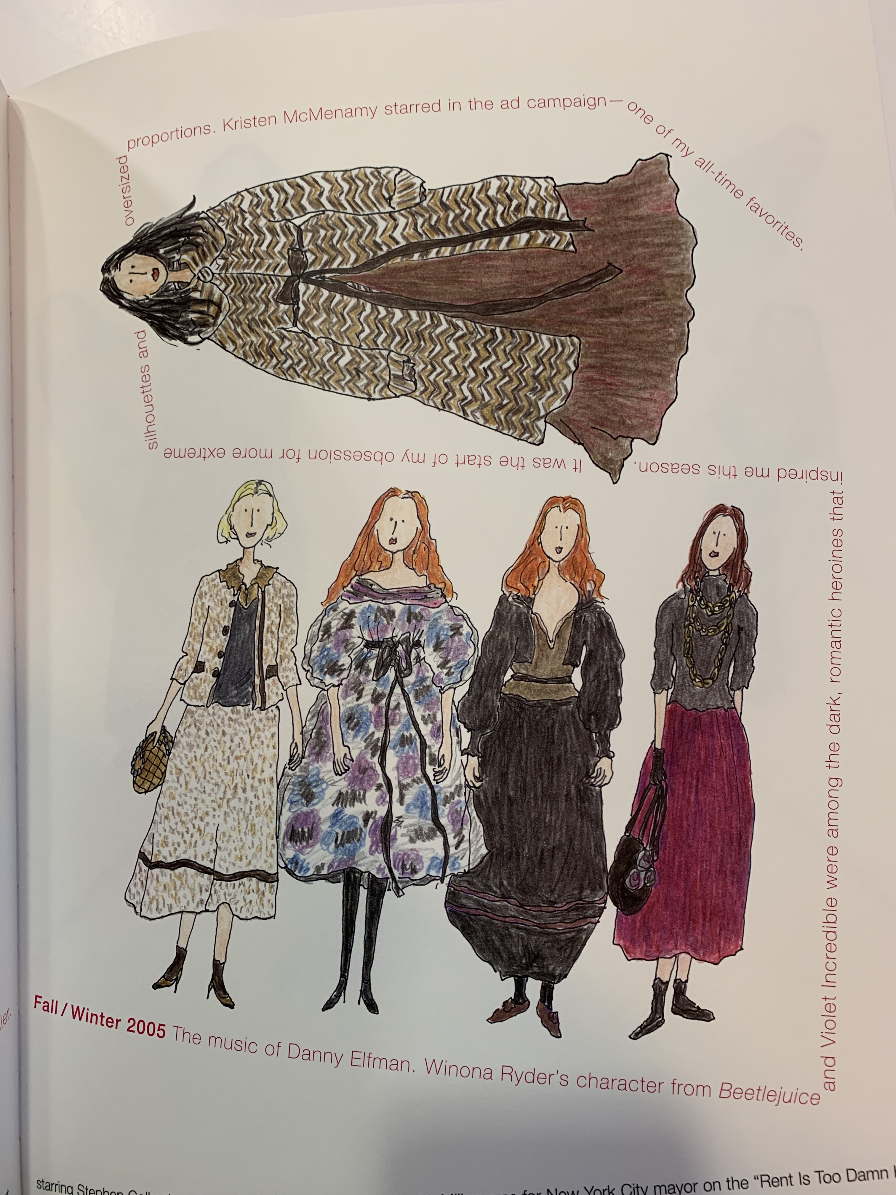
I was inspired by a recent read of the Marc Jacobs book, the whole book is an illustrated publication of all Marc Jacobs looks. The way the illustrations speak instead of text really stood out to me and I thought it was a really creative way of conveying and discussing a point without having to use words.

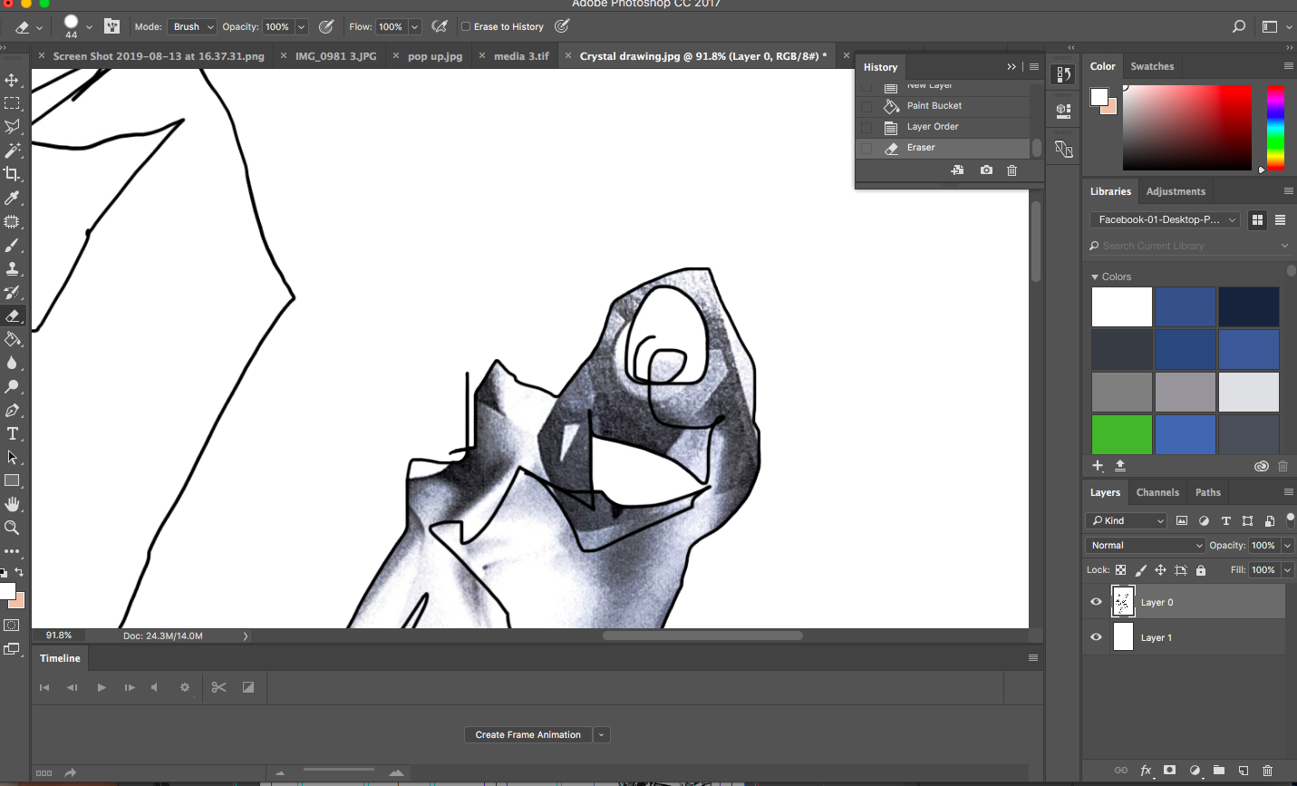
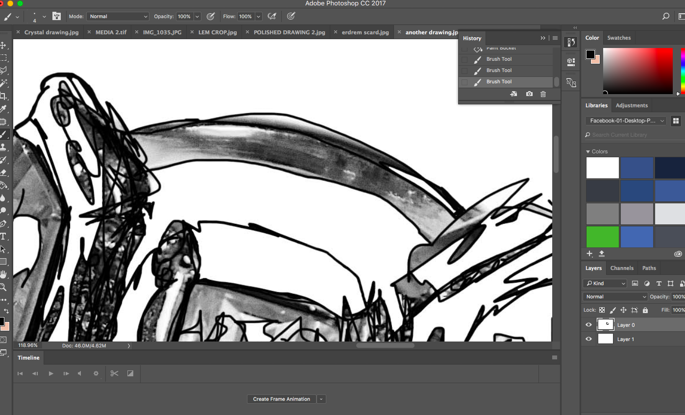
Inspired by these I went back in and added and refinded some of my own illustrations for Emergence, using Photoshop.

Having my own illustrations within the work really gives another dimension to the book, allowing for a youthful creative sketchbook dimension in collaboration with the luxurious feel. I believe in doing so it gives Swarovski a voice to be able to communicate creatively to their readership and following, in a different light than they have done before, truly drawing light towards their participation within the emerging arts scene.

Digital Mock Ups

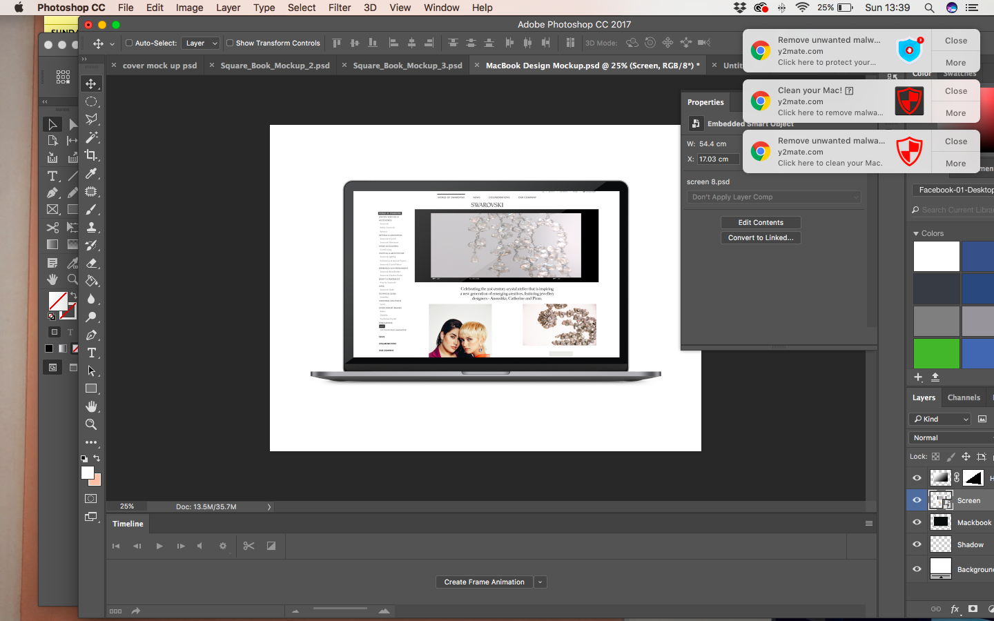
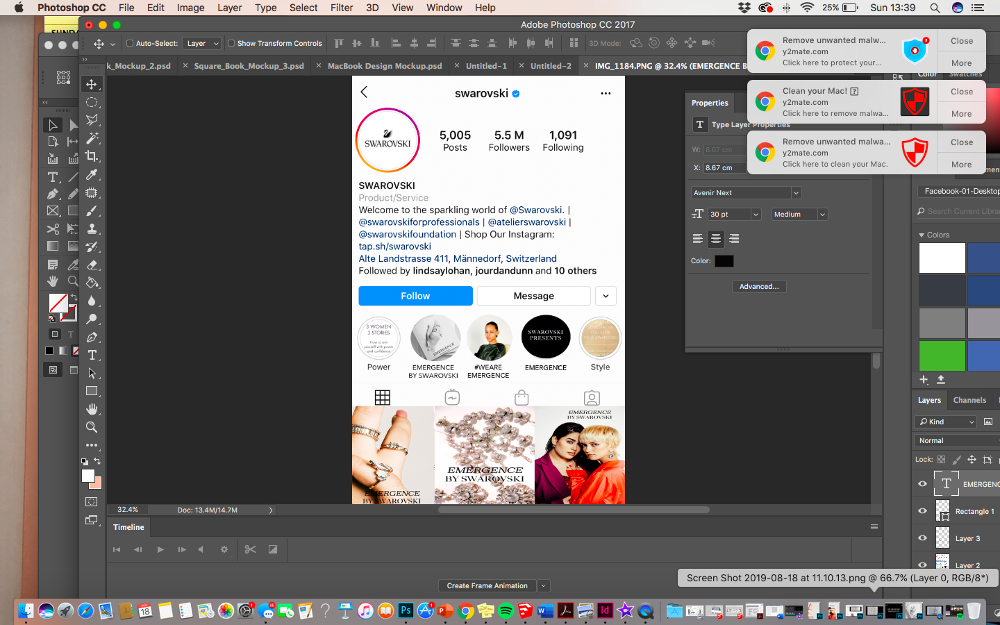
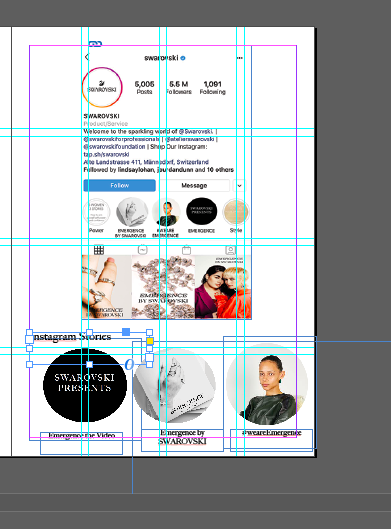
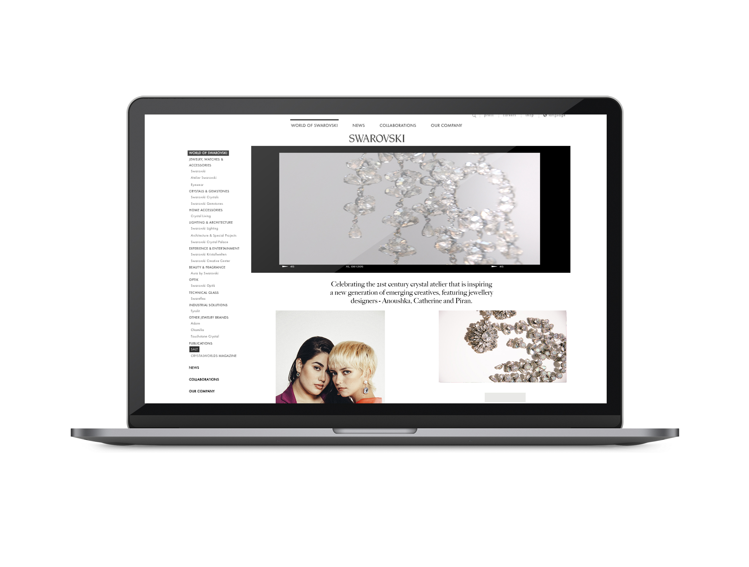
Coming to the end and so close to hand in I am working on seeing how the Emergence campaign will look on digital platforms. Using Photoshop I have been able to really bring my visuals to life.

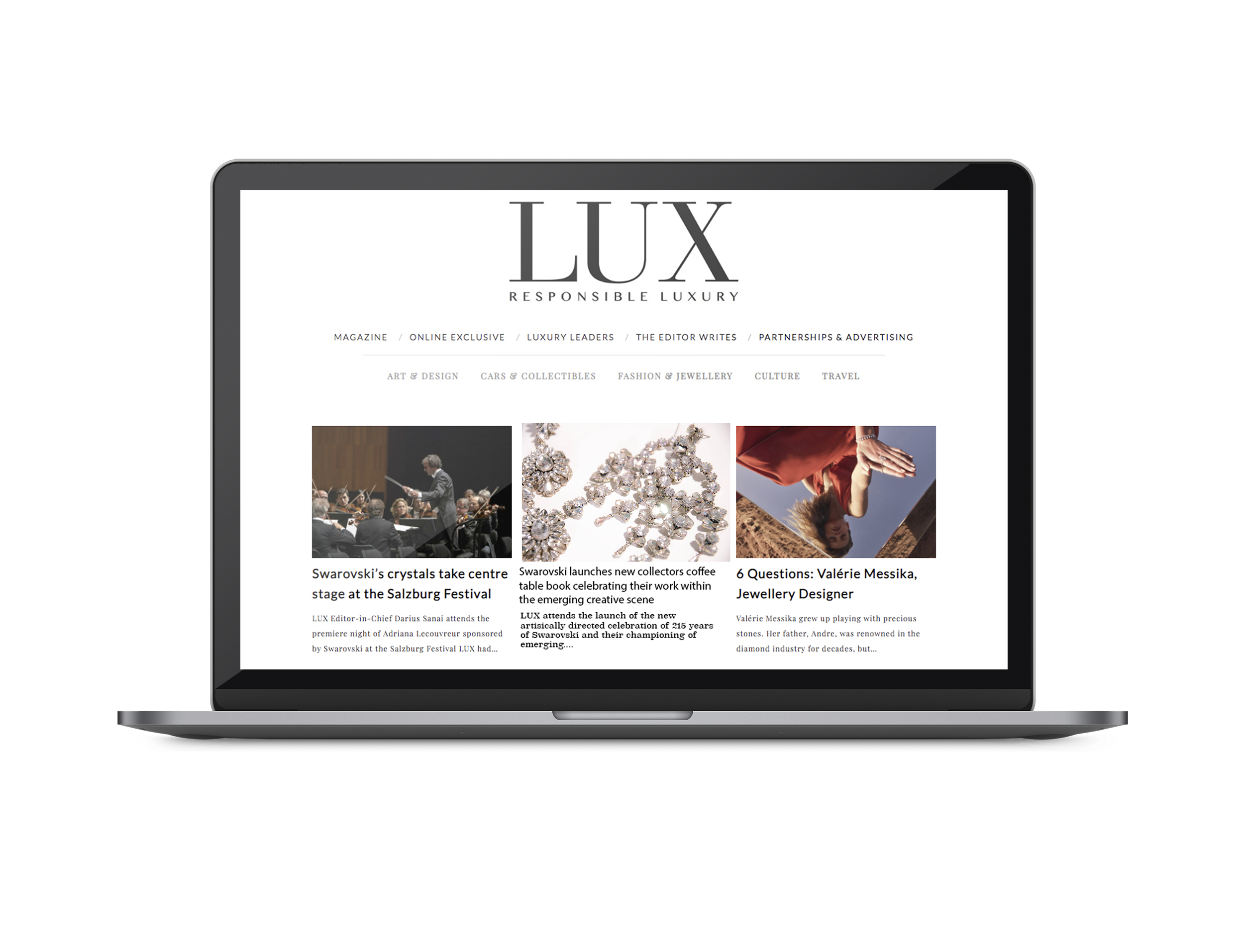
I have really put a lot of thought into the best ways to display Emergence digitally- through development of consumer profiles and Swarovski. I think in doing this it is important to visualise how the whole project could transfer into real life situations, such as feature pieces, online content and on the WORLD OF SWAROVSKI platform. This has allowed me to understand how my work could transform into industry practice of utilising a multi channel approach when it comes to publishing, as well as providing a call to action to the strategies, a key aspect of branded publishing- of which I learnt from an editor at Lux Magazine.

Printing and Papers

Excitingly, I have been called in for a meeting at Condé Nast on Monday, therefore today I have been focusing on finalising the book itself and print specifications. I am printing at the same shop that I have previously printed a coffee table book at- therefore I can trust that they will do a good job.

I have already chosen my size specifications (as stated in a previous post) to work in collaboration with the already existing Atelier Swarovski book 32×27 cm. Ideally I would like the cover to be matte, however due to budgets and printing restrictions due to me having an image on the cover the covers have to be laminated. I have tried to specify a cover as close to matte as possible and have chosen a matte laminated cover- in texture this was a lot rougher than a normal laminated cover so felt this worked in accordance with the image as closely as I could.

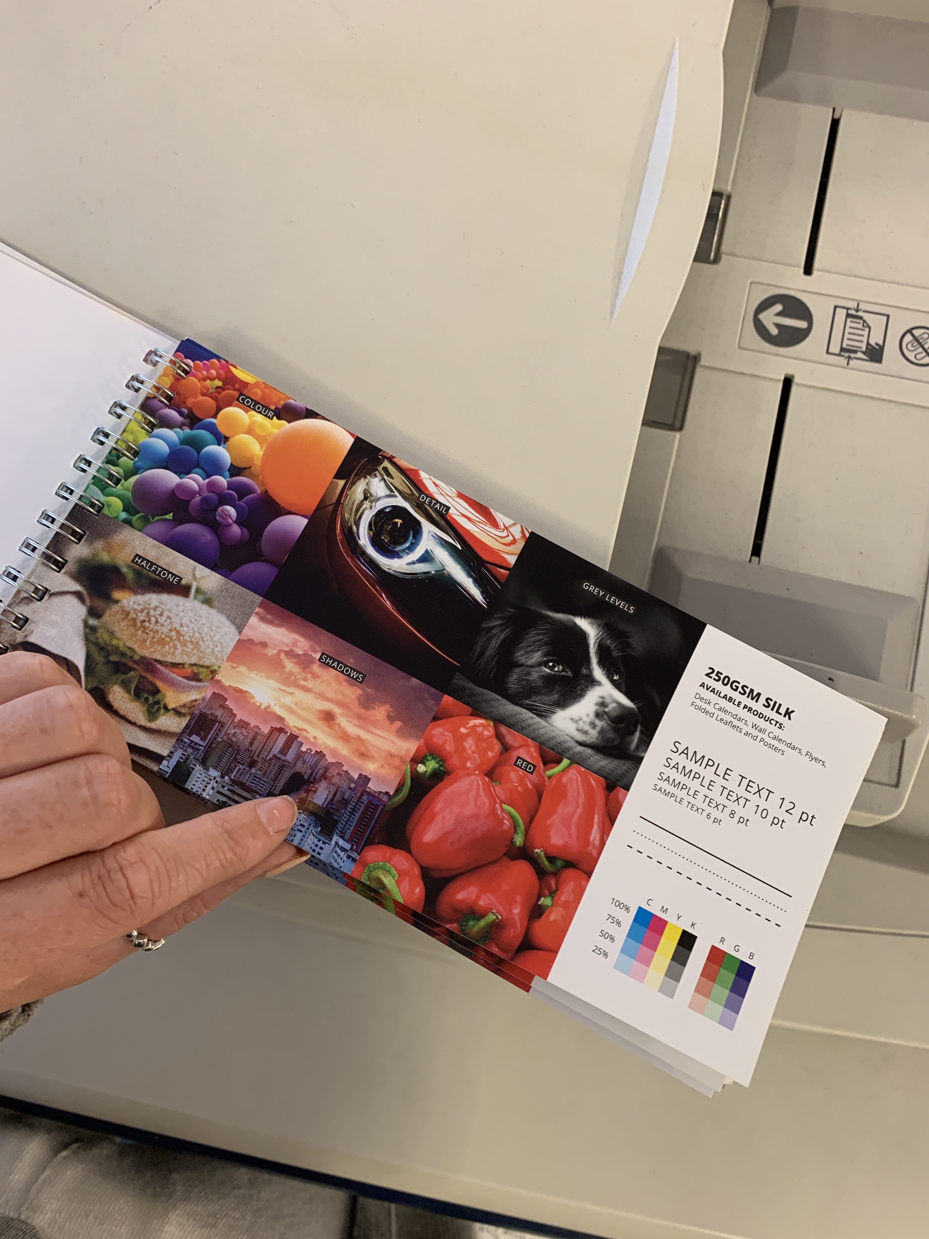
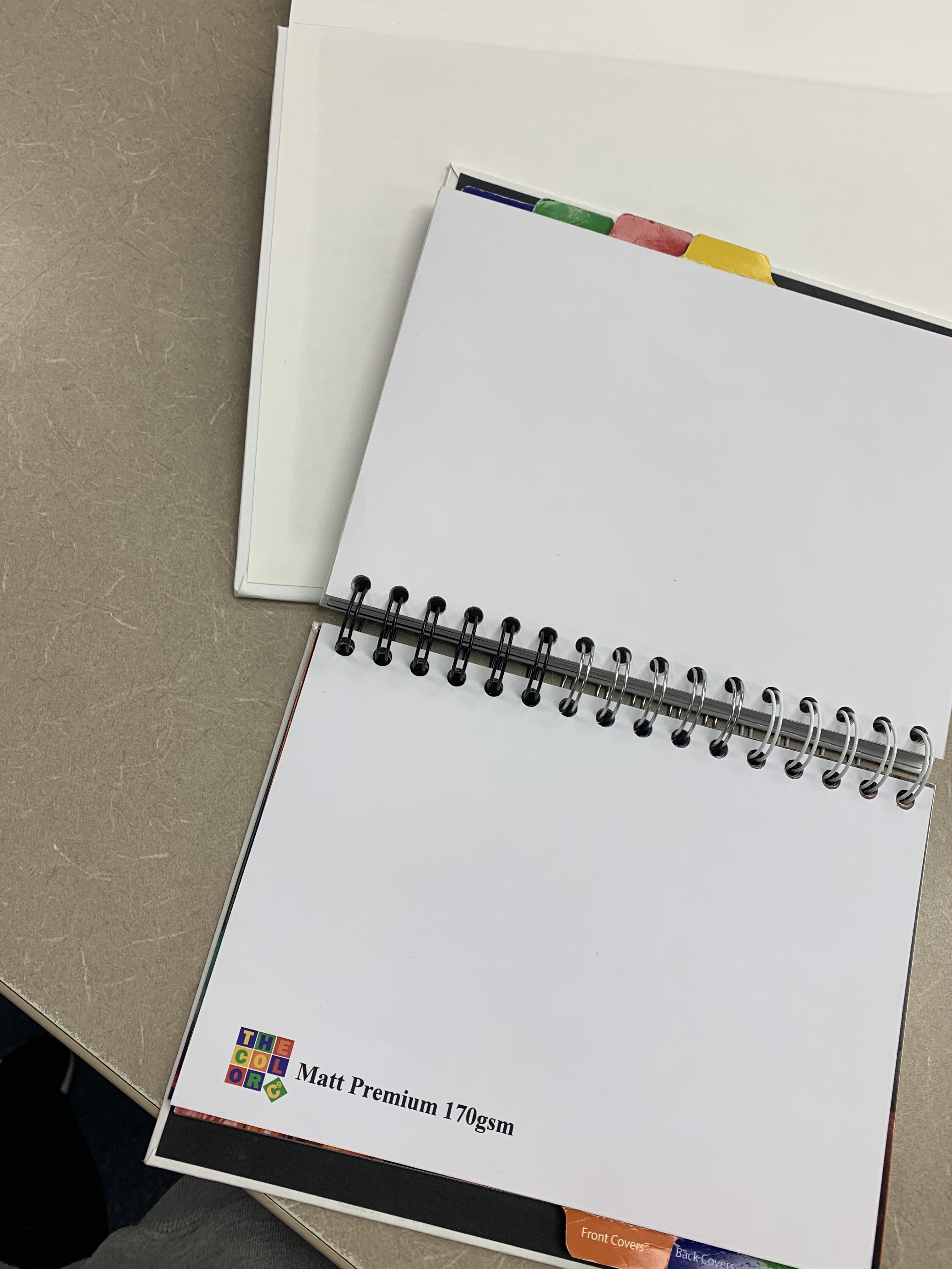
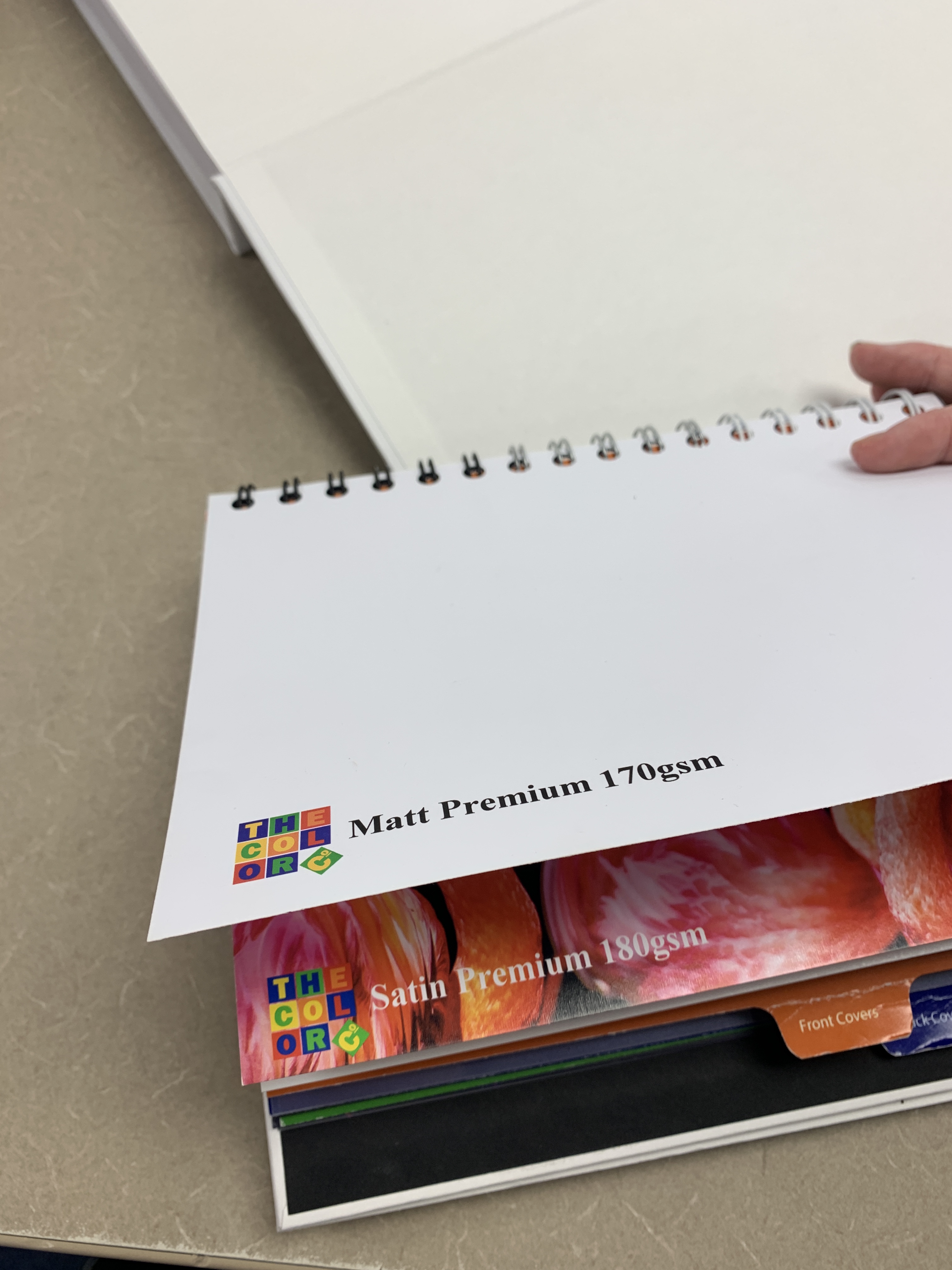
Decoding the use of paper quality in different publications has led me to my final paper printing choices. I was looking into different publications and how the paper reflects the brand, for example- The ES magazine is on very thin paper due to the fact it is a public free publication. However, Lux is on paper around 170gsm thickness and reflects its own branding as a luxury publication.

Papers chosen for the publication were 170gsm Acro, I chose this as it was the closest to a matt page and was advised that this was really good at complimenting imagery within the book. I knew I wanted a heavy GSM and was tossing between 160 and 170 but I really think the 170gsm makes a good, thick and luxurious page in order to feel like turning a luxury thick page of a publication. I believe the thickness of the paper will also further the validation of it being a luxury publication and replicate the luxury brand identity.

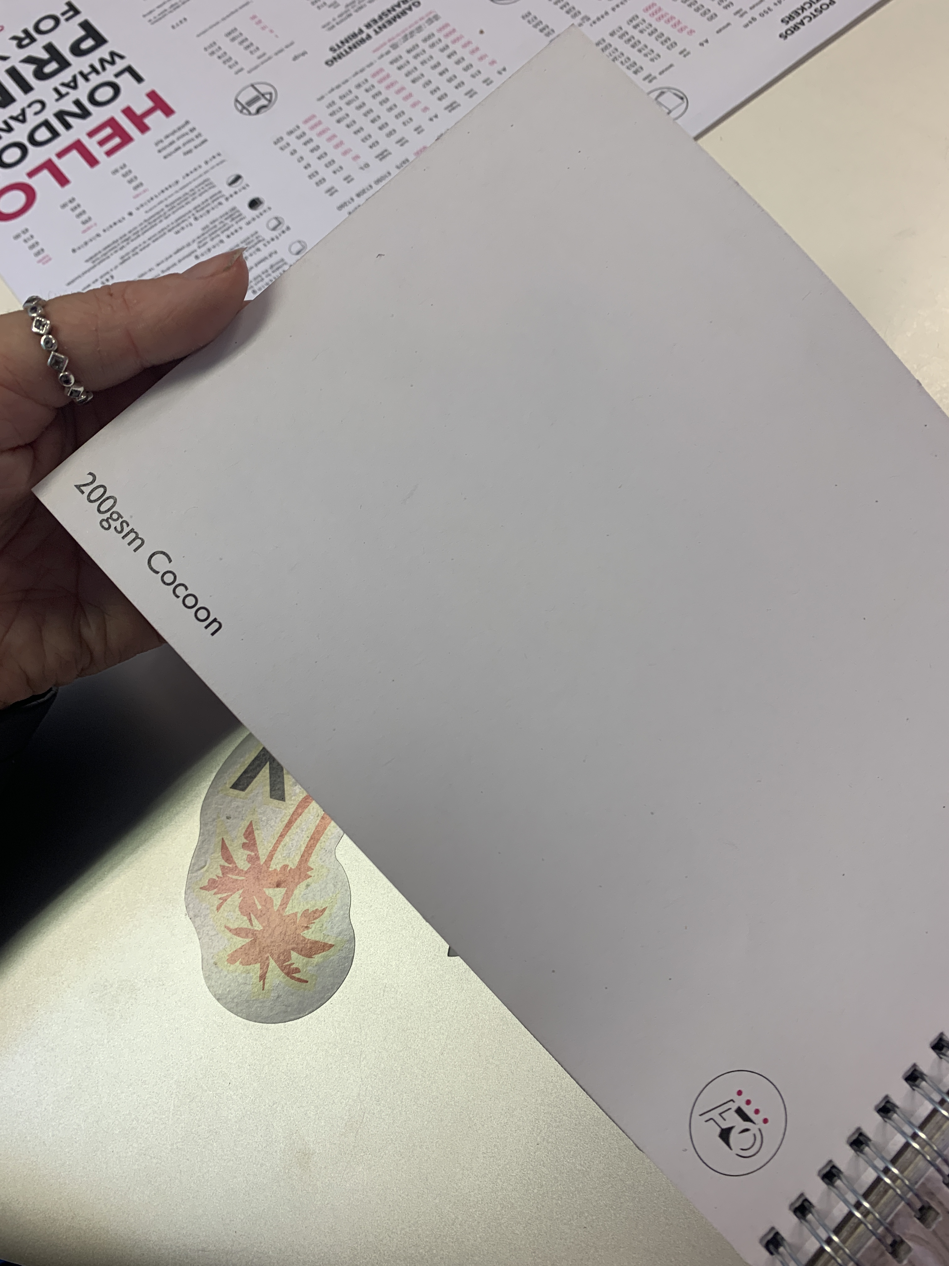
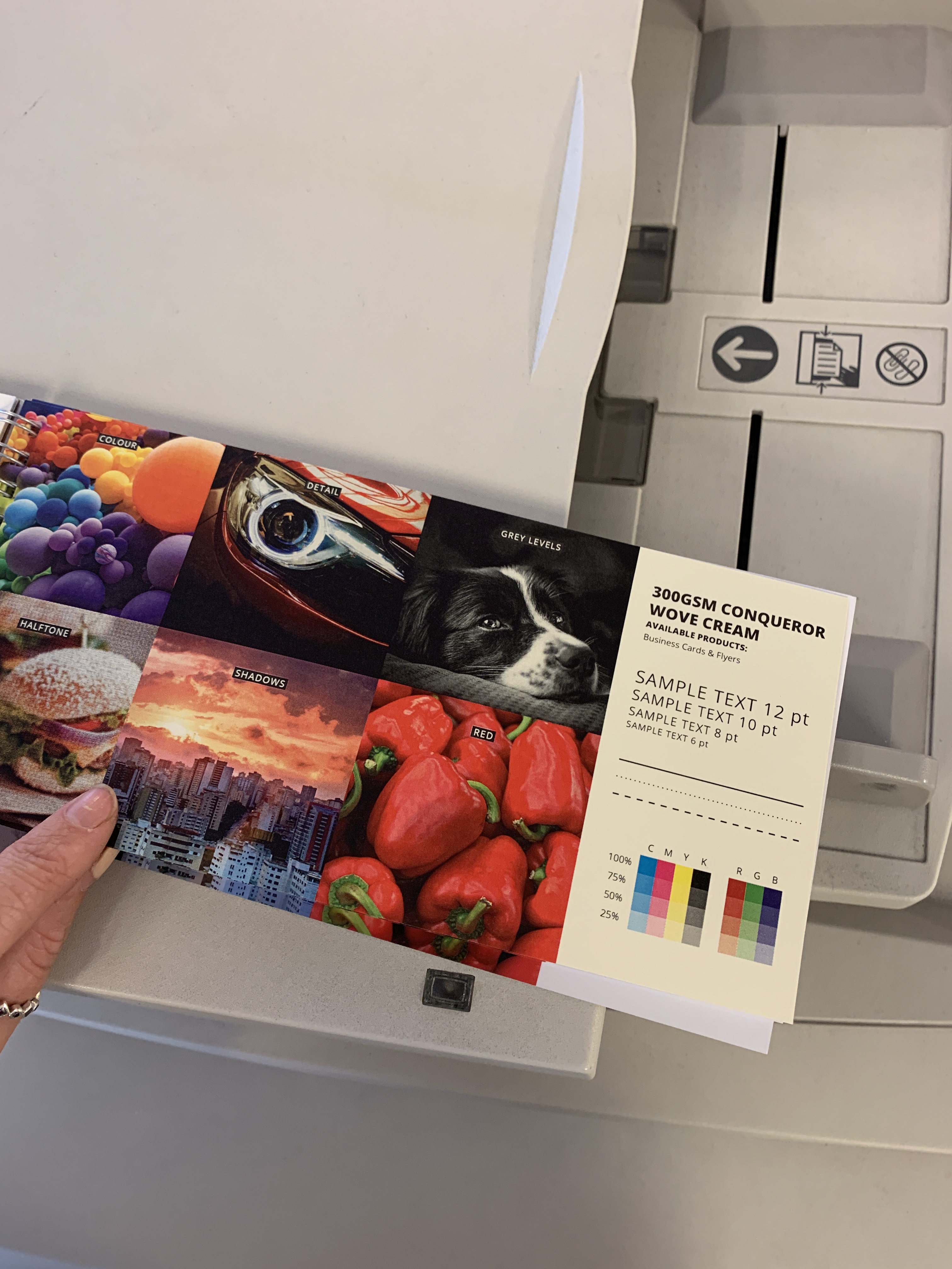
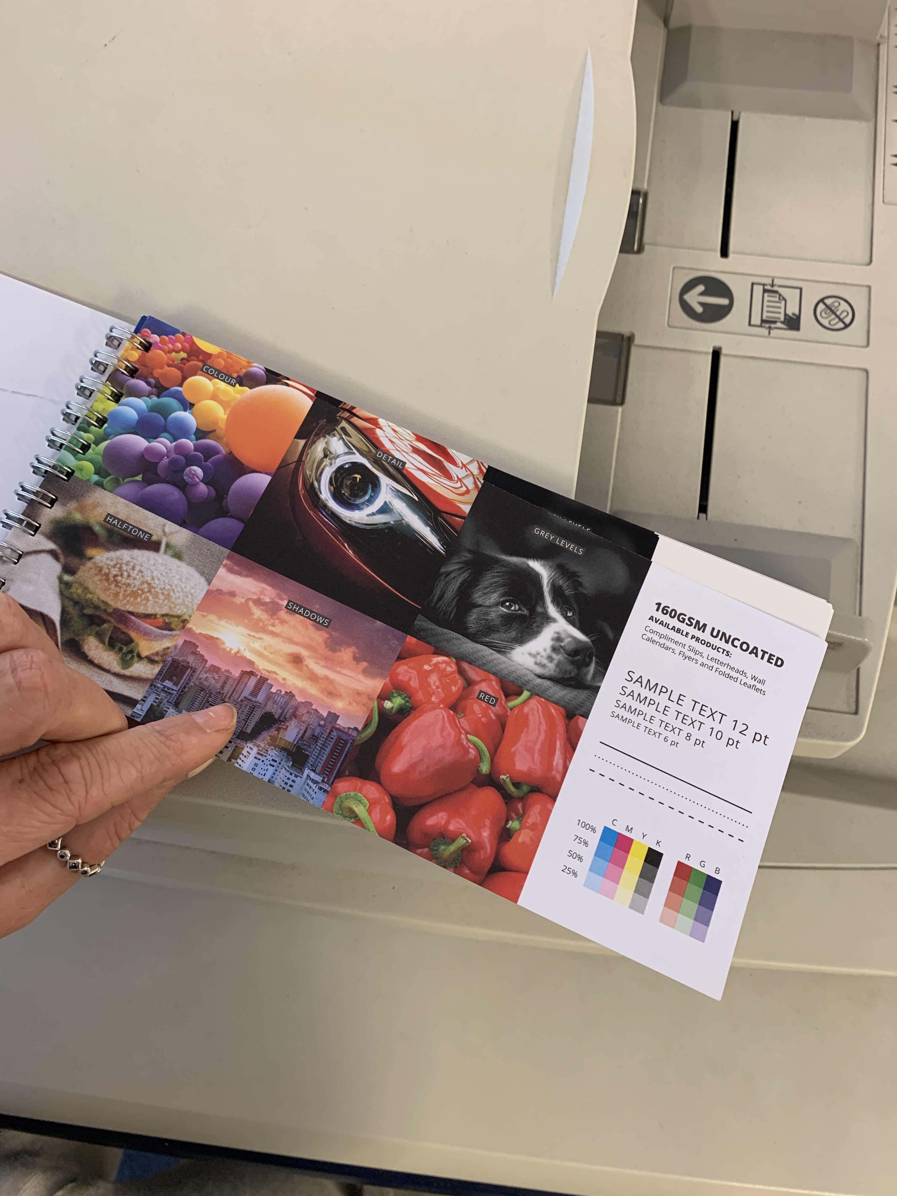
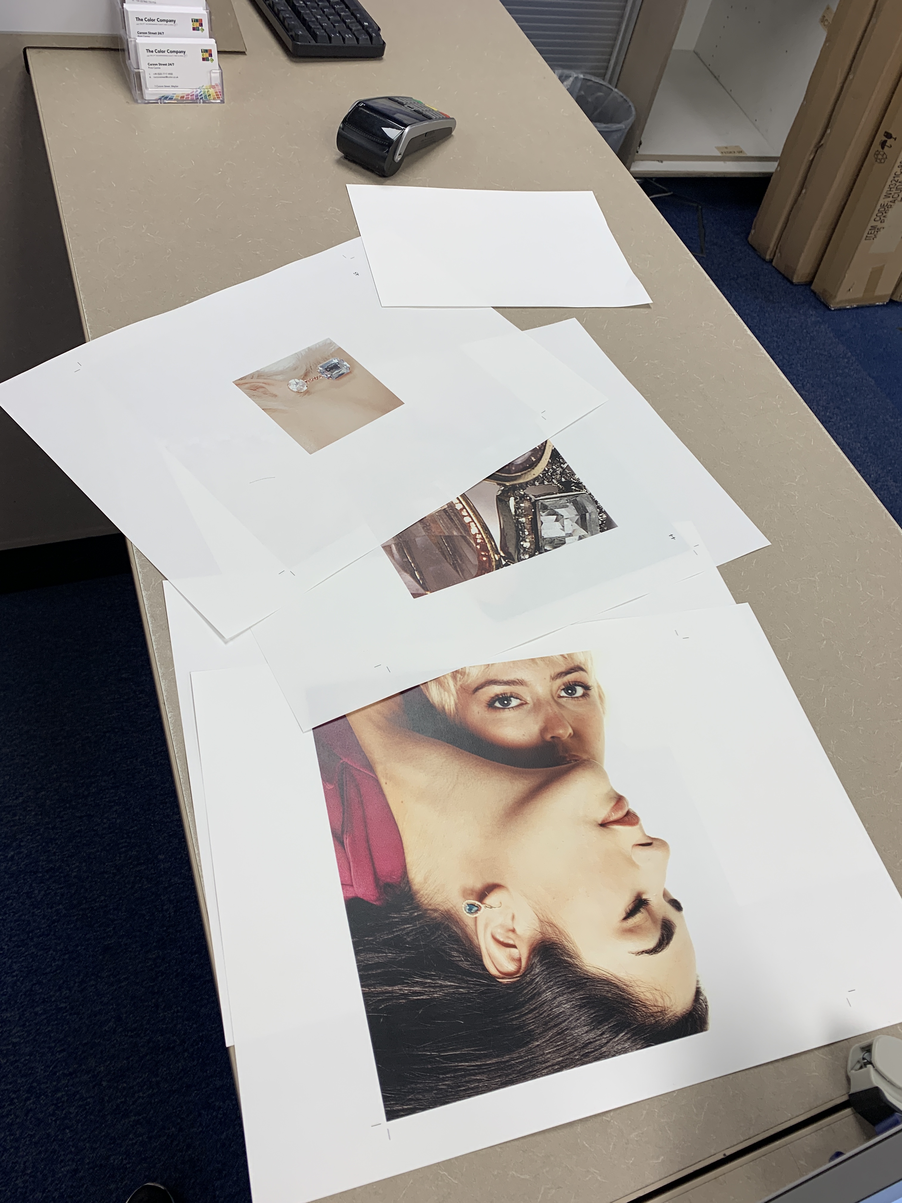
I visited the print shop this morning and was able to test out a few different sets of matte papers, the shop were kind enough to print some imagery out on the options of paper that I was tossing up between.

I was then able to see what paper worked better and felt better in general. The reason I was able to settle on a paper was through layering them and seeing which one was less transparent showing the page behind, to add a more luxurious feel to the book.

Video

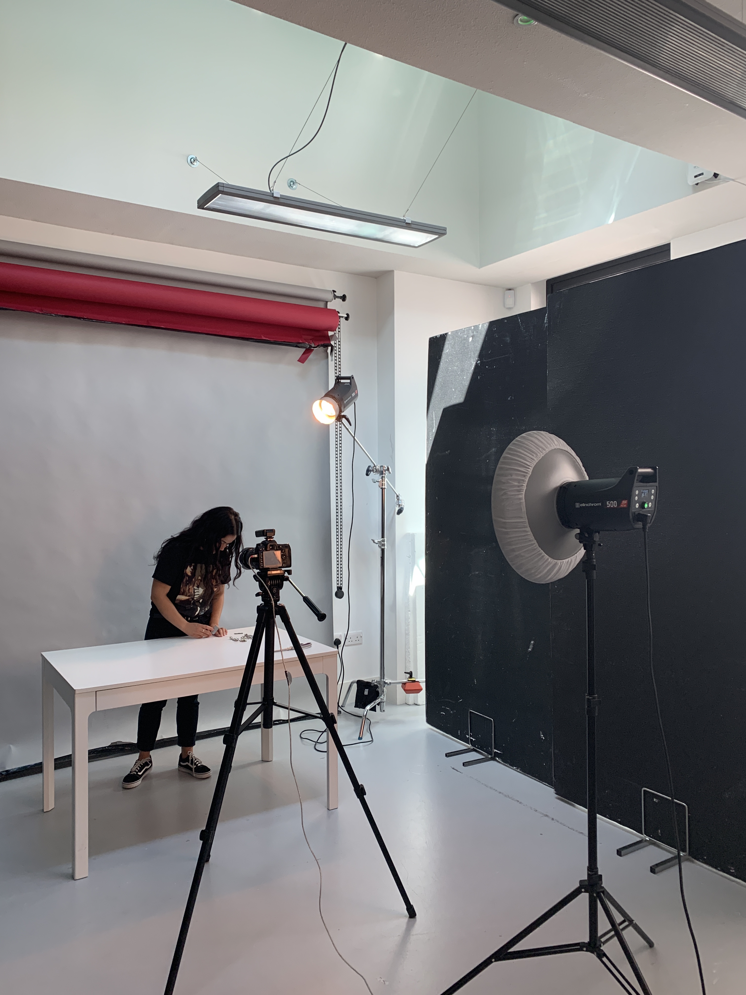
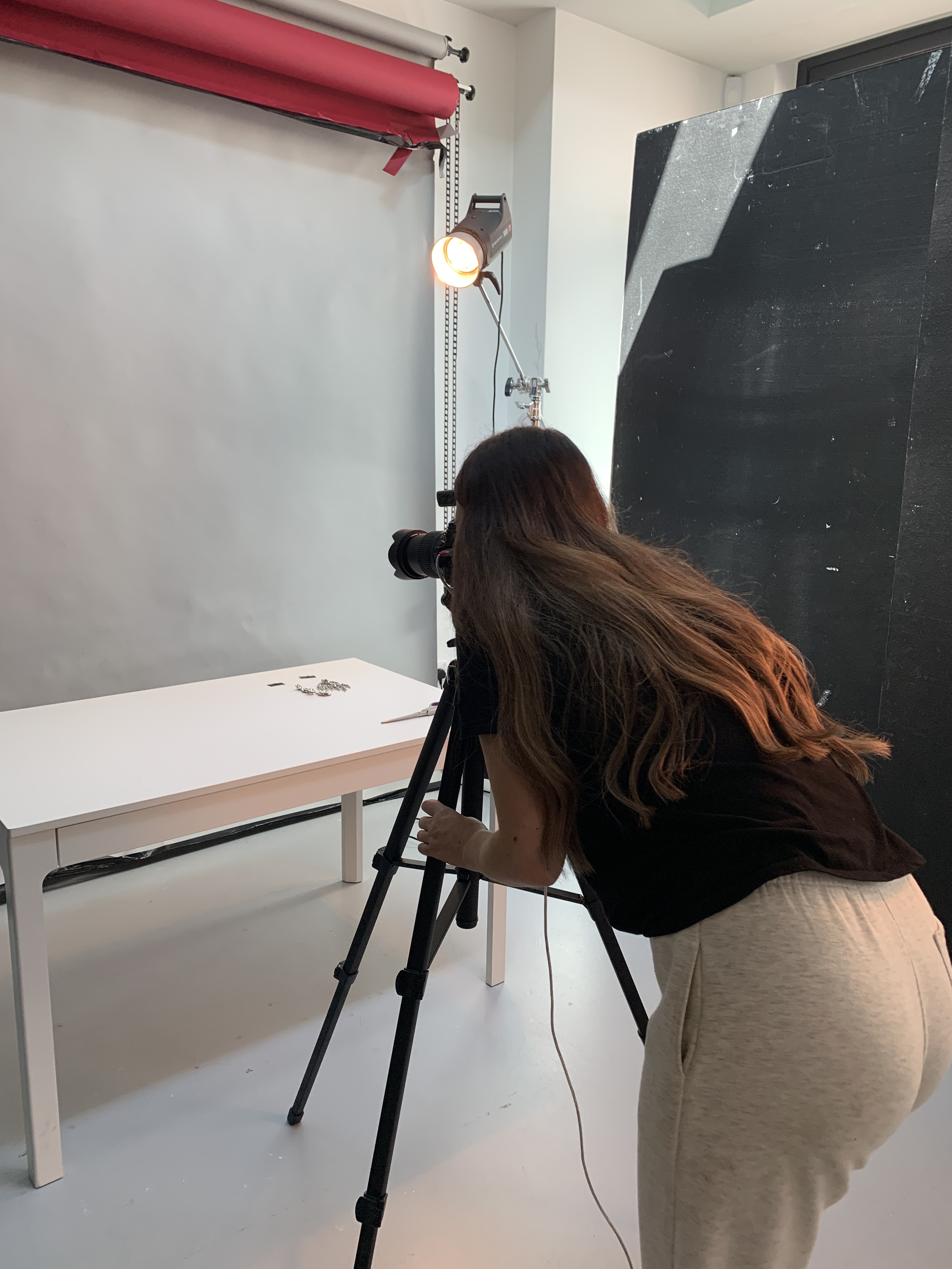
Pulling all my work together towards the final stages has allowed me to reflect on the strongest aspects and the not so strong. As this is a project I have put my heart and soul into I really don’t want to have an aspect that could even potentially drag my work down, therefore, yesterday I pulled some further jewellery pieces and tried to borrow some studio time off of a friend in order to see if I could shoot some more footage to create a more on brand video for Swarovski and for Emergence. I am really adamant that Emergence is fully supported by all the other elements that I am putting the work into my final project.

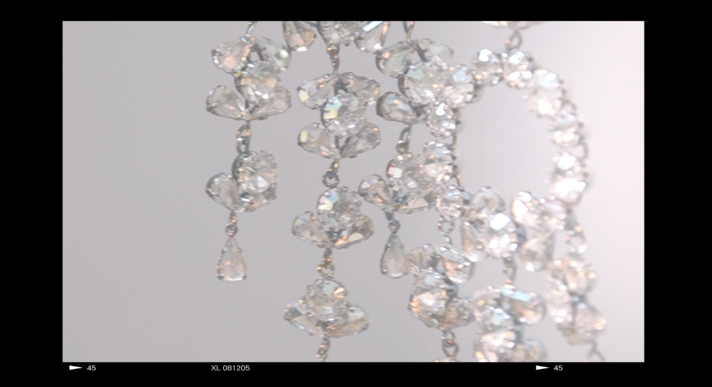
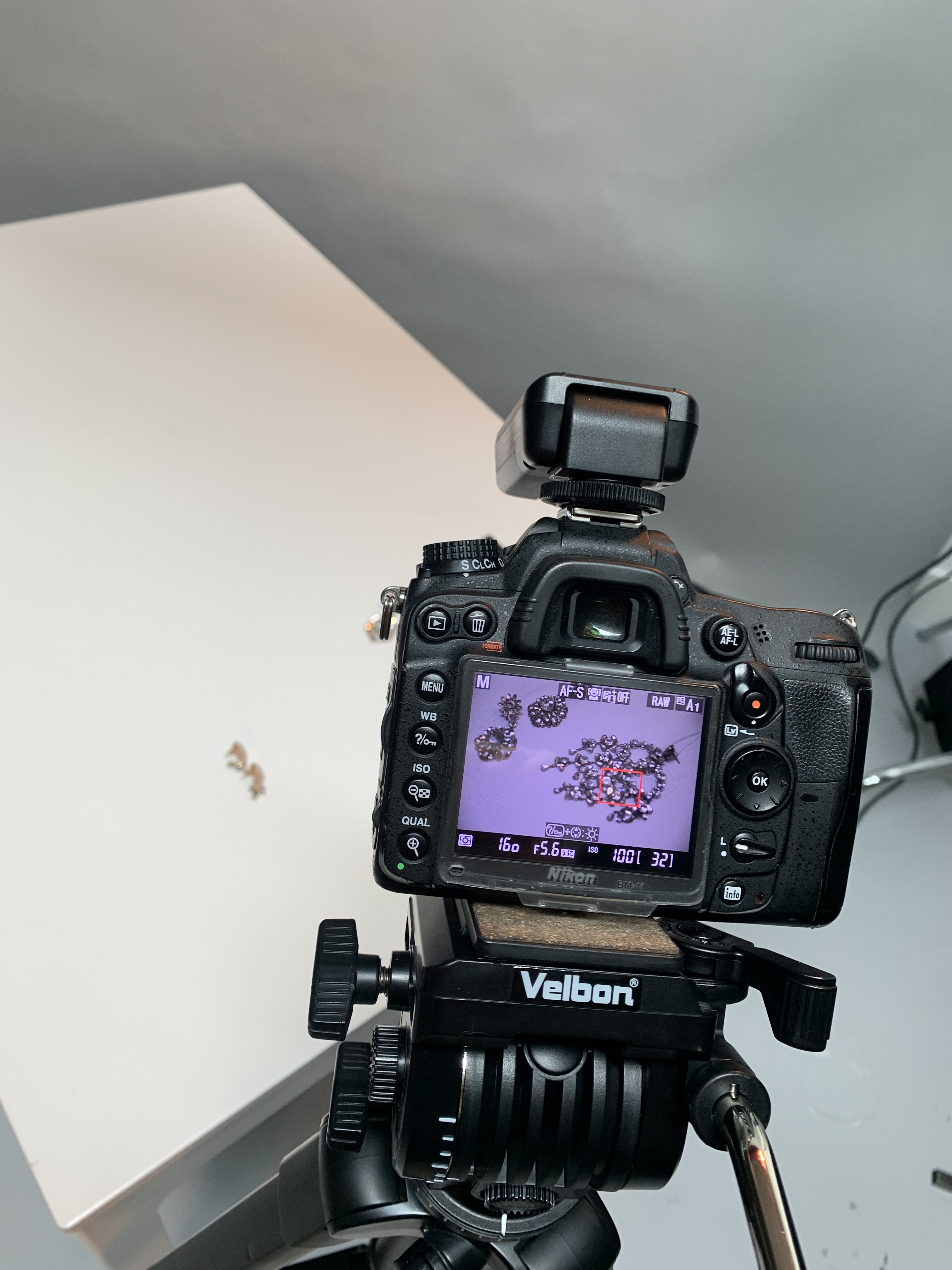
I then began to shoot more specific crystal shots as well to be able to compliment the book further and add some dimension to the crystals. In doing this I then began filming clips to see if there was a possibility of me being able to create an alternative promotional clip that sat well against the book itself. I wanted to make sure the shots were crystal focused and highlighted the simplicity of design yet the intricate work of Swarovski.

Editing the video

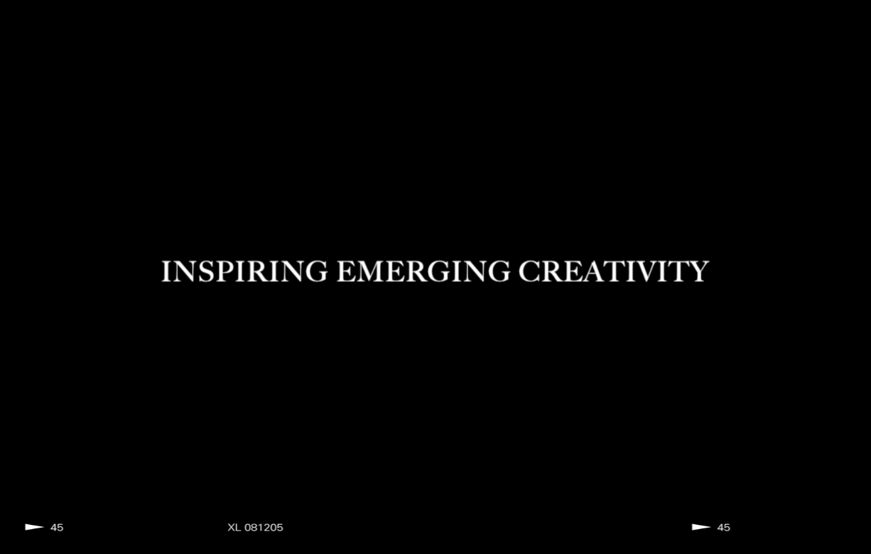
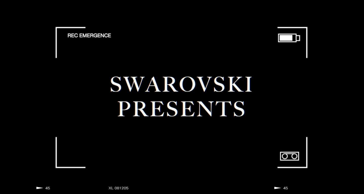
I am now editing the video footage to make sure it is done to the highest standard in order to fit amongst the book and the digital strategy, imagery and launch plan. On reflection, even though adding to the work load, recording some extra footage has worked in my favour so far- it is much more fitting to the notion of the book and the Swarovski DNA in general.

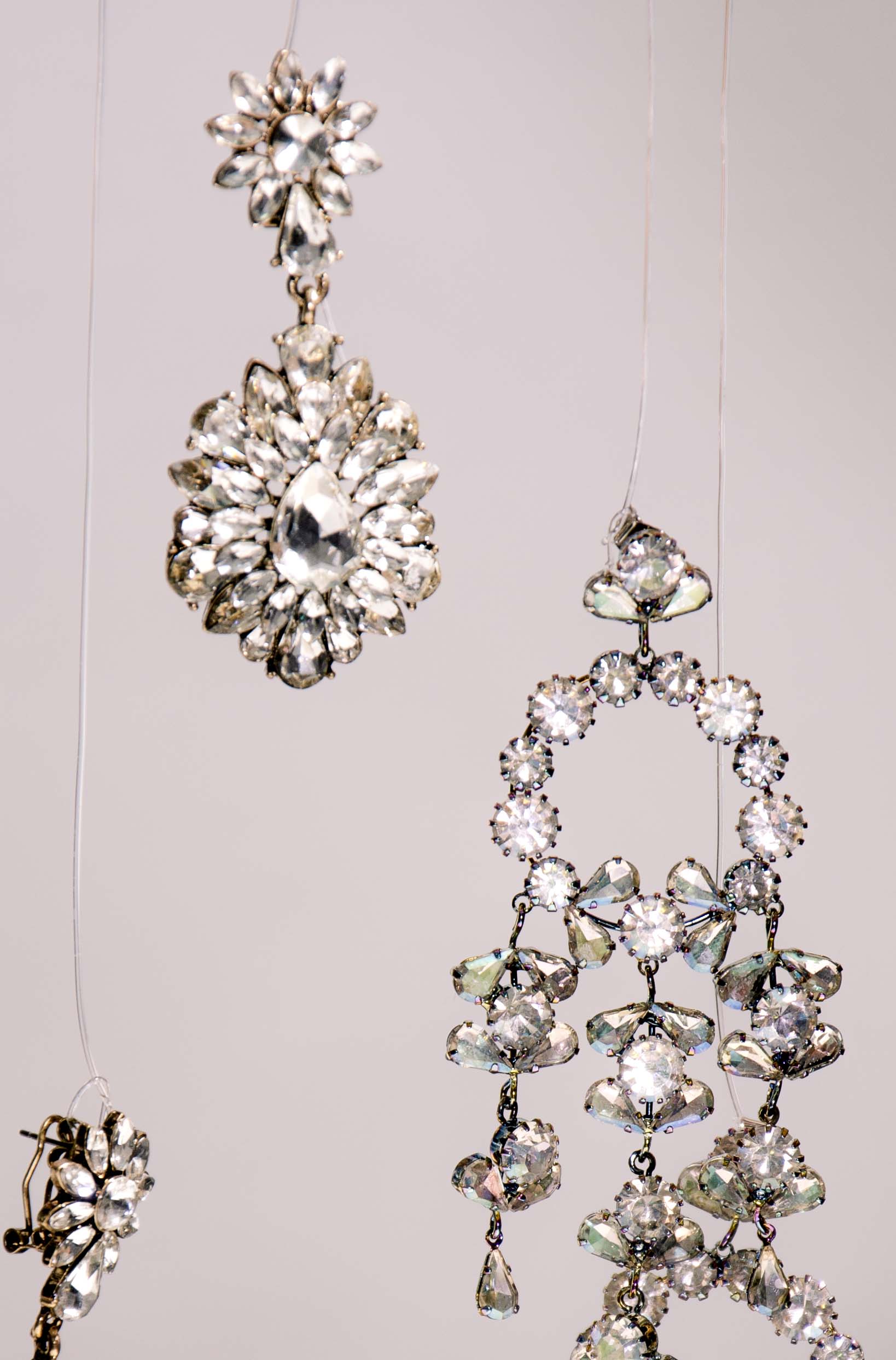
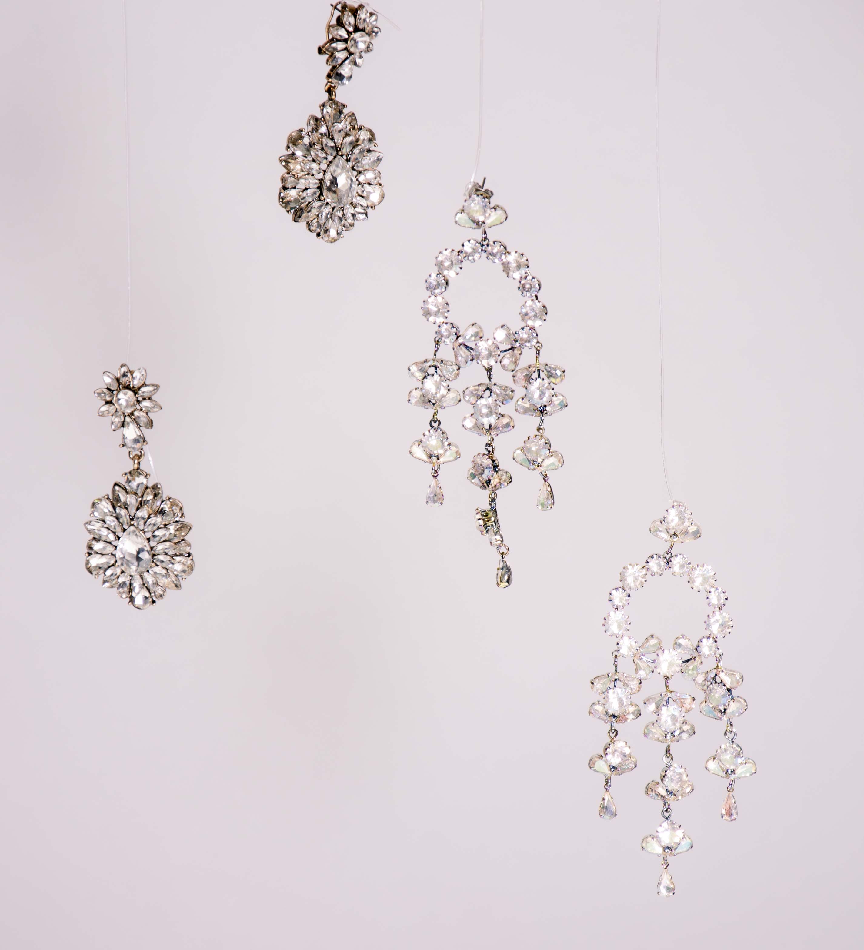
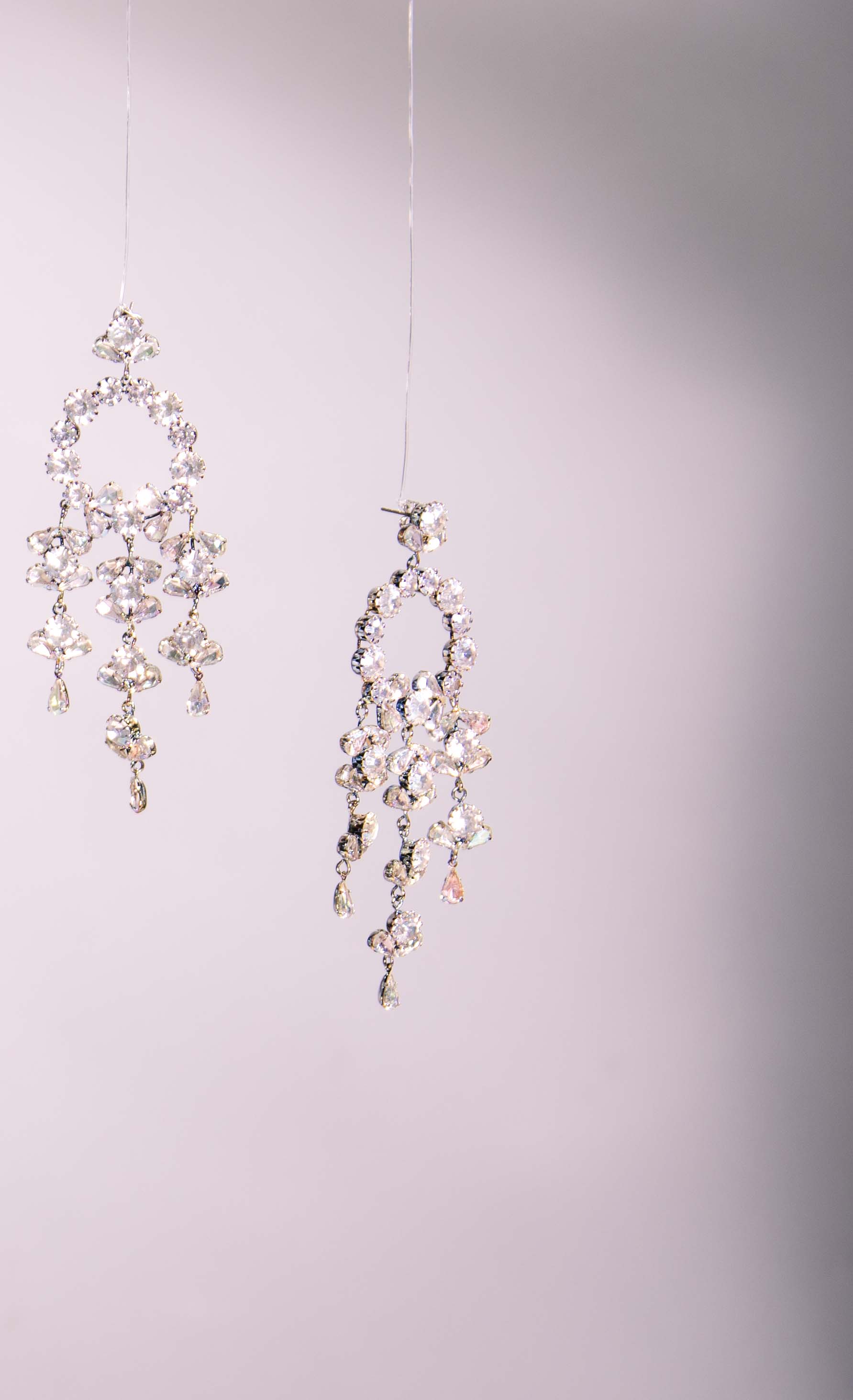
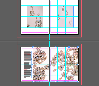
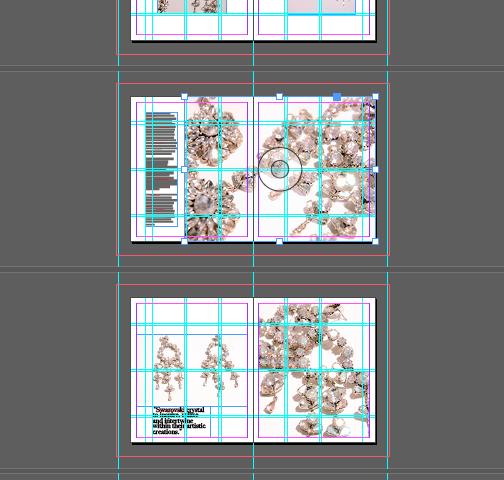
Amongst shooting clips for a new video I took some more stills that I love and will be adding to the book. I think these images really aid in bringing all the imagery and editorial together to formulate around the idea of crystals.

Adding this imagery into the document allowed for some 3/4 pages which really compliments the large scale imagery, whereas the more portrait imagery works really well framed by negative space within the book. Myself, Harriet and Sep discussed the wires hanging the jewellery within the portrait imagery and decided keeping the wire within the imagery works really well as otherwise they have no purpose- I think it adds further dimension to the imagery.

Design a site like this with WordPress.com
Get started