After an online tutorial/catchup with my tutor Harriet, I have been considering, into greater deal, the editing process and layout of the book. I have been taking inspiration from the Atelier Swarovski book and the way in which they display drawings and sketches. Harriet shared with me her copy of ’19 Photos by John Rocha’- this publications is edited with much detail as is shown within the spacing and layout of imager, and has motivated me to edit the way I am displaying images as when I first placed them in they were mainly largely spaced and one per page. I like the double per page and I think it allows the eye to naturally follow the page to the next image like a story. I also really liked the idea of printing pages on acetate to give some transparency to the imagery, however, after research this is really difficult for me to get printed, so maybe this is a thought to display some images at the exhibition.
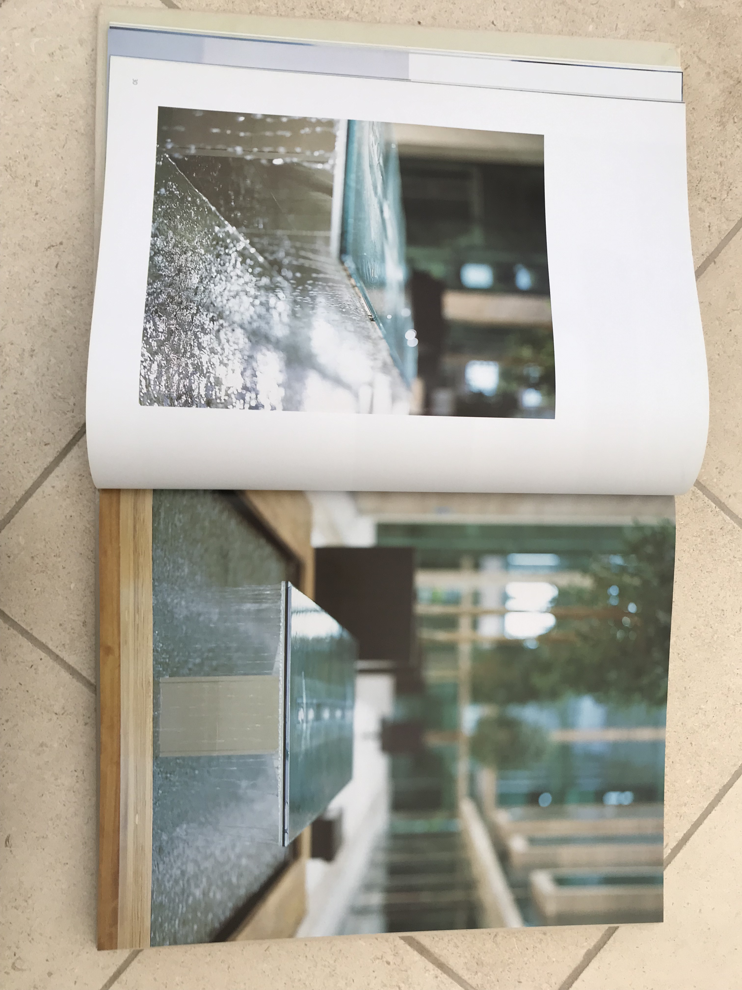
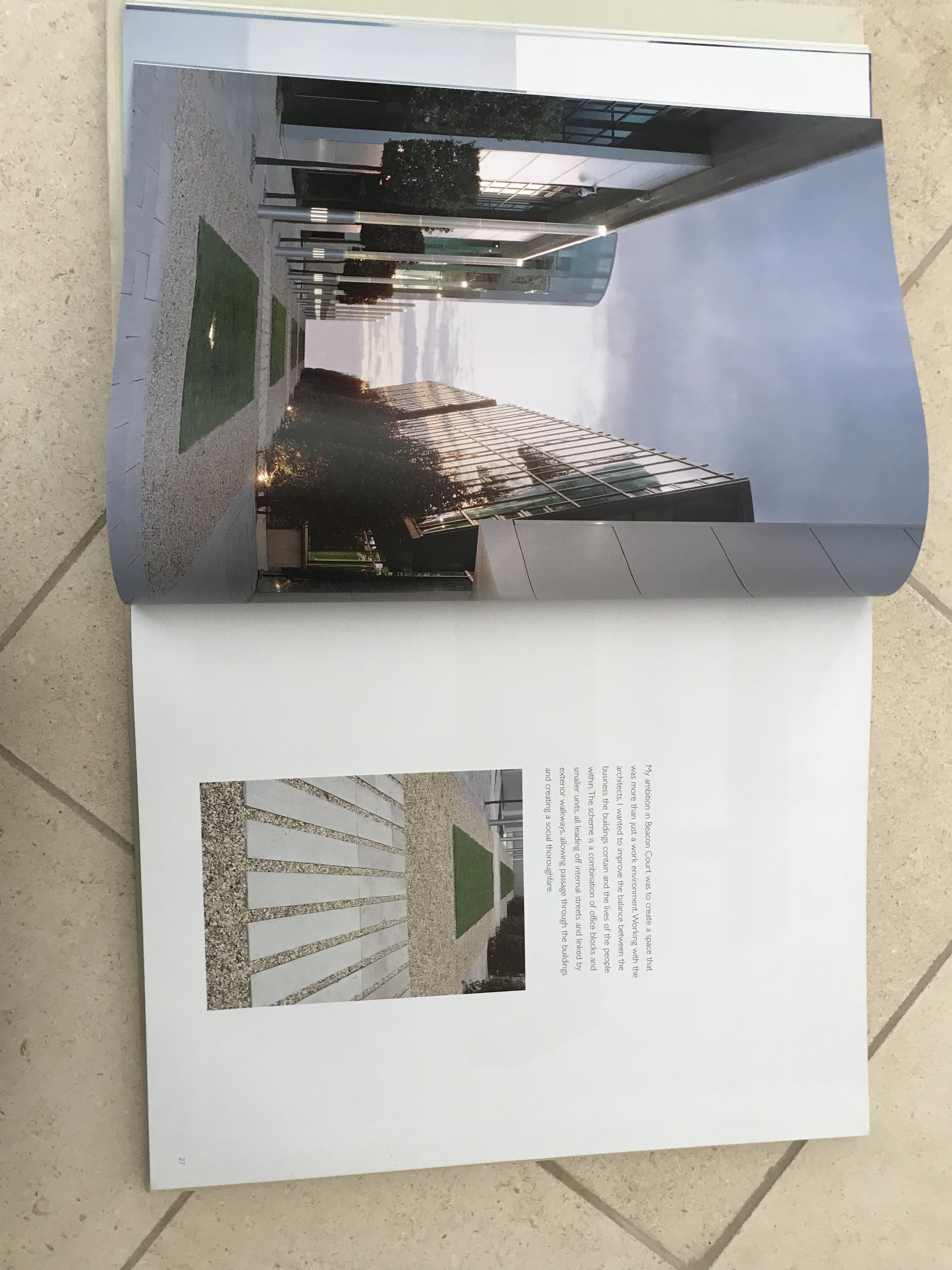
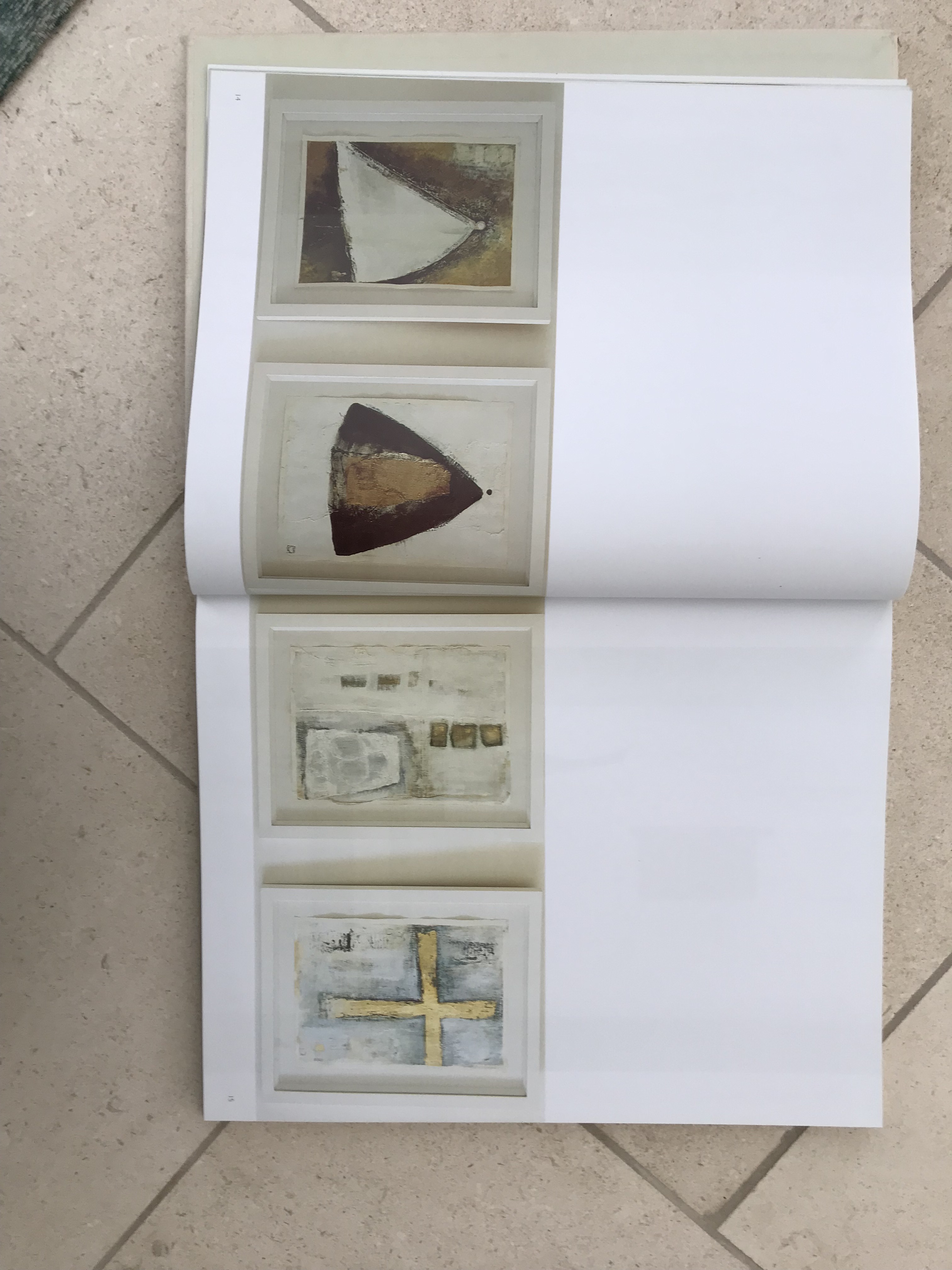
I have translated this idea into the way I am displaying my imagery. I think it is really important for this book to tell a story visually to the viewer, being heavily imagery based I aim for the images to tell the story of Swarovski and of the brand and creative that I am communicating.
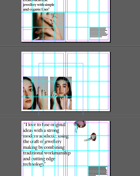
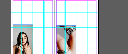
Taking inspiration from the John Rocha book I have added more negative space around the imagery to let the viewers eyes move a lot more naturally around the image.

