Savage Beauty
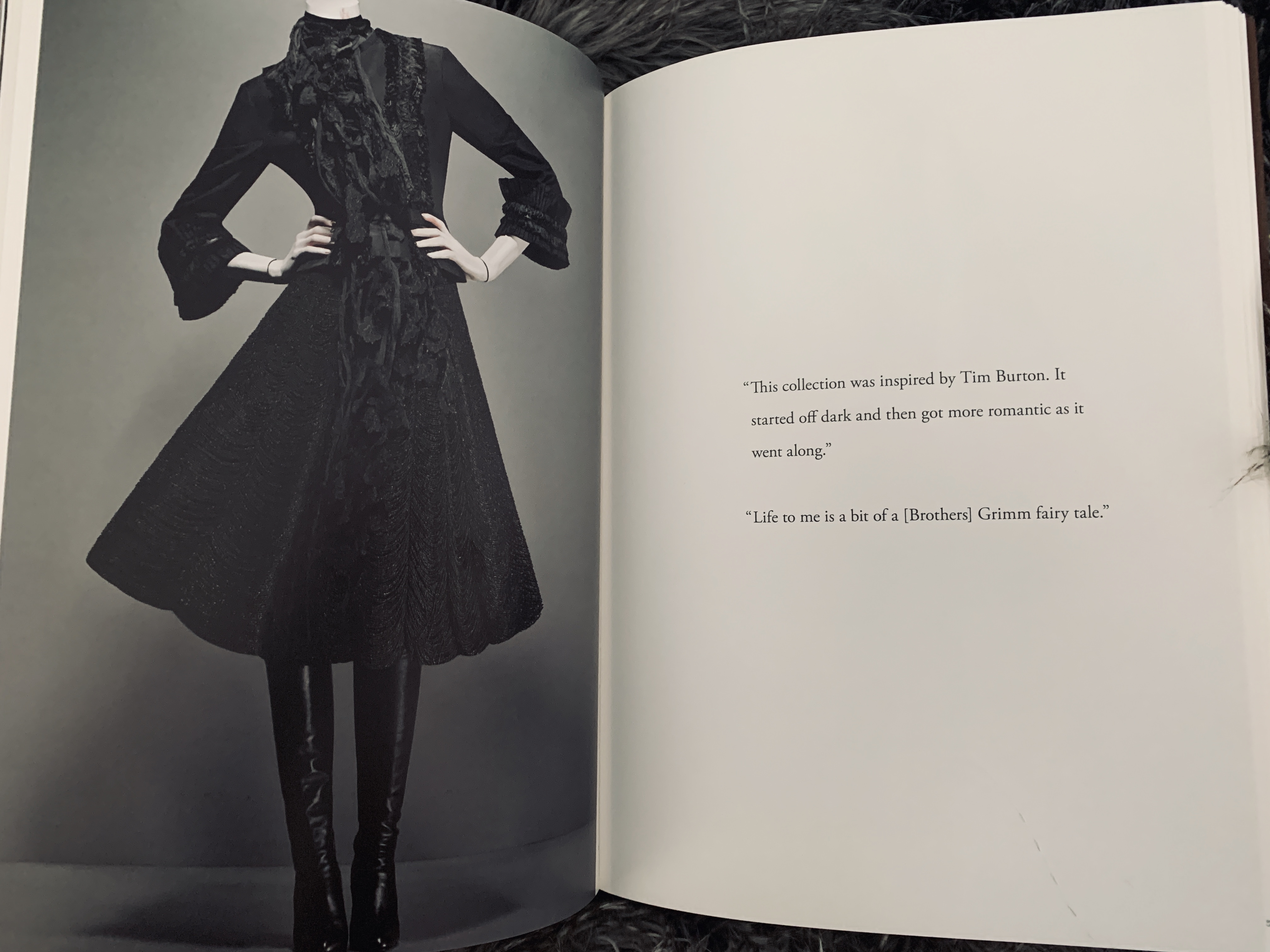
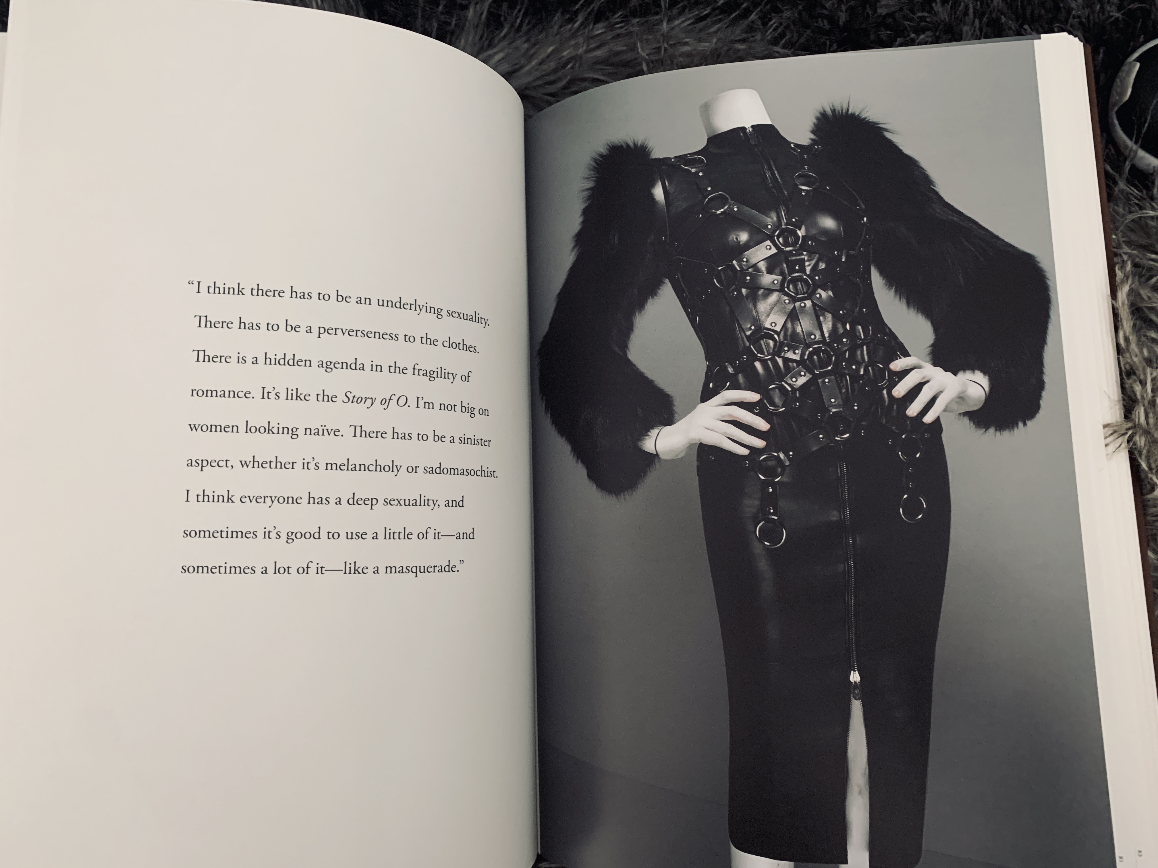
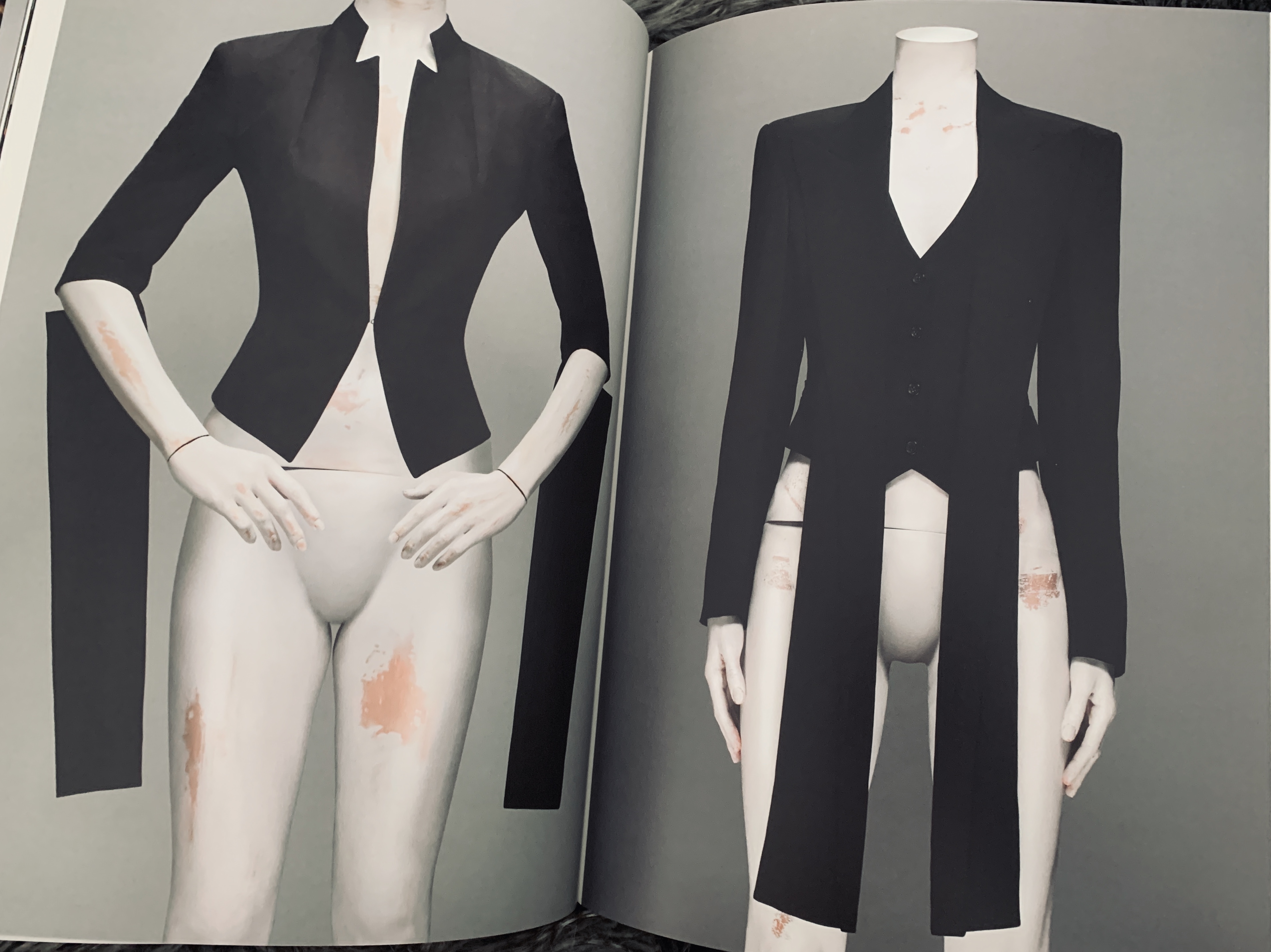
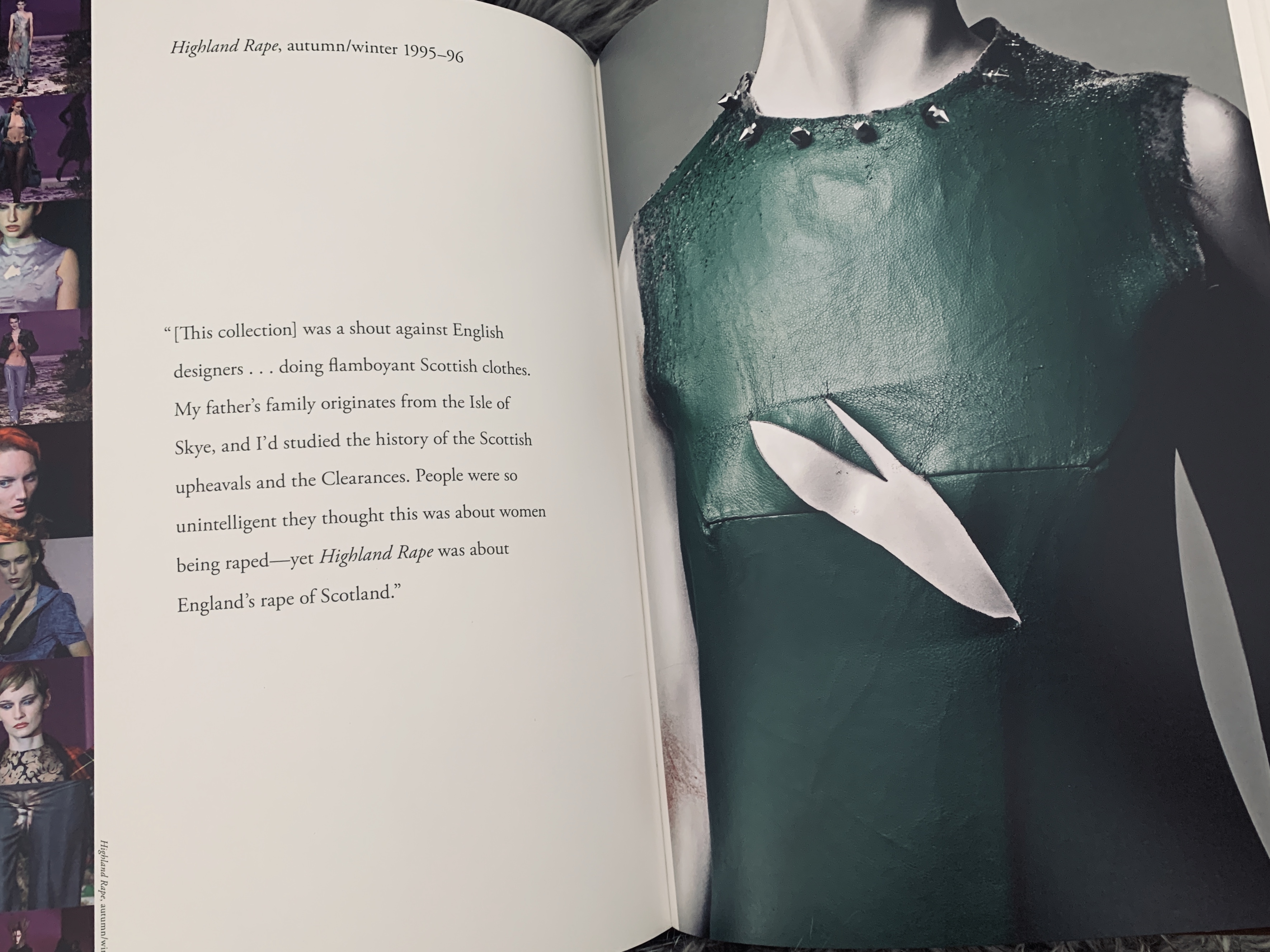
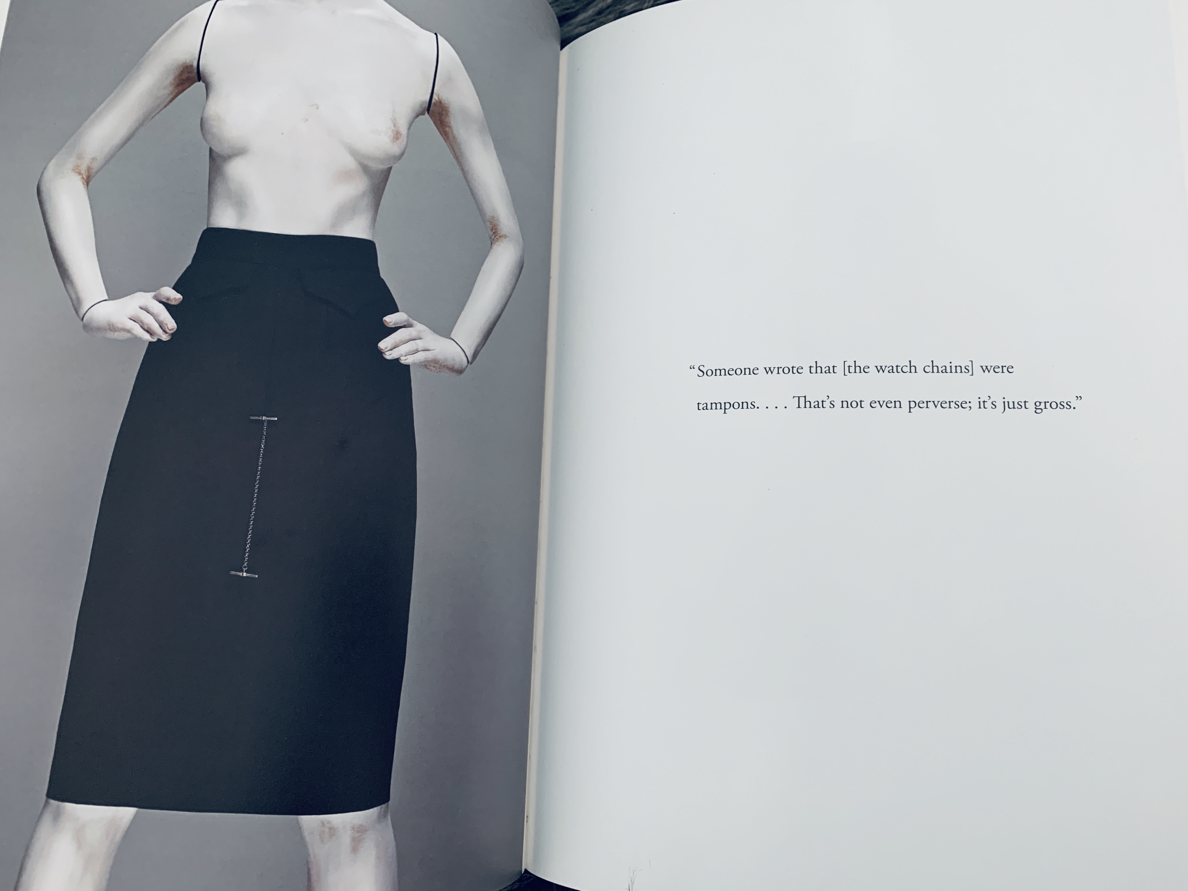
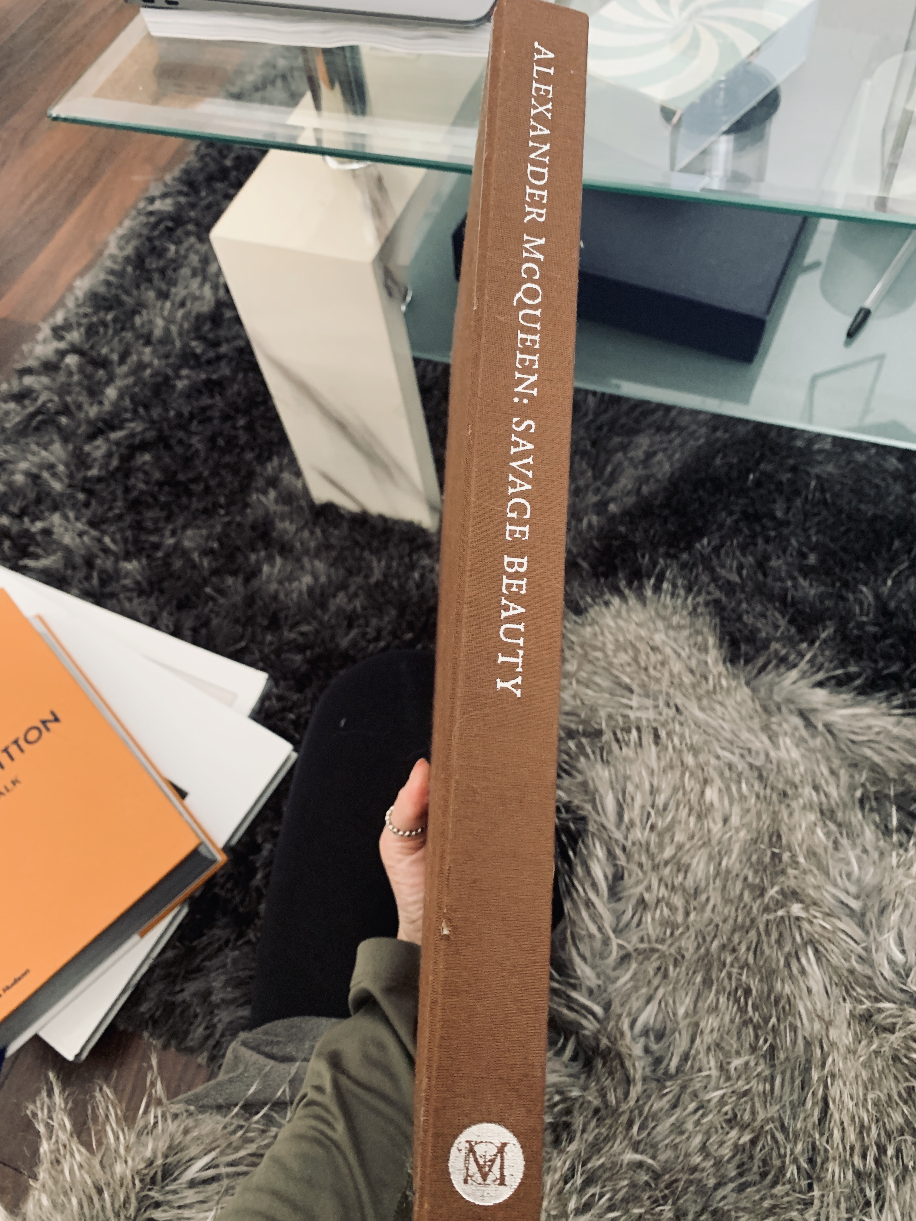
Savage Beauty was my first ever coffee table book- I got given it five years ago for Christmas as McQueen is my favourite designer of all time- I truly love him. McQueen has inspired many things throughout my life, from my textile creations, to my choice to study at Central St Martins and Savage Beauty opened my eyes to the aesthetic and luxury of coffee table books. The main aspect that I love about Savage Beauty was the minimal but highlight executed layout and design. All the images sit to the same or simular size and bleed and some are accompanied per chapter with a quote by Alexander on the collection that is centred within the page surrounded by negative space. What is truly inspiring about the layout of the quotes in this book is the space around that lets the mind occupy a space- a truly powerful way of displaying the work and mind of Lee McQueen. This has inspired me to utilise quotes within Swarovski and really understand the brand and the brand DNA.
Catwalk: Louis Vuitton
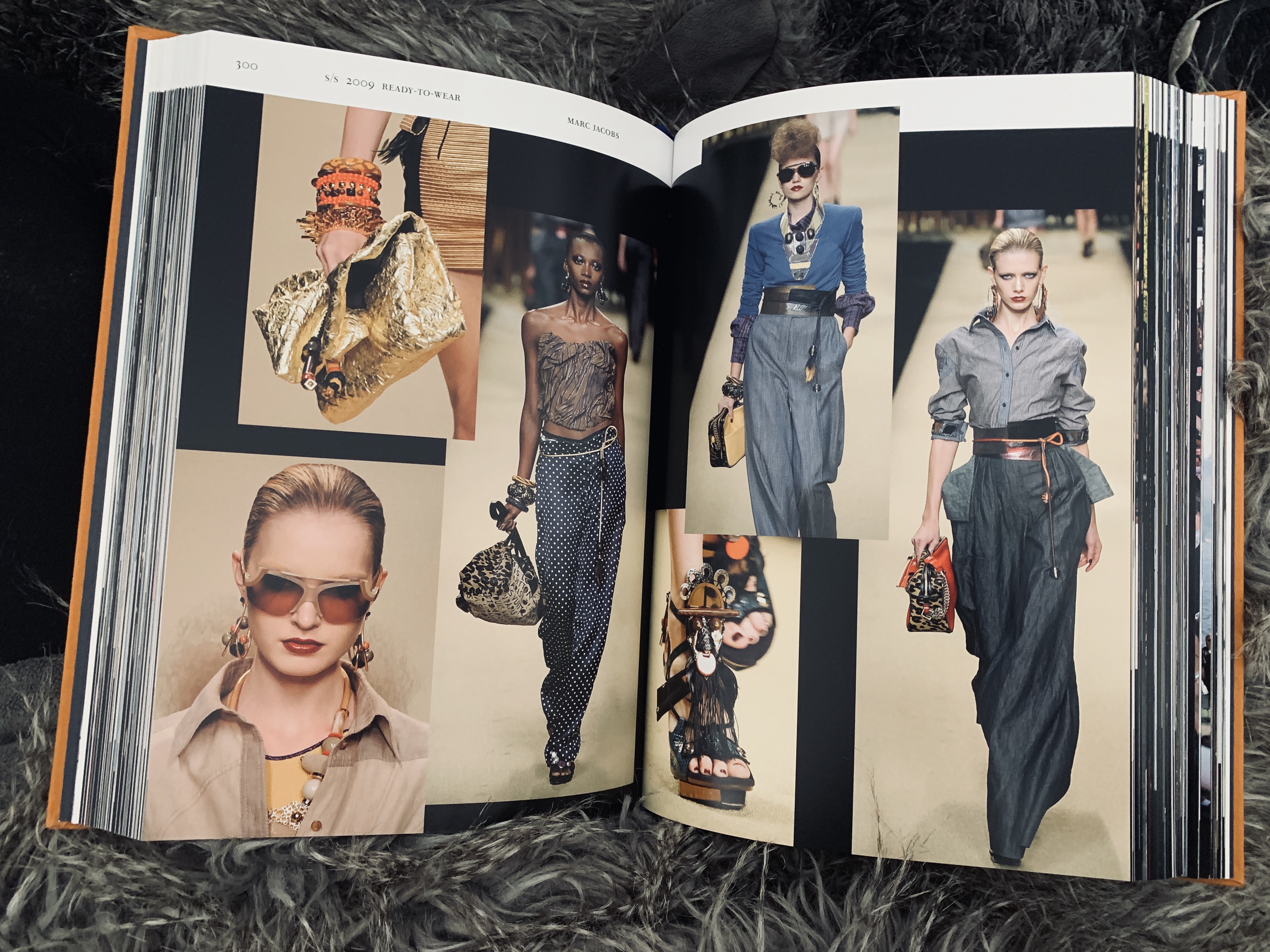
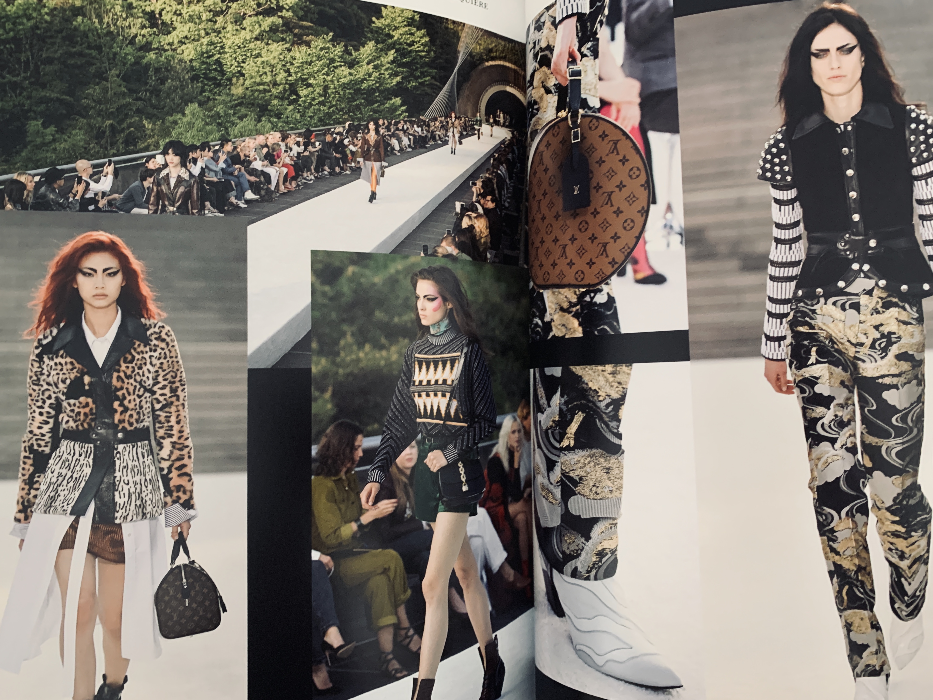
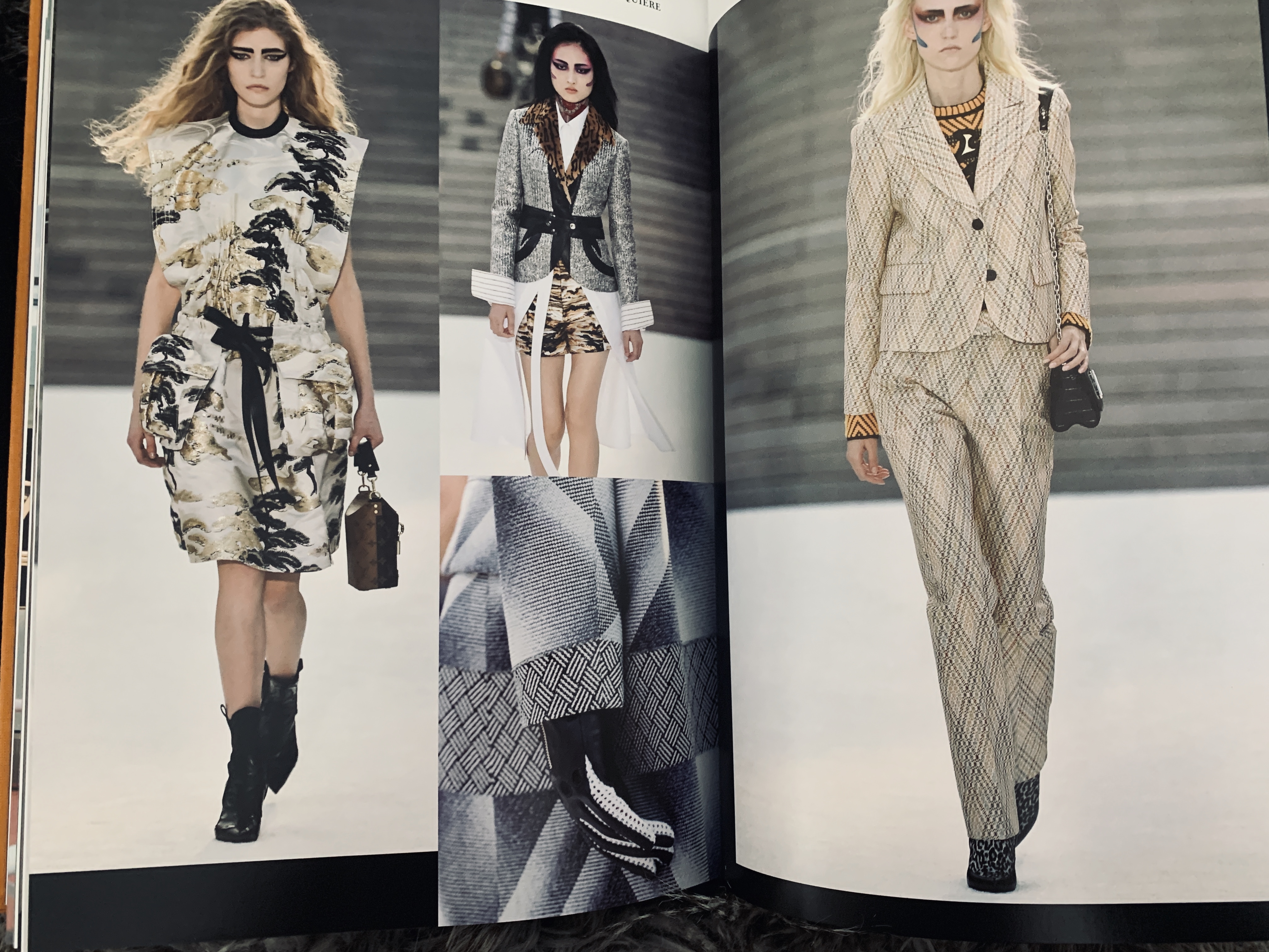
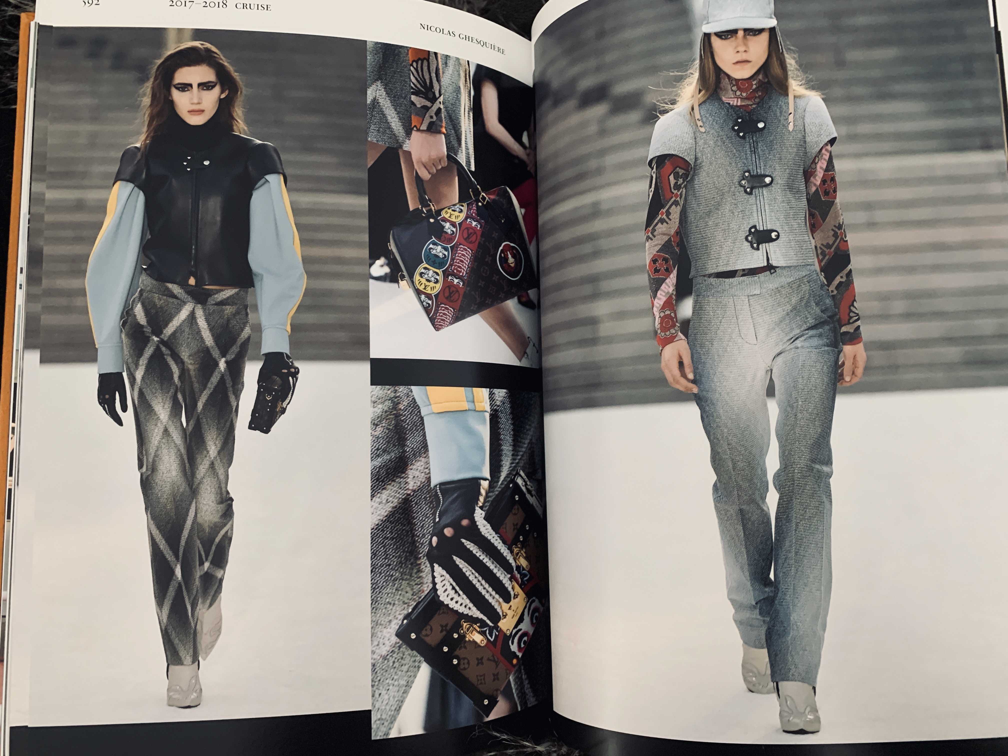
I haven’t owned this book long, however this is a really clever way of feeding timeline like information in a creative manor. Catwalk: Louis Vuitton spans for 1998 – 2016 of 614 pages of all Louis Vuitton catwalk collections. What really stands out to me going through this publication is the use of collaging the imagery together for more of a dramatic look at the collection. There is no words in the book and therefore the imagery speaks for itself through the collaging. What I will take from me from this book is the use of crops on important and special items from that collection, using a crop really draws the eyes in which is something that lets the eye focus on the important aspect of the images.
TWIN
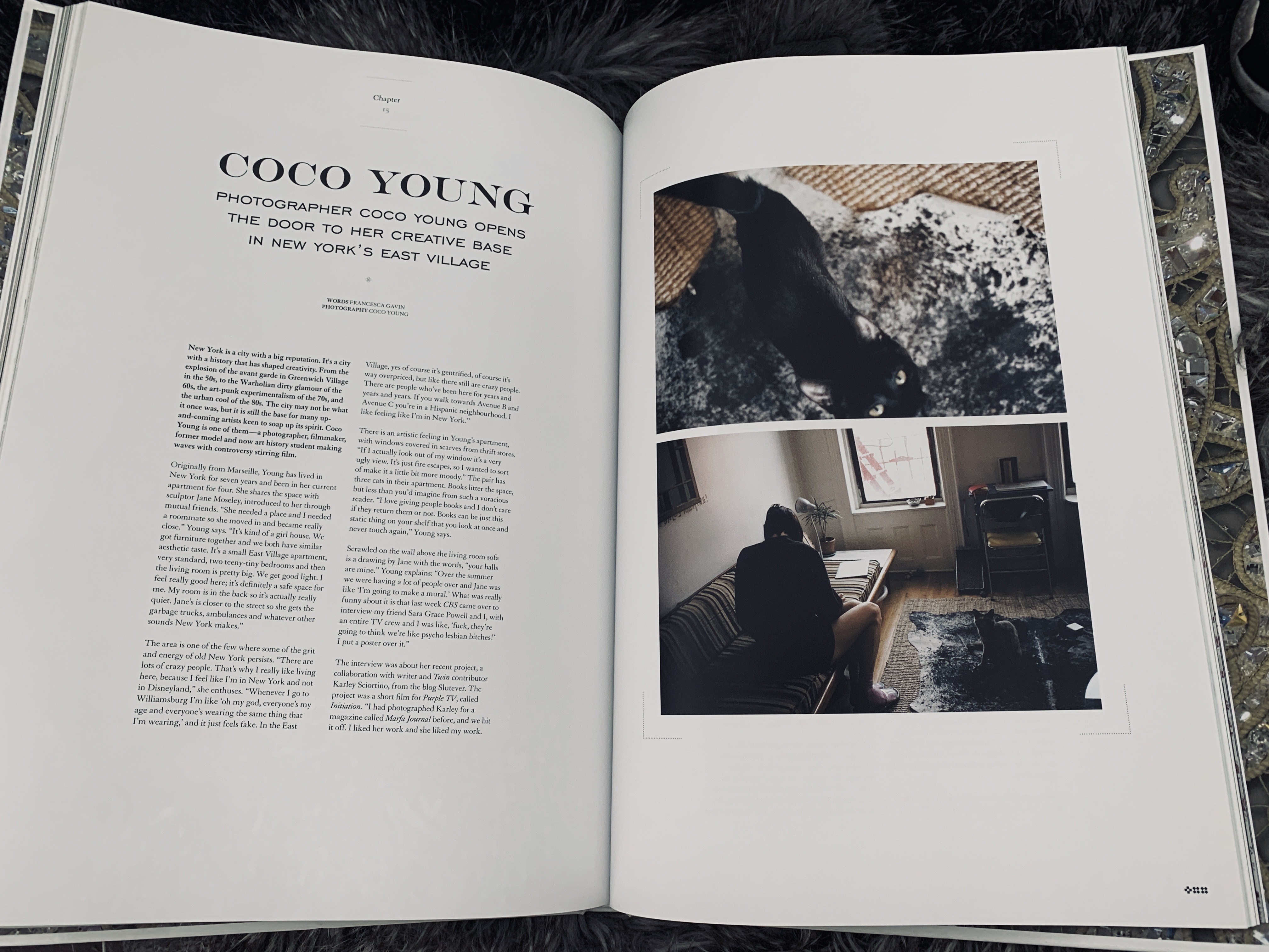
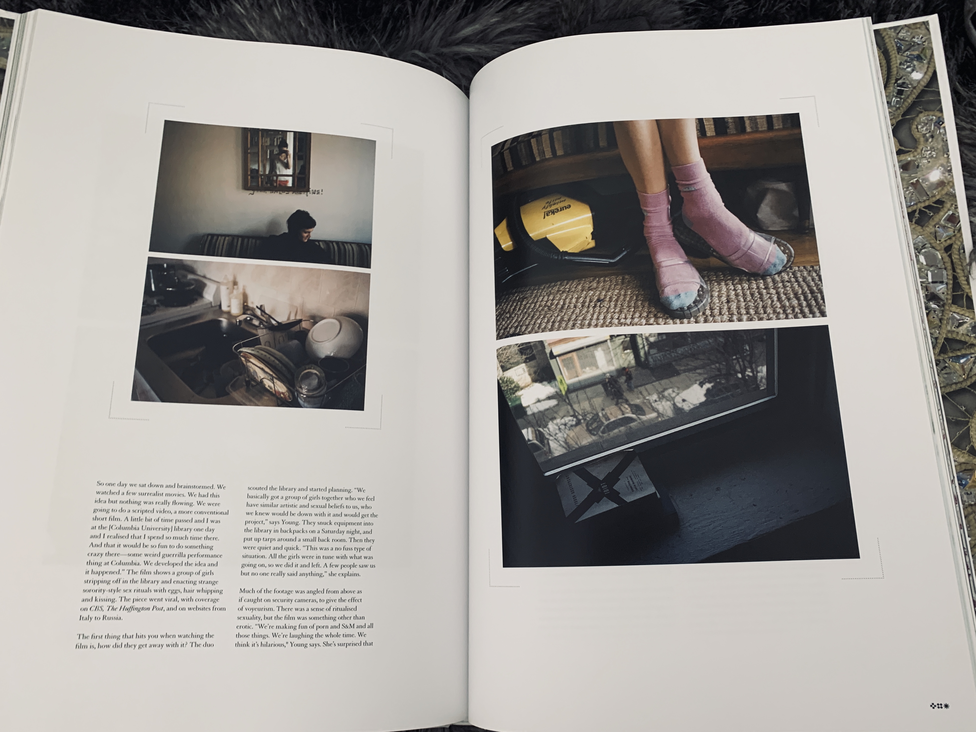
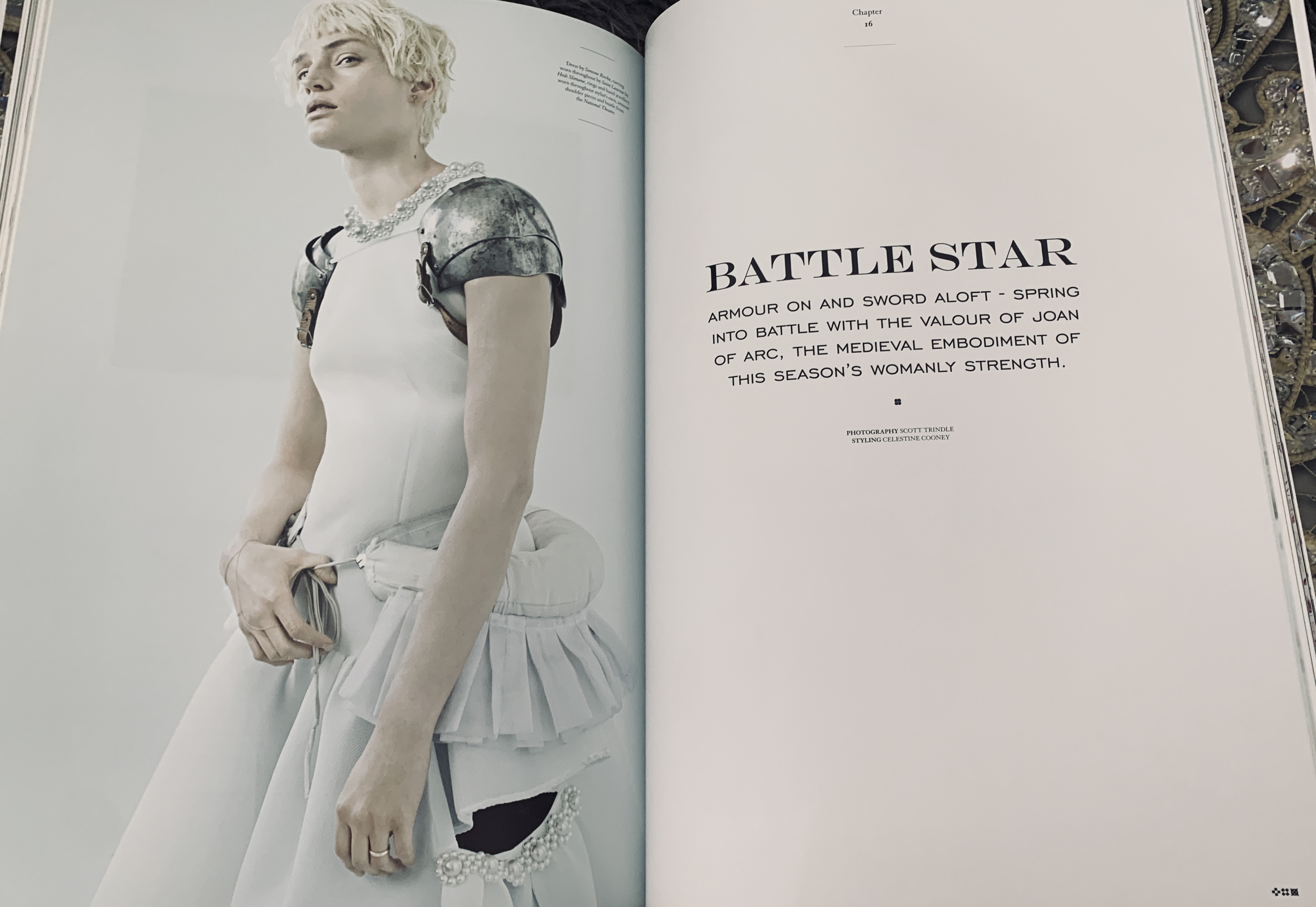
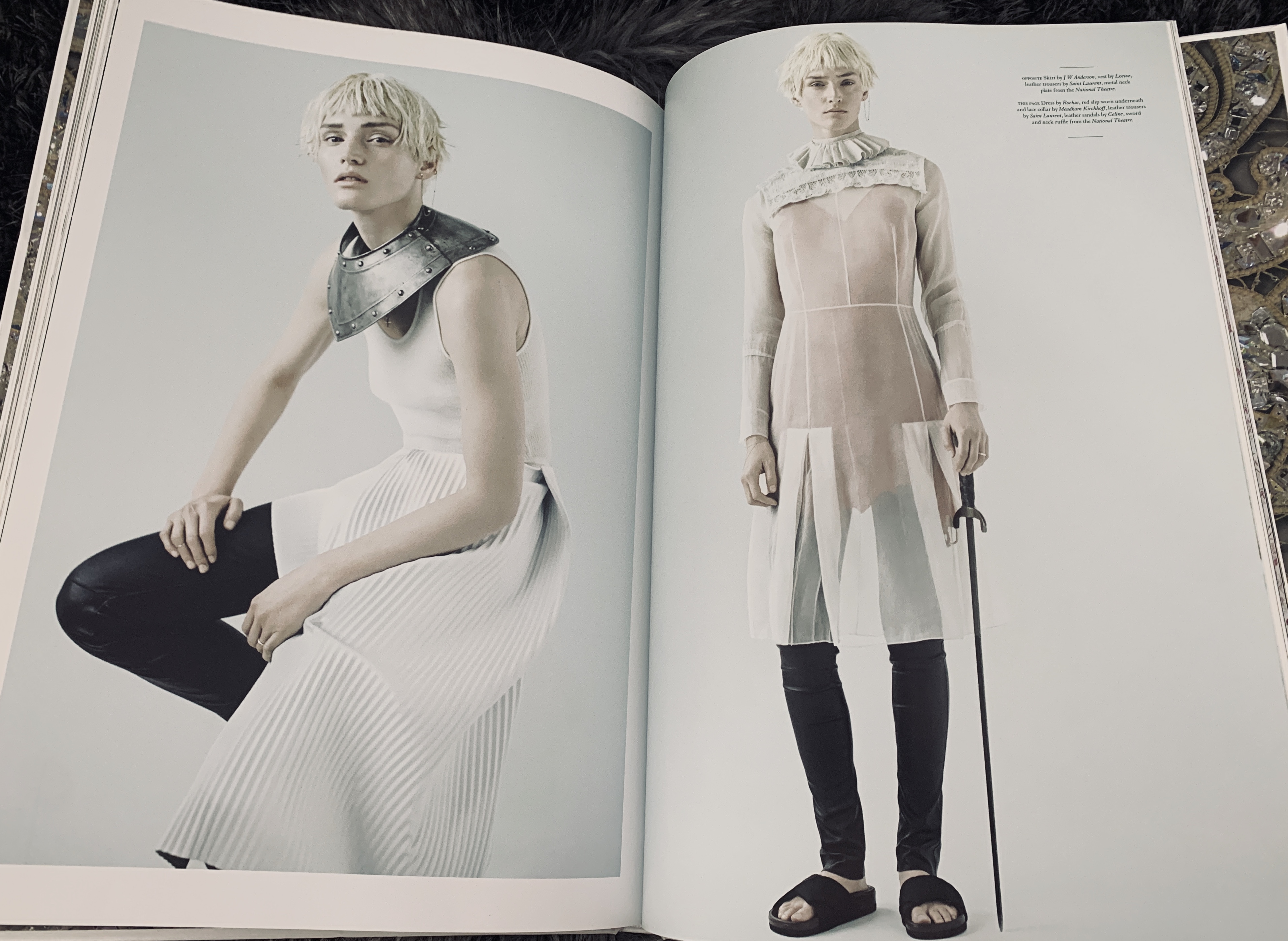
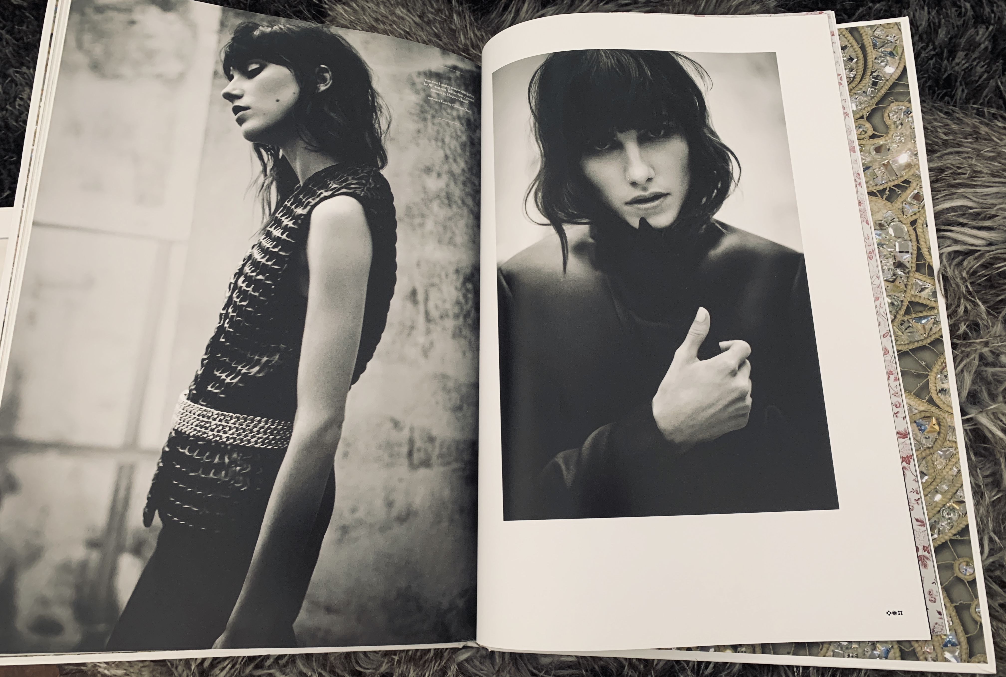
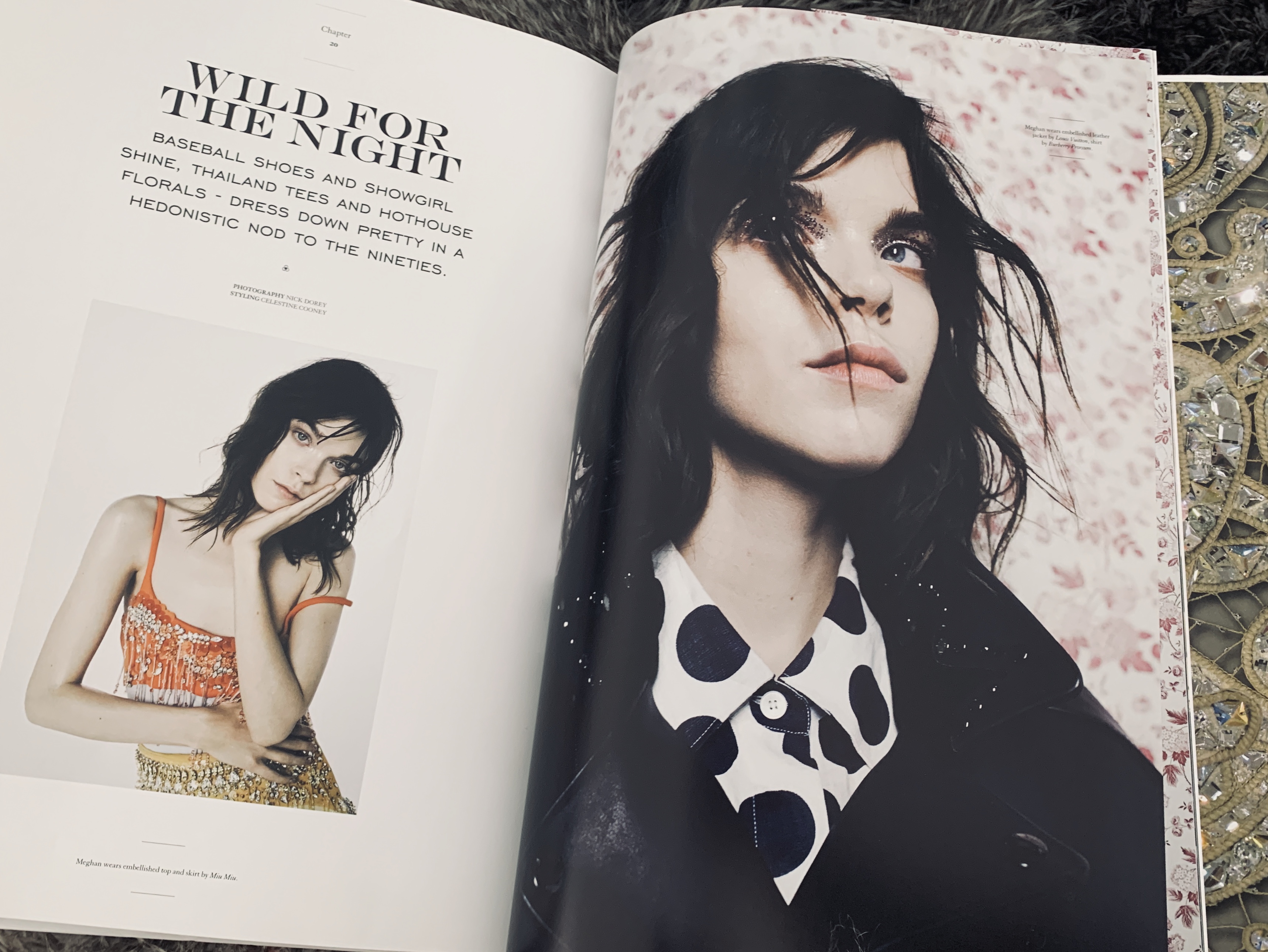
TWIN is actually a magazine, however is hard back bound making it sit more as a coffee table book but with magazine style editorial and features. What really stands out to me about TWIN is the use of full bleed imagery next to imagery with a white border- I think these juxtapose each other really well that they almost compliment each other. I also really like the use of a large heading and a small bite of text underneath surrounded by the white page it is a way of a subtle yet dramatic page layout.
PURE Saint Tropez
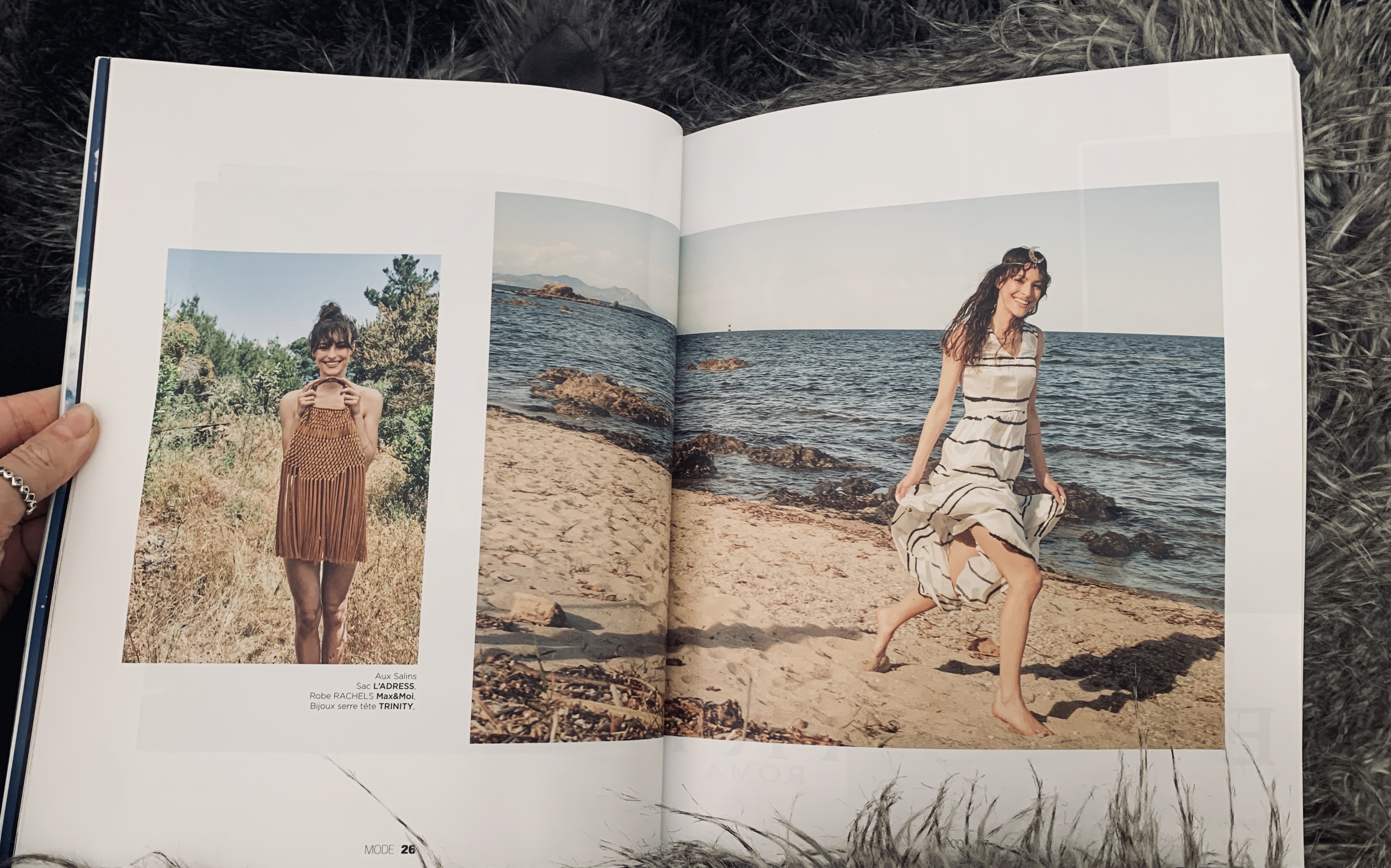
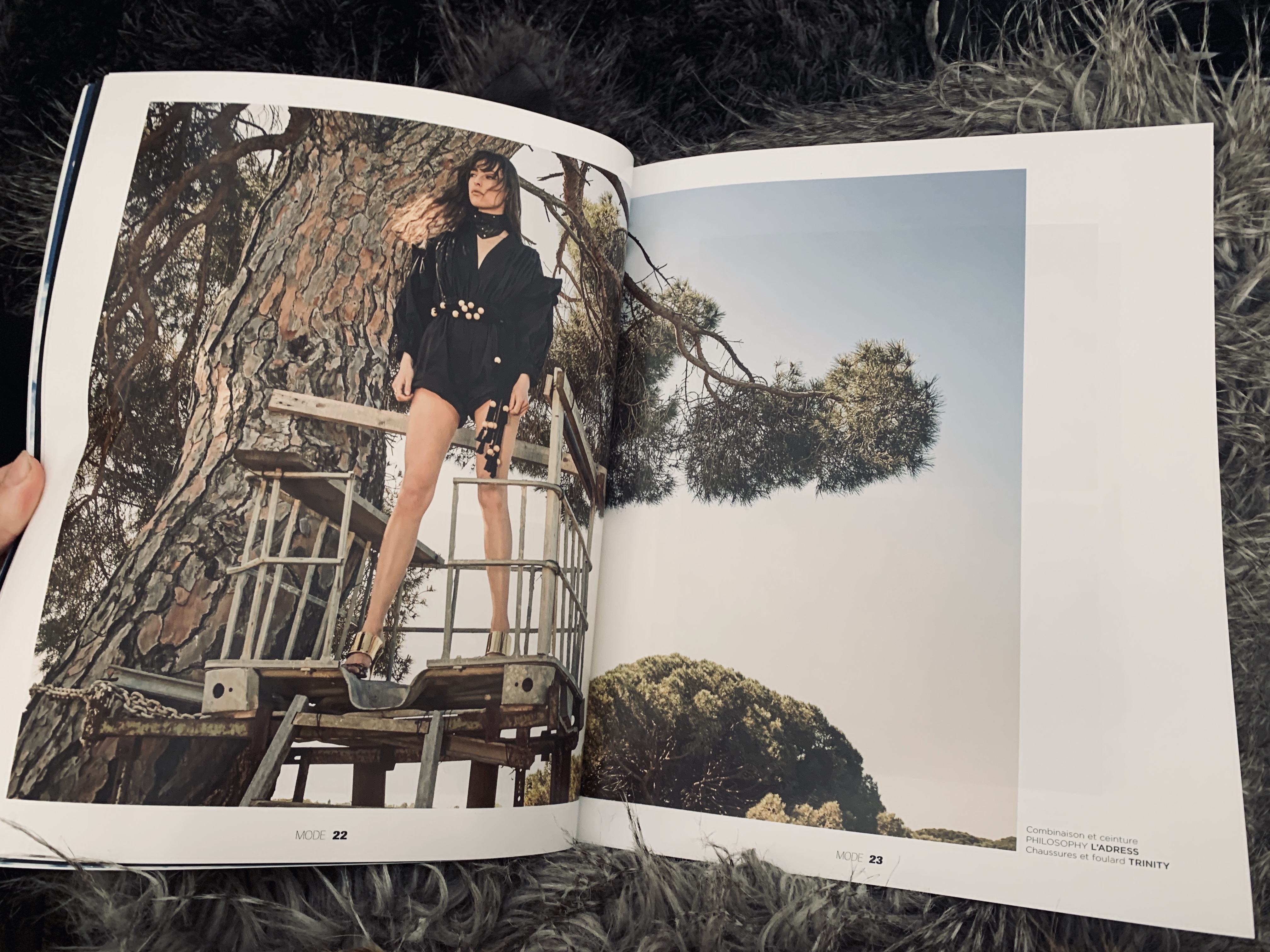
I was recently given this publication by a family member who had been travelling in France- knowing I was passionate about luxury publications. Pure is a publication based in Saint Tropez and features fashion and editorial as well as travel and lifestyle pieces. The photography is actually really impressive and I am a huge fan of how they have laid out the publication on matte paper- I honestly think now matte paper is more luxury than glossy due to the thickness of the matte. The image bleeding over the pages with a slight gap is also really beautiful and takes the eye across the page on a journey.

