This morning I began generating different ideas for covers, see below:
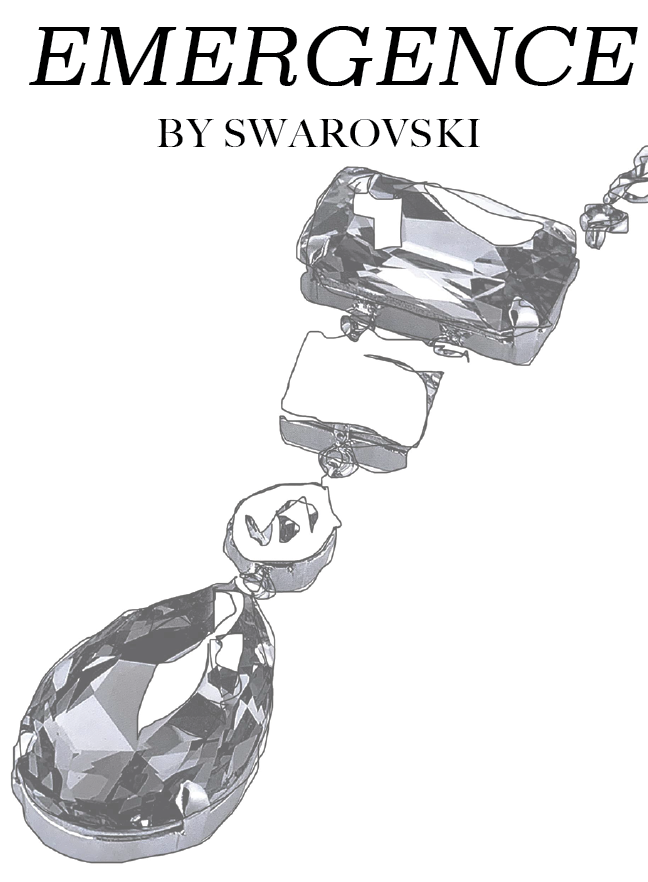
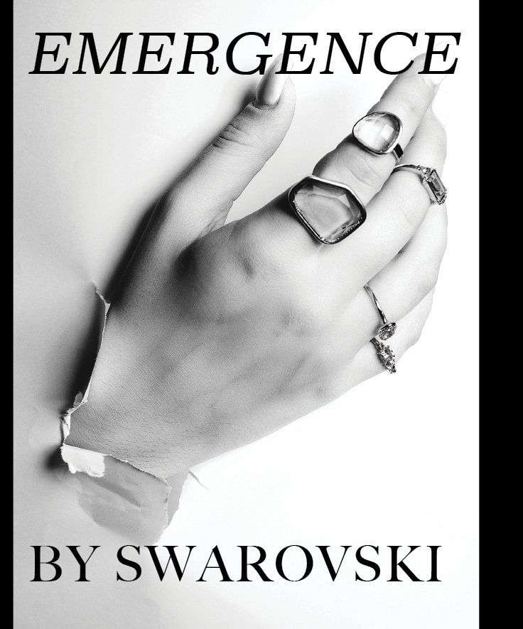
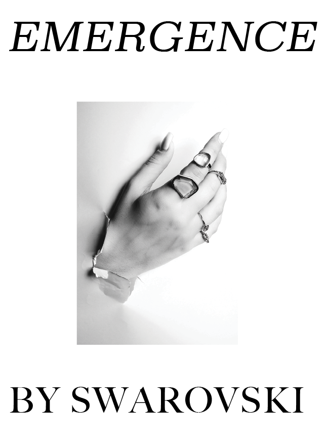
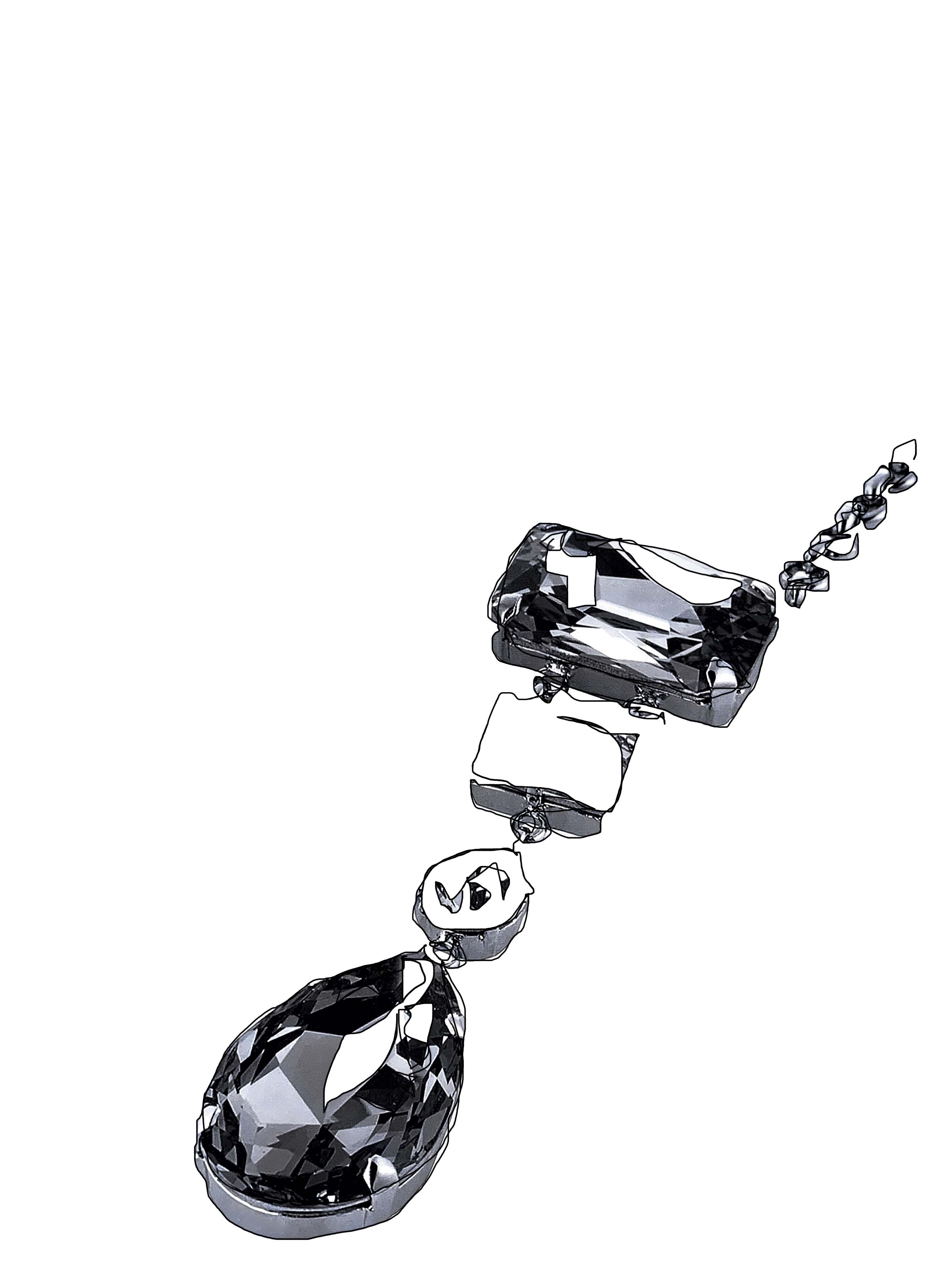
I have two main ideas for the cover of EMERGENCE, one being a drawing/sketch on the cover and the second being an image from one of the main shoots of the book. Both images and sketches were created to instigate the idea of ’emergence’.
Emergence- “the process of coming into existence or prominence.” this was something I wanted to visually communicate on the front of the book before even opening the pages. The way in which the drawing aims to communicate this idea is to show the stimulation of the mind and the creative process of a designer or creator of these pieces. It shows a raw and original insight into the process of imagination and creation around creatives working with Swarovski crystals which is what the book aims to highlight. The image was directed, styled and shot by myself to communicate the idea of coming to fruition through the emergence of the hand ripping through and showing all the rings on the hand aims to represent the way Swarovski enabled young creatives to be able to emerge as brands and as successful creatives.
I knew I wasn’t going to be able to chose between the different ideas so I asked opinions of 4 other students at college, 3 claimed they preferred the drawing on the cover, as it remains simplistic and powerful- claiming it made them think of young creative processes- through the look of a sketch book.


I keep meaning to ask you who did the illustrations? Would be good to put a little credit with the image.
LikeLike
I did all the illustrations, in the book I have said what I illustrated do I need to credit myself per illustration?
LikeLike