Coming towards the end of creating the coffee table book I decided this would be a good time to send a draft and get another opinion as well as changes that should be made. I sent a draft to Hannah Shakir- I worked with Hannah on my Contract Publishing module last year and therefore wanted her opinion on what I was working on from her perspective having not seen my blog nor know what I am working on fully.
I sent her a pdf and she came back with some great pointers to consider, Hannah stated:
- cut down the amount of imagery, keep imagery that is outstanding etc don’t fill pages with imagery that is almost the same.
- Consider cropping further into imagery to really focus and highlight the crystals
- Alter some lighting on the imagery to make the photos brighter.
- Gramatical corrections
Following Hannah’s comments I went in and tried to edit more closely which images should cut completely and which ones should have a closer crop. I then took imagery into photoshop to edit lighting in imagery to make the images a lot more crisp. Hannah made a valid point of saying “really think about how Swarovski would show the imagery” making me think closely about the lighting and crops.
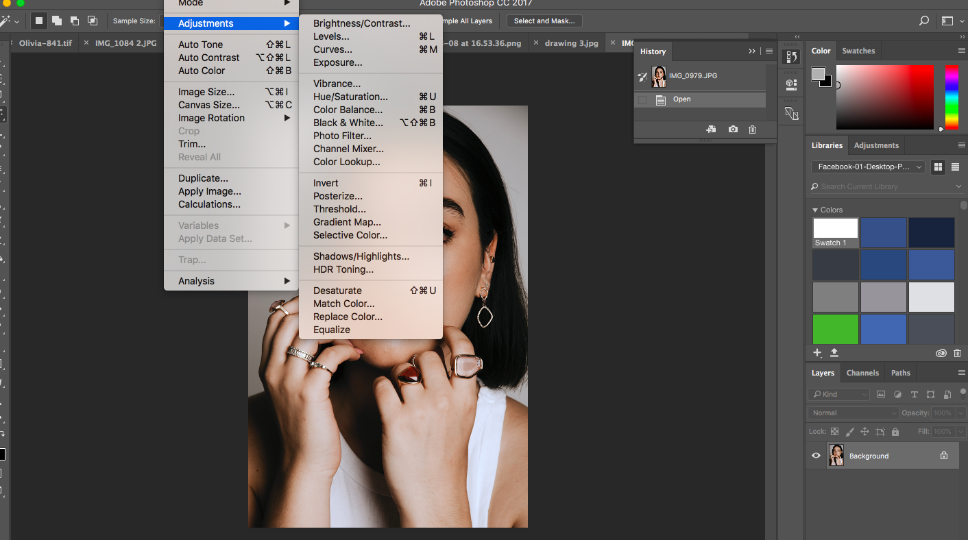
Following a catch up with Hannah regarding my project it allowed me to really consider how I was presenting things on behalf of the brand- making me want to go in and make everything a bit slicker. I went in and adjusted sizing and crops as well as cut things that were repetitive. I then considered how the pages were looking and it made me refer back to Swarovski’s previous book- I saw the sizing and adjusted my page size to see if allowing a bigger and wider size allows the information and imagery to sit a lot better.
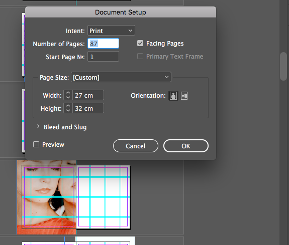
After changing the document size to that of the past Swarovski book, the imagery and content had a lot more space to breathe, allowing a much slicker feel to the publication, something I may have over looked without Hannah’s input.

