Gutter and Margins:
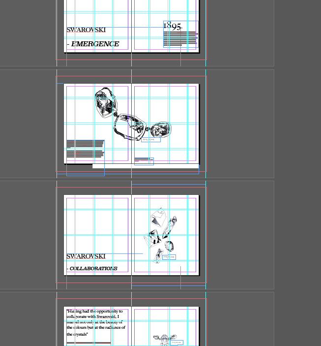
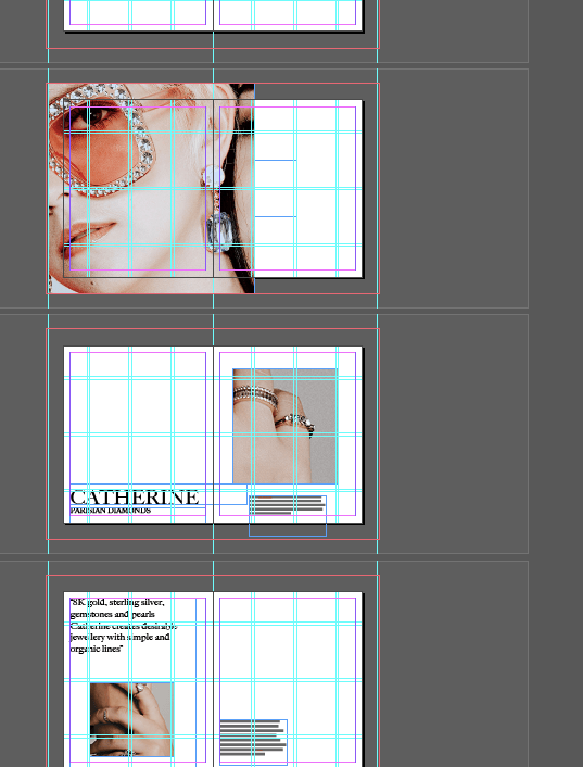
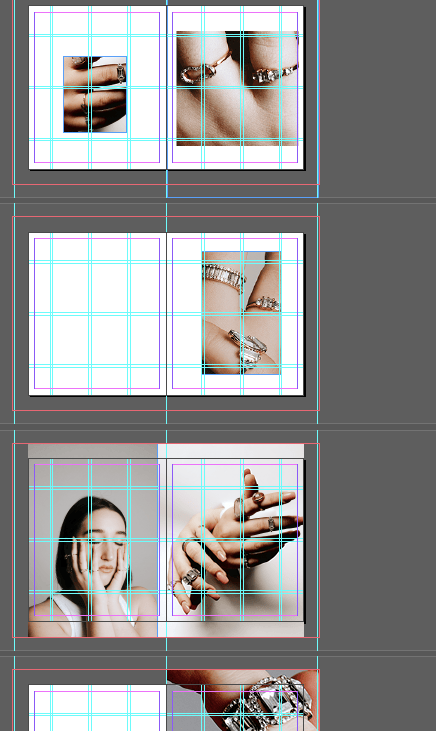
Here I have been developing processes of layouts through working on gutters and margins for my layouts.
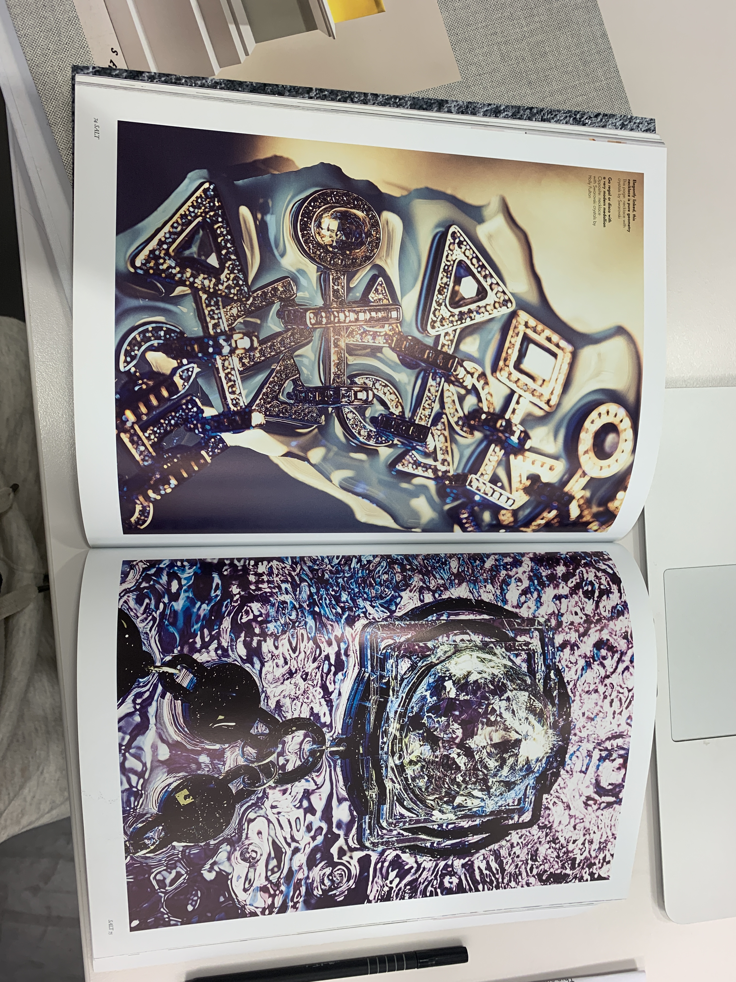
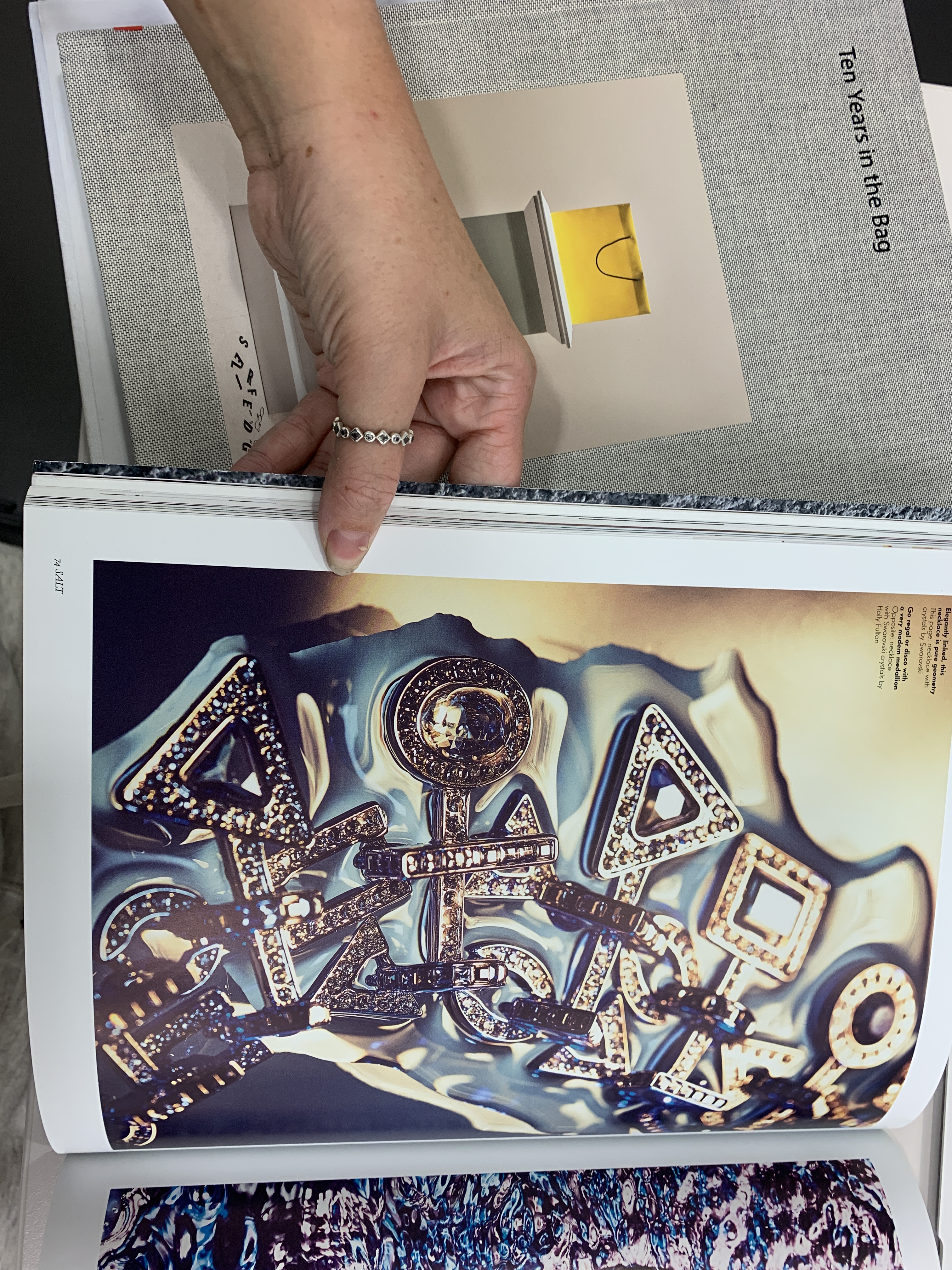
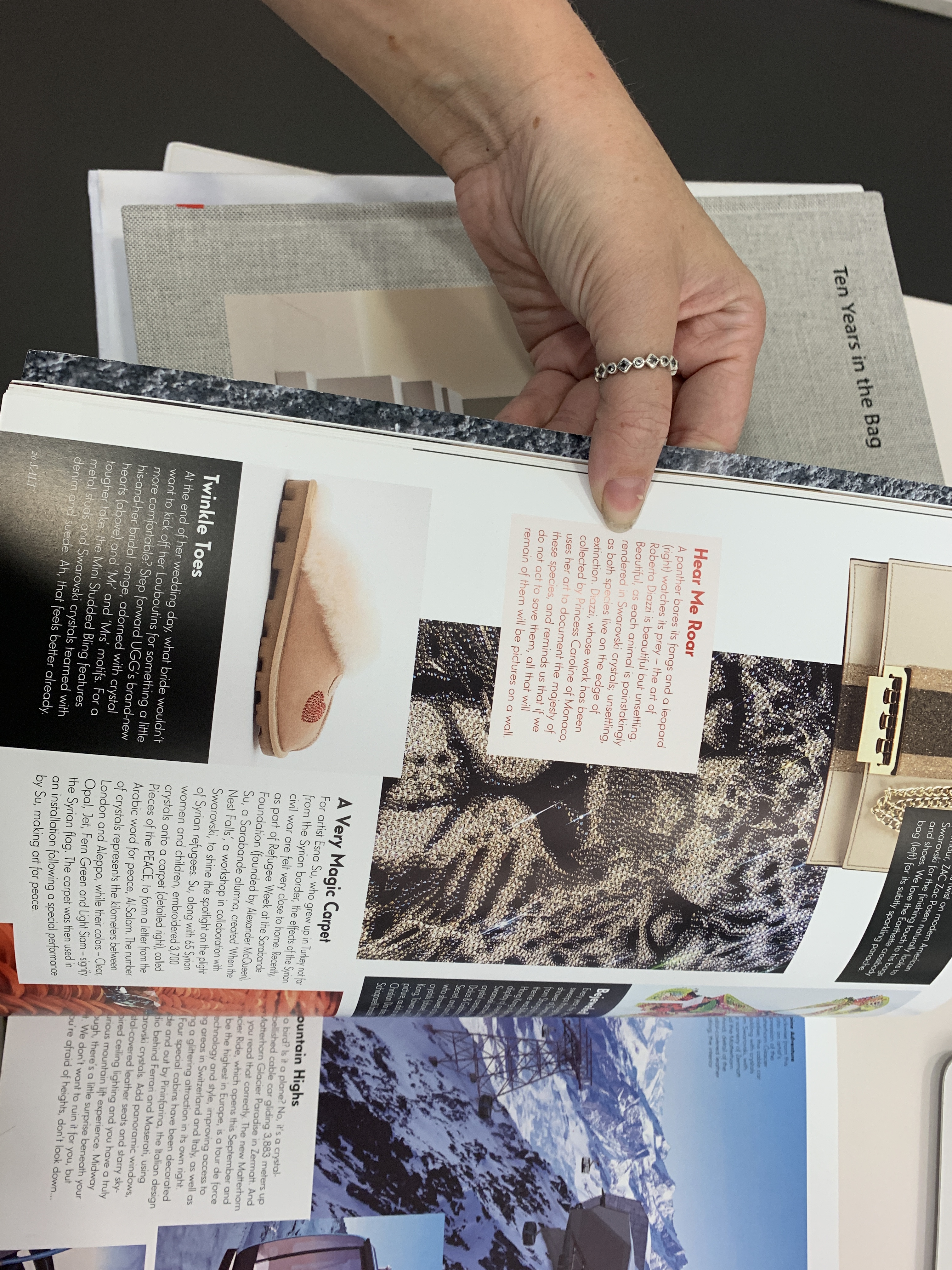
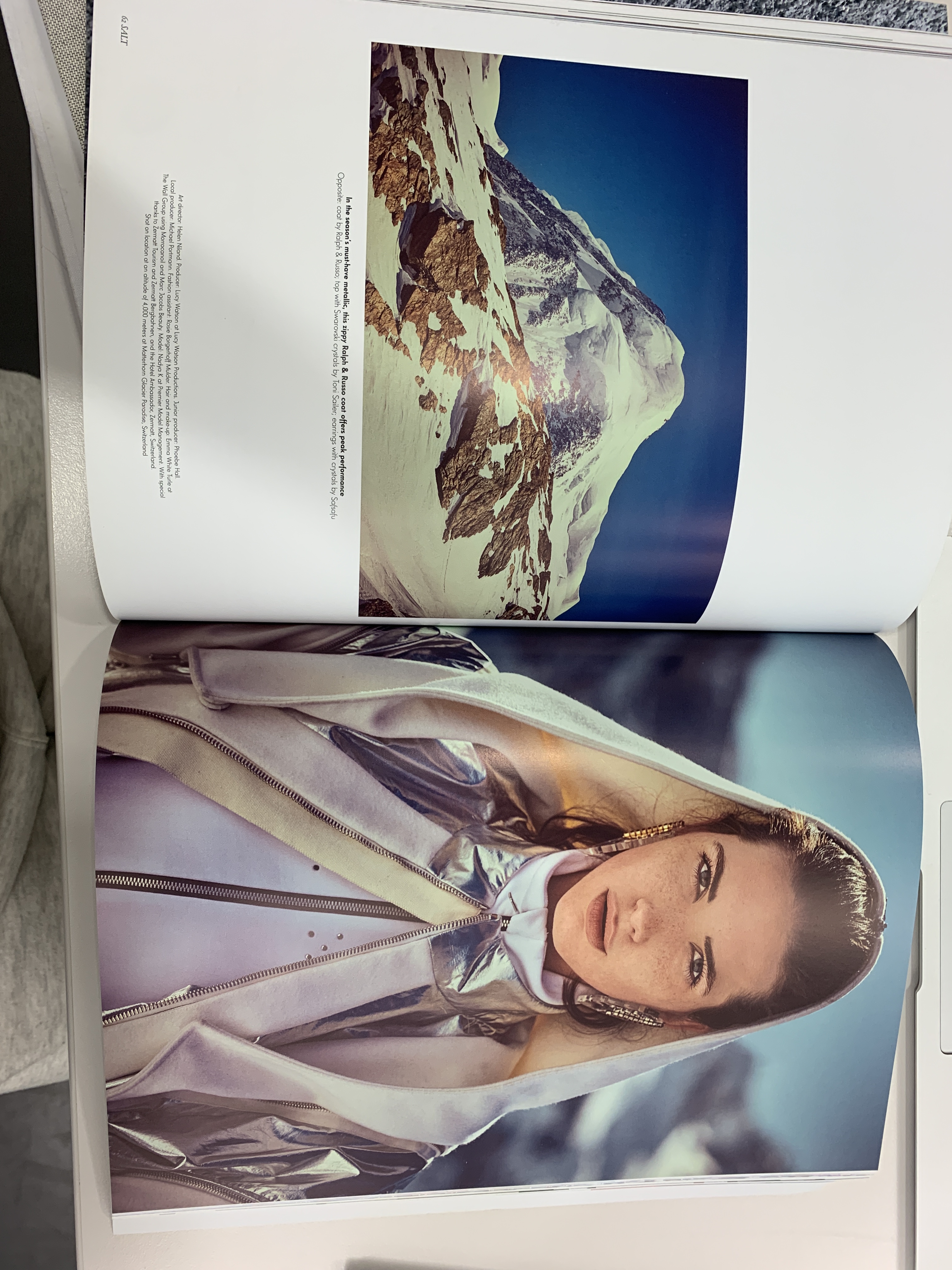
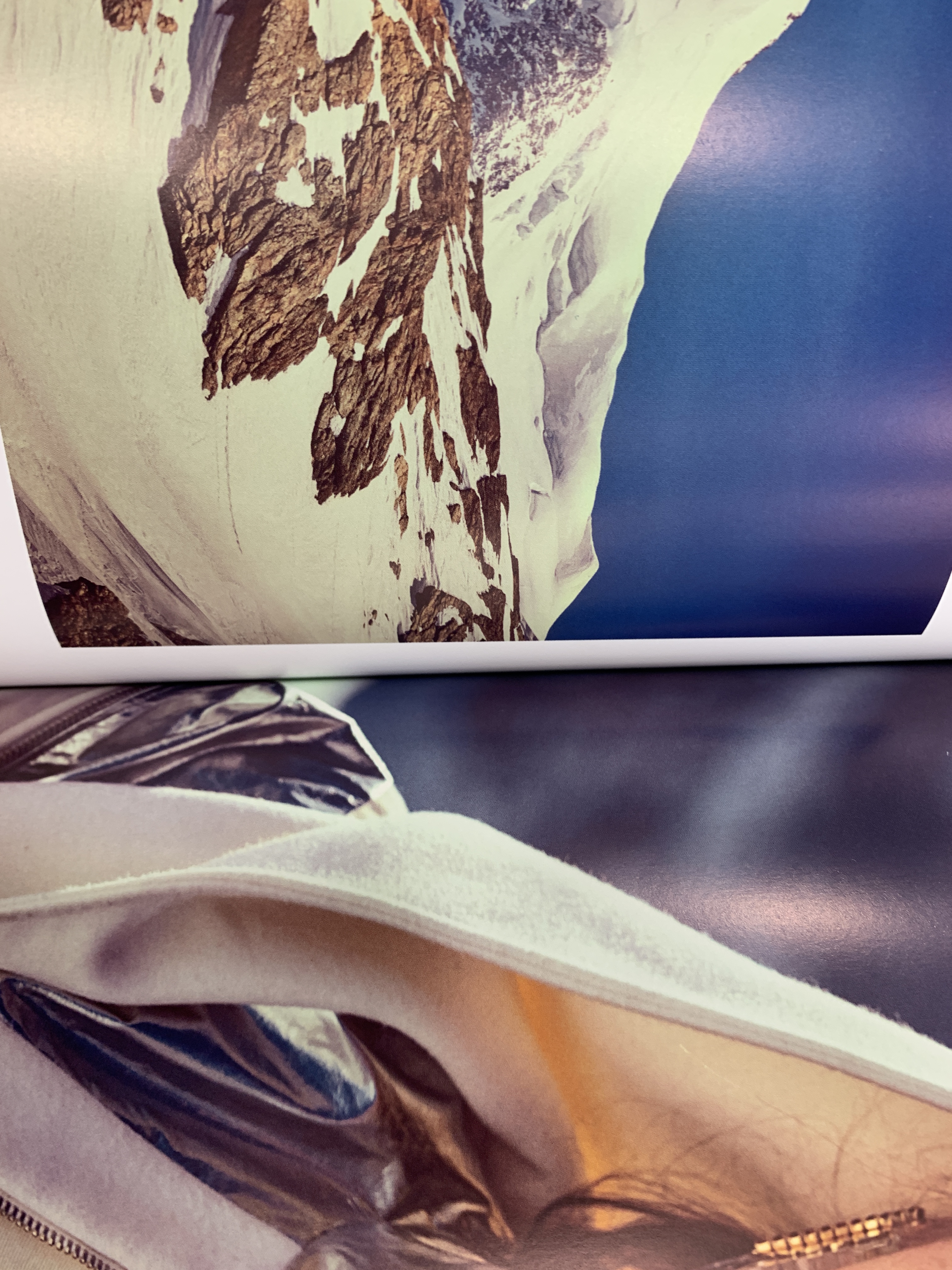
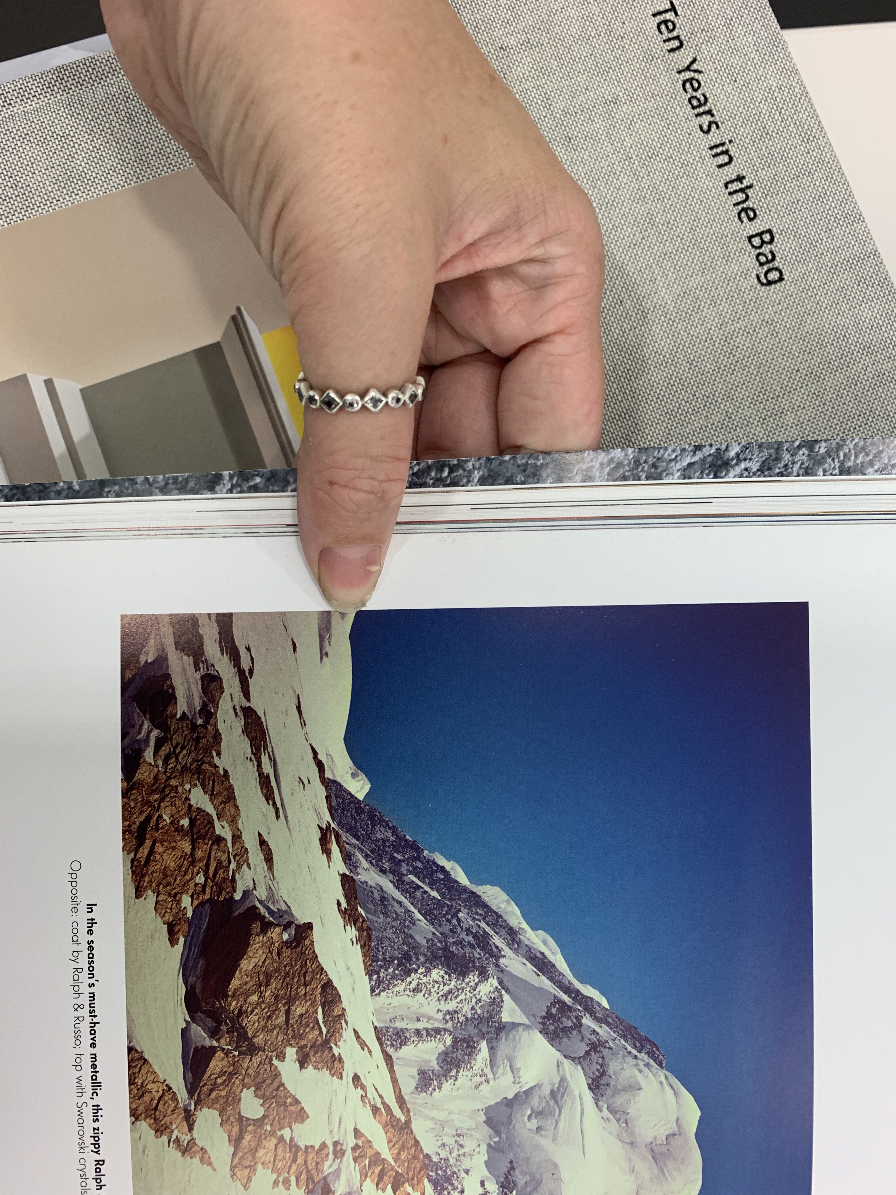
As seen above, I have researched into Salt magazines layouts, grids and margins in order to formulate spacing into how I will space imagery against the side of the publication as well as uses of spreads and negative spacing.
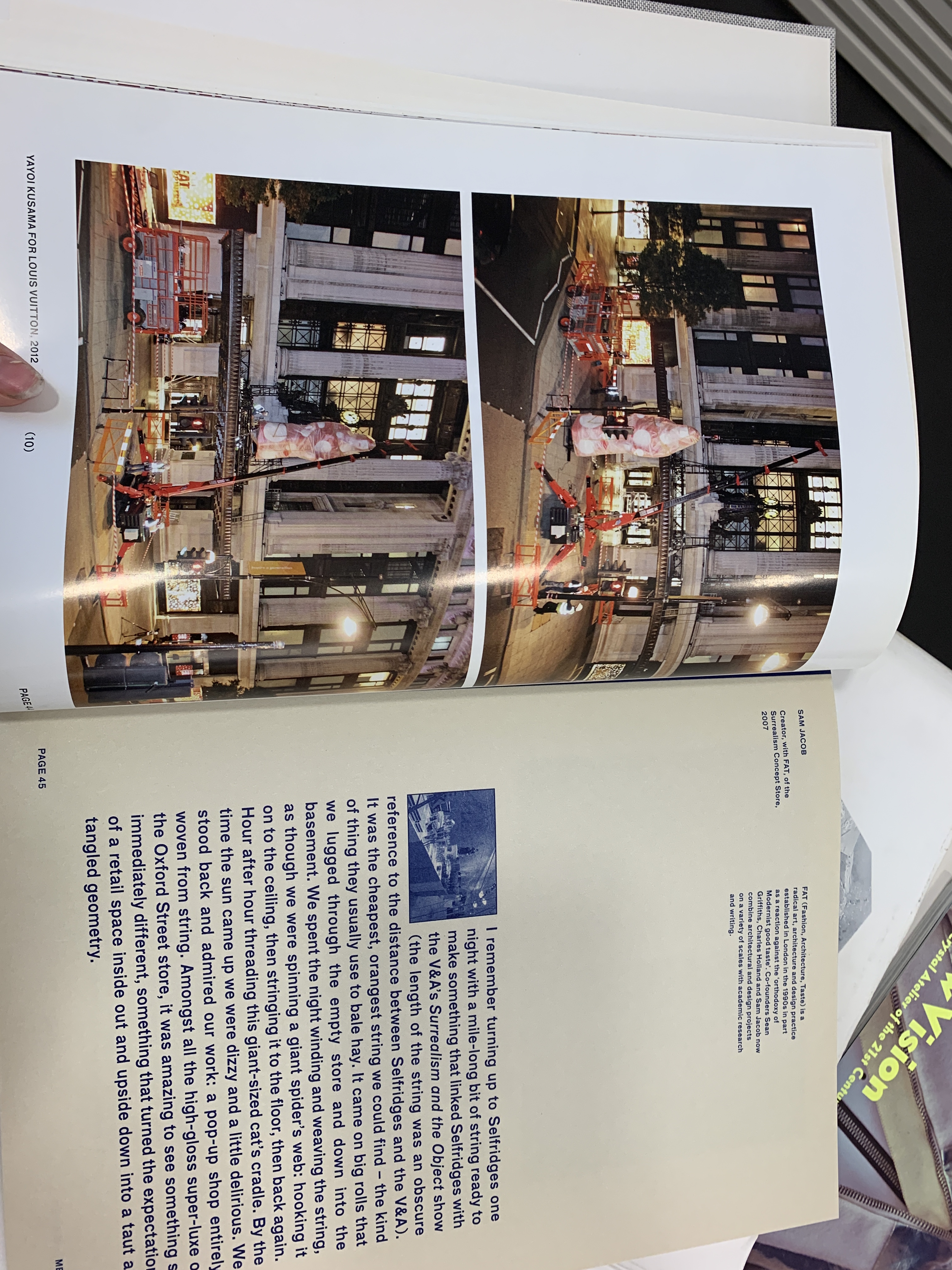
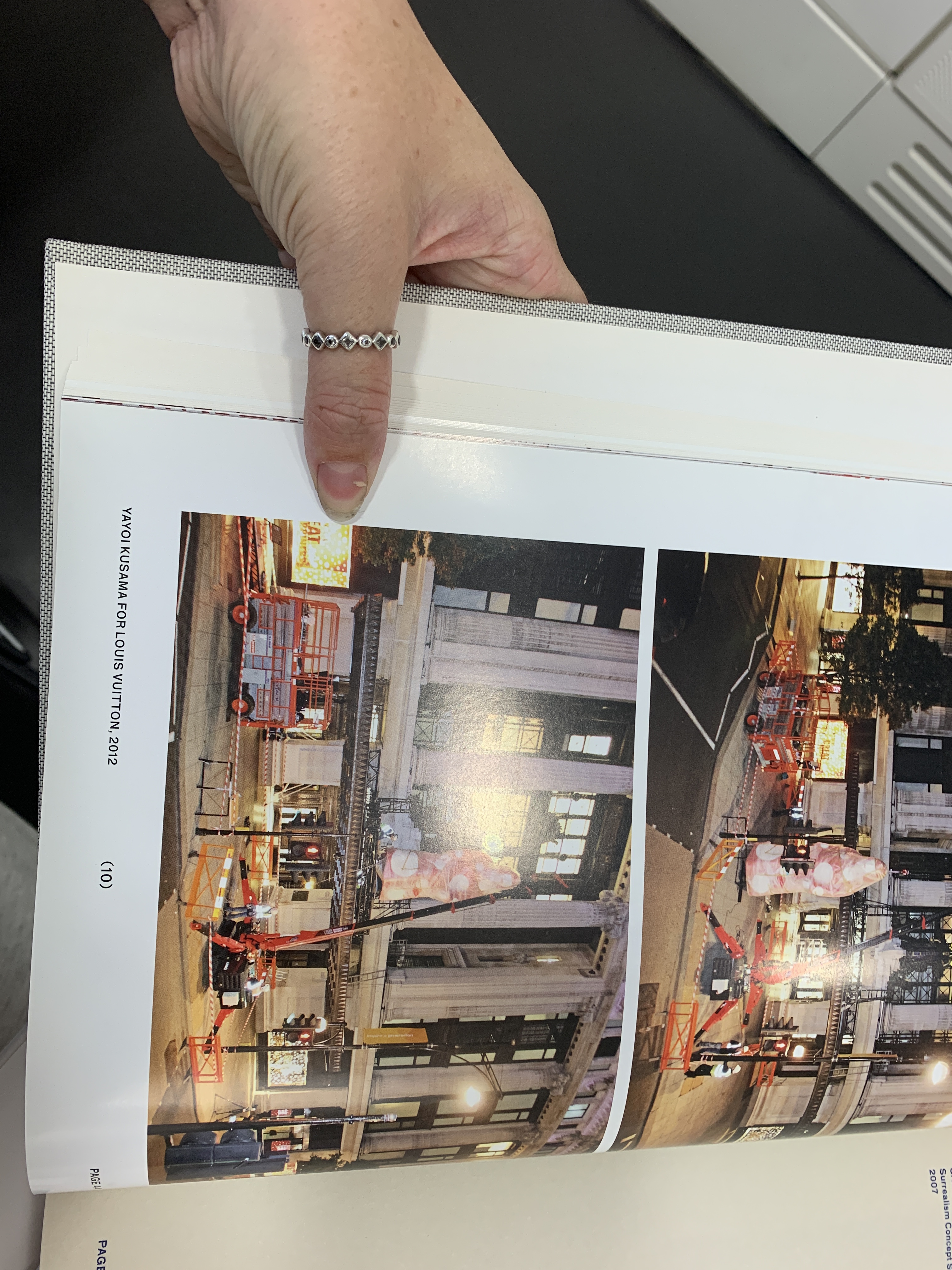
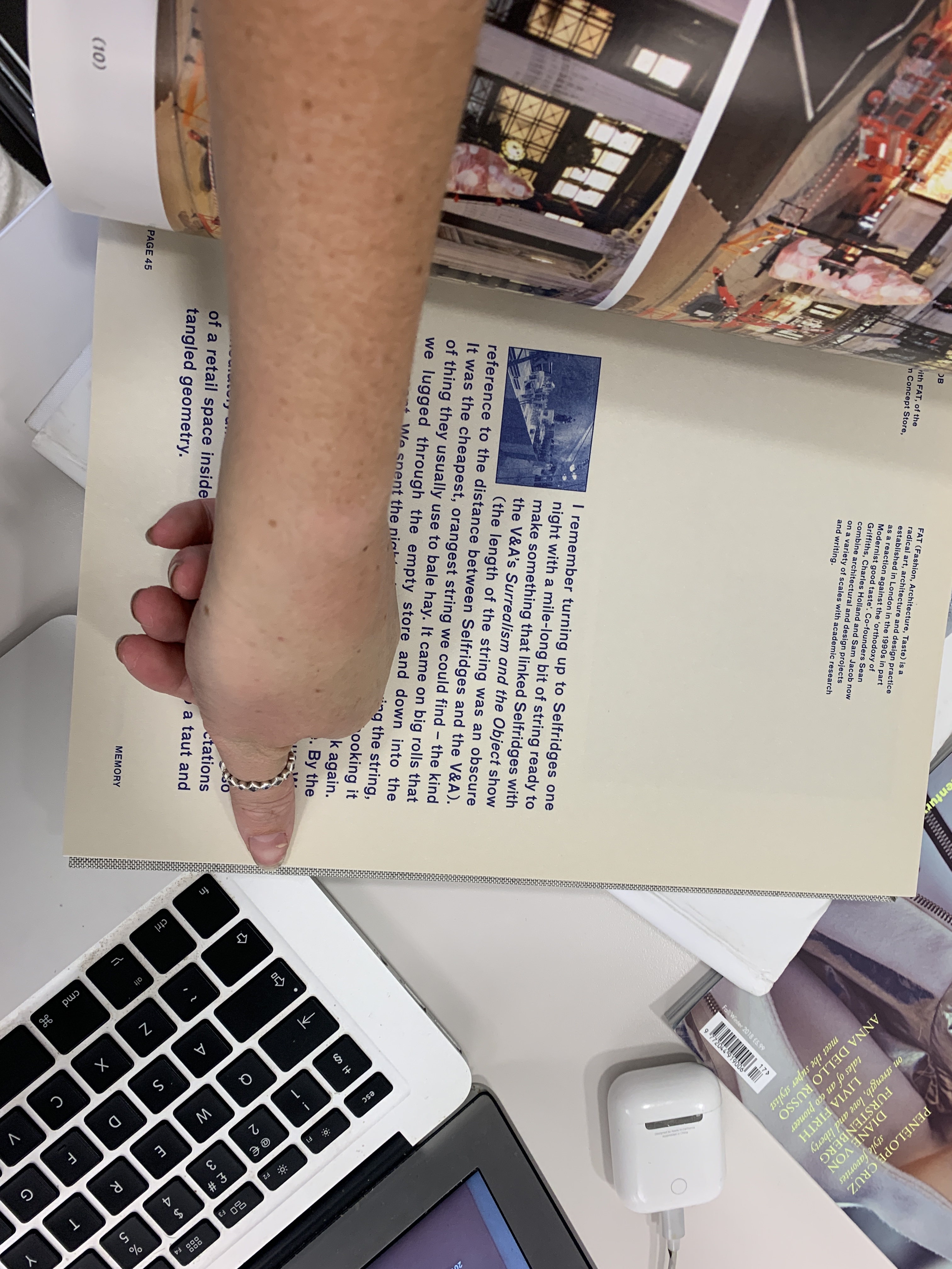
Here, Ten Years in the Bag, by Selfridges uses a bigger gutter and margin in their publication as well as using a much larger font size and their layout is a lot less minimalist. The size of the book is also a lot small than Emergence will be as it is A4- this isn’t something I am looking to take into Emergence as I think the large and bold text in the centre of the page takes away from the luxury aesthetic of Swarovski though Emergence.
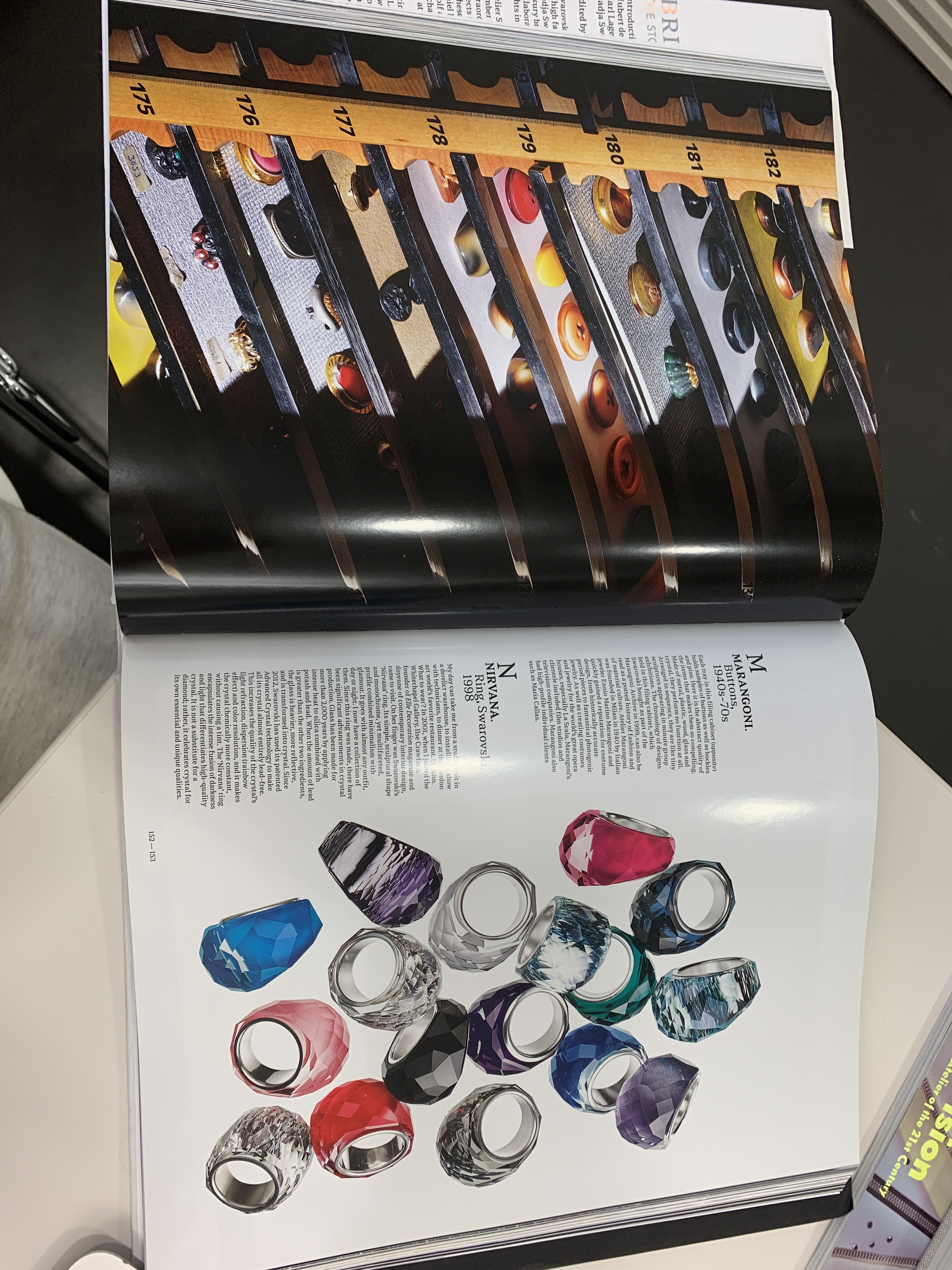
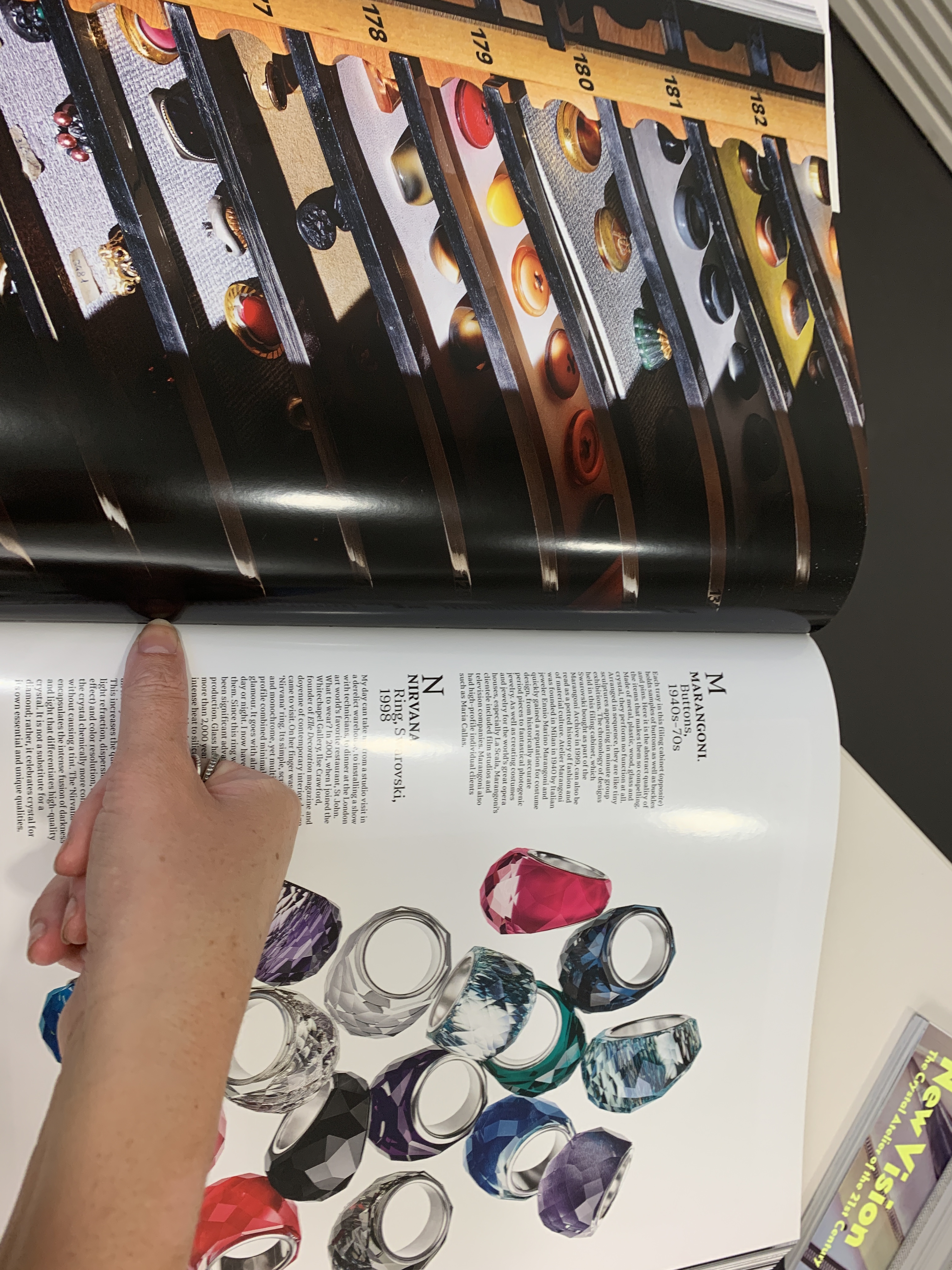
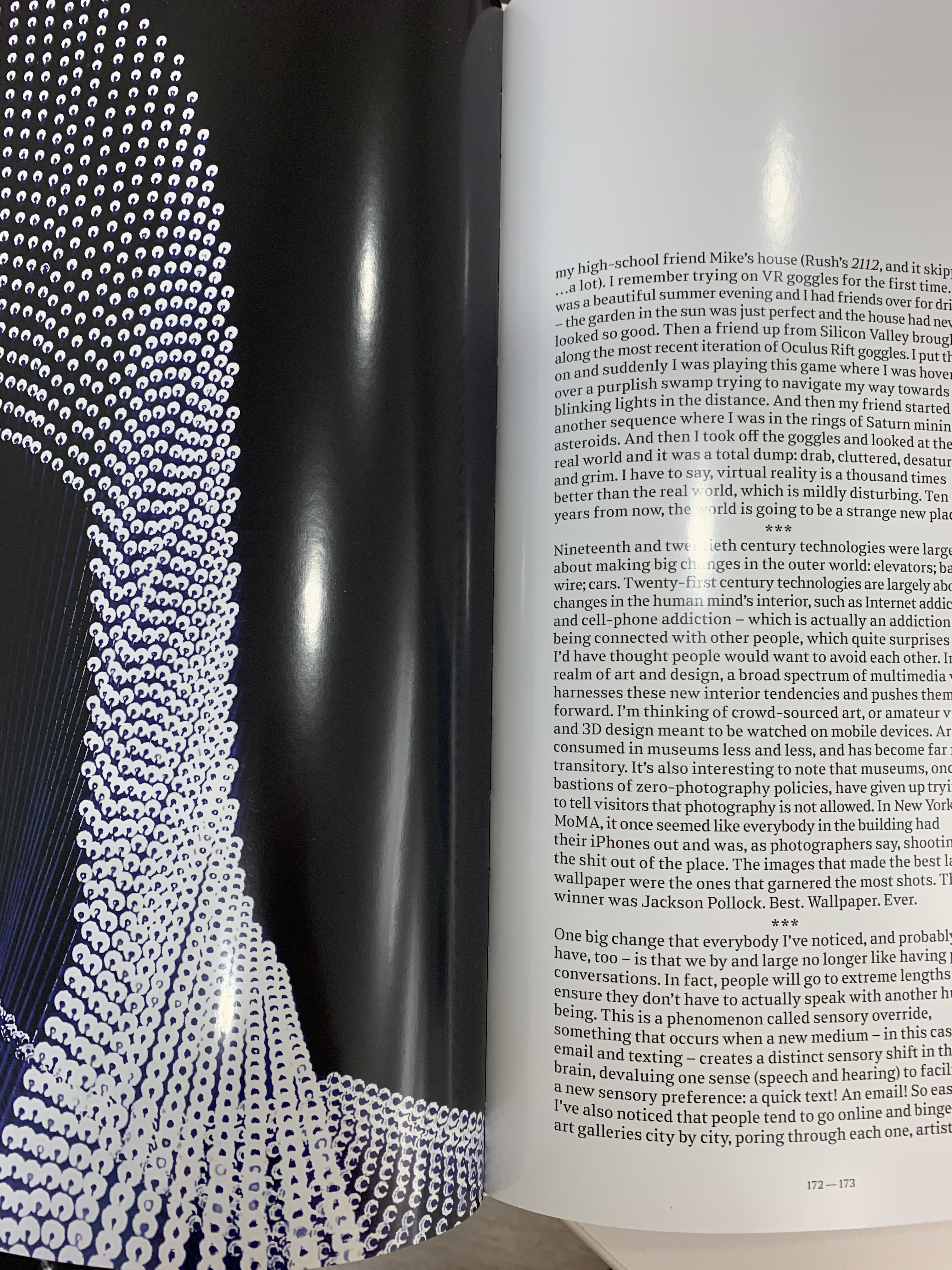
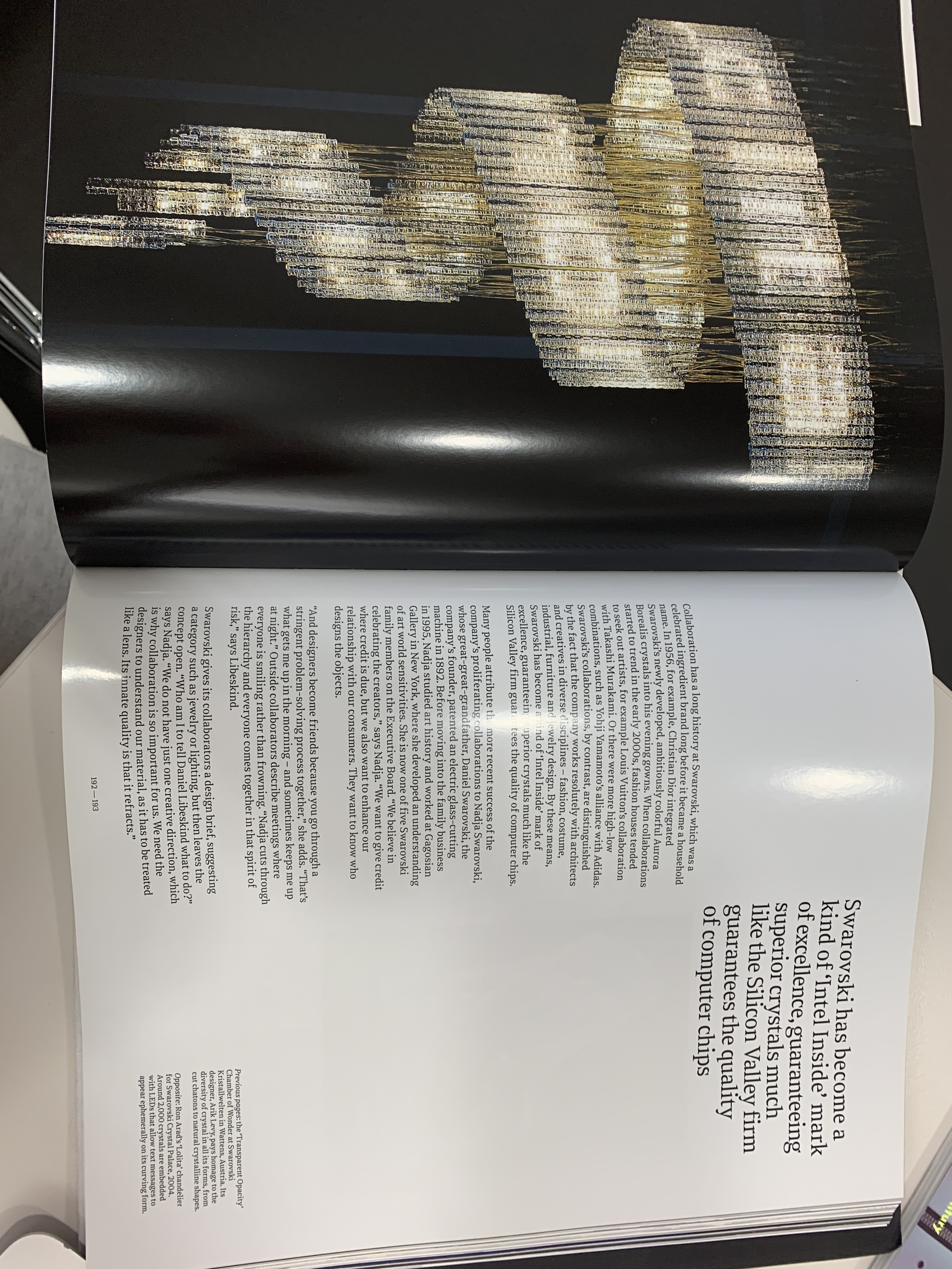
The Atelier Swarovski book is a main point of inspiration as I want to make sure they work hand in hand. The guttering here is smaller than the Selfridges book- it also provides a good grid on the page which is something I am trying to utilise within using grids in indesign to layout my text within. The juxtaposition of the large quote is a theme that I want to translate into Emergence, and the full bleed image next to a page utilising negative space works well due to the spacing of the negative space and text using the grids.
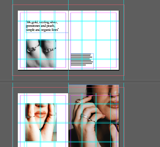
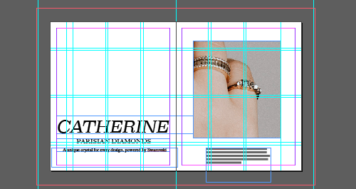
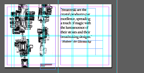
Within creating Emergence I have utilised full bleed and smaller imagery within grids to provide a greater use of negative space and layout- the use of the quotes against a full bleed image is inspiration taken from the Atelier book, as well as utilising a bleed against the imagery and a gutter provided through indesign to give a structured layout to the book.

