Following a tutorial with Harriet yesterday, it was agreed that the two branded shoots ‘Anoushka’ and ‘Catherine’ imagery needed to differentiate slightly so I have been working on giving the Catherine shoot more space to breathe and a greater DNA that evolves with the brand. In doing so I have named the pieced ‘Parisian Crystals’ to elevate the brand DNA and bring the brand to fruition through the images.
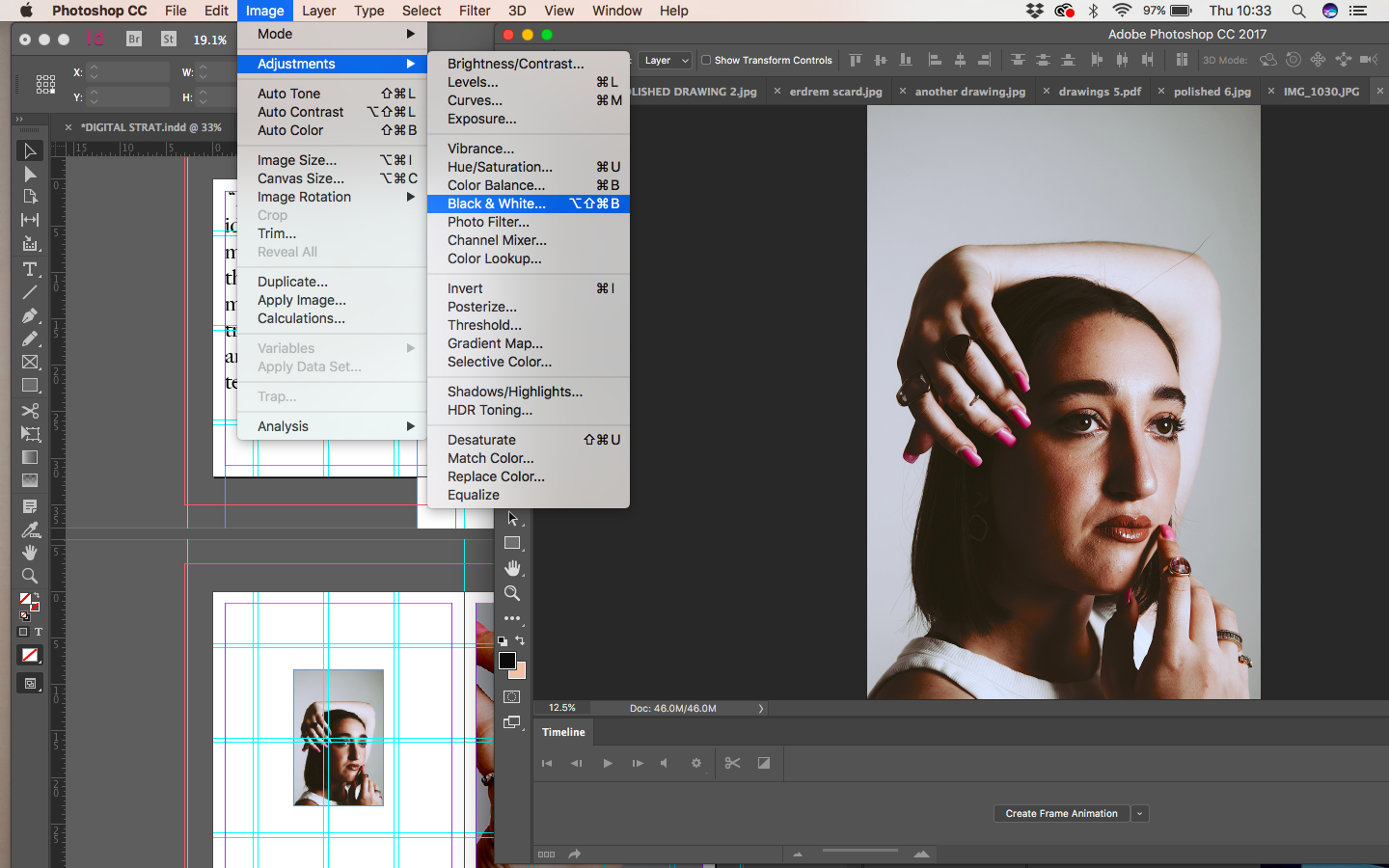
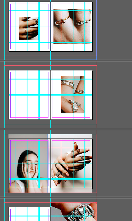
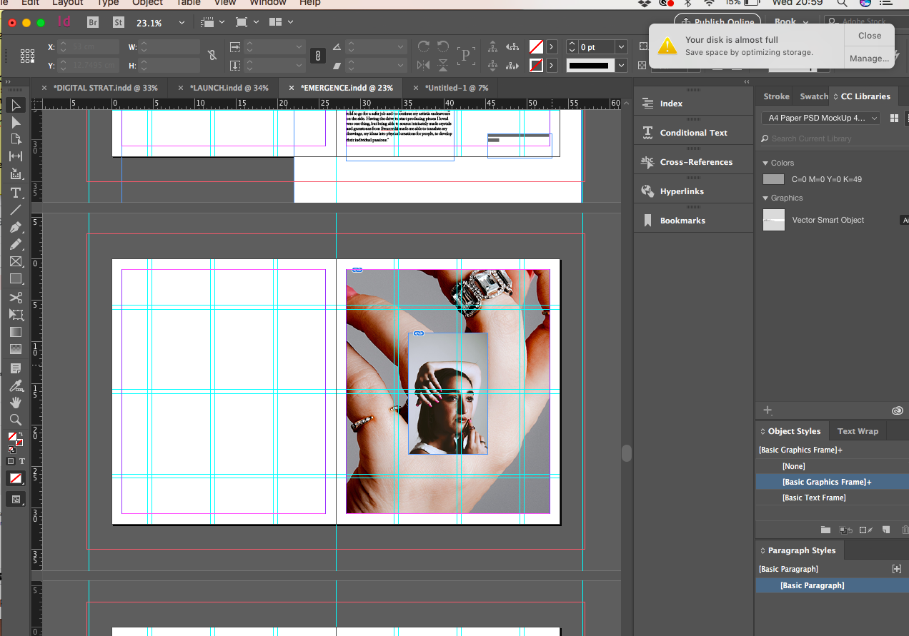
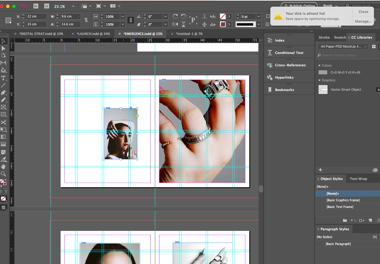
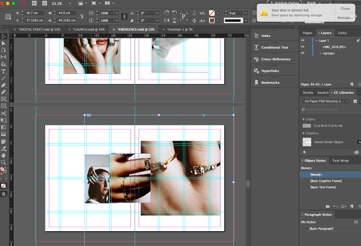
In doing so I decided to experiment with layering on top of imagery to understand if utilising this layout gave the images a greater space to breathe on the page. I also created greater crops in photoshop to bring a greater deal of attention to the pieces. I then decided to pull some of the imagery into photoshop and create some light- in doing so I wondered what the imagery would look like in black and white so I then placed that among some coloured imagery and I think this really differentiates the shoot as well as communicating the minimalist theme of the brand.
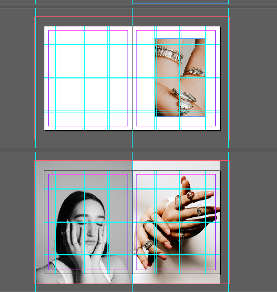
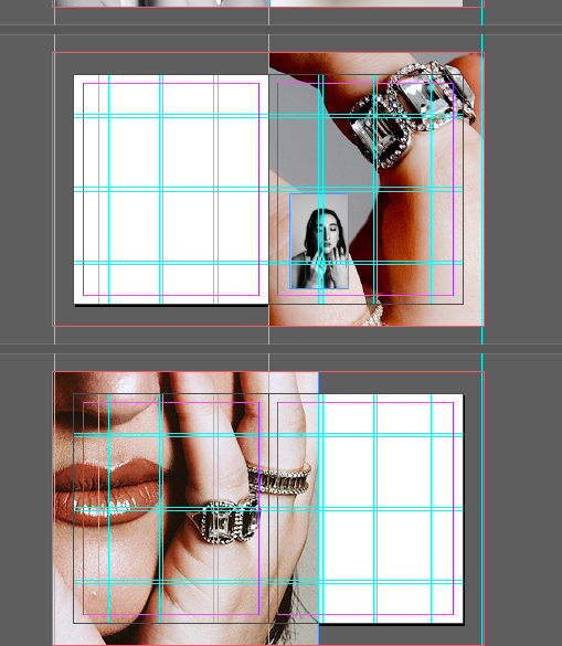
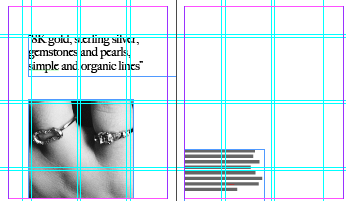
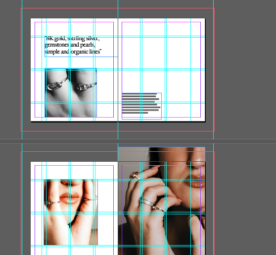
Above shows me editing the imagery and then placing within the pages to see how the black and white worked with the coloured imagery. I think this really makes the brand and the shoot stand alone against the Anouska shoot through the juxtaposition of light and dark as well as crops and the black and white sheen over imagery adds a further glisten.