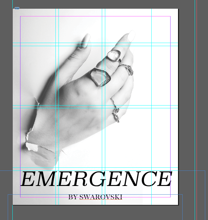
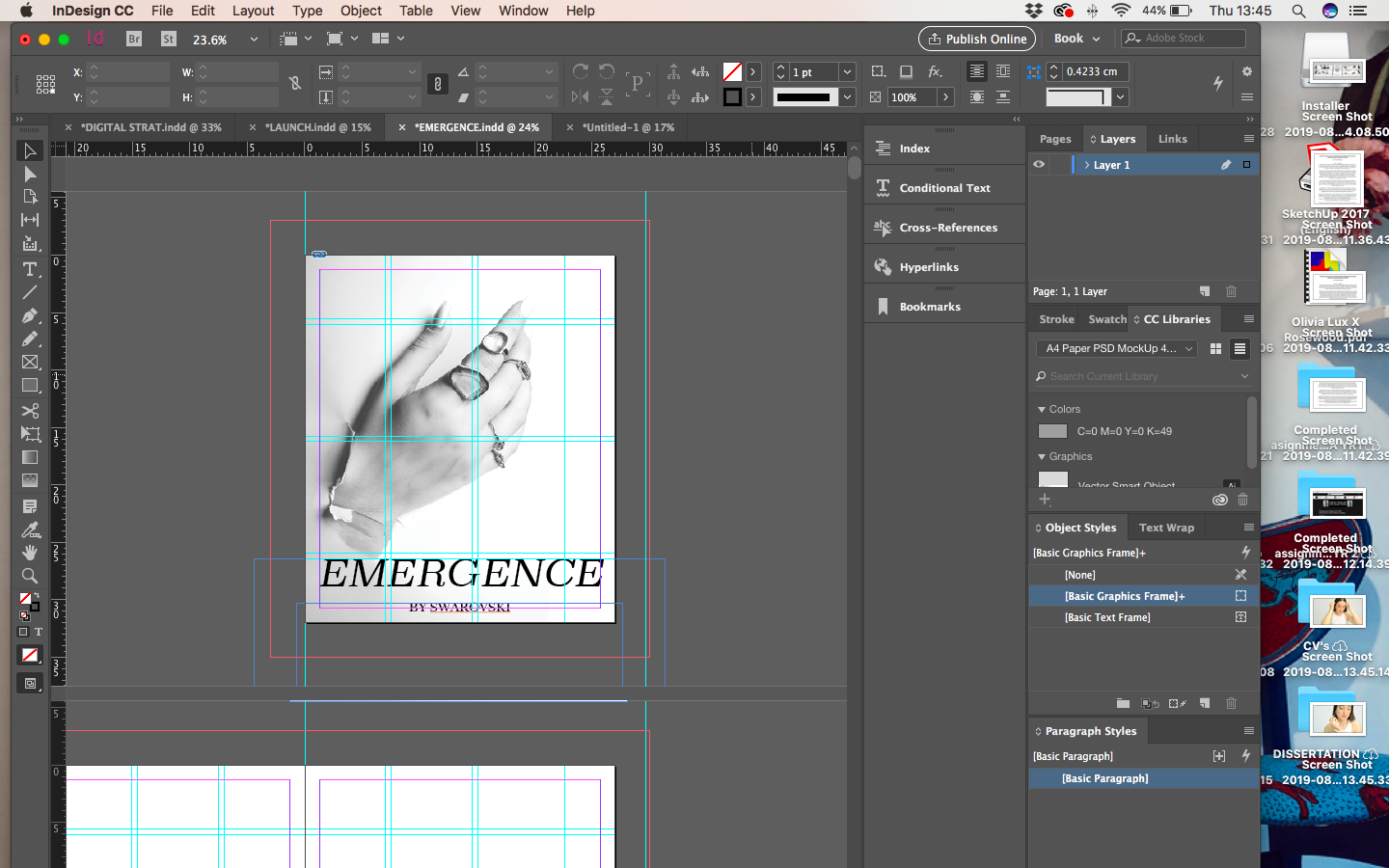
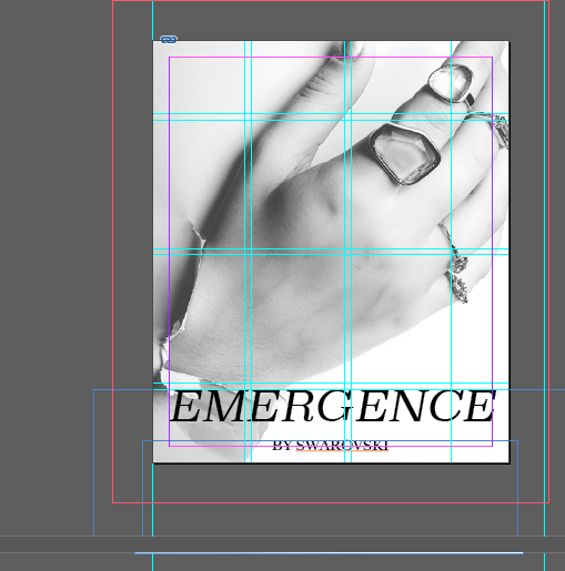
Post tutorial with Harriet yesterday we discussed how the drawing on the cover maybe wasn’t my best option to go with for Emergence. We discussed how this image had a lot of connotation regarding the words emergence and break through and emerging creative so maybe it would make more sense to be featured on the cover.
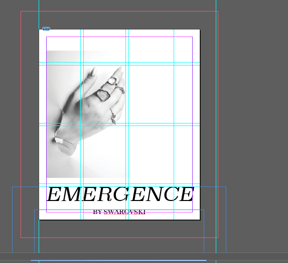
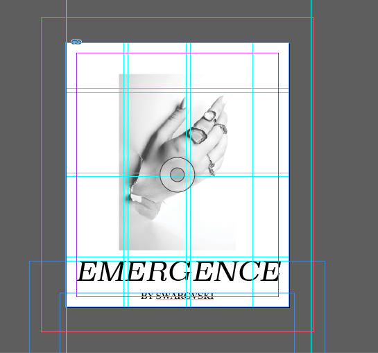
Following this I looked at ways in which the image could look on the cover using transparency, black and white filters and moving the image around the page. I used transparency to lighten the corner of the image to almost look like the hand was coming through the book page itself and lightening the edge really made it look like it wasn’t an image that had been cut off. The top left image is the cover that I like the most and this has been created stretching and cropping the image and using transparency and black and white.

This was the intended cover previous, however I have decided to keep all illustrations inside the publication to keep a more clear structure of the book, in the aspect that it is not an illustration book.

