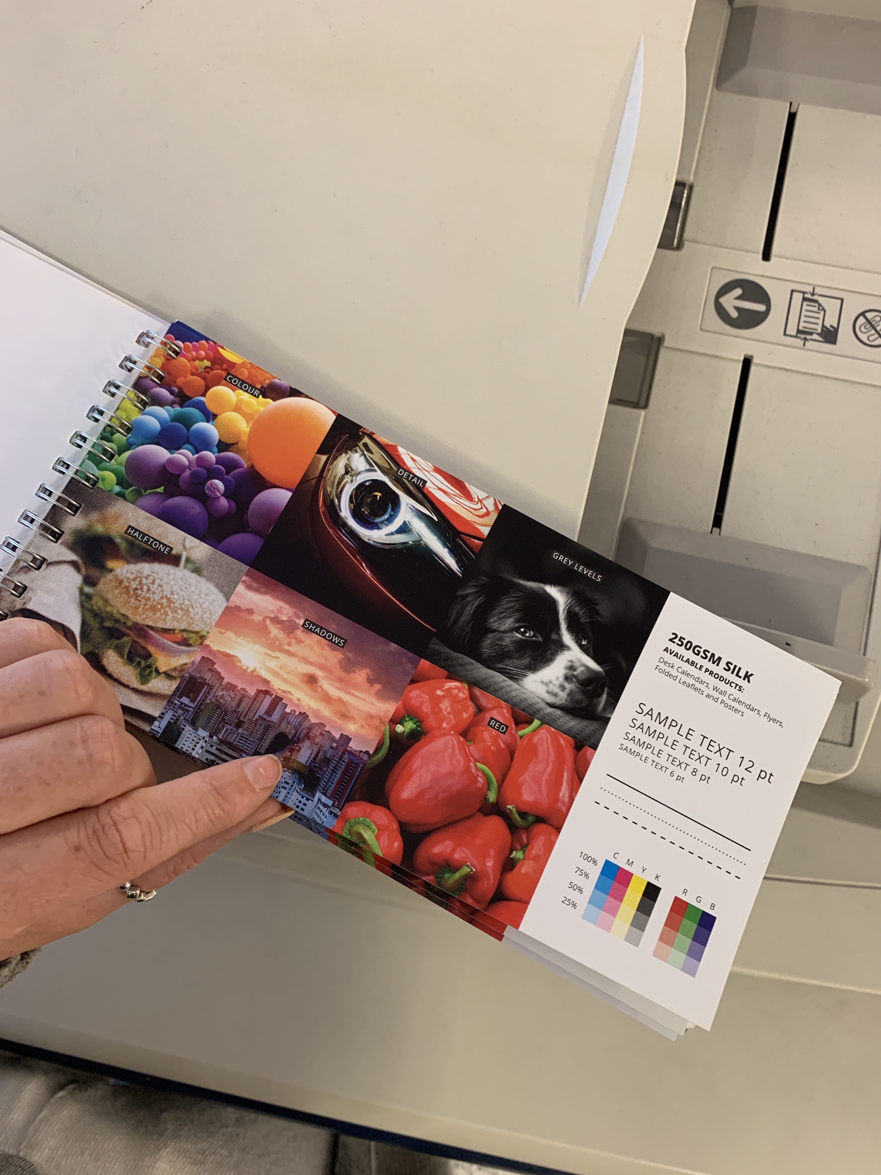
Excitingly, I have been called in for a meeting at Condé Nast on Monday, therefore today I have been focusing on finalising the book itself and print specifications. I am printing at the same shop that I have previously printed a coffee table book at- therefore I can trust that they will do a good job.
I have already chosen my size specifications (as stated in a previous post) to work in collaboration with the already existing Atelier Swarovski book 32×27 cm. Ideally I would like the cover to be matte, however due to budgets and printing restrictions due to me having an image on the cover the covers have to be laminated. I have tried to specify a cover as close to matte as possible and have chosen a matte laminated cover- in texture this was a lot rougher than a normal laminated cover so felt this worked in accordance with the image as closely as I could.
Decoding the use of paper quality in different publications has led me to my final paper printing choices. I was looking into different publications and how the paper reflects the brand, for example- The ES magazine is on very thin paper due to the fact it is a public free publication. However, Lux is on paper around 170gsm thickness and reflects its own branding as a luxury publication.
Papers chosen for the publication were 170gsm Acro, I chose this as it was the closest to a matt page and was advised that this was really good at complimenting imagery within the book. I knew I wanted a heavy GSM and was tossing between 160 and 170 but I really think the 170gsm makes a good, thick and luxurious page in order to feel like turning a luxury thick page of a publication. I believe the thickness of the paper will also further the validation of it being a luxury publication and replicate the luxury brand identity.
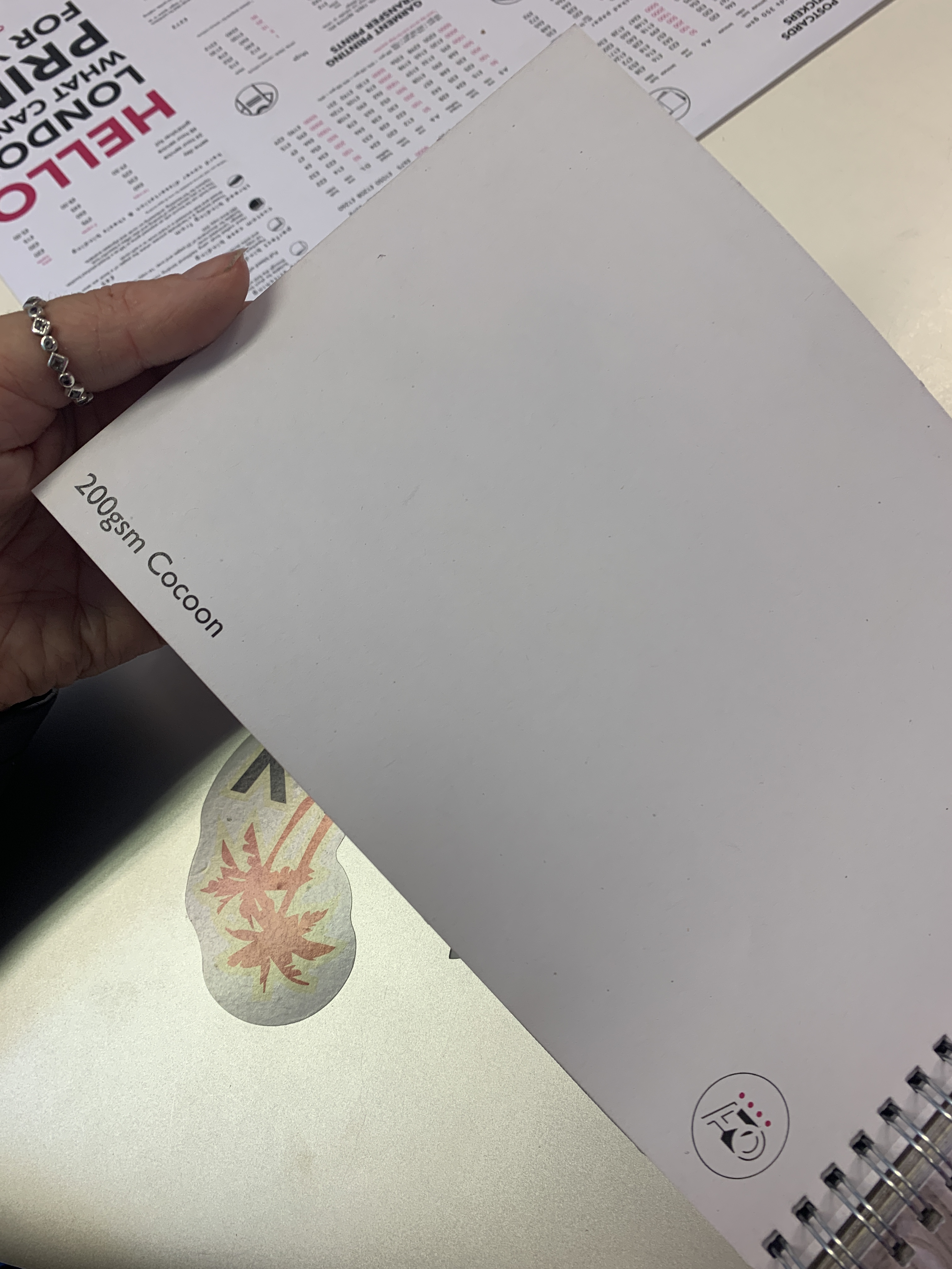
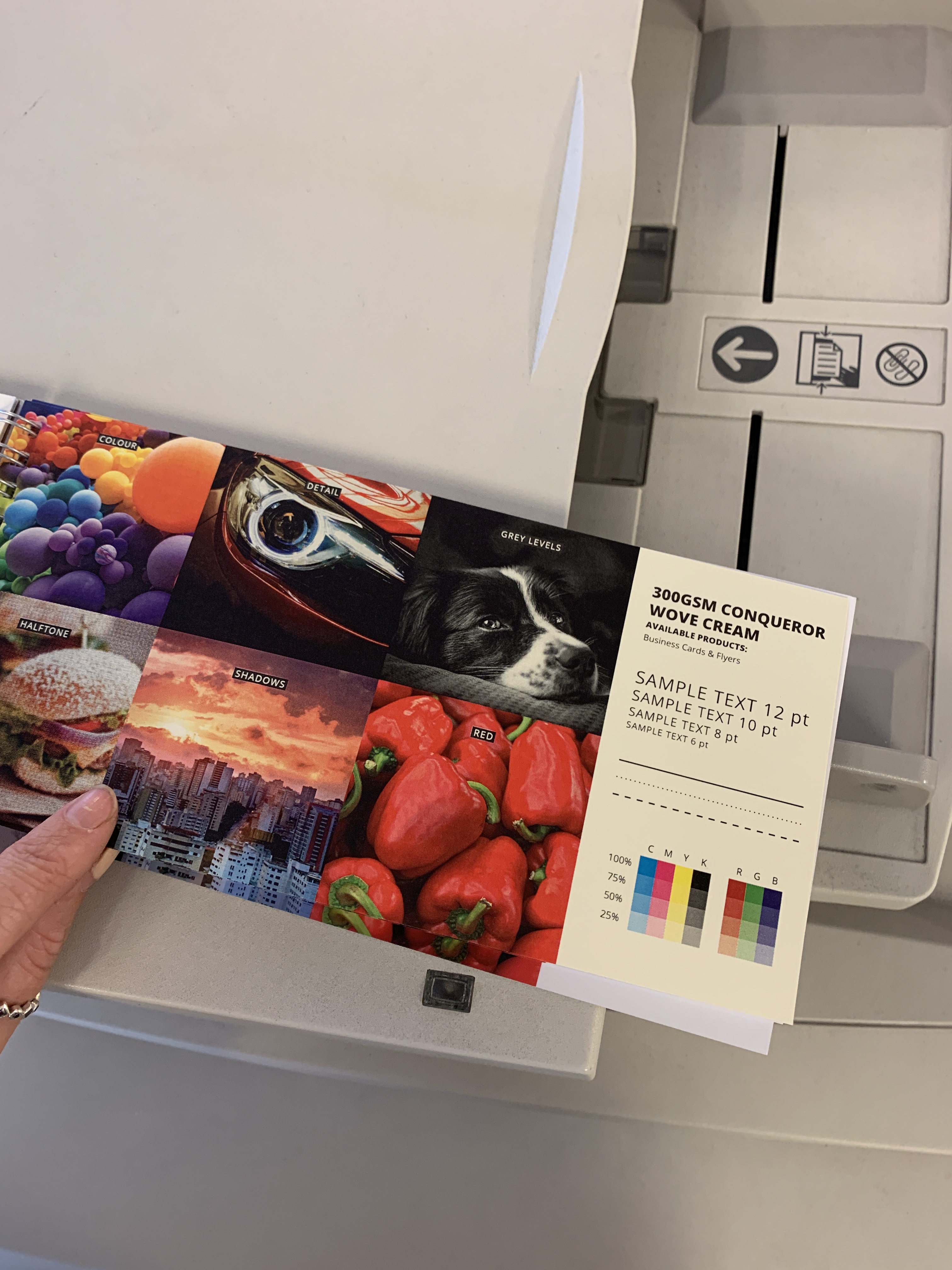
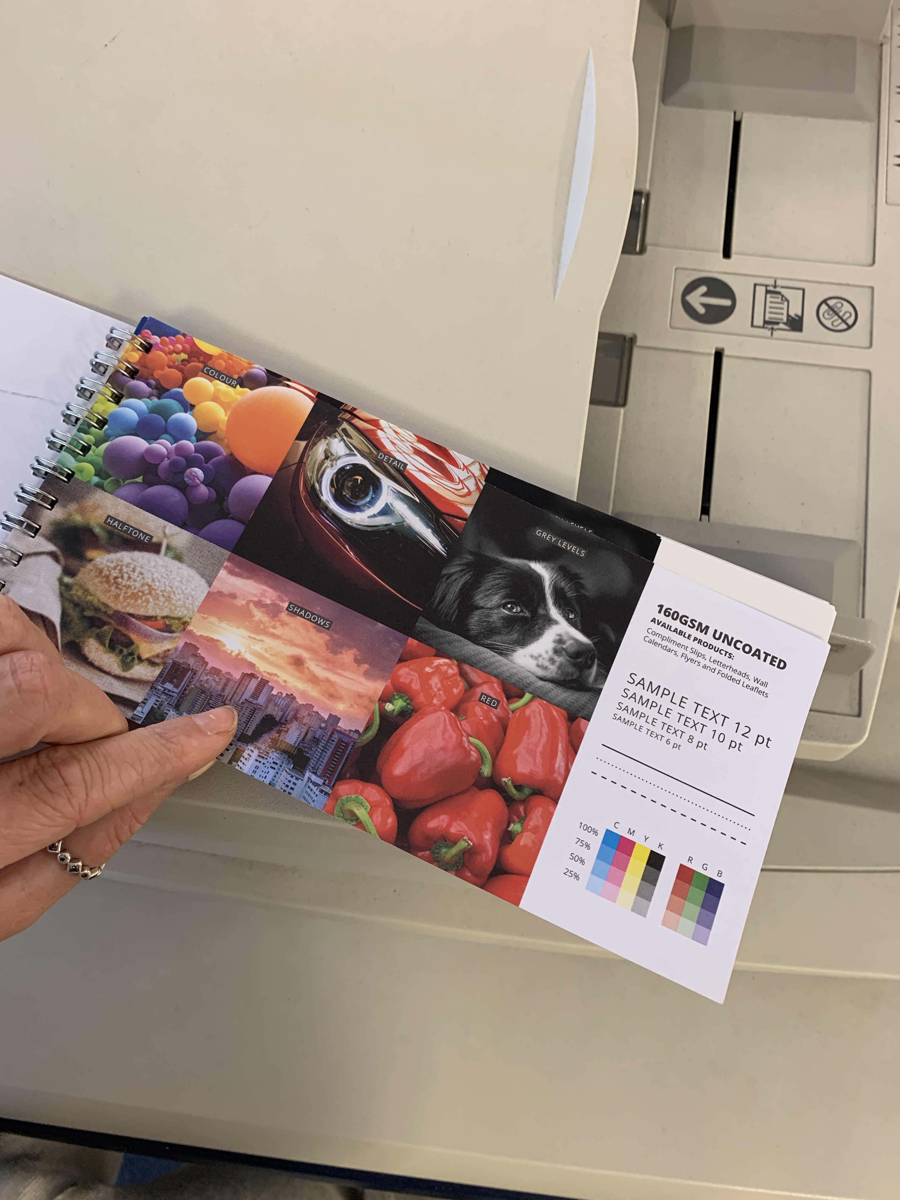
I visited the print shop this morning and was able to test out a few different sets of matte papers, the shop were kind enough to print some imagery out on the options of paper that I was tossing up between.
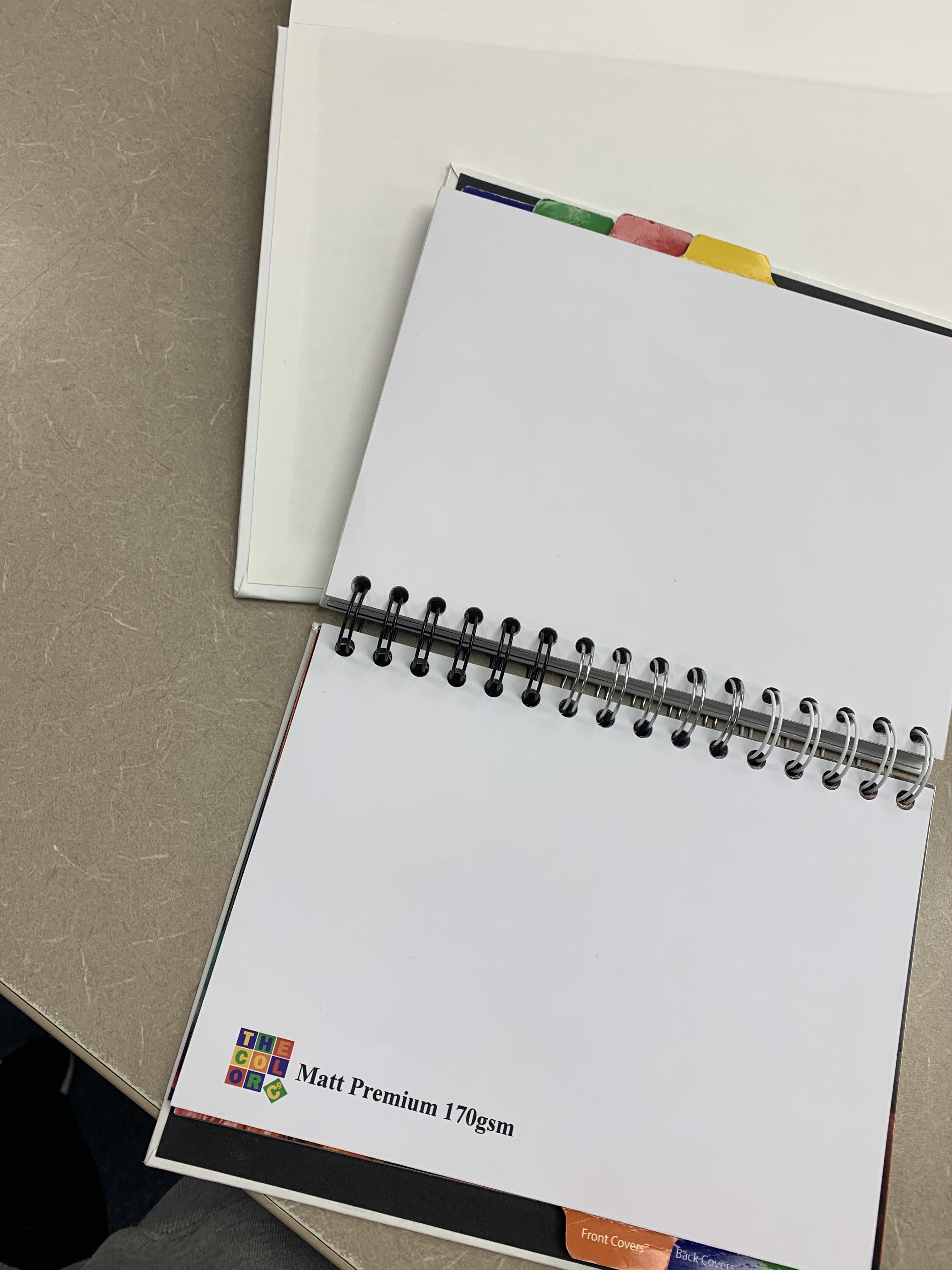
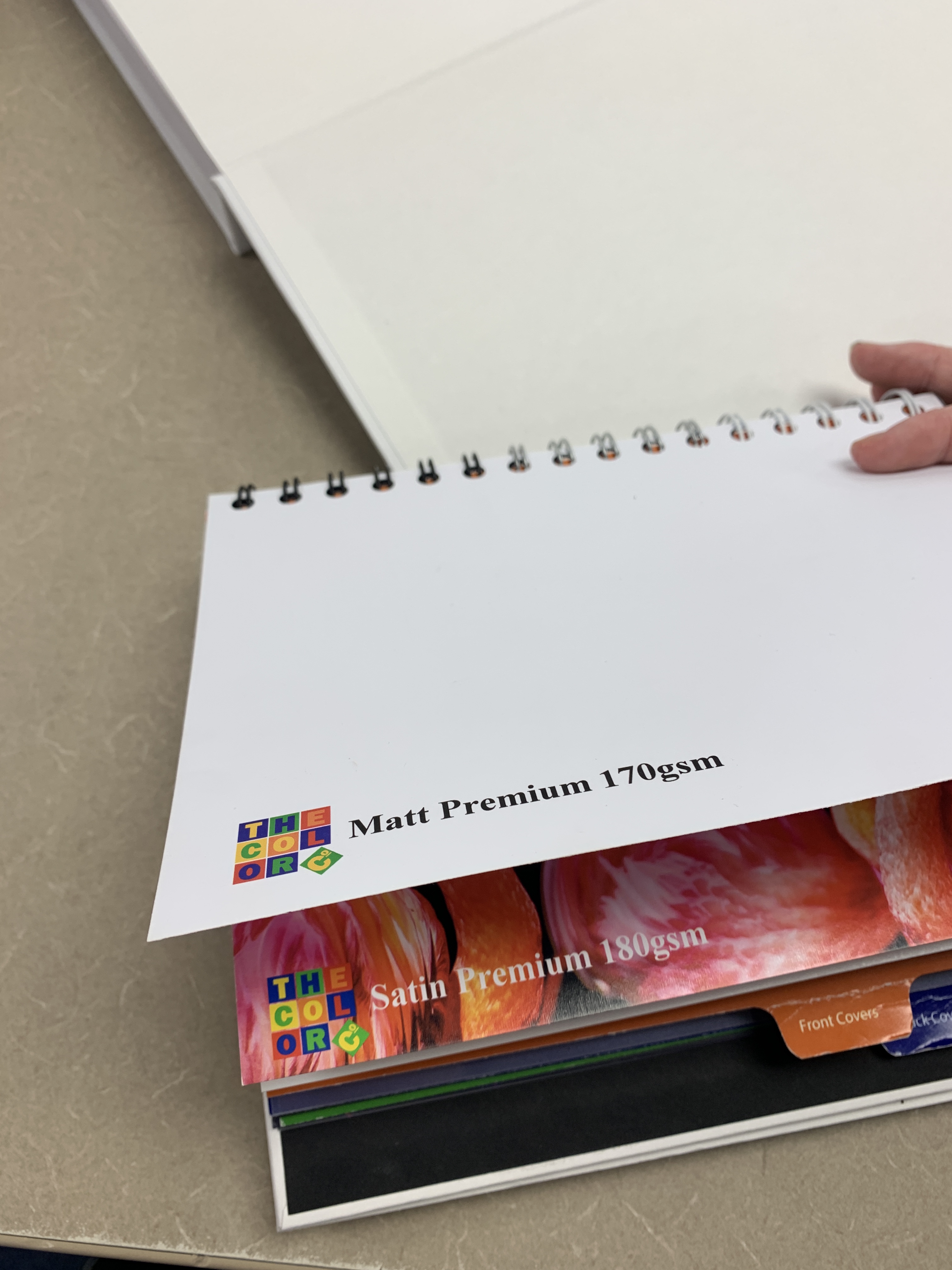
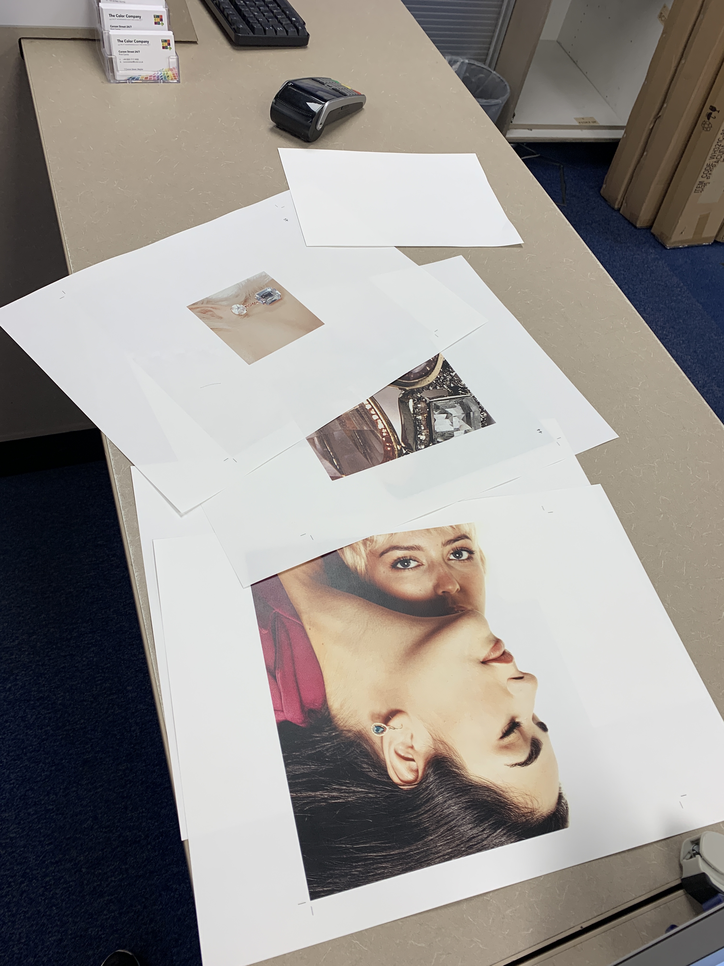
I was then able to see what paper worked better and felt better in general. The reason I was able to settle on a paper was through layering them and seeing which one was less transparent showing the page behind, to add a more luxurious feel to the book.

