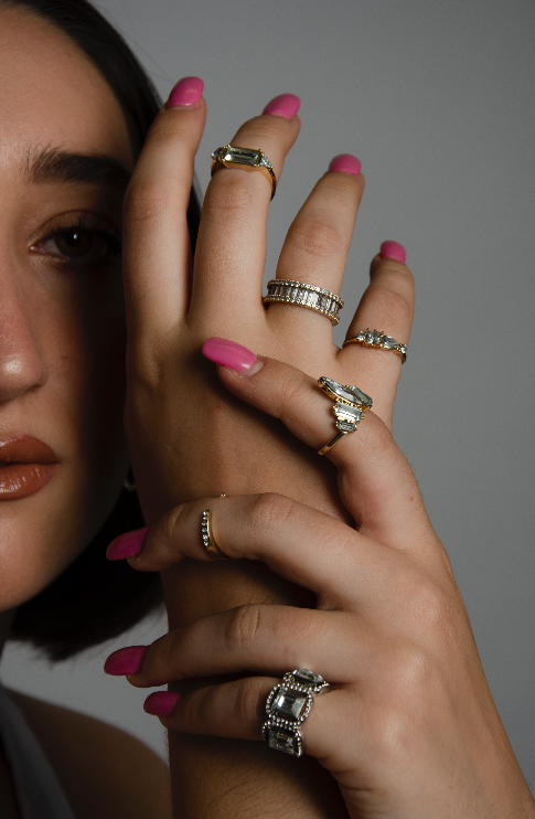
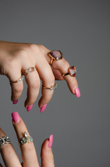
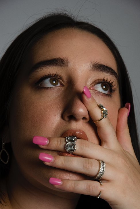
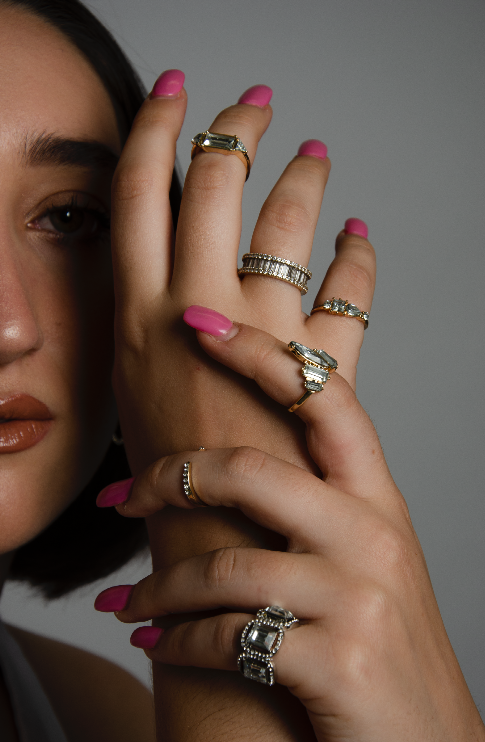
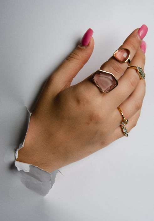
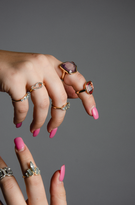
Yesterday I conducted my second shoot for EMERGENCE using pieces sent to me by a brand called Catherine! The shoot took place on the 6th of August in the Condé Nast College studio at 10am. The model, Lem was styled in a white top due to the focus being upon the pieces.
Below are the outcomes of the shoot without any editing- I will take these images into photoshop to brighten them, as well as into Tezza to add filters and edits onto the image to work in accordance with the book and the other shoot.
The shoot worked really well- I was photographer and Sep aided me with lighting instructed by my mood board. We tried loads of different hand poses to be able to get a variety. I really love the ones coming through the paper as it really fits well with the idea of emergence. The shoot was minimal as aimed however the rings really were the centre piece and will stand out on the pages of the book.
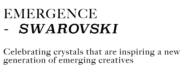
EMERGENCE so far, has been such a fun book to work on. As a young creative myself I find it so important for brands to communicate to their current and future audience of the collaborations and support they continually have throughout the young, emerging, and future creative scene. The aim for this coffee table book is to communicate the way Swarovski support, collaborate and understand the future of the creative industries as well as emerging creatives.
In writing my my recent dissertation, titled “do branded publications form consumer loyalty?”, I found out that branded publications do not form direct consumer loyalty- however, do form a greater amount of brand equity. I conducted a case study into Salt Magazine for Swarovski (published by Condé Nast) and spoke to three readers of the publication. In doing so, I found that over riddlingly all readers liked the branded publication due to the fact they were learning something from the brand that they didn’t know from seeing the brand at face value.
What stood out to me about this figure was that they all were happy and eager to learn more about Swarovski- and in doing so, made them change their attitudes towards the brand. This inspired me to create a collectors, artistic publication based on exposing and bringing to light the collaborations and support the brand have within the emerging creative industries and young creatives. I wanted to communicate this in a luxurious way and give the creatives a platform that Swarovski is able to provide.
In a recent project, tasked to me by the Editor in Chief of Condé Nast Contract Publishing, I was asked to come up with a digital strategy and idea to pitch to a luxury hotel brand, providing a collaboration with the title ‘young creatives’. In doing this pitch I conducted some of my own research towards young creatives.
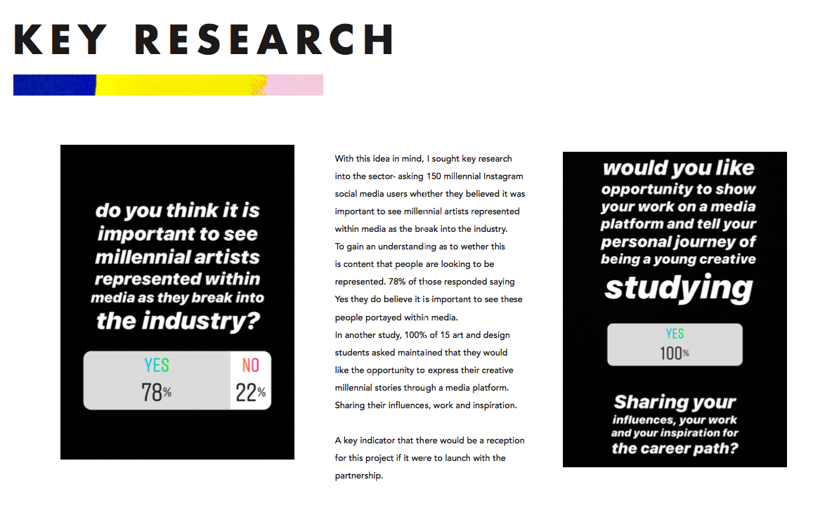
In doing so I asked people if they believed it was important to see millenial artists represented within the media- 78% stated yes. In another question, I asked young creatives and creative students only if they would like the opportunity to present their work on a media platform and 100% stated yes. As much as this helped me with the project for Condé Nast it also allowed me to open my mind into understanding this data for my own IFCP.
And finally, when speaking with Darius Sanai- Editor in Chief of Condé Nast Contract Publishing and of Salt Magazine for Swarovski I asked him why communicating through print publishing was still appropriate for brands. He stated “if you are a brand you have many routes open to communicate your brand now, and the print is a pillar that is distinct. It is not something that I think will replace it is something that I think is along with other pillars so you are going to do film, digital and social- but what print has still images of lasting value (so you will keep looking) and it will get the attention. You can produce a great video but no one is going to watch it, or if people do watch it you might have spent a lot on it and it engages people very briefly. With print people go back to and it needs to be a work of art in themselves so it needs to be something people keep, value and show. If you are watching Gucci’s video through GQ on your phone then no one knows but if you have a copy of Vogue in your house then people know you are a Vogue reader, so that has a certain personal branding element to it”
All these aspects of research have been placed together in order for me to produce a piece of branded print communication as a piece of art to bring to light knowledge of a brand, Swarovski.
The font I have chosen for EMERGENCE- Is a mix of Big Carlson and Superclarendon. I have chosen this mix to convey a sense of heritage and luxury around the brand as well as communicate the modern and young creative side of the brand that I am exposing through the book, so therefore I felt the fonts complimented each other well and fitted with the ethos and DNA of the book.
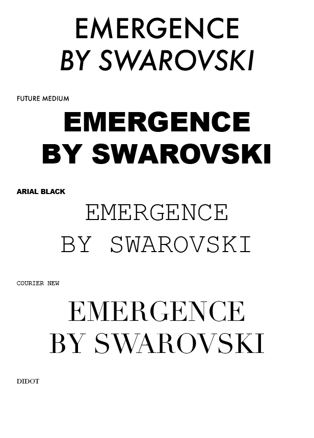
Throughout the process I have also experimented with FUTURA MEDIUM. However, I liked this font as it felt it was fresh and modern, of which I am trying to show the modern side of Swarovski- I felt it did not speak enough of the luxurious art feel that not only Swarovski has but also a feel I want to carry on through EMERGENCE, even when focusing on young and modern creatives. Therefore felt it wasn’t the right choice.
These are all the fonts I trialed when starting to design. I began with Futura, however felt this was too off brand for Swarovski as it was a sans serif font and all Swarovski fonts used are Serif fonts, it therefore almost felt less elegant to use. Arial Black I was trialing to see if something bolder would work to push the idea of emergence however this was too heavy for a luxury book and publication and seemed far to strong and abrupt for the eye to focus on. Courier New is almost like a type writer font and I thought through using this it may give a theme of creativity and almost like a sketch book, however the font looked slightly immature for such a brand like Swarovski, I needed to find the perfect mix of the elegance and creativity. I trialed using the Vogue font Didot to see if this gave a bit more classic elegance, however it looked to my eye to similar to the Vogue font so I went to trial a combination of the Swarovski font ‘Big Carlson’ and a similar font to Didot but slightly italic to give a definition in text with the font ‘Superclarendon’.
I also tried out the fonts in Superclarendon throughout (I have settled on a mix of this and Big Carlson). I felt that with this being so bold throughout becomes confusing and mis matching to the eye- with all text in this it felt that the levels of the letters were wrong and it didn’t read well, which is what lead me to using it only slightly throughout the book.
These are all the fonts I trialed when starting to design. I began with Futura, however felt this was too off brand for Swarovski as it was a sans serif font and all Swarovski fonts used are Serif fonts, it therefore almost felt less elegant to use. Arial Black I was trialing to see if something bolder would work to push the idea of emergence however this was too heavy for a luxury book and publication and seemed far to strong and abrupt for the eye to focus on. Courier New is almost like a type writer font and I thought through using this it may give a theme of creativity and almost like a sketch book, however the font looked slightly immature for such a brand like Swarovski, I needed to find the perfect mix of the elegance and creativity. I trialed using the Vogue font Didot to see if this gave a bit more classic elegance, however it looked to my eye to similar to the Vogue font so I went to trial a combination of the Swarovski font ‘Big Carlson’ and a similar font to Didot but slightly italic to give a definition in text with the font ‘Superclarendon’.
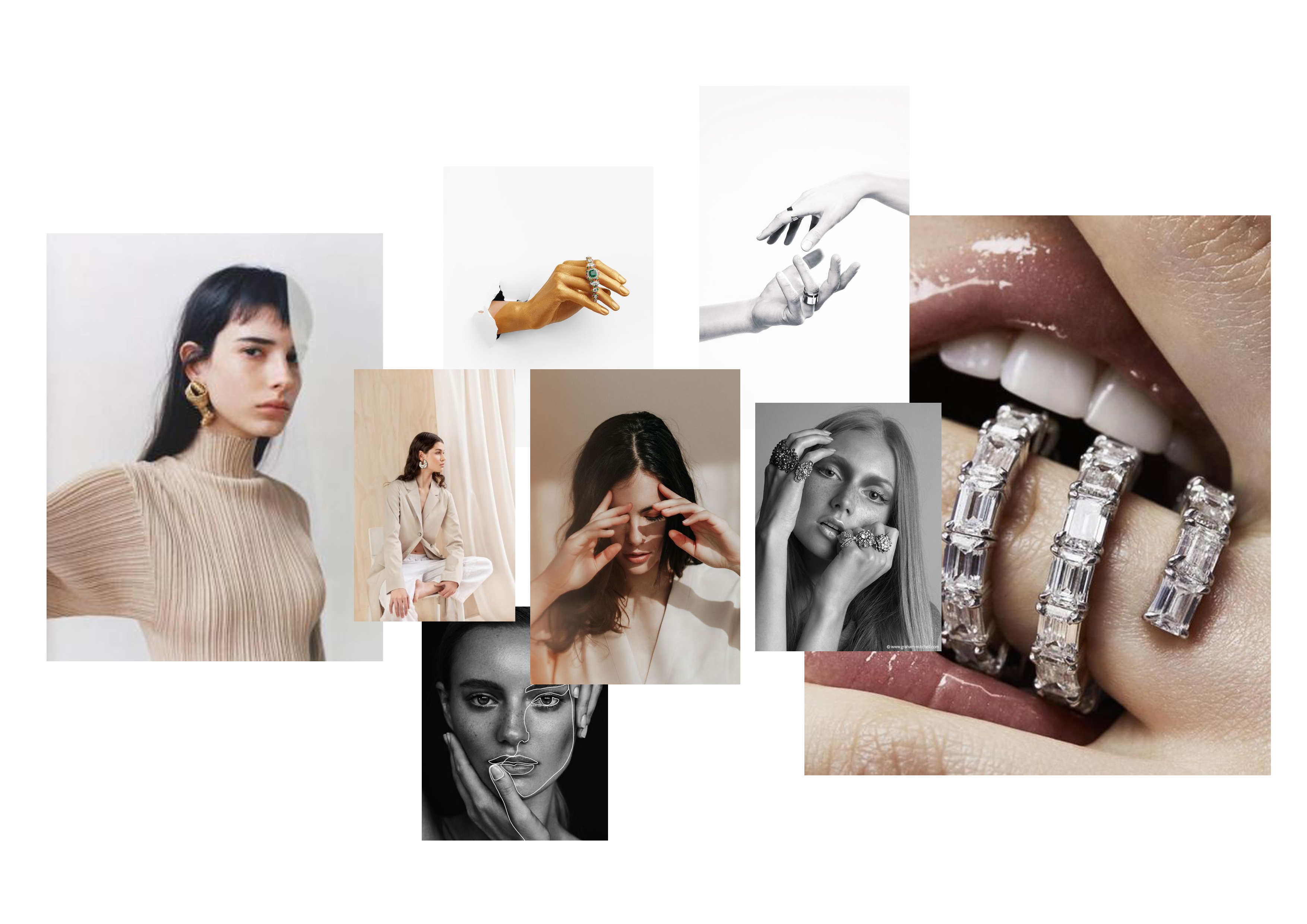
For my next shoot, I have sourced boutique ring brands to shoot. I aim for the shoot to be minimalist themed and simplistic with heavy focus being on the hands, rings and the face. In doing so I have carefully selected my model, Lemonia. Lem is my chosen model for this shoot due to her minimalist elegant natural look, I aim to style Lem simplistically through pale beiges, whites and blacks and photograph her on a white background. I have met with my model and we have gone through how the make up will look. I will be doing the makeup on the day due to having practice in the field- I know I want to convey a rough, glowy and natural look. I have created a mood board for the shoot featuring hand posing imagery for Lem to gain an understanding of how to model hands as well as lighting to add a dramatic shadow to the side of the face bringing focus to the rings and the crystal.
The imagery I aim to be simplistic, up close and detailed in order to convey and communicate the emerging jewellery brands of Swarovski and the young creatives involved.
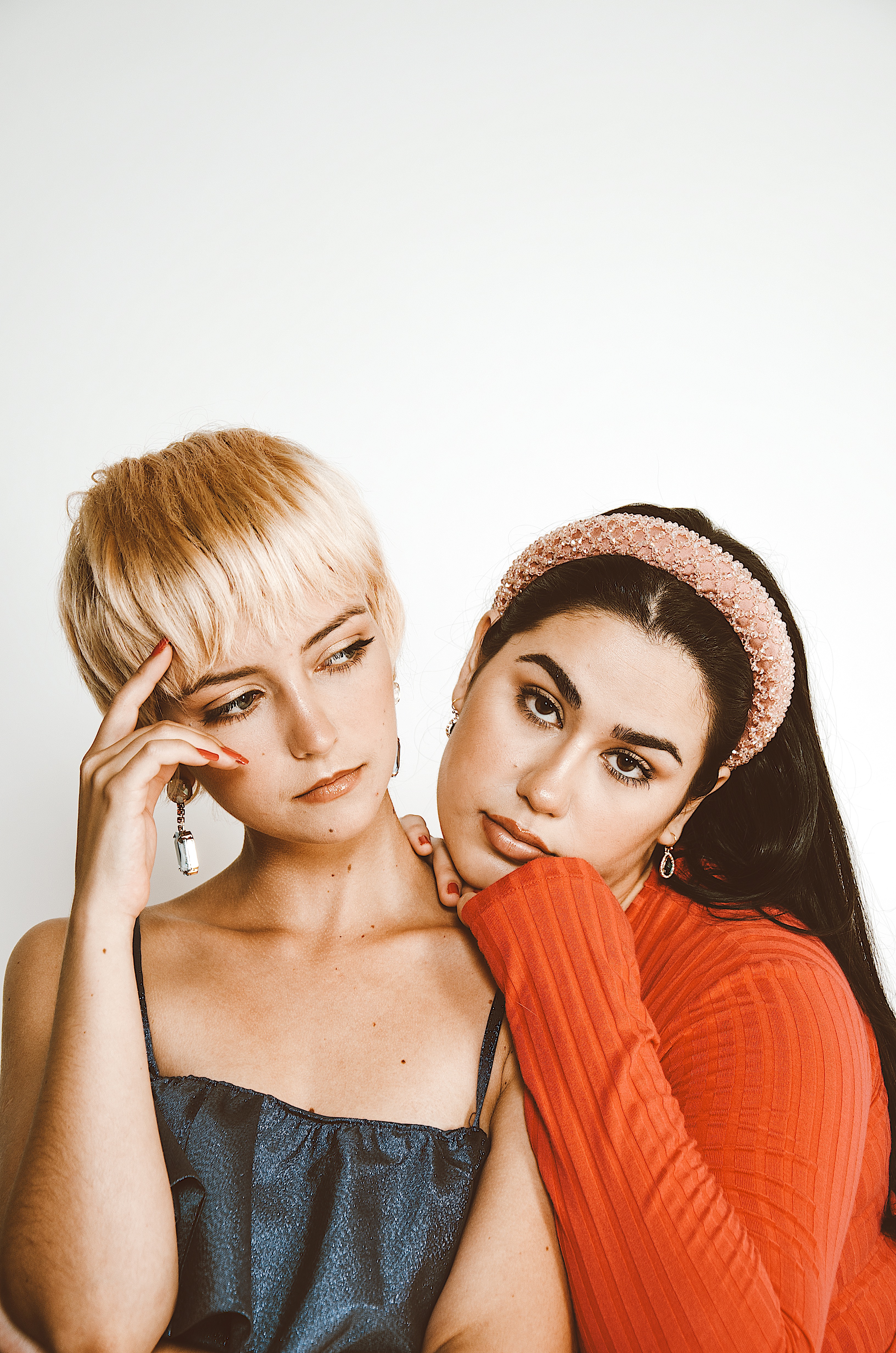
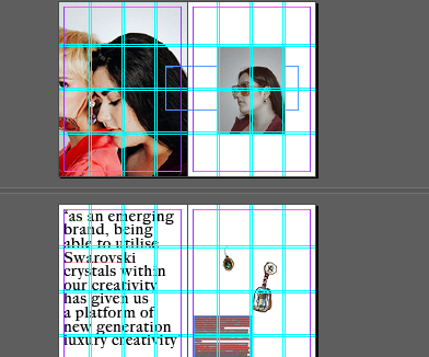
Shooting the brand Anouska with 2 earrings which they sent me, I styled these pieces according to a pink theme in order to compliment the colours of which they have sent me. I also paired with some hair accessories to push the vintage glamour feel of the shoot.
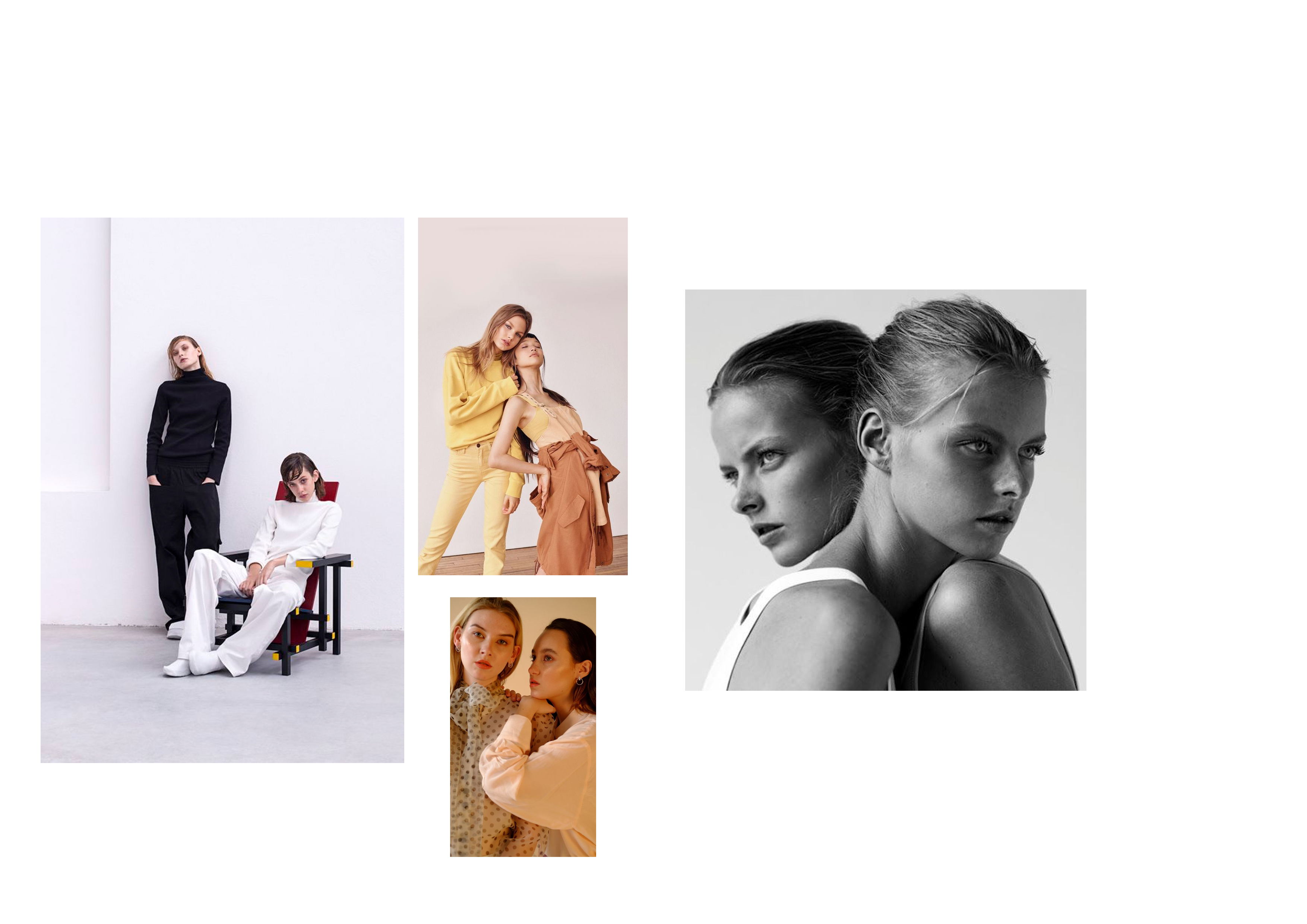
My models were Giulia and her sister, the reason for choosing these two models were due to the brand itself. Anoushka was set up between sisters and developed the brand from a love of creativity and wanting to add a modern take on the classic pieces. I then planned my shoot accordingly to the brand ‘ethos’ of Anoushka and believed having two sisters that could translate the close and intimate relationship of the brand through the images would work well. The models worked really well together and conveyed their relationship through the camera in order to translate with the brand that I am highlighting. The reason the imagery worked well was due to the relationship we had that blended well with the brand, as well as the models being young translating the feel for a modern vintage through Anoushka, which is what the emerging brand is all about.
Today I have been researching further emerging creatives and designers of whom use the crystals within their work. In doing so today I came across a Central st Martins X Swarovski Collaboration – in which they open a jewellery design competition and propose a cash prize to the winner as well as their pieces shown within the V&A. The collaboration between the insitute and Swarovski is a 16 year partnership and something they hone into when exposing young creatives.
I took this further and wanted to find the young creative who designed and made pieces for the 2019 competition- being a CSM Alumni myself I got in touch with friends I have on the Fashion design courses and they were able to place me in touch with this years winner- Piran. I contacted Piran explaining the project, the highlight on emerging designers and the coffee table book itself and he has stated he is more than happy to help and to meet for an interview in the week!
With this exciting development I have created a chapter within Emergence based on Piran and the CSM X Swarovski partnership of celebrating young designers using the crystals. I look forward to meeting with Piran this week to see his creations and have an interview, of which I can use for a great piece of editorial within Emergence!
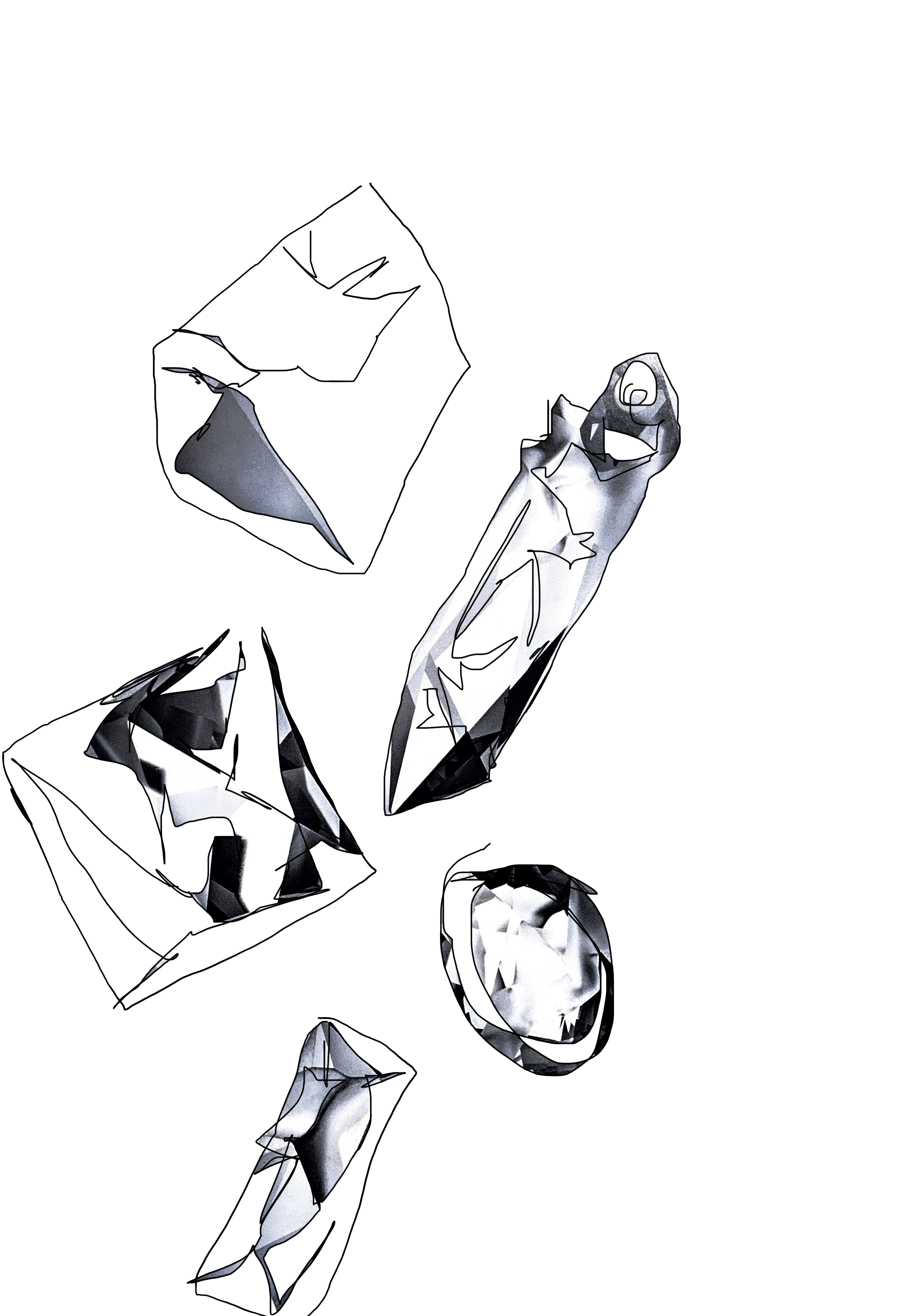
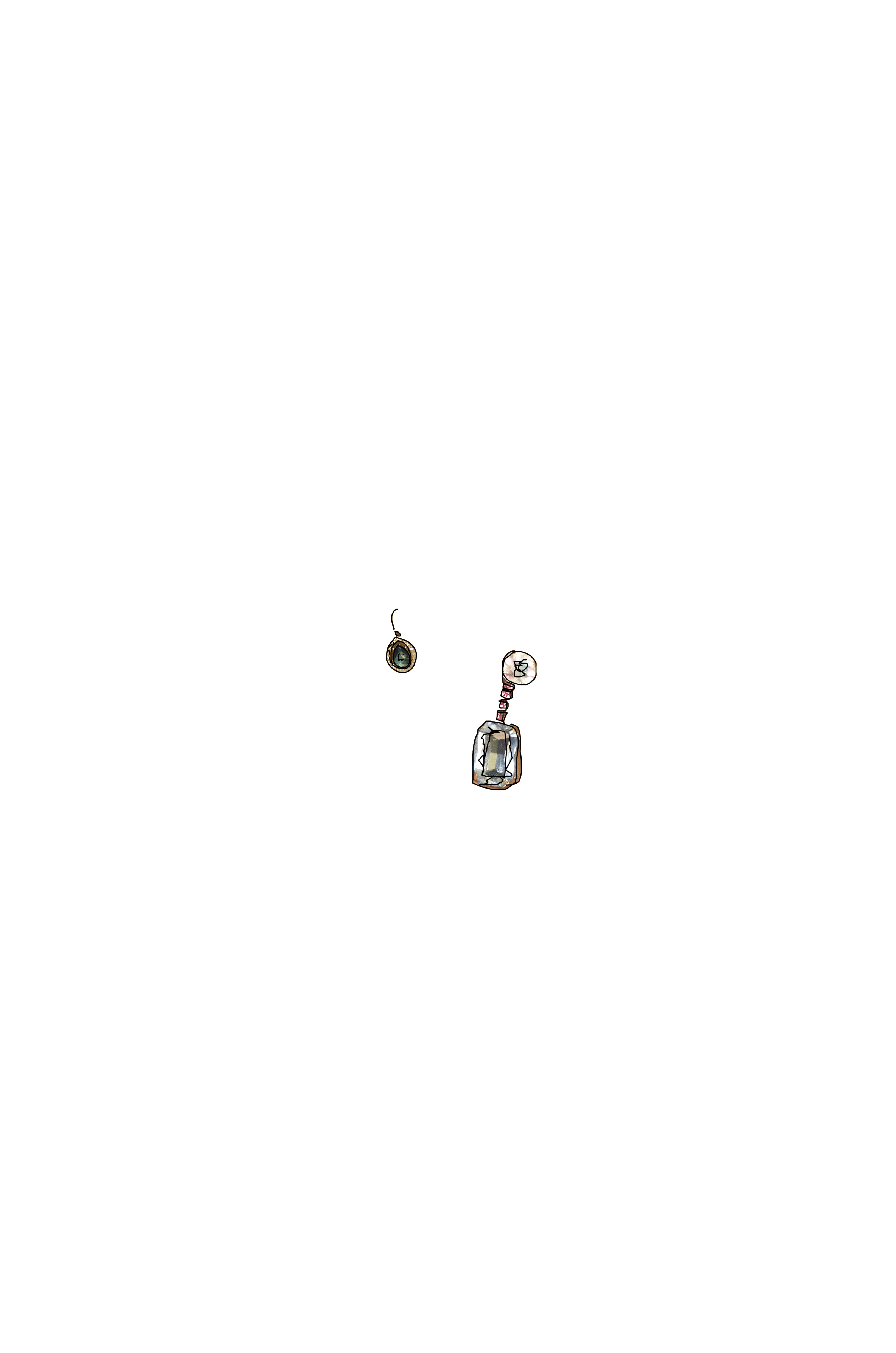
As I begin to place editorial and images together within the book I have noticed throughout the Atelier Swarovski book they utilise designers sketches and drawings. As I was looking for something to bring the two entities together I found sketches and expanded upon previous sketches to add to the page design. I believe that this really echo’s the notion of what the book is about- highlighting and displaying emerging brands utilising Swarovski, and therefore having ‘skatchbook like’ pages will compliment the idea well throughout the book.
I have had my first shoot for the book and the images were great. I am in the process of editing the imager to place and crop into the book. The images were really raw and natural- the colour pallet has worked really well and during post production I aim to make them look really raw to draw attention to the jewellery in the imagery.
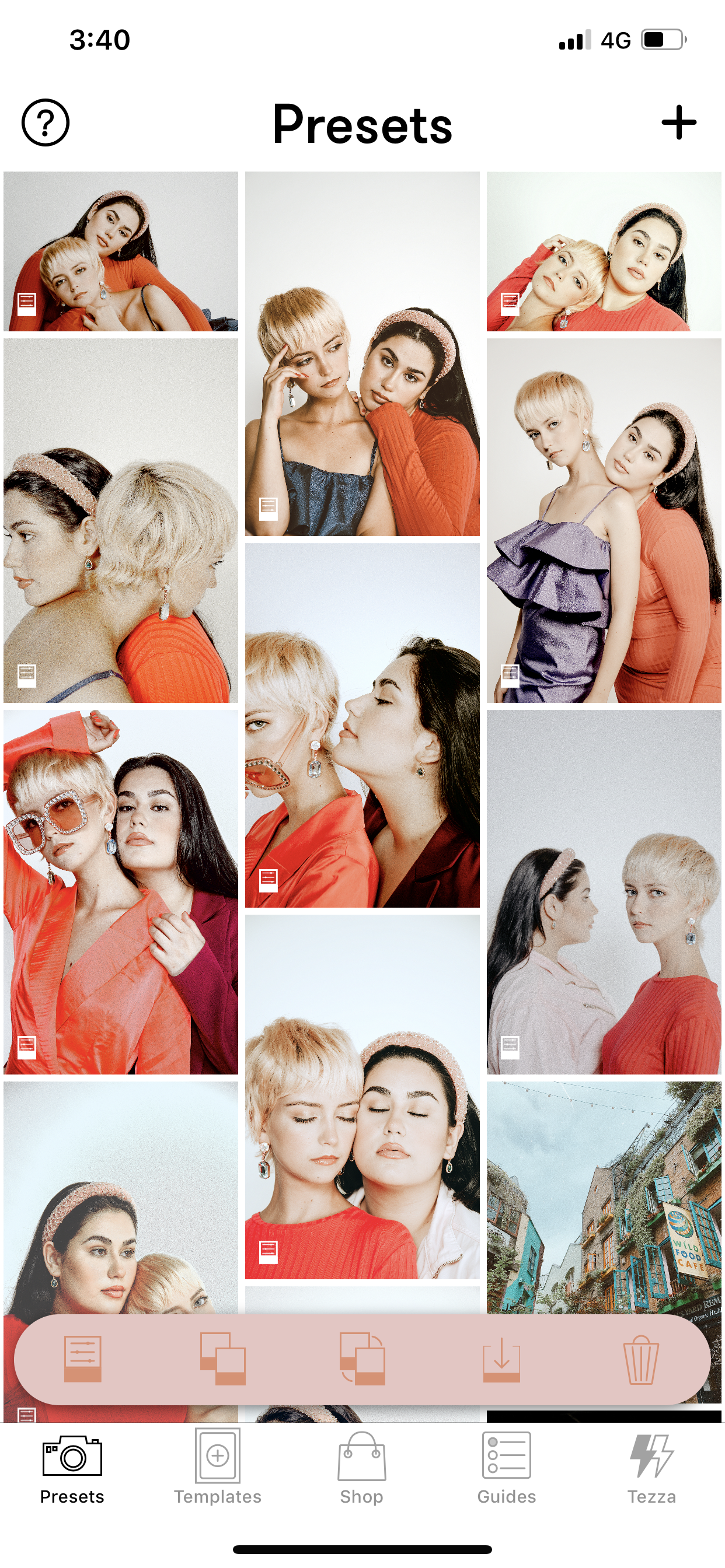
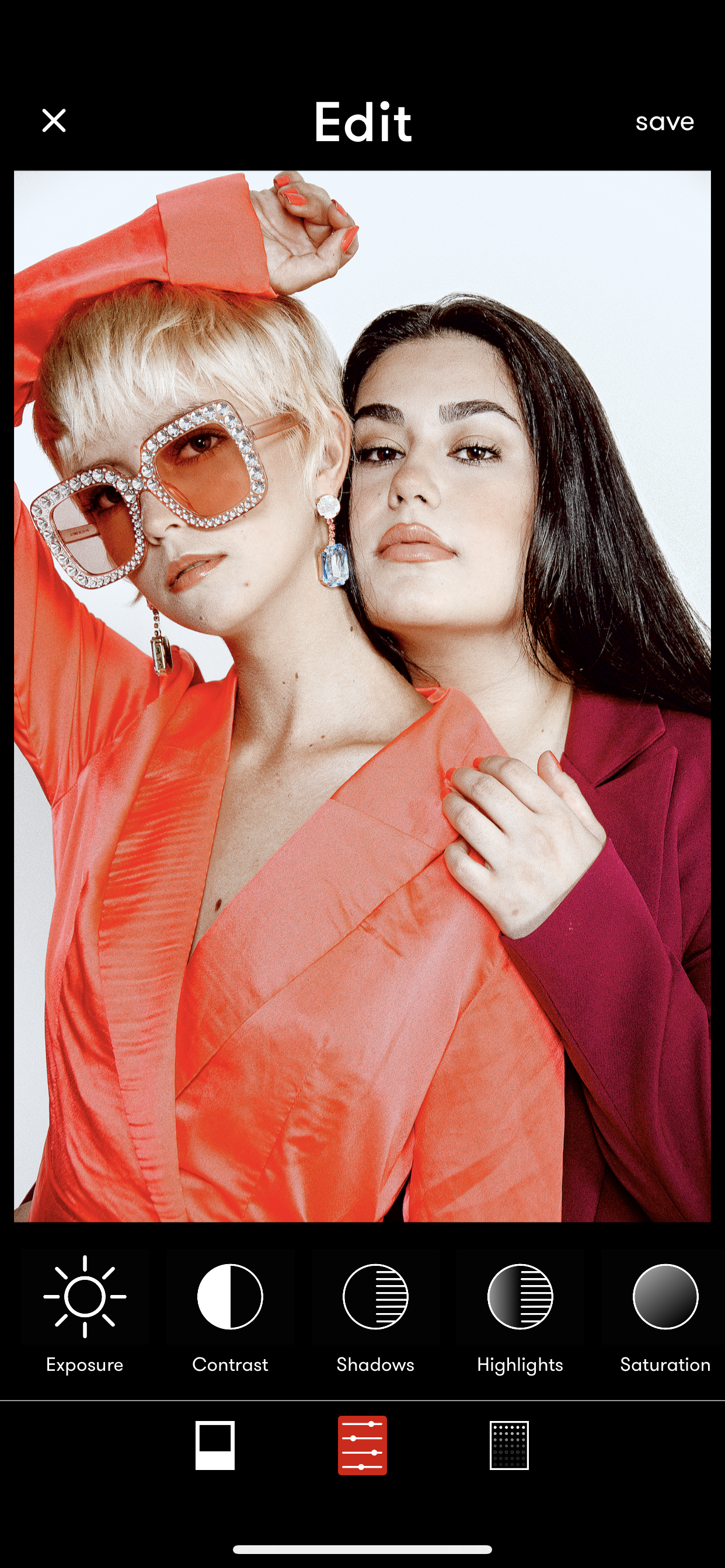
Using the editing application Tezza I have been able to sharpen and lighten the images, on a few of them I have added a slight grain as I feel these compliment the sharpness of the others when placed next to each other on the pages.
Using two models has worked really well and the models used had great chemistry, as wished, which allowed me to capture so many natural poses between the two- highlighting the youth of the jewellery really well.
For the publication, I am looking to make the publication heavily photography with small bites of editorial throughout- in doing so I drafted some key editorial pieces that I know are crucial to go inside the book and began writing them out. The key pieces I will include are : The emergence of Swarovski, Collaborations, Encouraging Emergence and pieces on emerging brands used throughout.
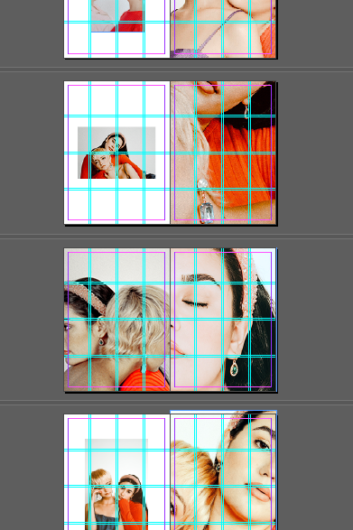
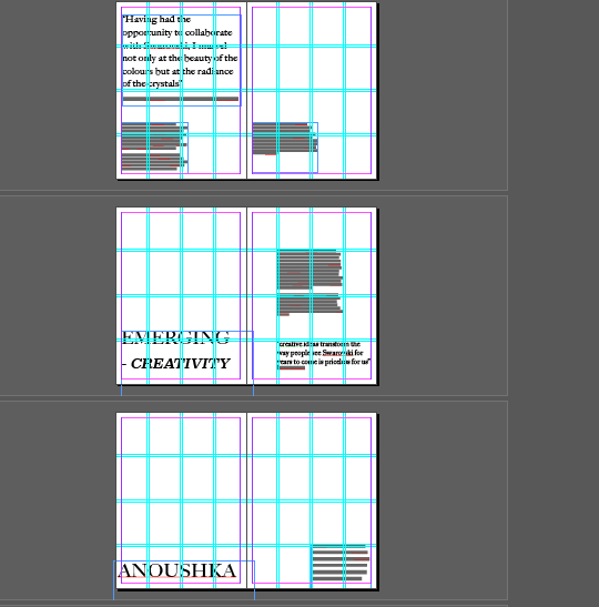
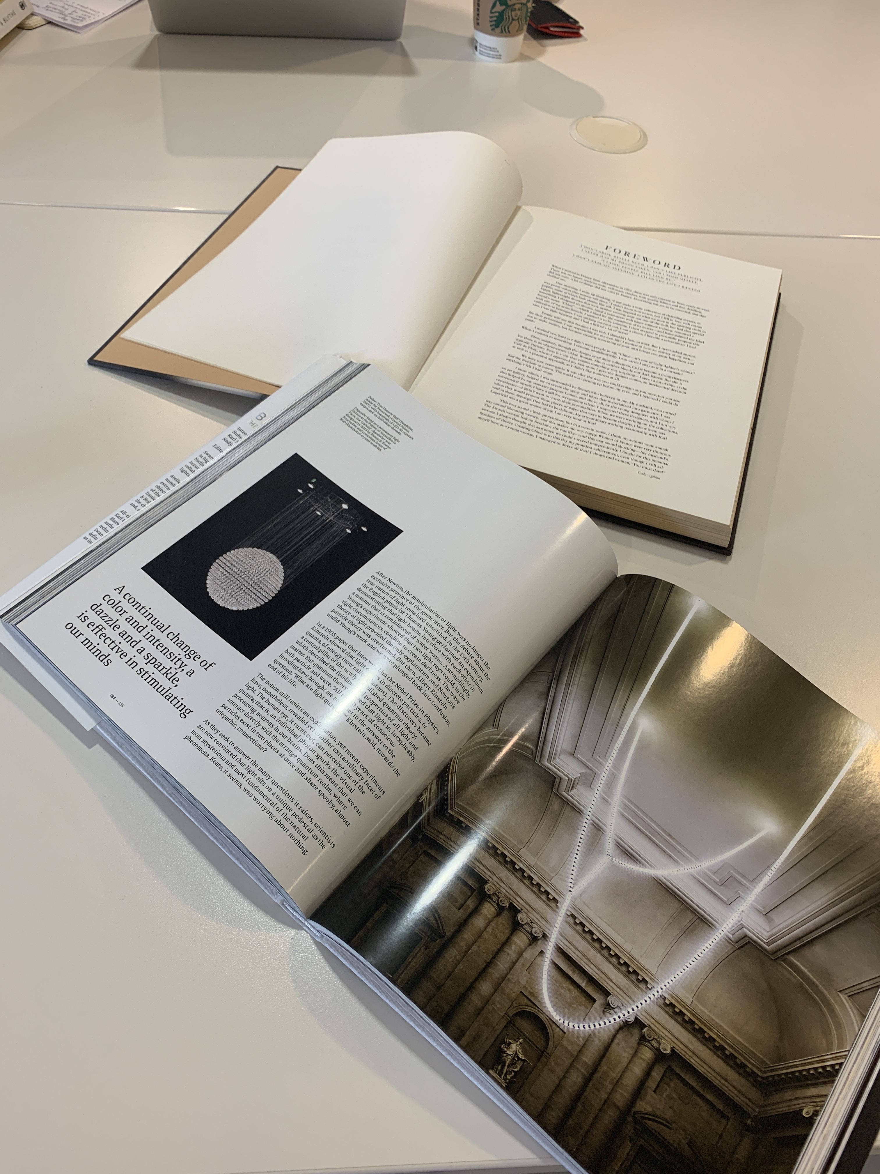
I want to keep the book heavily aesthetic and creative and therefore considering layout is important. I have been reading the Atelier Swarovski book to gain knowledge of how Condé Nast publishers have previously considered the lay out and I want to take aspects from that but make it more current and hone a focus on new gen creativity so create a more fresh looking lay out. I have taken inspiration from the “Chloe, Attitudes” as well as the “Dolce and Gabbana- Alta Moda” book.
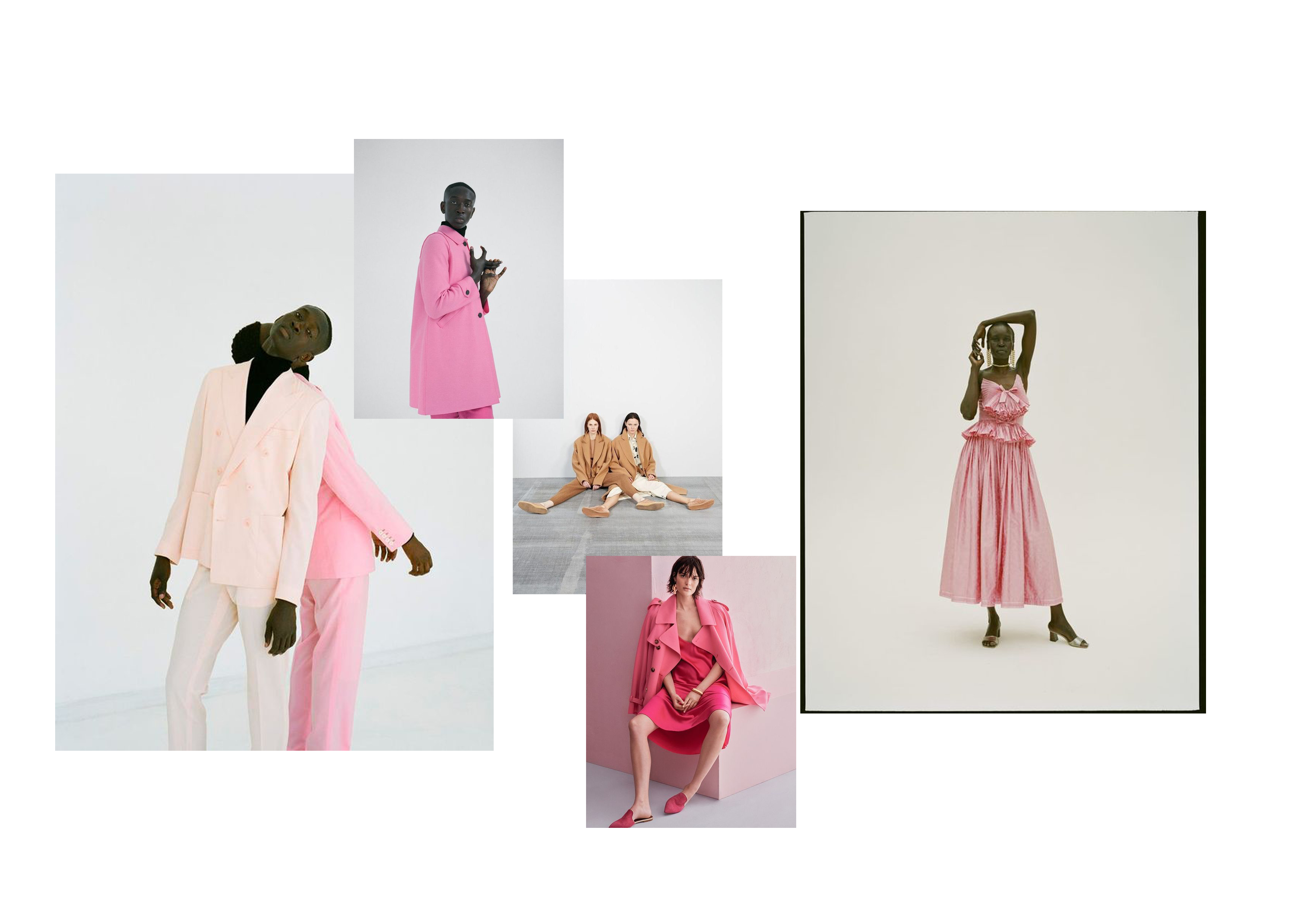
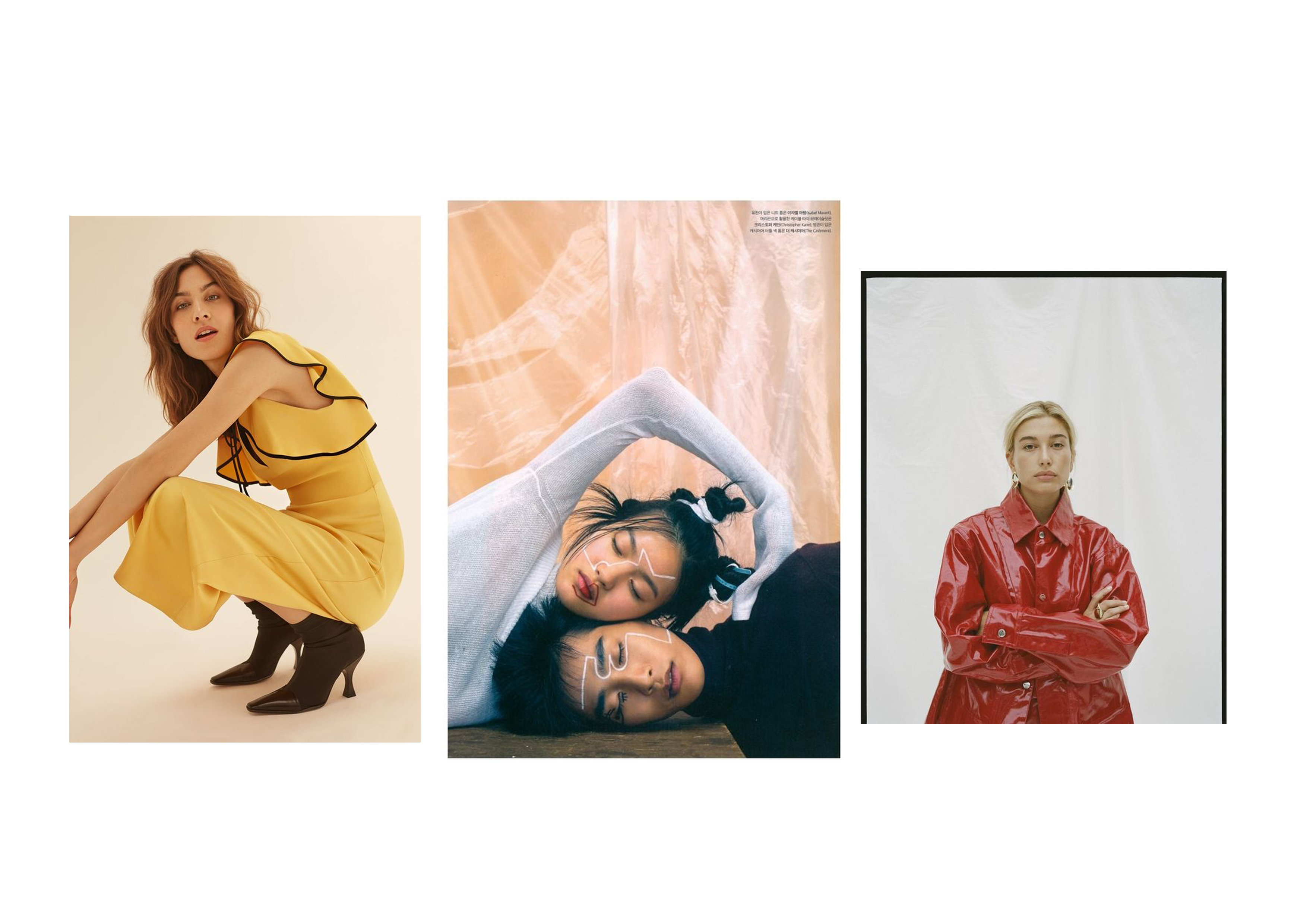
Mood boards for my shoot that is coming up on Friday the 2nd of August! This shoot is in collaboration with an emerging brand that has enabled me to pull and borrow their pieces for the shoot. The shoot aims to capture the new gen of design, crystal and youth in the creative industries as well as remaining luxury.