Developing the digital strategy

For Emergence, I feel that it is crucial that it has a digital strategy to go along side the print mode of communication. Not only does this provide a greater deal of immersive and creative experience provided by the brand but it also speaks of what Emergence is about, the future of the creative industries.

In developing the digital strategy I have taken inspiration from a recent project I worked on with the CN Publishing team. In this, a luxury hotel asked for a pitch to target a milenial consumer through digital. I came up with a social story telling pitch for the hotel group, of which got great feedback. So the social story telling aspect is something that I think works along side the book, it gives the ability to be involved in the story through digital.

The digital strategy I want to implement for Emergence is a social story telling series. The series will capture 60second stories from the emerging designers and artists within the book, of whom will tell their story of cracking into the industry and collaborating with Swarovski. The call to action from the story telling series will then be a swipe up to purchase the emergence book.

The call to action here should feel very slick and natural- from the 60 second video series the natural swipe up notion should allow people to want to learn more and be able to experience the art of the book.
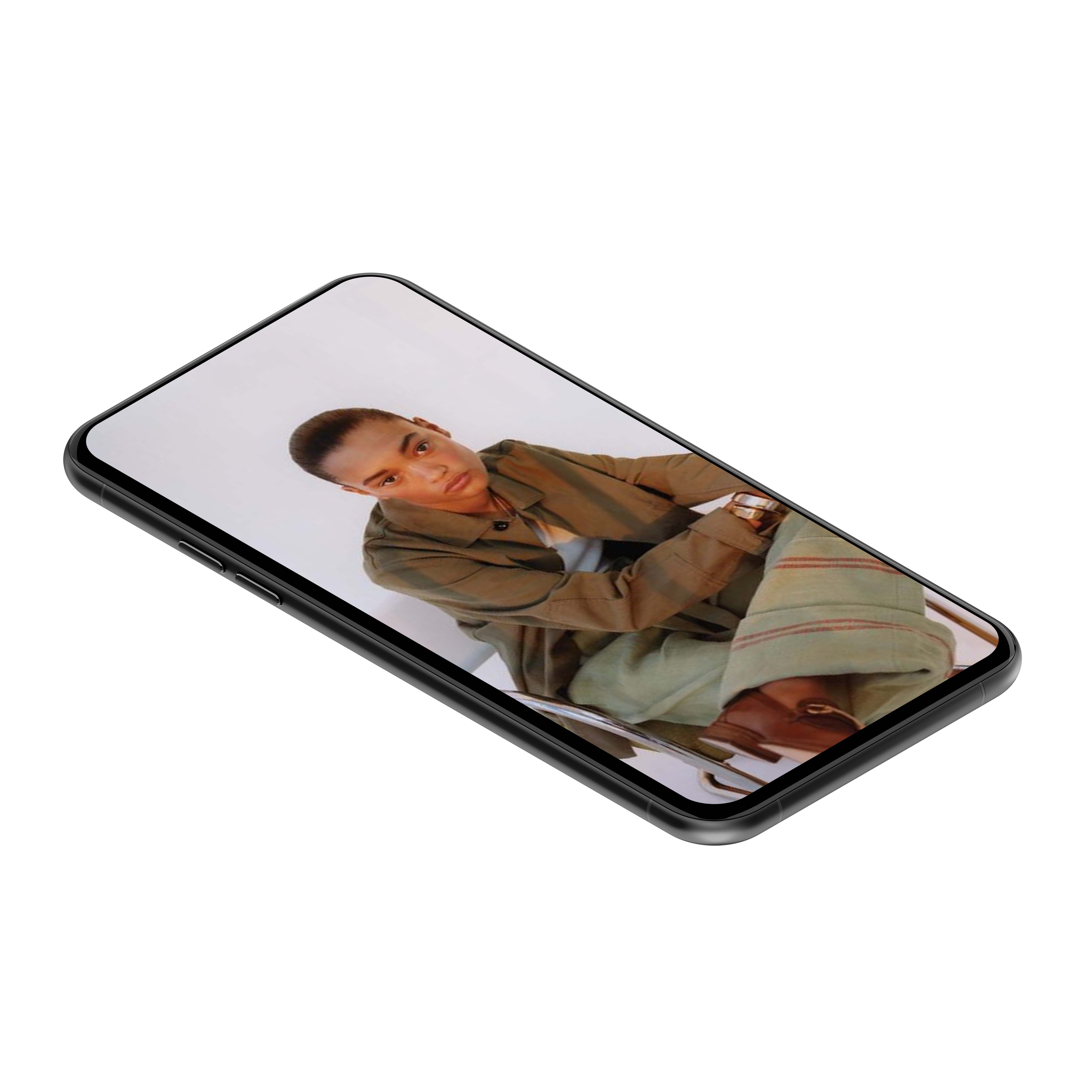
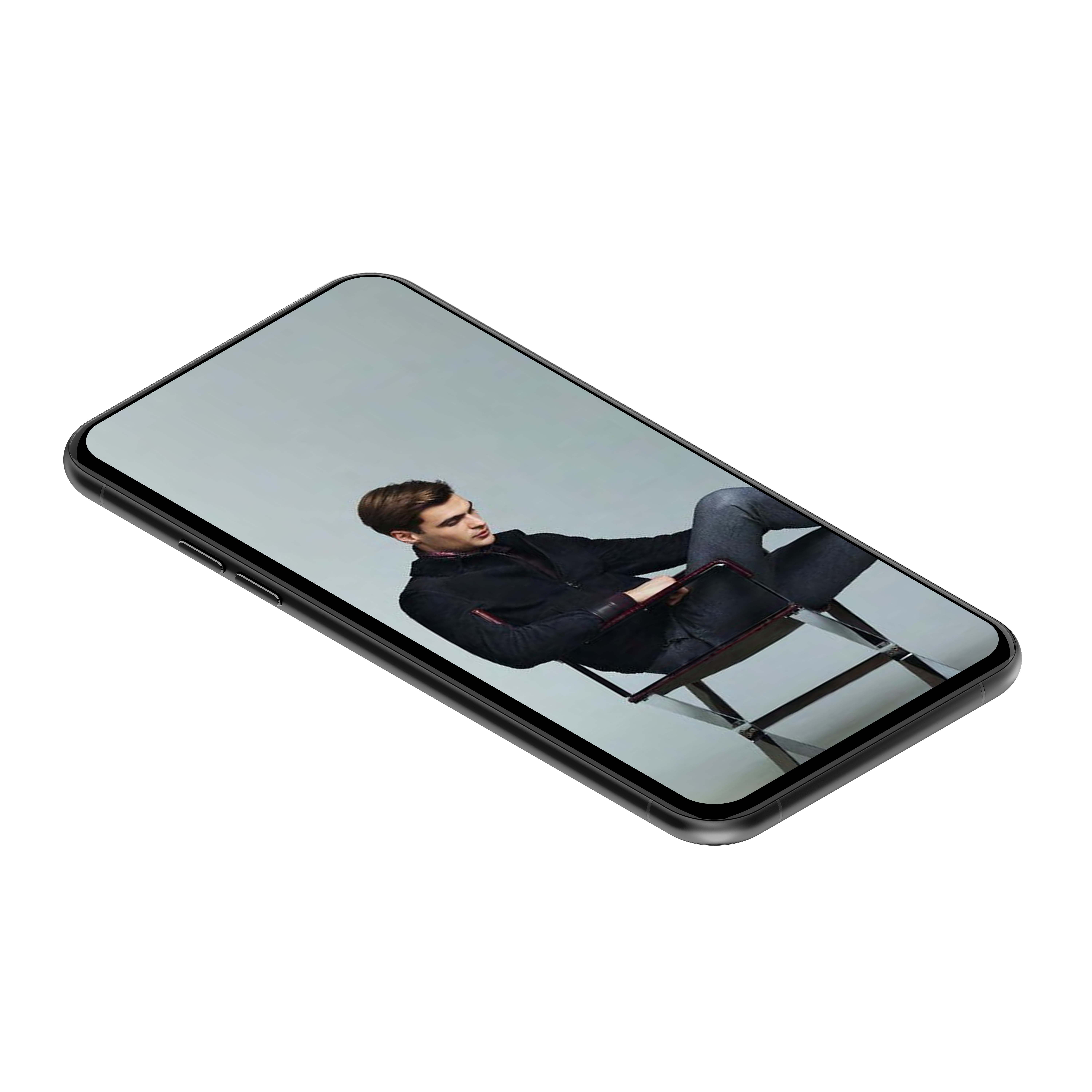
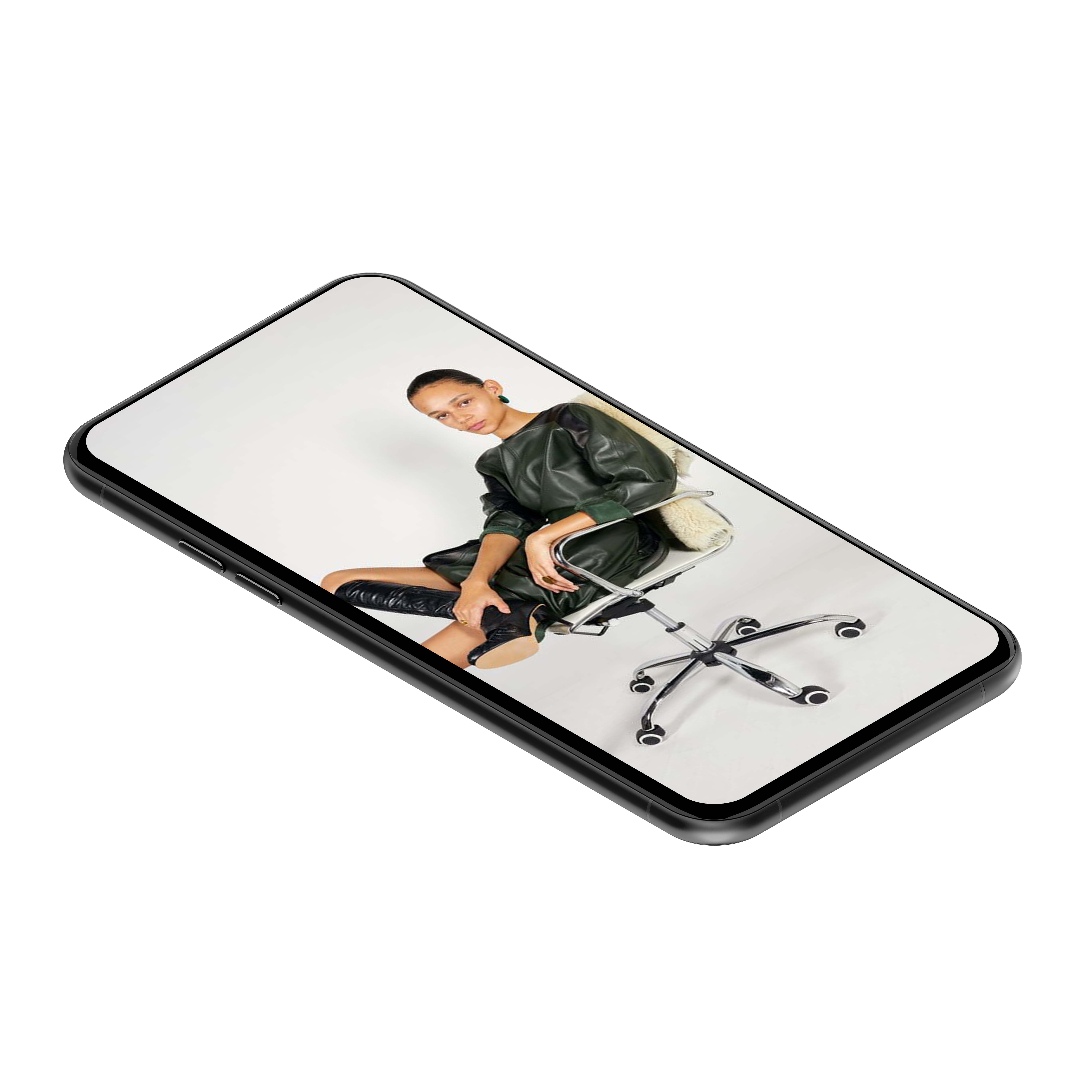
These mock ups show how the digital story telling series would look, natural, honest and open allowing people to resonate a connection with the emerging creatives and eager to find out more.

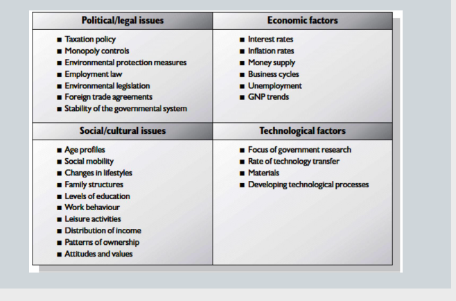
To allow me to develop some key points around digital strategy I have found an online session from Januarys Pr & Digital strategies module- taking inspiration from some vital slides from that module.
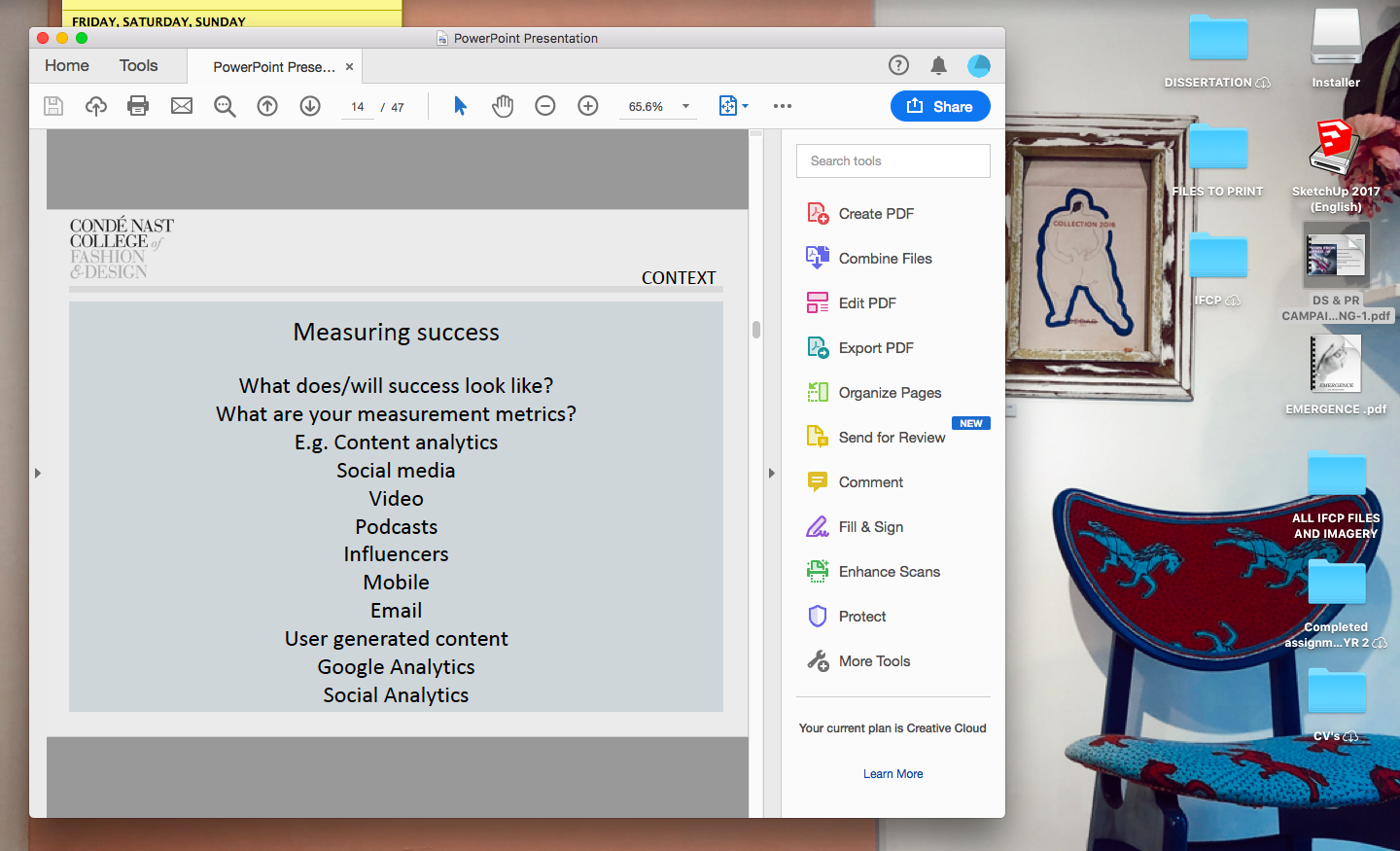
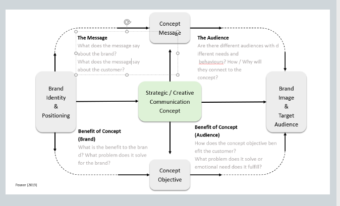
I was also able to contact some colleagues I work with in PR and make sure all vital elements were included to make the strategy slick for Emergence!
A second pair of eyes.

Coming towards the end of creating the coffee table book I decided this would be a good time to send a draft and get another opinion as well as changes that should be made. I sent a draft to Hannah Shakir- I worked with Hannah on my Contract Publishing module last year and therefore wanted her opinion on what I was working on from her perspective having not seen my blog nor know what I am working on fully.

I sent her a pdf and she came back with some great pointers to consider, Hannah stated:

  • cut down the amount of imagery, keep imagery that is outstanding etc don’t fill pages with imagery that is almost the same.
  • Consider cropping further into imagery to really focus and highlight the crystals
  • Alter some lighting on the imagery to make the photos brighter.
  • Gramatical corrections

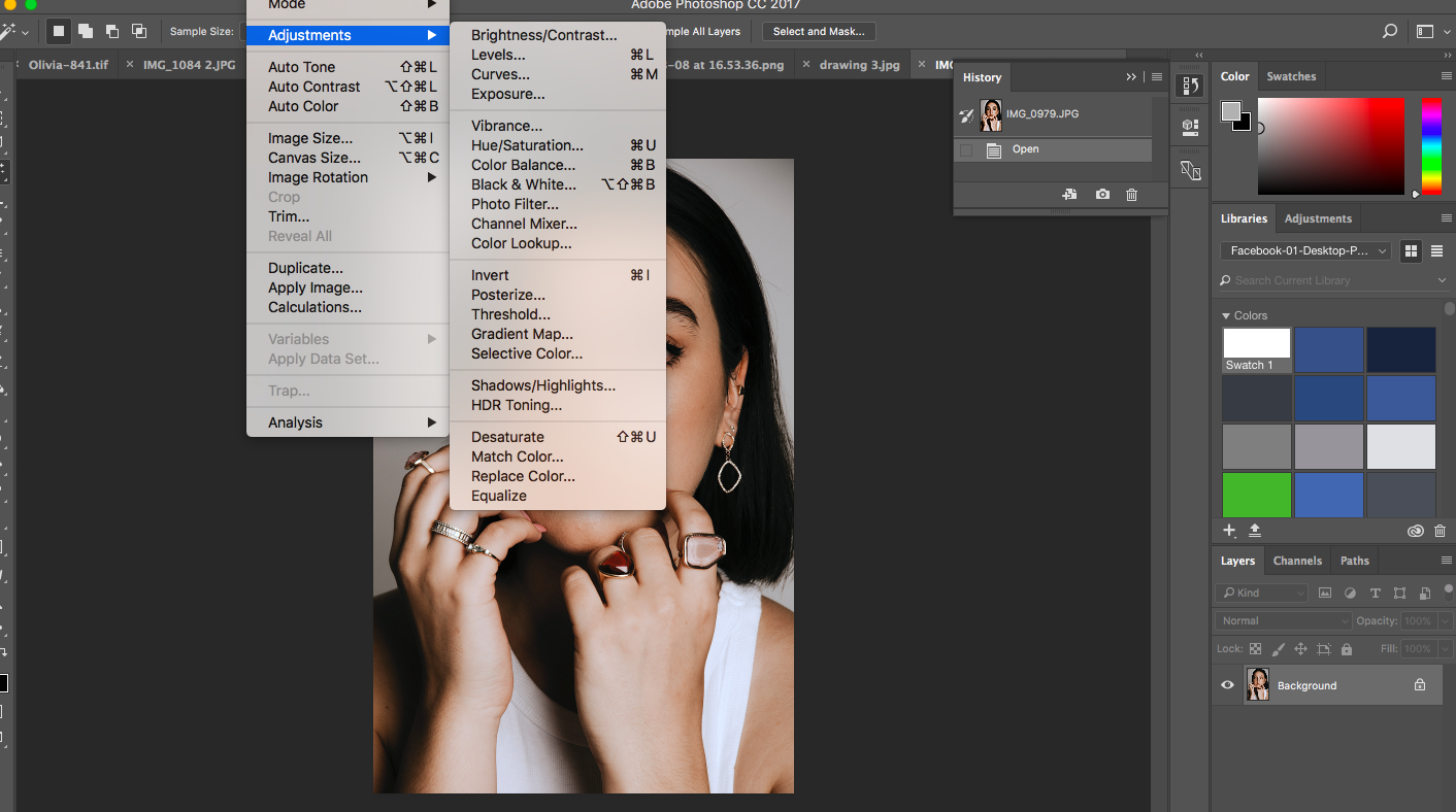
Following Hannah’s comments I went in and tried to edit more closely which images should cut completely and which ones should have a closer crop. I then took imagery into photoshop to edit lighting in imagery to make the images a lot more crisp. Hannah made a valid point of saying “really think about how Swarovski would show the imagery” making me think closely about the lighting and crops.

Adjusting shadows on the face and jewellery in photoshop

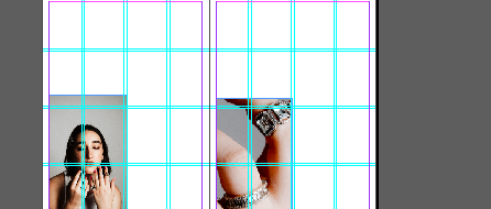
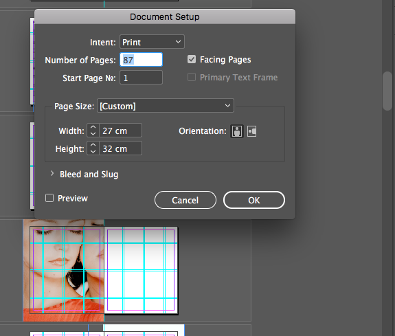
Following a catch up with Hannah regarding my project it allowed me to really consider how I was presenting things on behalf of the brand- making me want to go in and make everything a bit slicker. I went in and adjusted sizing and crops as well as cut things that were repetitive. I then considered how the pages were looking and it made me refer back to Swarovski’s previous book- I saw the sizing and adjusted my page size to see if allowing a bigger and wider size allows the information and imagery to sit a lot better.

Changing document size

After changing the document size to that of the past Swarovski book, the imagery and content had a lot more space to breathe, allowing a much slicker feel to the publication, something I may have over looked without Hannah’s input.

CSM X Swarovski

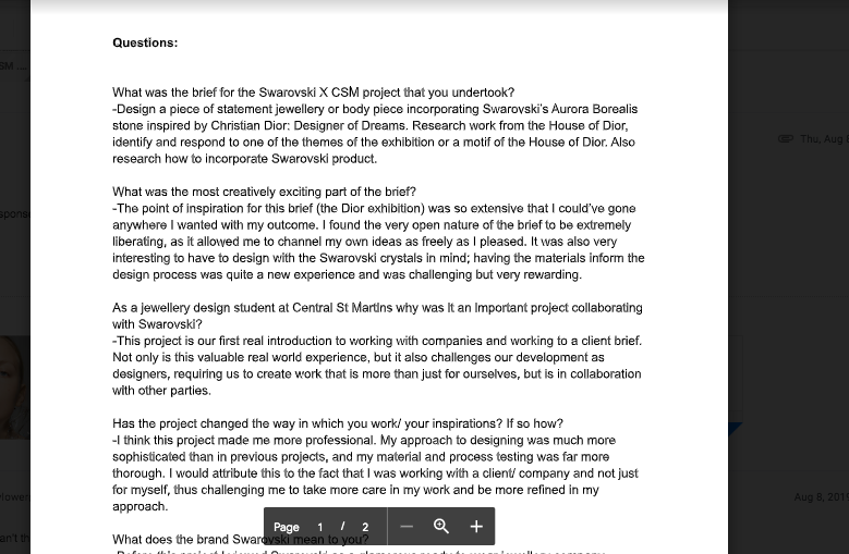
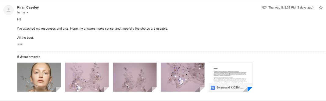
Winner of the 2019 csm x Swarovski project, Piran Caseley, got back to me yesterday with his answers to the questions I had asked him all about the project and working with the brand.

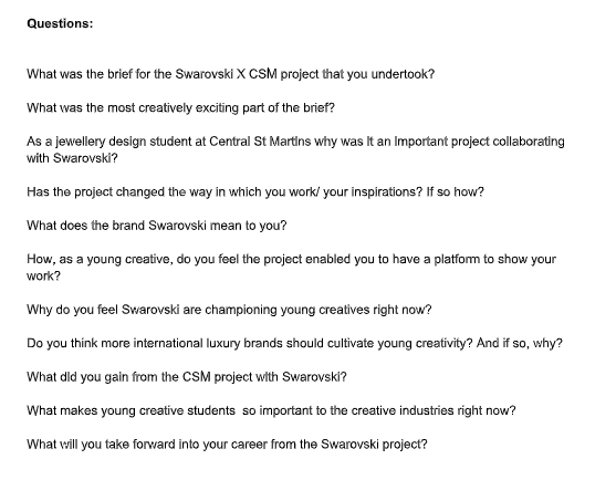
Questions I sent to Piran to be able to develop an editorial piece on the project, his views and opinions to allow the piece to feel natural.

Reaching out to Piran was a great added extra for the project, it brings another dimension of perspective for the book, leading back to the research I gained through my dissertation of people wanting to learn something through branded print matter. Introducing such a key participant of emerging creativeness (particularly for Swarovski).

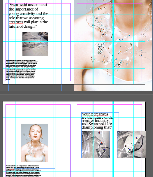
I have chosen to structure the answers from Piran within the book as if he was a contributor to the book. I have taken the answers and formulated them although they were a self written piece. I believe in doing this the book reads in a much more luxury artistic way rather than having questions and answers that reads much more like a magazine piece.

Placing the text into the book to read like a self written piece.

Piran sent imagery of the piece he created for the project as well as his process imagery which I have included as I believe this makes the notion of new emerging and young creatives a lot more real- displaying more creative imagery pushes the idea of emergence, of which Swarovski are championing.

Book Size

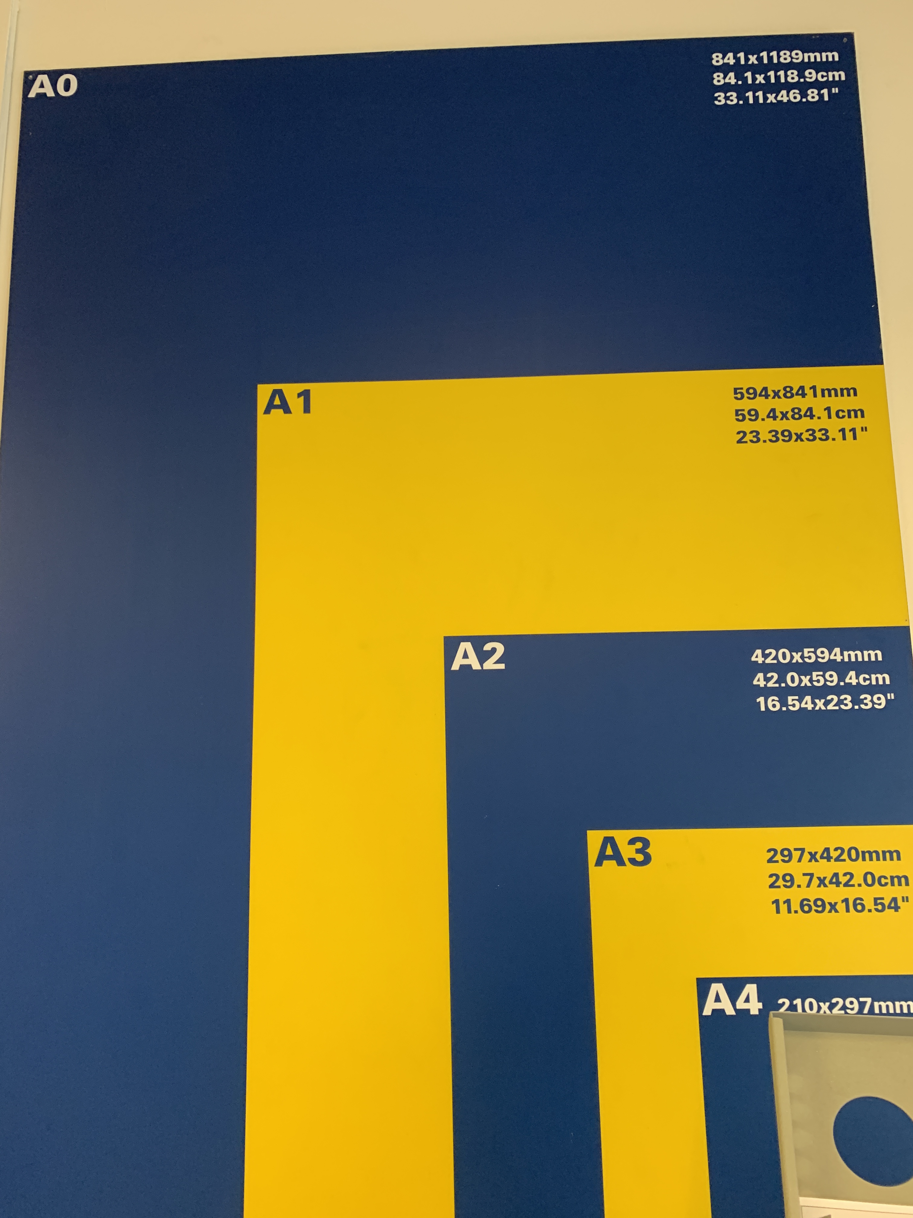
This has been one of the hardest decisions of this project so far as it is such a crucial part of the project. Choosing the right size for the book is something that has a lot of detail within the thought. When I originally had the idea of a coffee table book I visualised it A3 size, however after deliberation I think this size could be too long in size and could loose some of the editing process that has gone into the work.

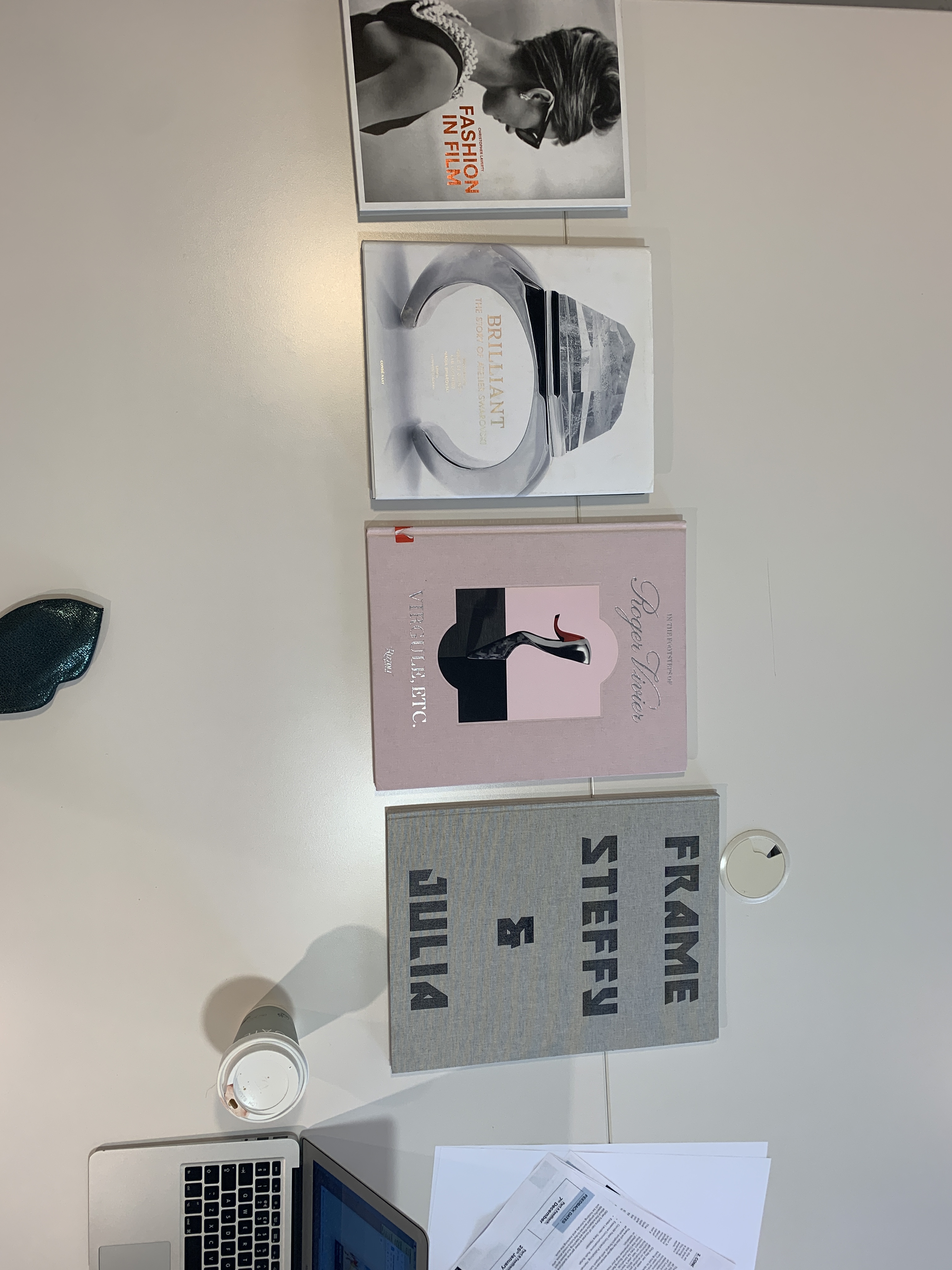
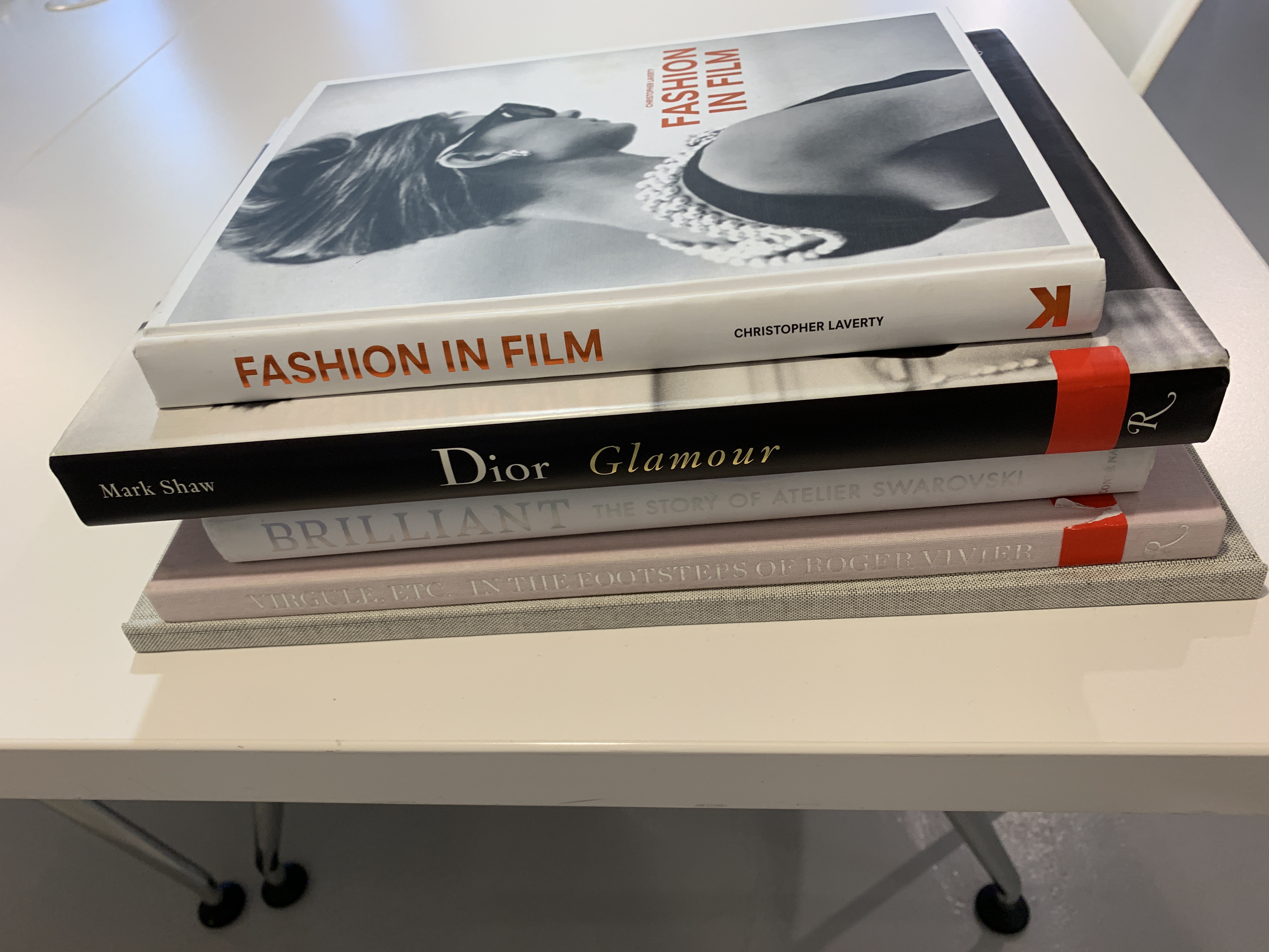
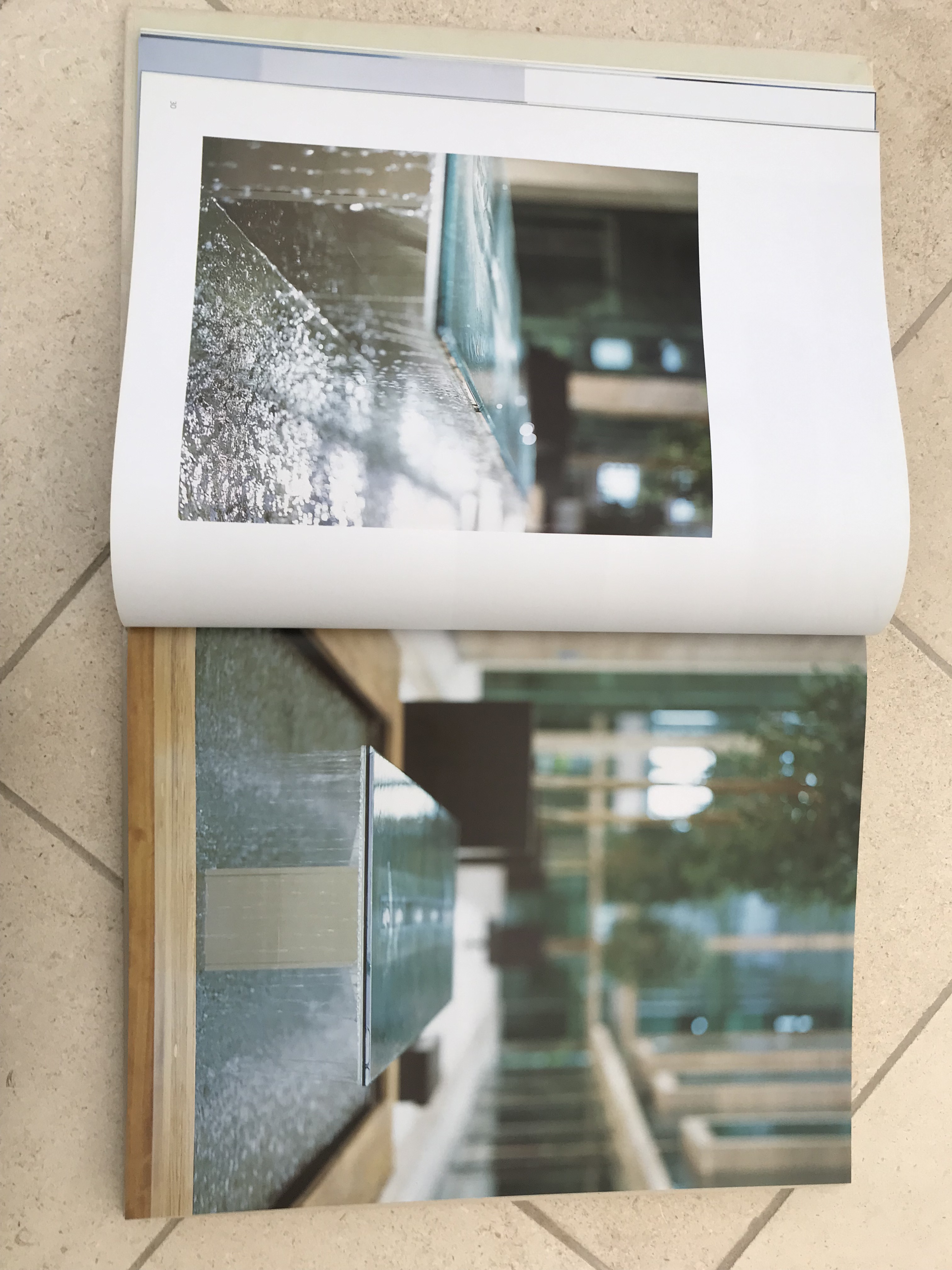
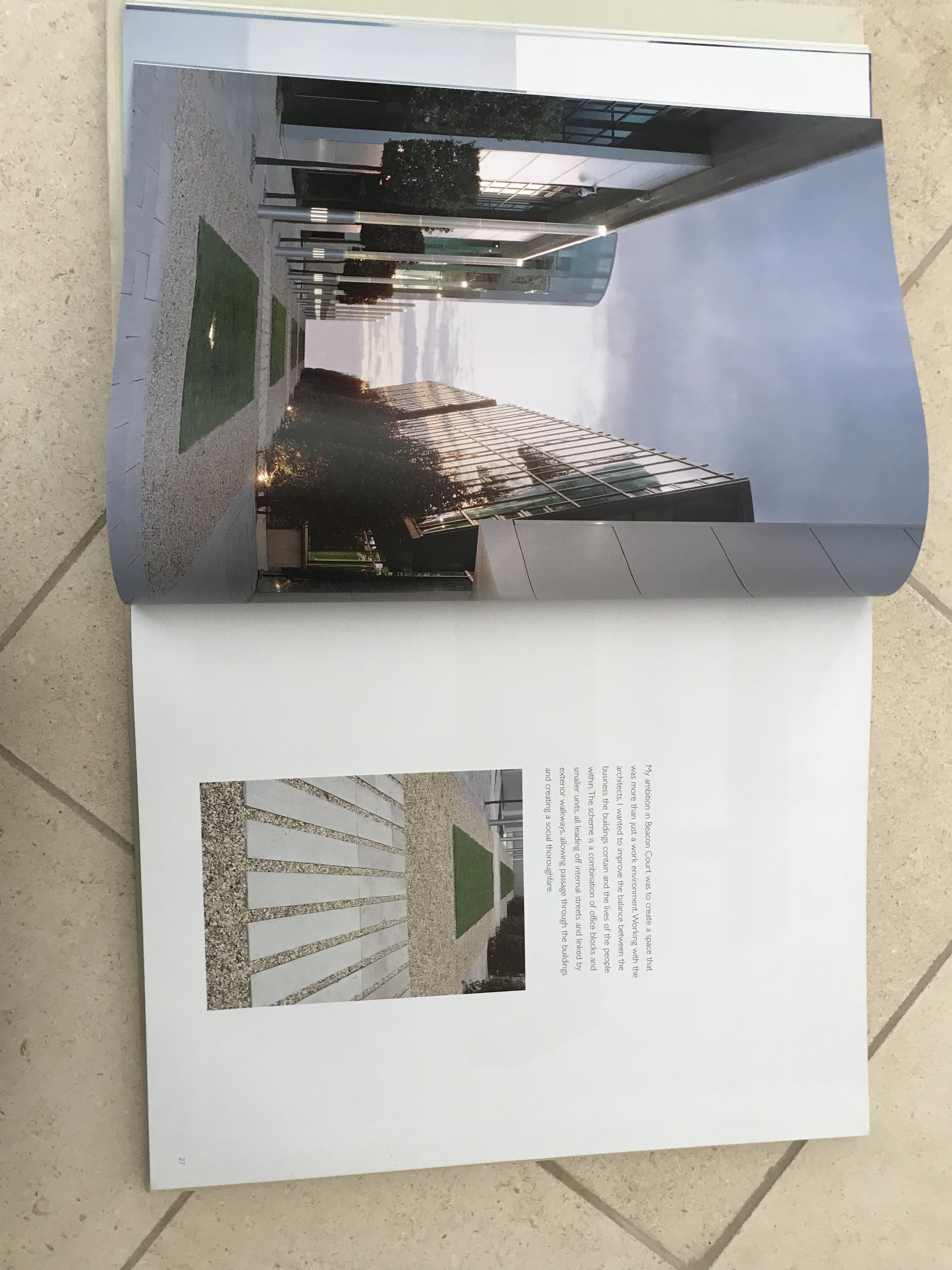
To visualise sizes I gathered all the sizes I was considering of books within the library. The ‘Fashion in Film’ book is A4, the ‘Atelier Swarovski’ book is 27×32, The pink book is 27×37 and the “Frame Steffy and Juilia” book is A3 in size. After visually seeing this I can see the a3 is far too long, I am currently thinking between the pink and the Swarovski book.

I visited Soho print rooms to see what kind of sizes visually were better and this really displayed to me how A3 was far to long for a book- it needed to be more concise and neat.

working on my launch

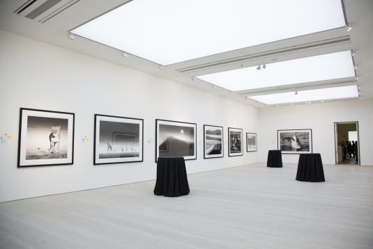
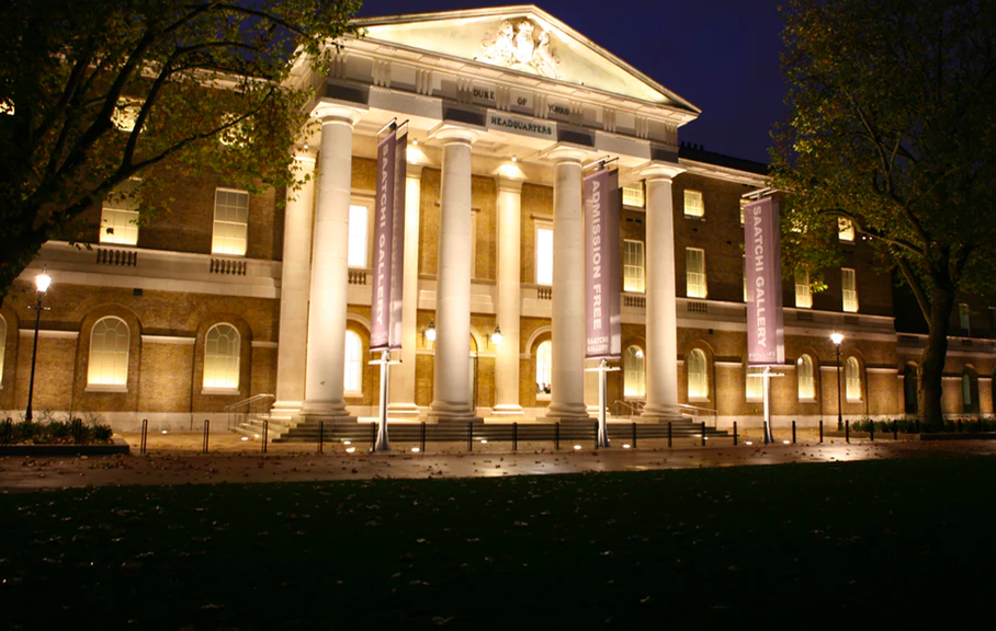
As I wait upon proof reading and the feature from the CSM X Swarovski winner, I have developed some work on another part of my brief- my launch plan. I have had the idea of hosting the event in an art gallery to support the idea of heritage paired with emerging and young creatives, of which art galleries and the Emergence by Swarovski does.

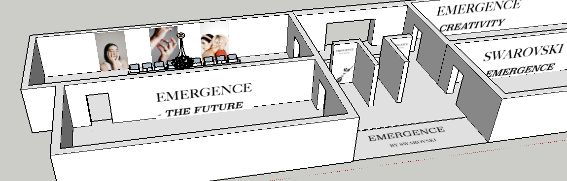
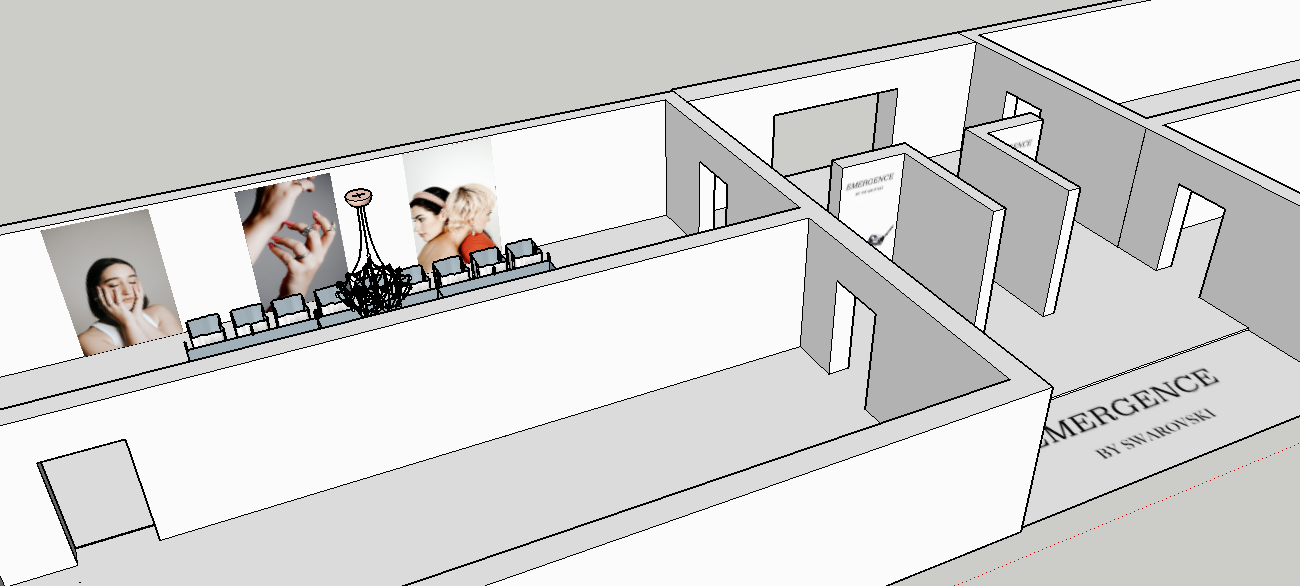
As a part of this- I wanted to create a mock up of what the event would look like to be able to visualise my ideas that I have within my mind. In doing this I started to play around with the floor plan of the Saatchi Gallery in London on SketchUp to see if I could translate my thoughts onto a visual platform.

I want the event to be like a visual story so that whilst press/guests walk around the location they are able to feel although they are flicking through the pages of the book. The aim is to have each room a chapter from the book, with information on the chapter, large blown up imagery. The aim through this is to fully immerse the viewer through physical space in the book.

I am currently in the middle of working on the mock up of the event on sketch up! But I want to be able to fully translate my creative vision for the event onto something people can understand, in order for my to fully communicate my idea.

The idea of even doing a launch plan and event came from an interview I recently had with the team at CN Publishing- they described to me the roles that a job entails and I aimed to hone all of those roles into this project, in order for me to fully demonstrate my capability. The role consisted of design, editorial, editing, event, press hosting, press contact and digital strategies, therefore I aim to incorporate all aspects into this project.

Considering Casing

So, when I first had the idea for this project one major thing that stuck in my vision was the idea of having a book about crystals produced within a glass case, to fit with the idea of glass, production, creativity and of course, crystals by Swarovski. When I first had (dreamt actually!) this idea, it seemed so easy to do, however, this has been so difficult to acquire! I had no idea it would be so difficult to create a glass box.

Back in June I contact glass makers, window makers, glassiers and even visited many a glass and construction shop. Most of the time I was told it was too much of a ‘small’ job to do that would take up too much time as it is a lot of intricacy for the people who make the glass. I was told the glue itself is the most expensive part and I would have to pay for the tube of glue being around £500 and they couldn’t even be sure if the box would take up the tube of glue.

This set me back in my idea of having a glass case and I moved onto looking to acrylic cases to still have the same look, however be potentially a lot easier. I found places in London that could make the case for me and I have been in contact with them, however, whilst looking through acrylic casing I still have the drive to have a glass case. I feel my mind is set on the idea I mentally visualised- and as an expressive creative myself I find it hard sometimes to almost take a step back from the elevated vision I have.

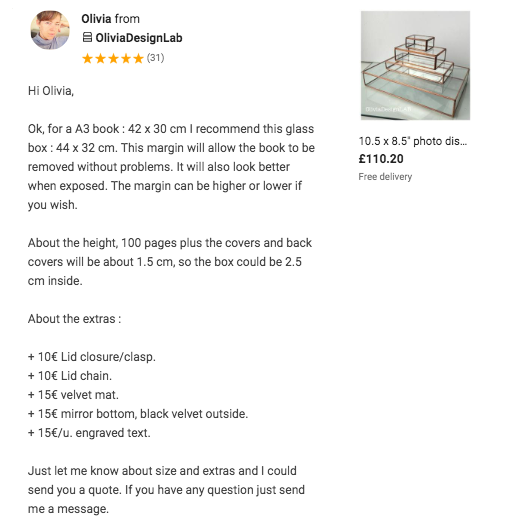
I searched the realms of the internet last night and managed to find a boutique glass manufacterer in Europe who creates custom glass objects and ships them over (she also creates them to size, can create hinges and engraving on the box). I reached out to her last night and she just got back to me!

See below:

This is such a great advancement in the process and has given me hope that my glass box vision can happen and can come true.

Referencing

Today I have been thinking about the best way to reference my work. Obviously, I understand that as much as I want the book to look of industry quality, it still is an academic piece of work that is being graded at university. Therefore, I was thinking how to correctly reference the work. Within the book I am using quotes taken from brands, from their websites etc, as well as quotes from Givenchy on Swarovski. As I am spending a lot of money on getting the coffee table book printed I don’t want to have references in the corners of the pages as it takes away from the editing and design of which I have spent time working on.

I sent a message to my tutor, Harriet, and we discussed this. Coming up with the idea that it would be best to create a separate document for my references, so that they do not intrude on the artistic creation of the book and allowing me to be able to acknowledge and give credit for information sourced from different locations for the project!

Choosing the right cover

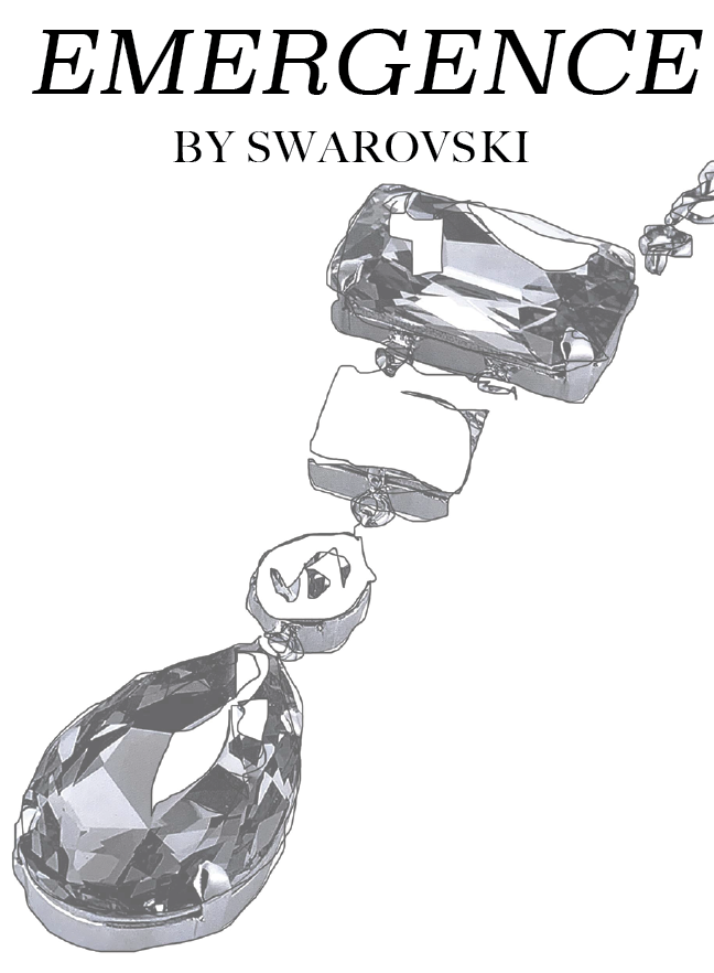
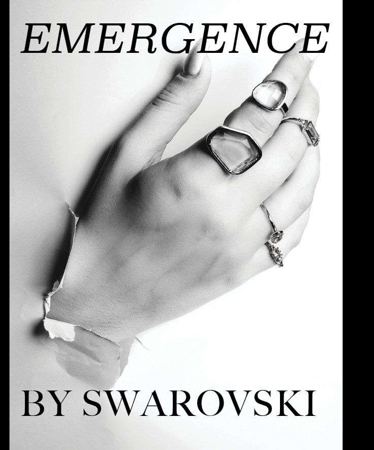
This morning I began generating different ideas for covers, see below:

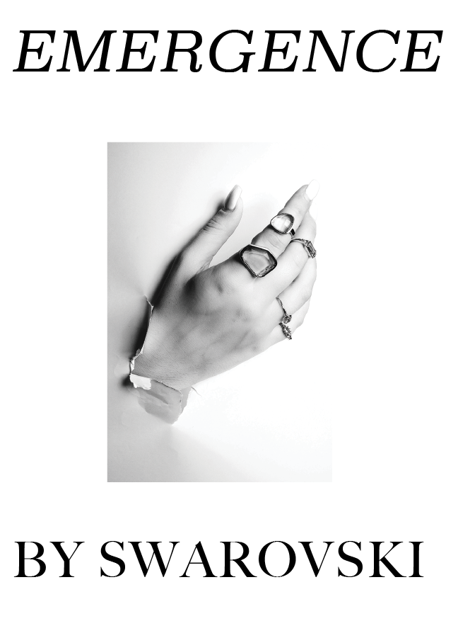
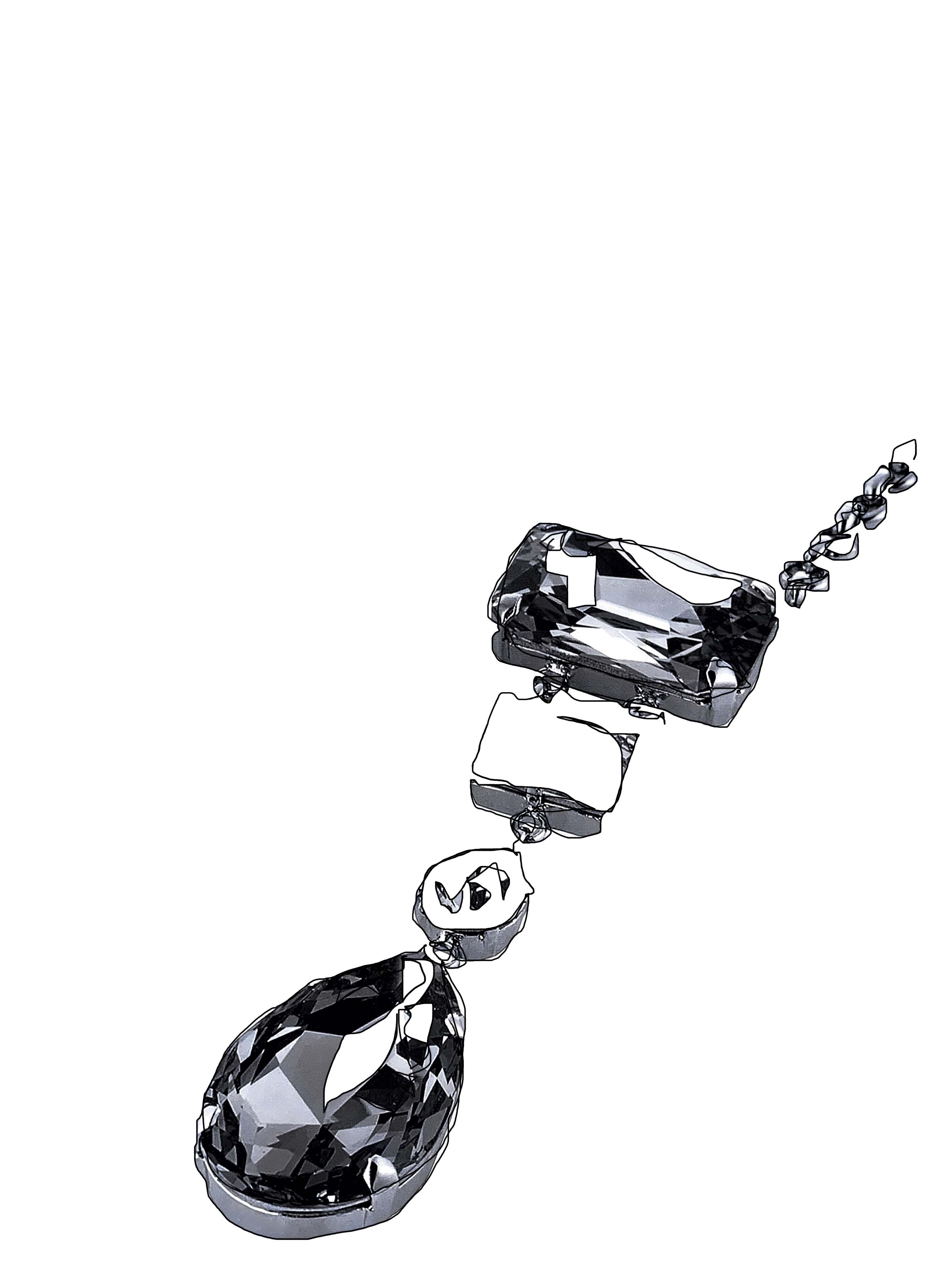
I have two main ideas for the cover of EMERGENCE, one being a drawing/sketch on the cover and the second being an image from one of the main shoots of the book. Both images and sketches were created to instigate the idea of ’emergence’.

Emergence- “the process of coming into existence or prominence.” this was something I wanted to visually communicate on the front of the book before even opening the pages. The way in which the drawing aims to communicate this idea is to show the stimulation of the mind and the creative process of a designer or creator of these pieces. It shows a raw and original insight into the process of imagination and creation around creatives working with Swarovski crystals which is what the book aims to highlight. The image was directed, styled and shot by myself to communicate the idea of coming to fruition through the emergence of the hand ripping through and showing all the rings on the hand aims to represent the way Swarovski enabled young creatives to be able to emerge as brands and as successful creatives.

I knew I wasn’t going to be able to chose between the different ideas so I asked opinions of 4 other students at college, 3 claimed they preferred the drawing on the cover, as it remains simplistic and powerful- claiming it made them think of young creative processes- through the look of a sketch book.

Considering Layouts

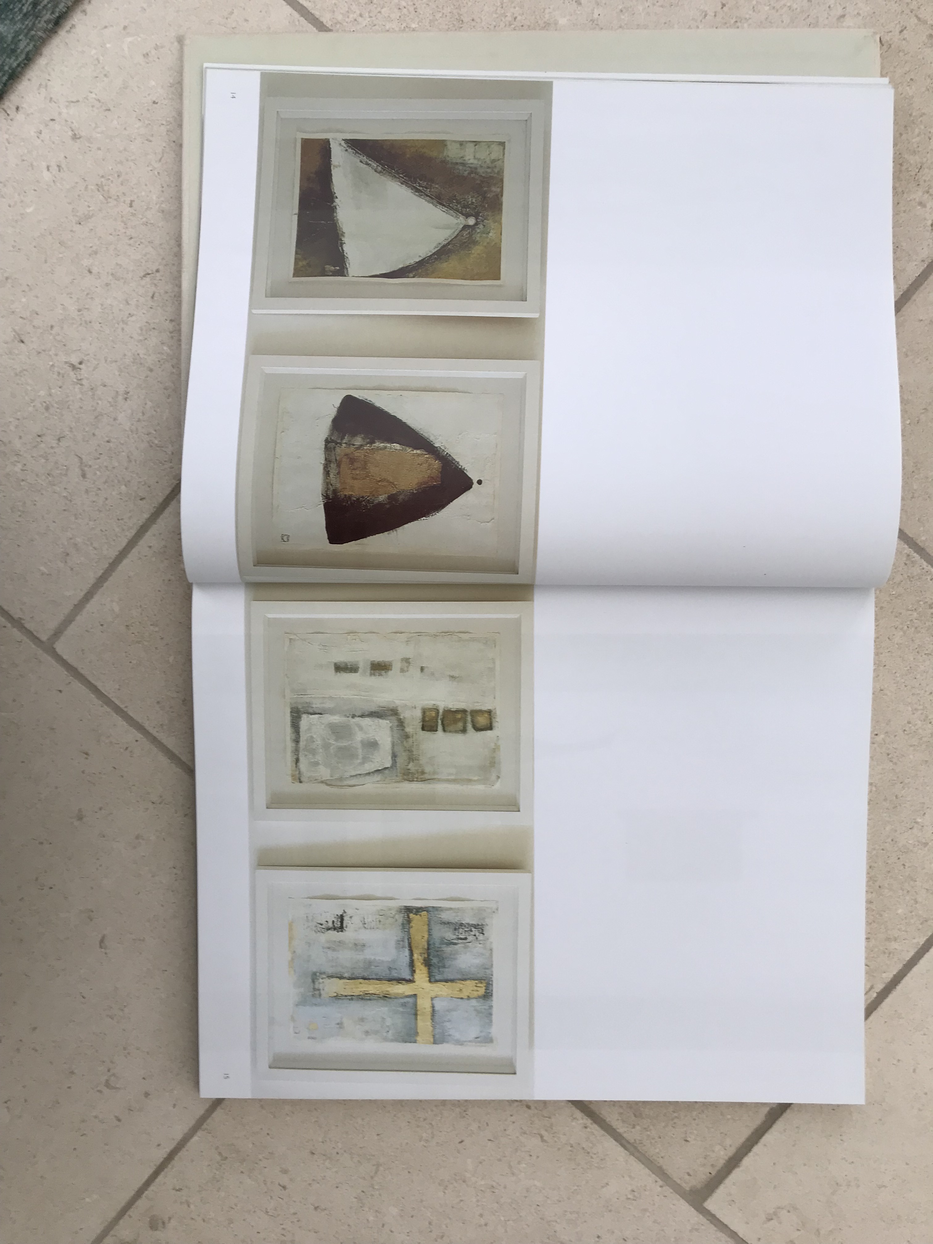
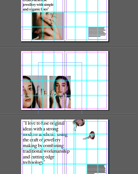
After an online tutorial/catchup with my tutor Harriet, I have been considering, into greater deal, the editing process and layout of the book. I have been taking inspiration from the Atelier Swarovski book and the way in which they display drawings and sketches. Harriet shared with me her copy of ’19 Photos by John Rocha’- this publications is edited with much detail as is shown within the spacing and layout of imager, and has motivated me to edit the way I am displaying images as when I first placed them in they were mainly largely spaced and one per page. I like the double per page and I think it allows the eye to naturally follow the page to the next image like a story. I also really liked the idea of printing pages on acetate to give some transparency to the imagery, however, after research this is really difficult for me to get printed, so maybe this is a thought to display some images at the exhibition.

I have translated this idea into the way I am displaying my imagery. I think it is really important for this book to tell a story visually to the viewer, being heavily imagery based I aim for the images to tell the story of Swarovski and of the brand and creative that I am communicating.

Taking inspiration from the John Rocha book I have added more negative space around the imagery to let the viewers eyes move a lot more naturally around the image.

Sourcing my brands for the book!

At the beginning of this process I knew this would be the hardest hurdle to come across- sourcing brands that were willing to lend me pieces. Having worked in fashion PR for a year now, I understand the process of borrowing and lending pieces out to stylists (having to process it myself weekly!). I spent weeks prior to beginning the project back towards the end of May contacting PR’s, any contacts I had, friends and emailing brands directly. I was lucky enough to get a response back fairly early on back in June from Anoushka. We had a mutual friend within the industry that was able to put me in contact and as they are a new and emerging brand they were happy for the opportunity to gain editorial style imagery from me that they were free to use. Anoushka sent me two sets of earrings (from my first shoot) of which arrived the evening of the 1st of August, I shot on the 2nd and were posted back to them on the evening of the 2nd of August, per our arrangement.

The second brand, Catherine, I sourced through a PR team I had met at an event. They put me in contact with the Parisian London based brand who were happy to lend me a generous 3 packs of rings to shoot, with the agreement that they were welcome to all the imagery! The brand were very welcoming and are happy to let me keep the rings until I shoot my still life this week- for me to post back on Friday. The rings were a great variety and the team were so friendly and understanding of me being a student however really loved the idea of the book featuring young and emerging creative brands.

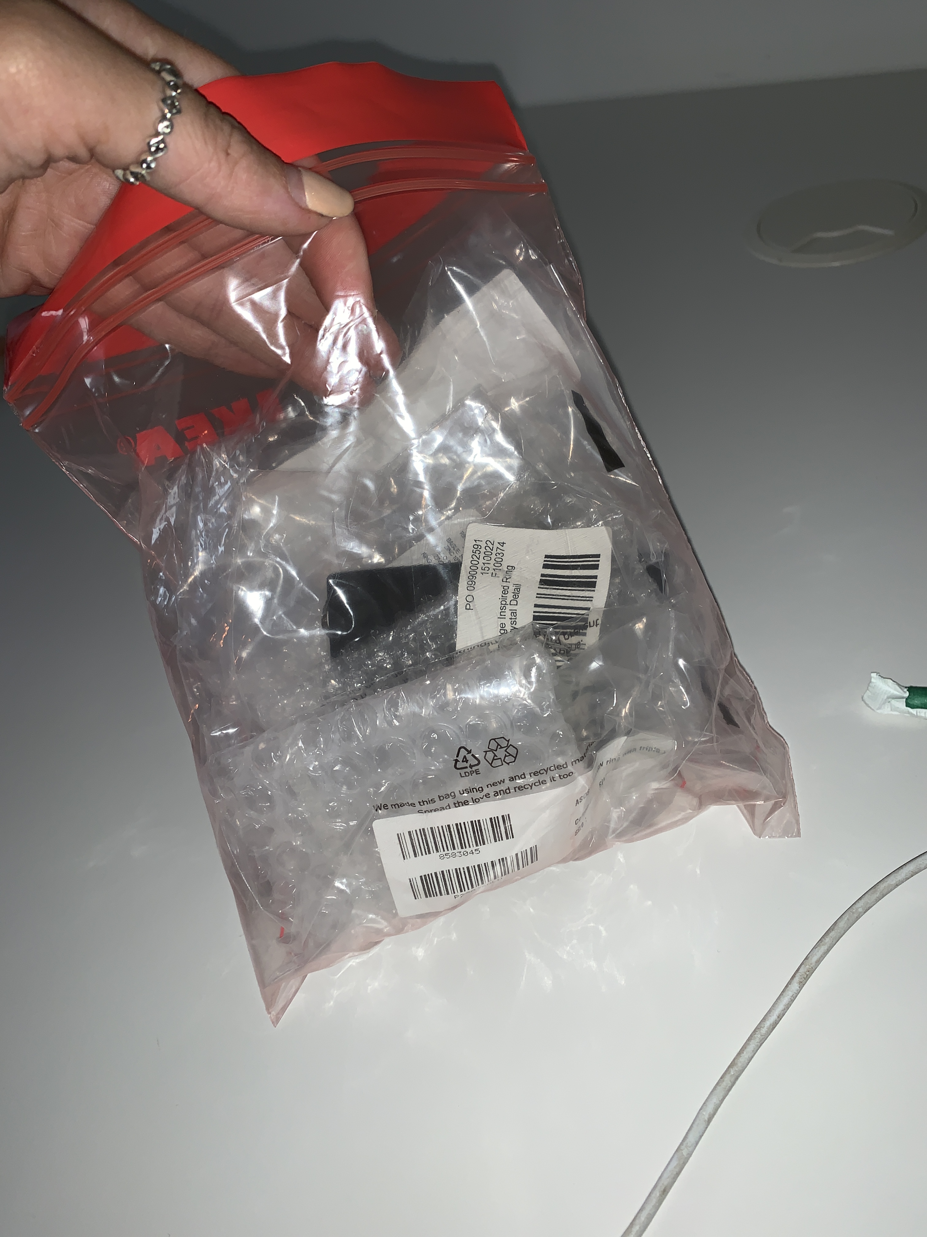
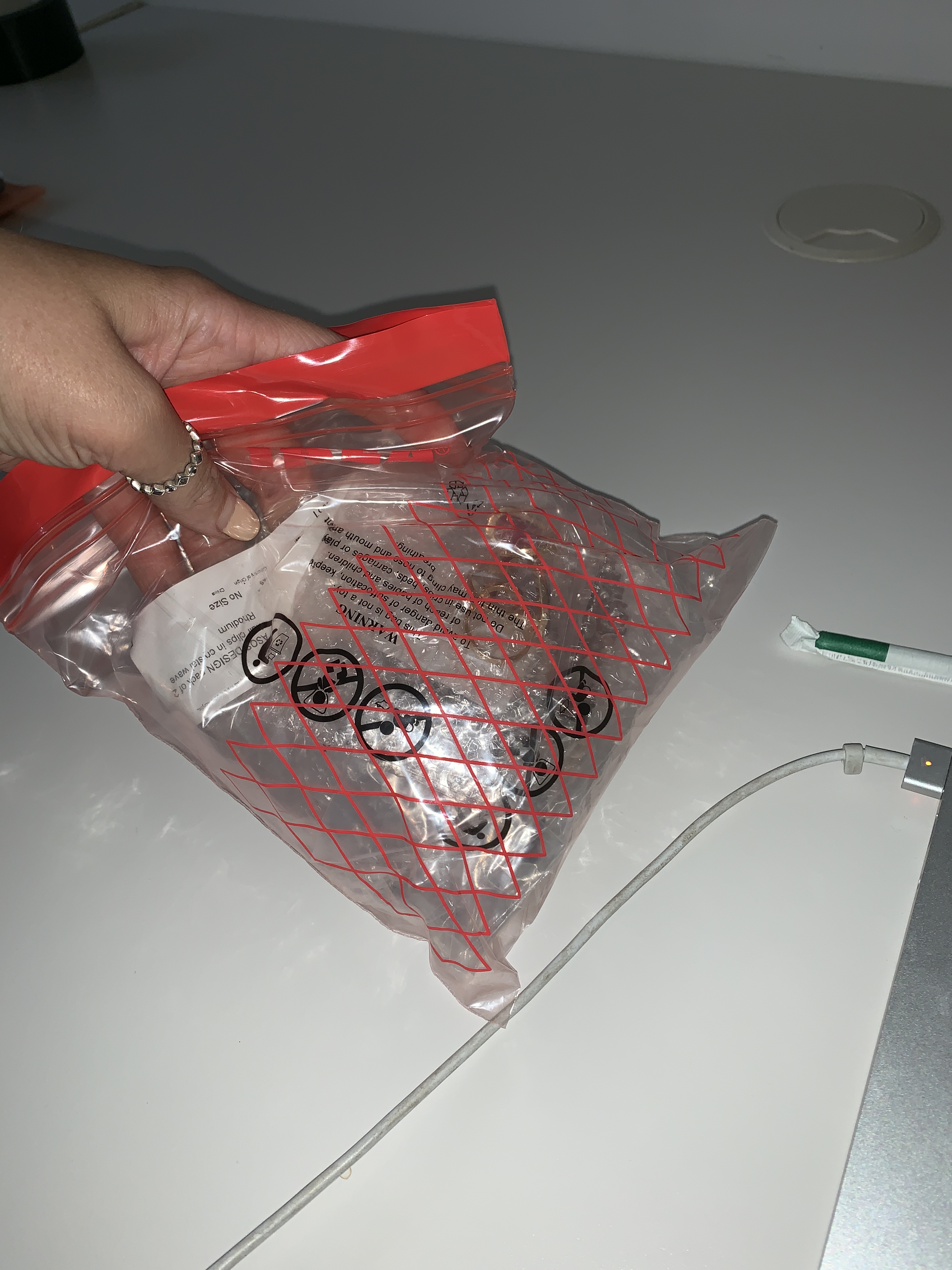
I like to keep all brands and pieces in small zip lock bags (maybe thats the PR assistant in me !!) to make sure everything is in the right place for the right shoots, then making it easier to send back at the end of the week.

I have been really lucky finding and being able to have pieces from these emerging brands, who’s ethos fit perfectly with EMERGENCE, in order to allow me to fill the book with great emerging creatives and brands, using photography and editorial on the brands!

Create your own website, free on WordPress.com.Create your own website.
Start free