Video Research

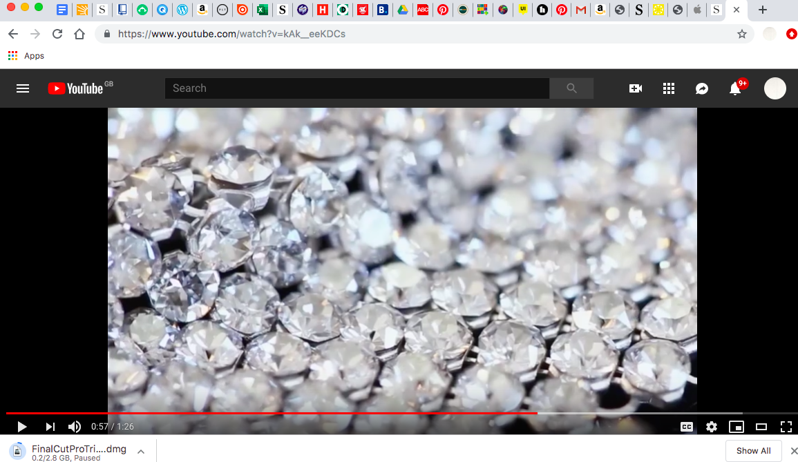
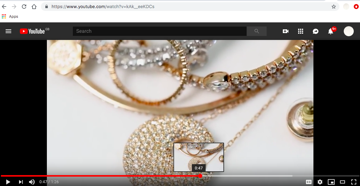
Preparing to edit the new video, I have been watching many past Swarovski video clips. They generally are only 30-60seconds. However, they are all jewellery ads. The video I am shooting is a promotional video with the purpose to be a banner on the Swarovski World site as well as on Swarovski youtube. The aim for the video is a call to action to find out more about what Emergence is and to motivate a purchase.
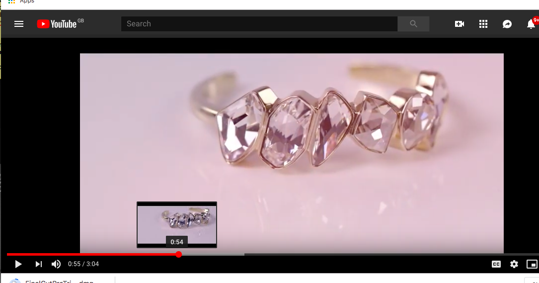
These videos all focus heavily upon the jewellery and the crystal with panning going in and out, this is something I would like to incorporate, however- they very generic these videos and all carry the same theme. Therefore, for mine I believe it needs to have some newness injected into it somewhere to maintain with the creative theme, however remaining subtle to stay on brand.

I have been inspired by the still life video footage that they use and this is something that could work with the Emergence video- putting focus onto the crystal with credits introducing Emergence by Swarovski that will sit at the header of the online site.
Playing with the cover

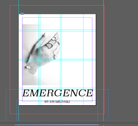
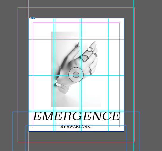
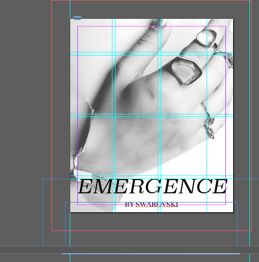
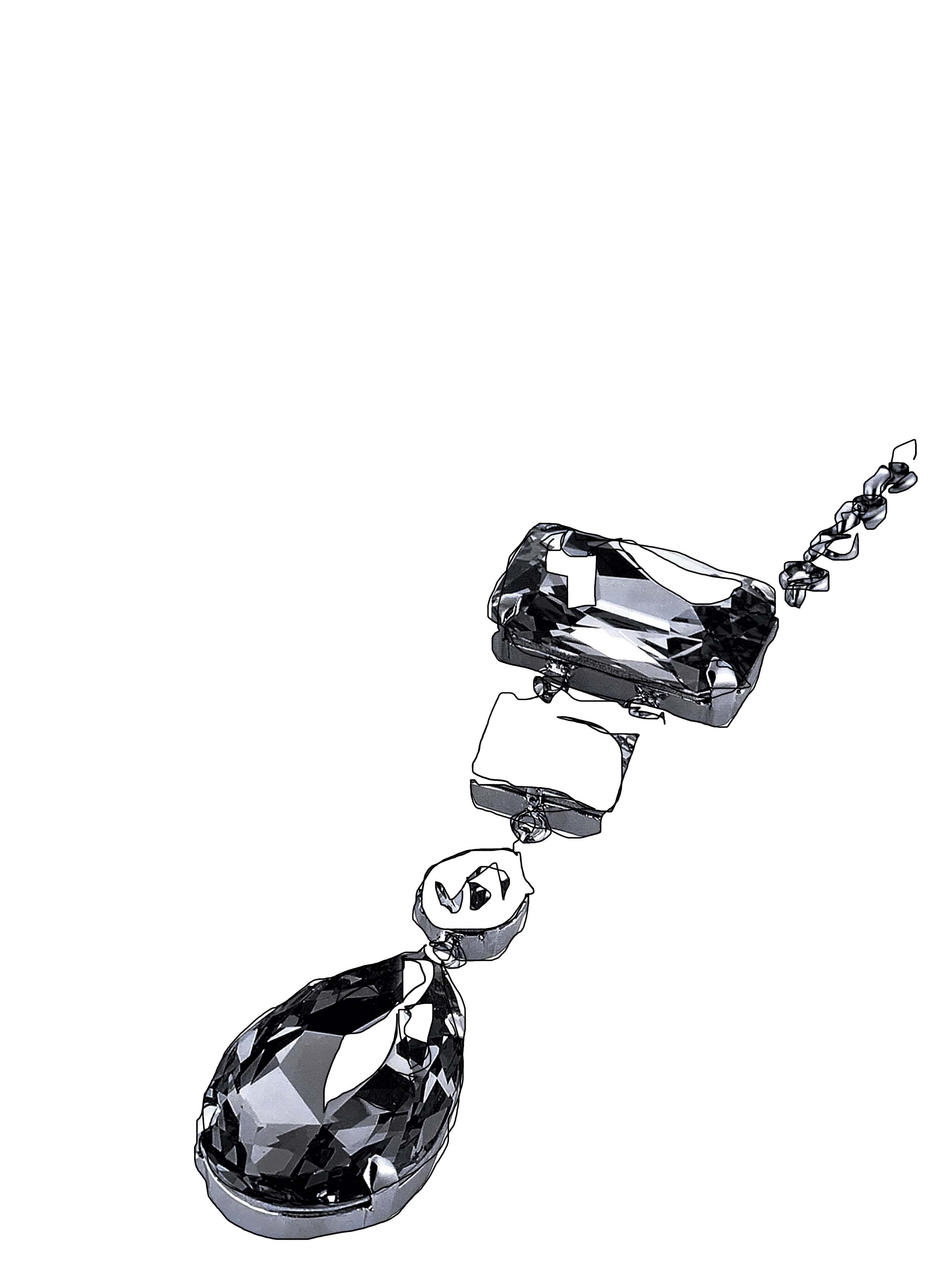
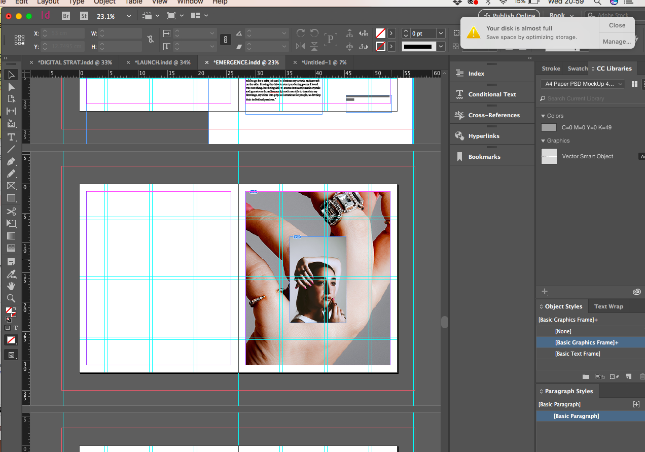
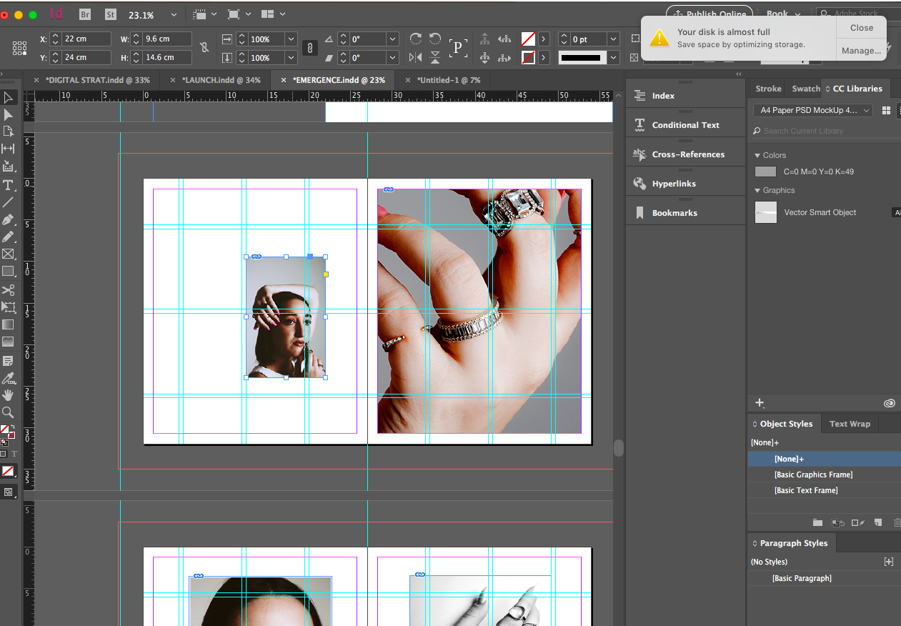
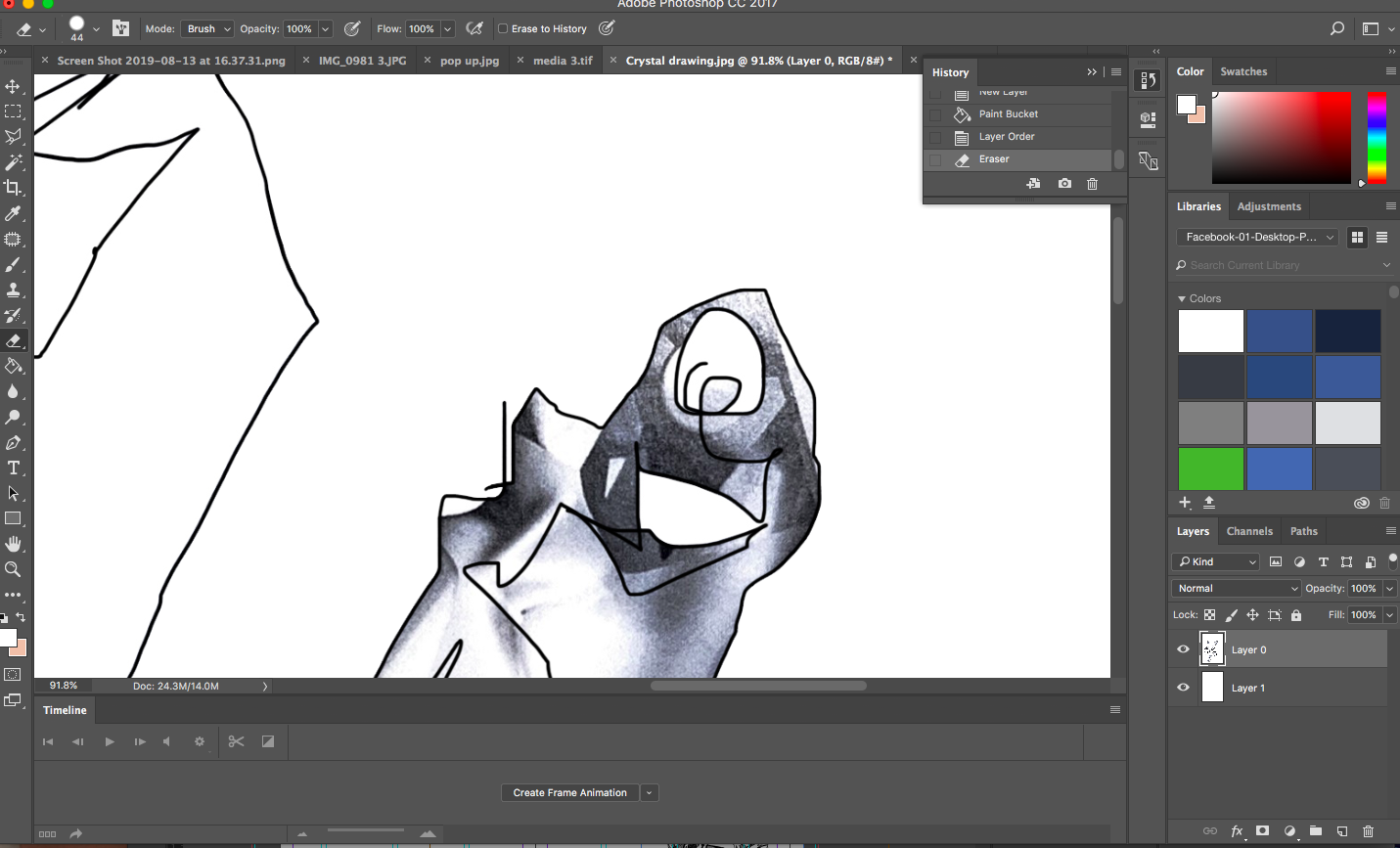
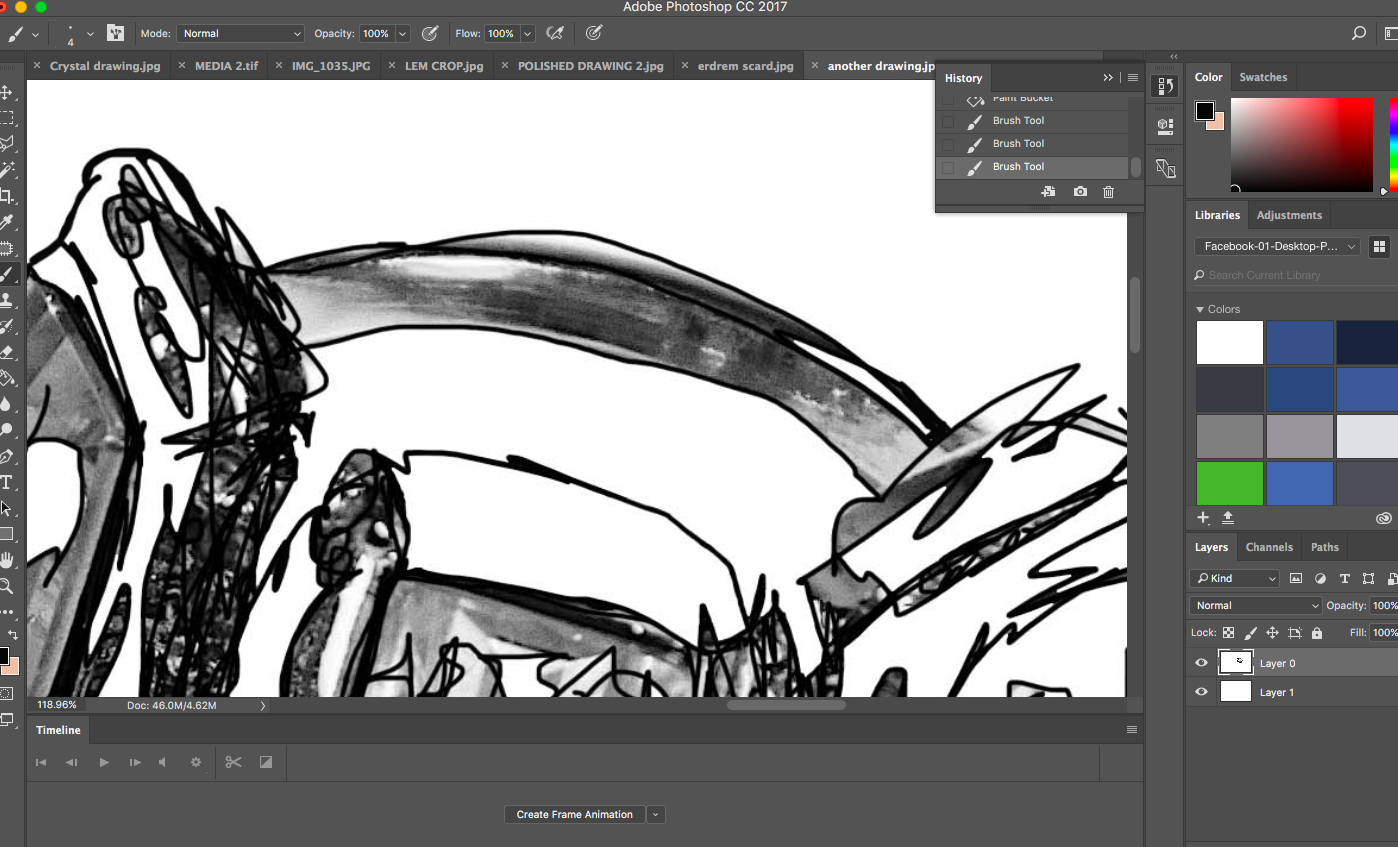
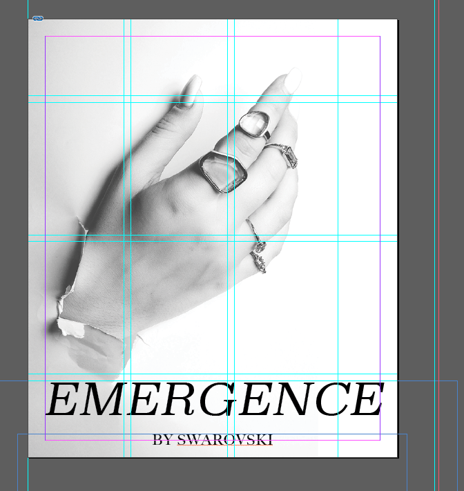
Post tutorial with Harriet yesterday we discussed how the drawing on the cover maybe wasn’t my best option to go with for Emergence. We discussed how this image had a lot of connotation regarding the words emergence and break through and emerging creative so maybe it would make more sense to be featured on the cover.

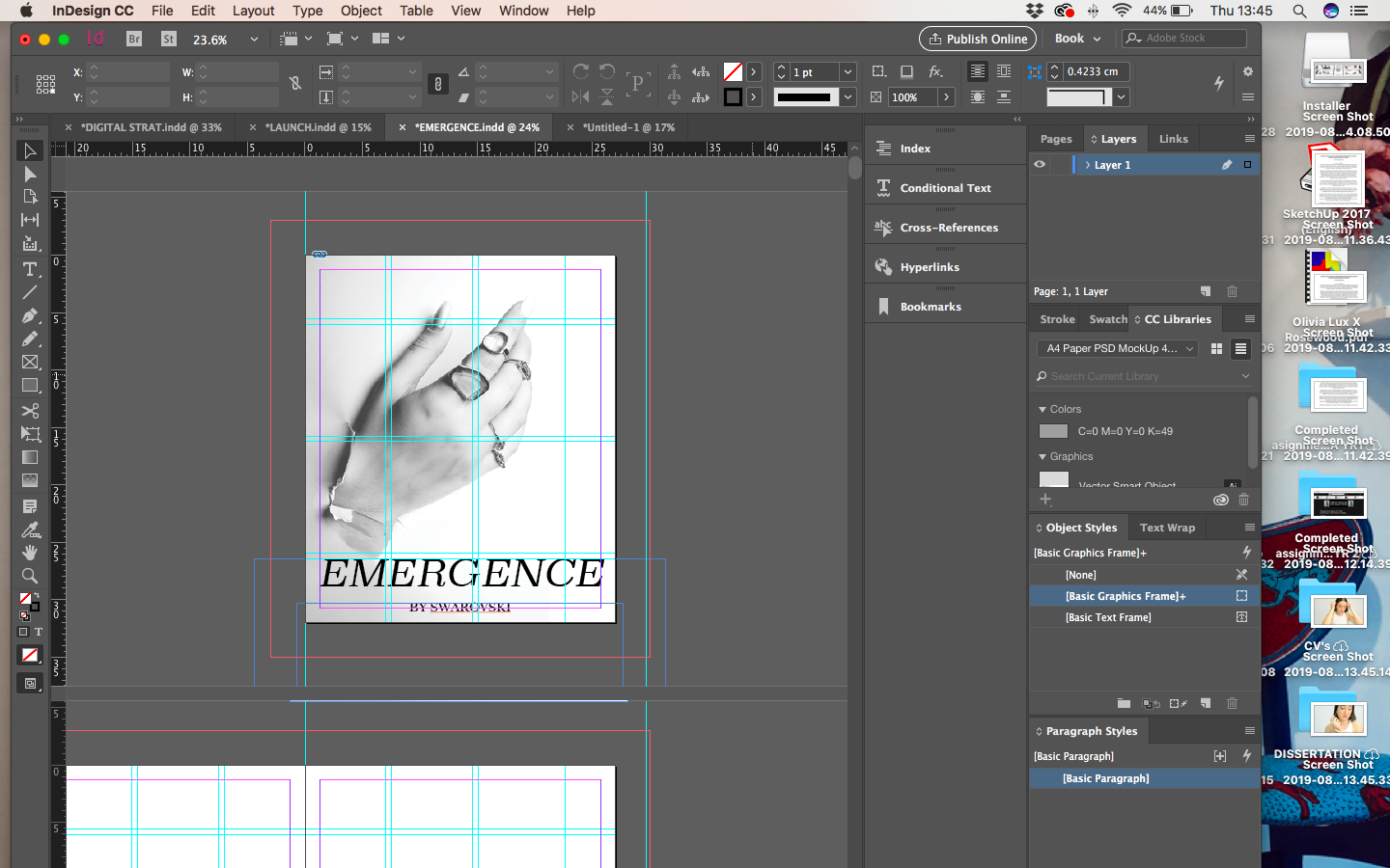
Following this I looked at ways in which the image could look on the cover using transparency, black and white filters and moving the image around the page. I used transparency to lighten the corner of the image to almost look like the hand was coming through the book page itself and lightening the edge really made it look like it wasn’t an image that had been cut off. The top left image is the cover that I like the most and this has been created stretching and cropping the image and using transparency and black and white.

This was the intended cover previous, however I have decided to keep all illustrations inside the publication to keep a more clear structure of the book, in the aspect that it is not an illustration book.

Key Consumer Research

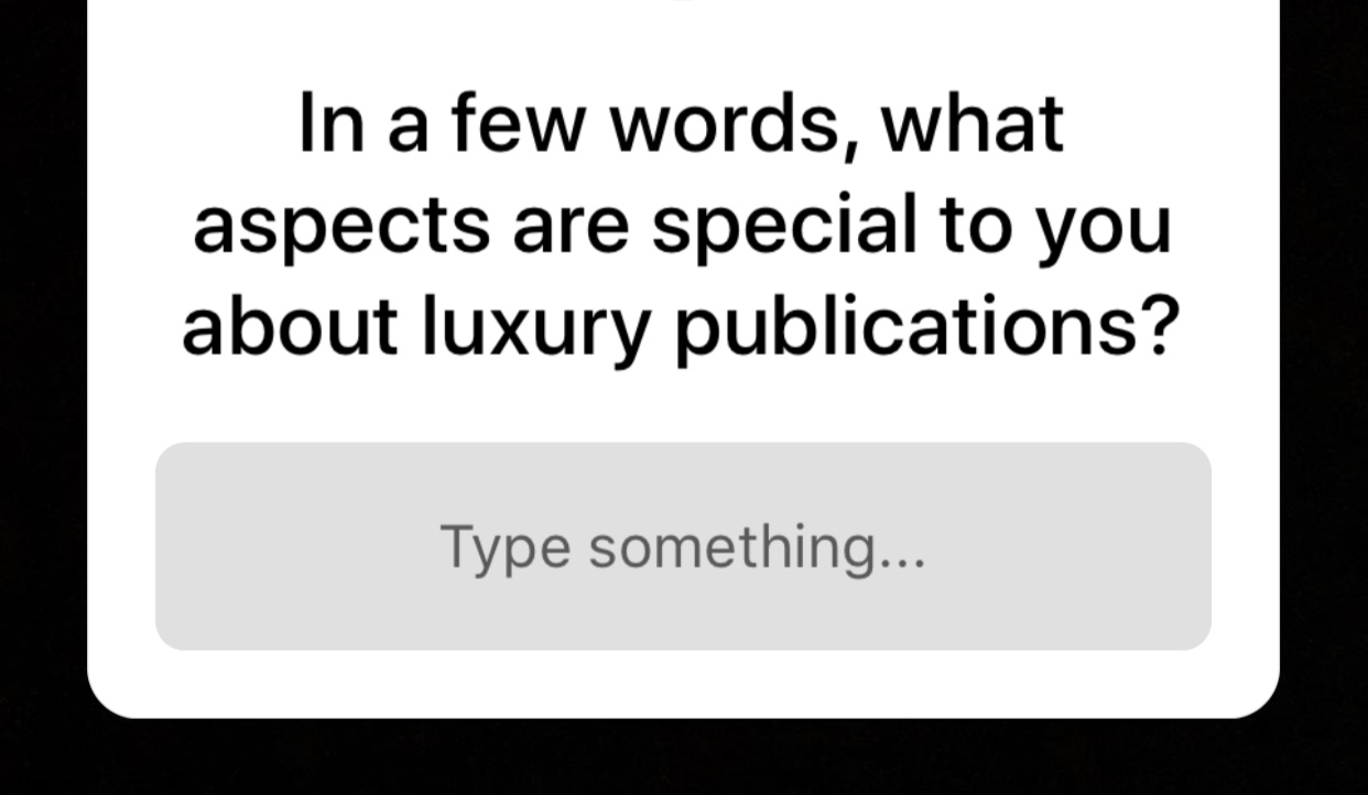
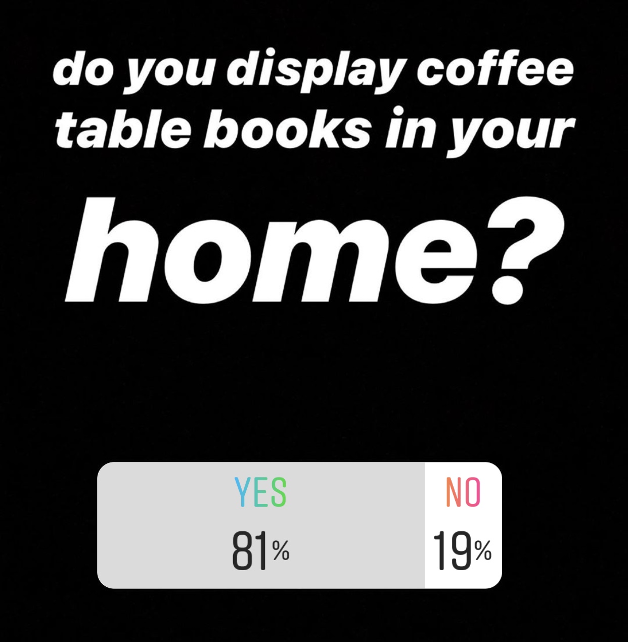
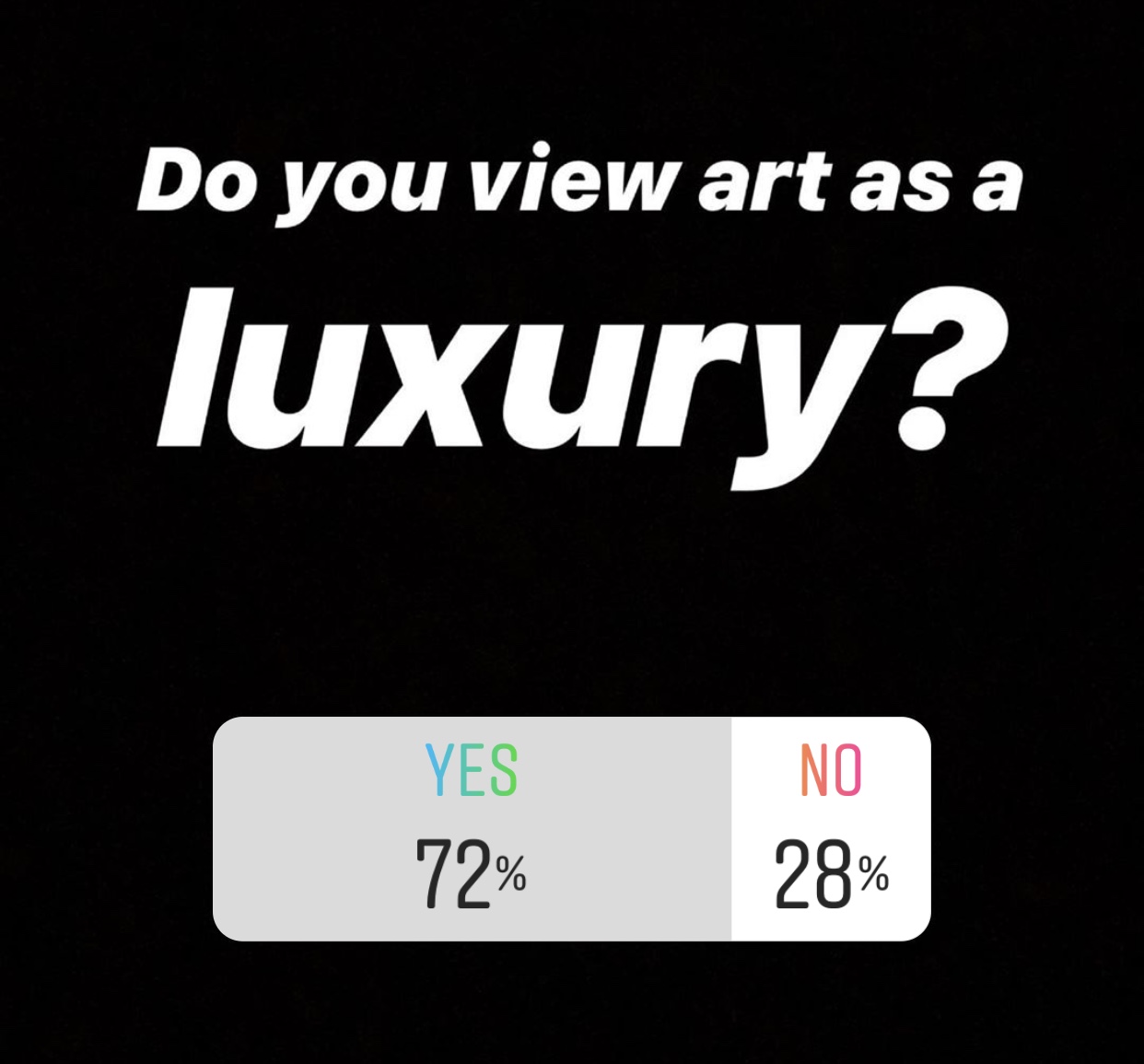
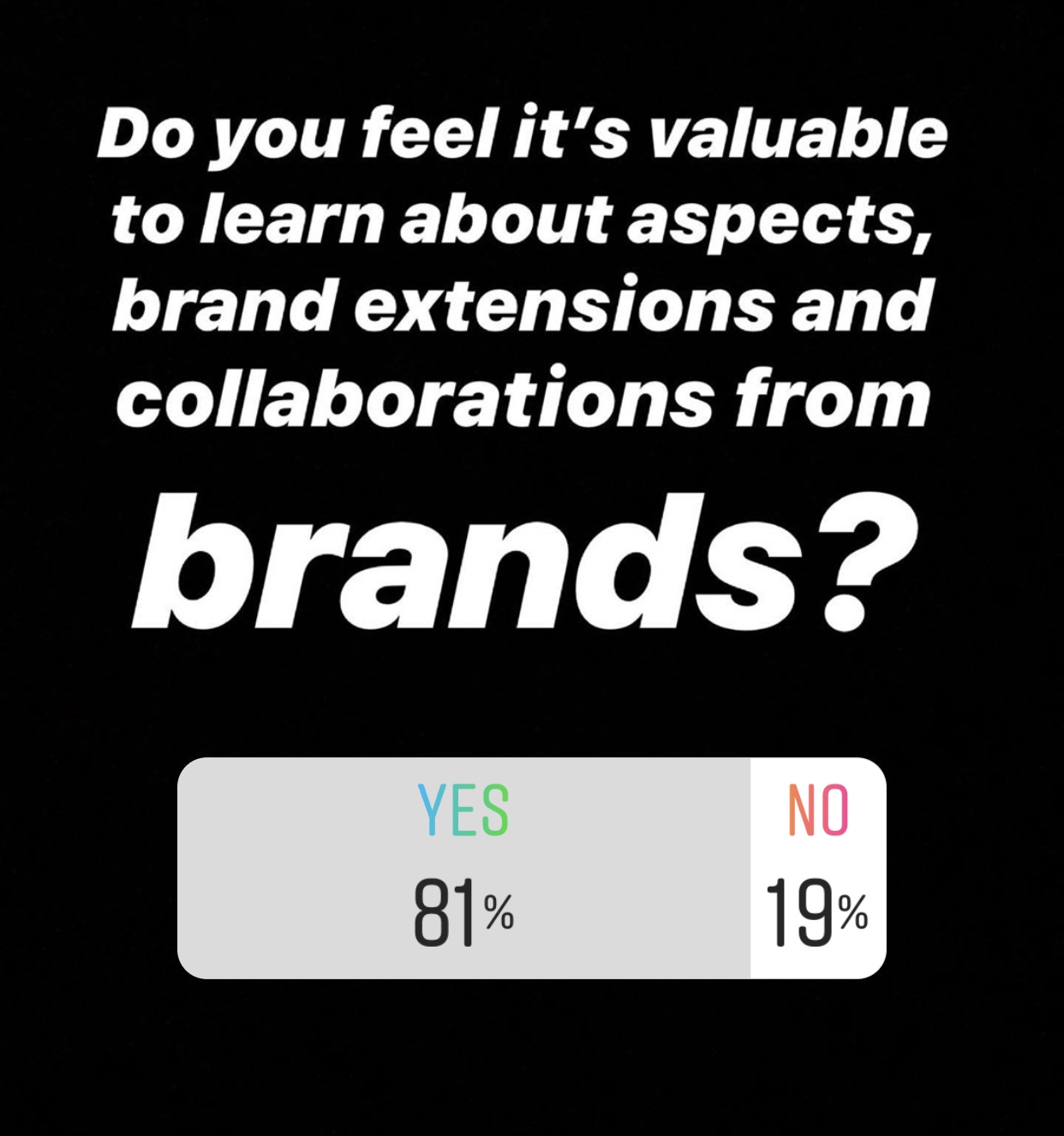
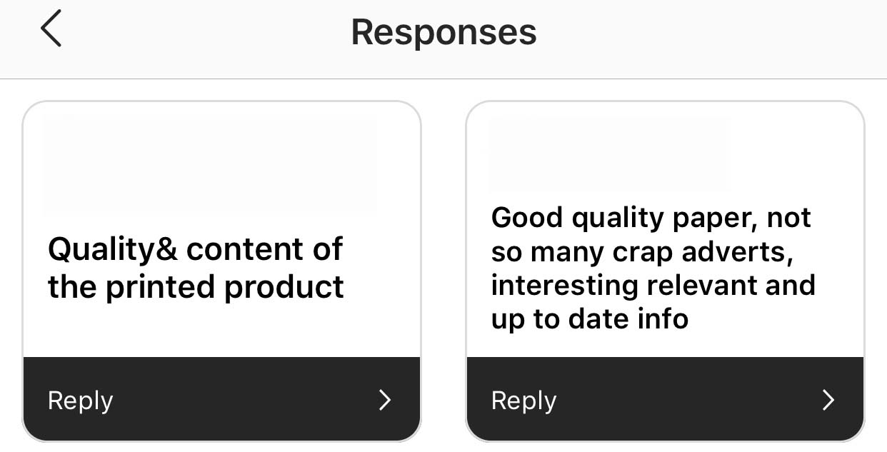
Through undertaking this primary research with 10 coffee table book collectors and readers I was able to gain really valuable information as to what readers and consumers look for when purchasing and becoming an advocate for the publication.

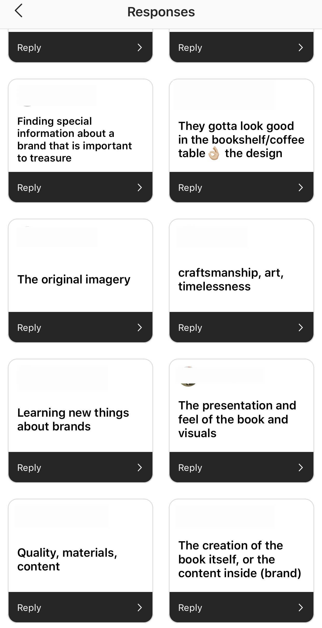
These were the responses:

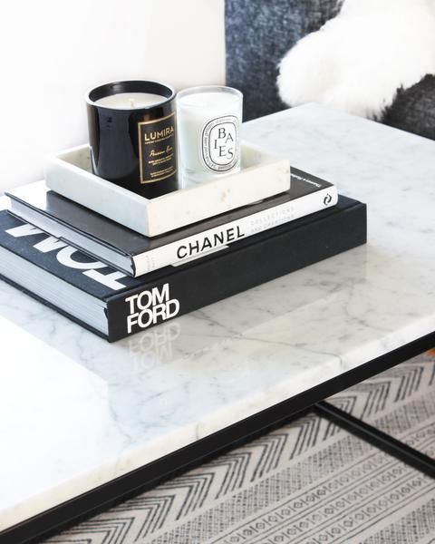
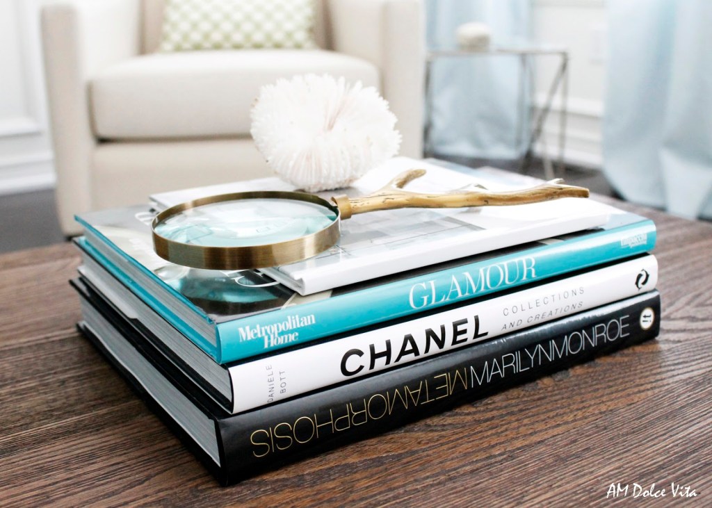
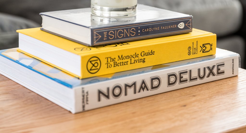
It is clear through these responses that quality is a massive aspect, as well as making the publication aesthetically look like something one would want to display amongst other publications. Many stated that they wanted to learn something about the brand through the publication, which compliments the research I gained through my dissertation thesis. Most of all, craftsmanship was something that regularly occurred- meaning people purchase for the quality of design, layout, paper quality and imagery- something that will be fed into Emergence (with a student budget, however).

This research has really allowed me to pinpoint the aspects that require the most focus when taking this publication to the final steps and taking it forward to become a work of art.

Spacing and Layouts

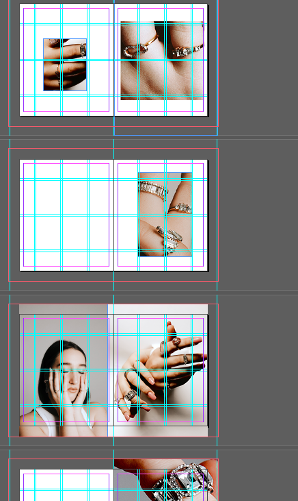
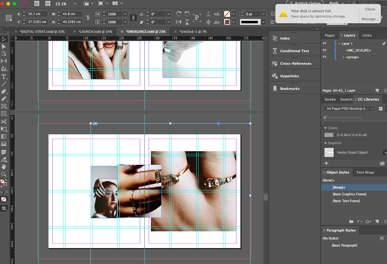
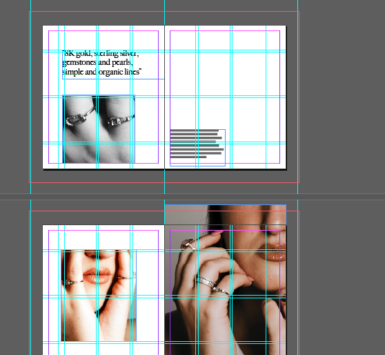
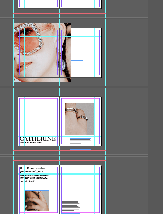
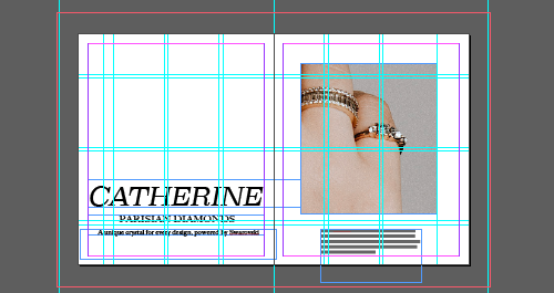
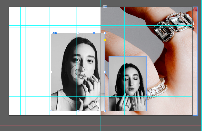
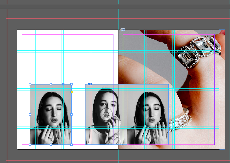
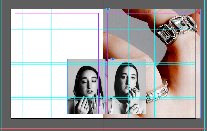
Following a tutorial with Harriet yesterday, it was agreed that the two branded shoots ‘Anoushka’ and ‘Catherine’ imagery needed to differentiate slightly so I have been working on giving the Catherine shoot more space to breathe and a greater DNA that evolves with the brand. In doing so I have named the pieced ‘Parisian Crystals’ to elevate the brand DNA and bring the brand to fruition through the images.

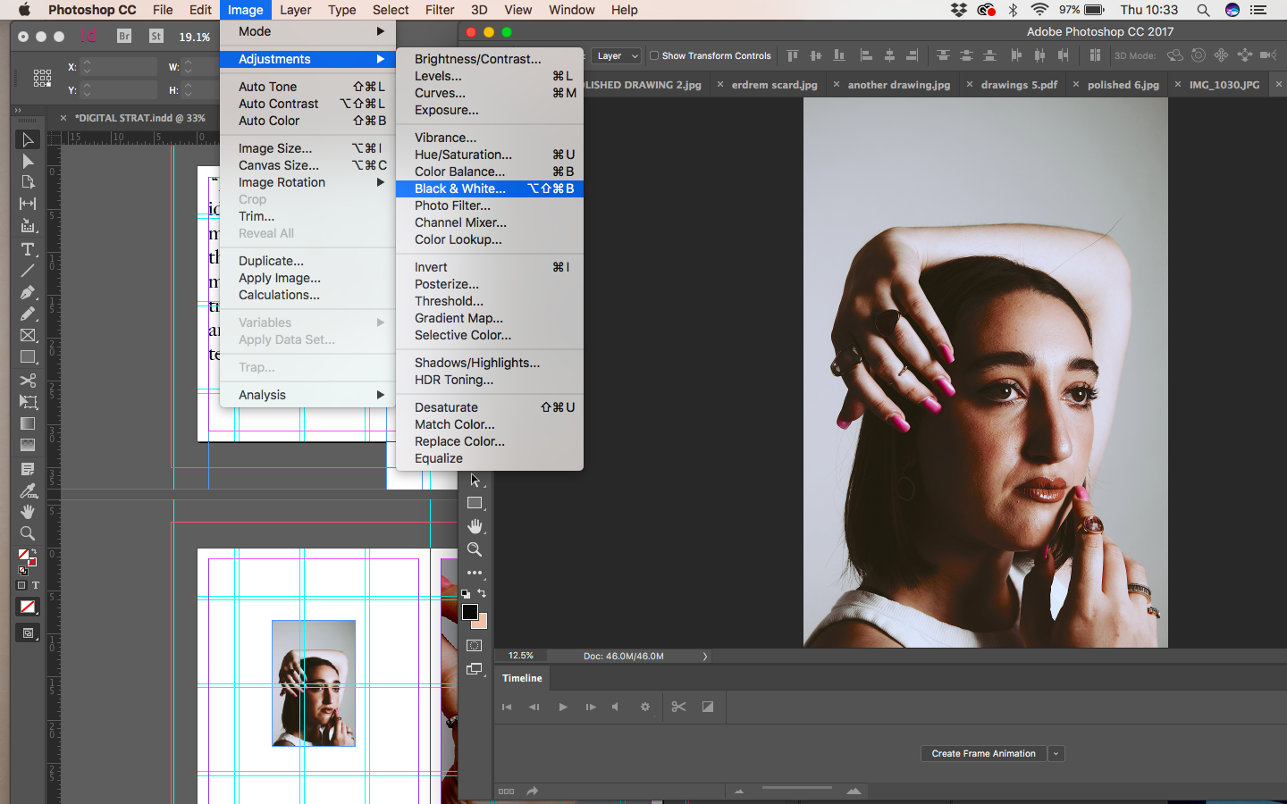
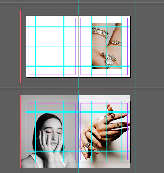
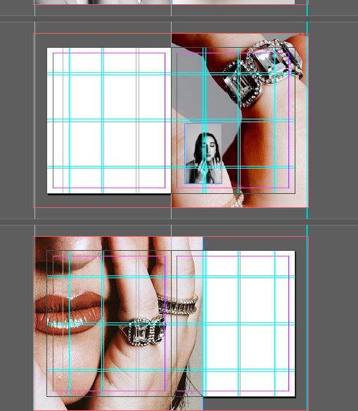
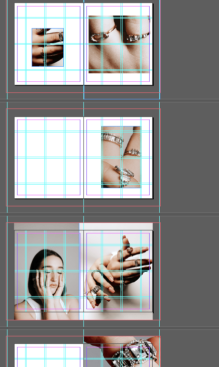
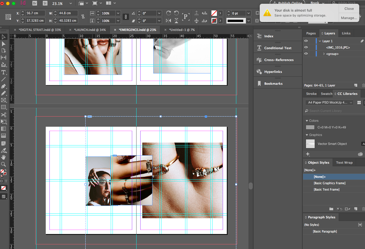
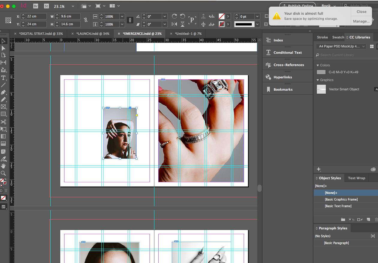
In doing so I decided to experiment with layering on top of imagery to understand if utilising this layout gave the images a greater space to breathe on the page. I also created greater crops in photoshop to bring a greater deal of attention to the pieces. I then decided to pull some of the imagery into photoshop and create some light- in doing so I wondered what the imagery would look like in black and white so I then placed that among some coloured imagery and I think this really differentiates the shoot as well as communicating the minimalist theme of the brand.

Above shows me editing the imagery and then placing within the pages to see how the black and white worked with the coloured imagery. I think this really makes the brand and the shoot stand alone against the Anouska shoot through the juxtaposition of light and dark as well as crops and the black and white sheen over imagery adds a further glisten.

Creating the gutter for my publication

Further Layout Work

Gutter and Margins:

Here I have been developing processes of layouts through working on gutters and margins for my layouts.

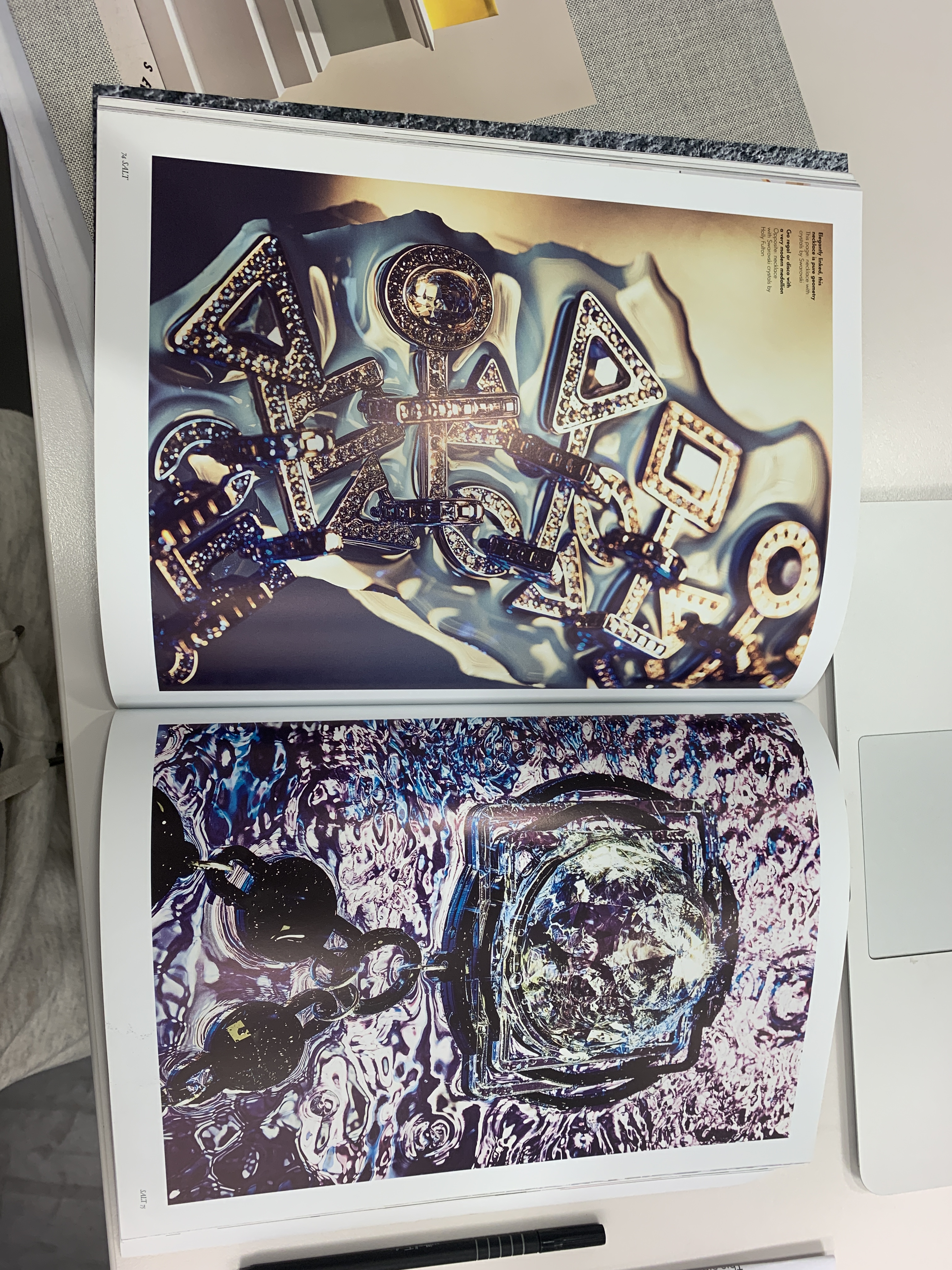
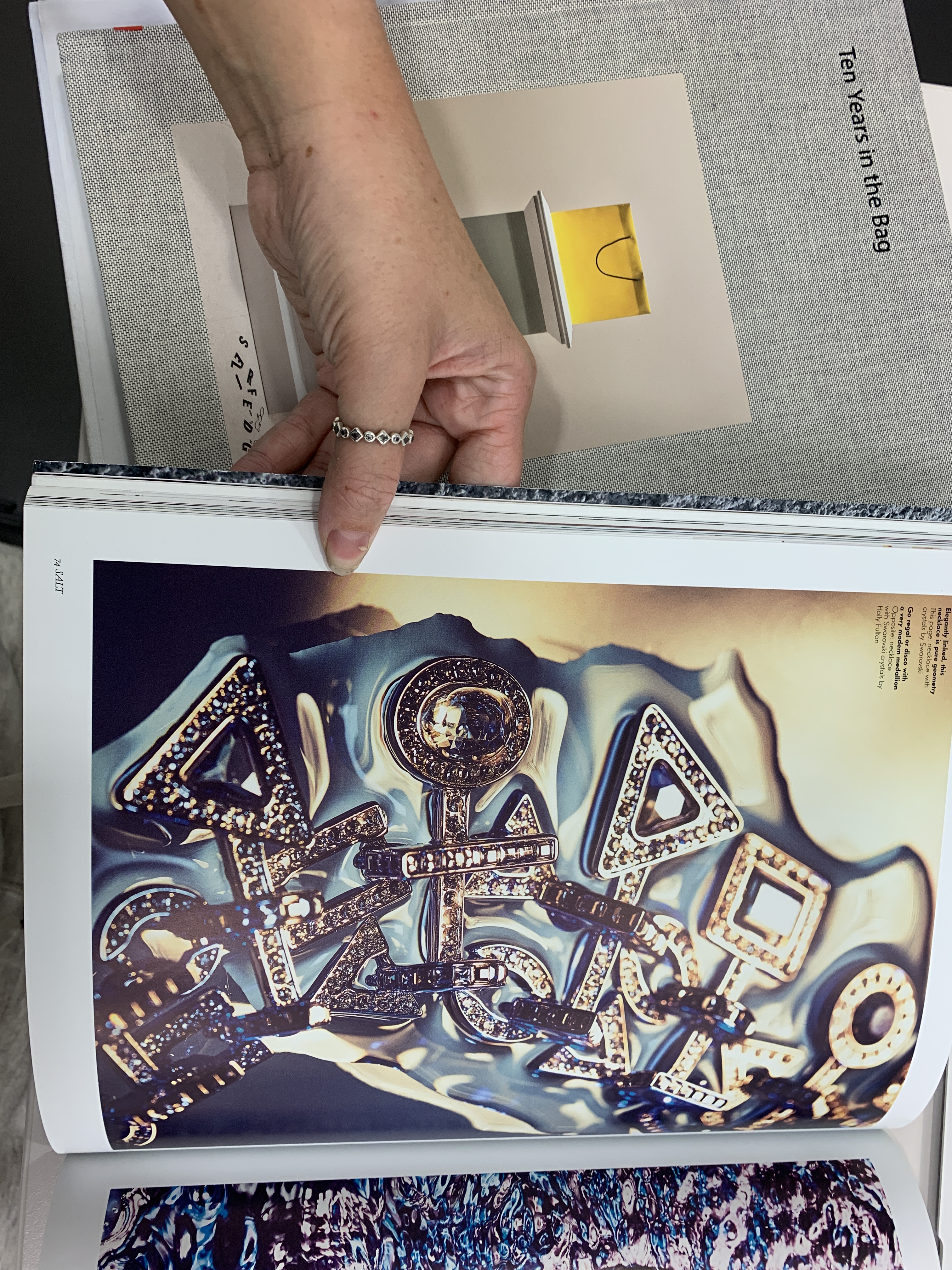
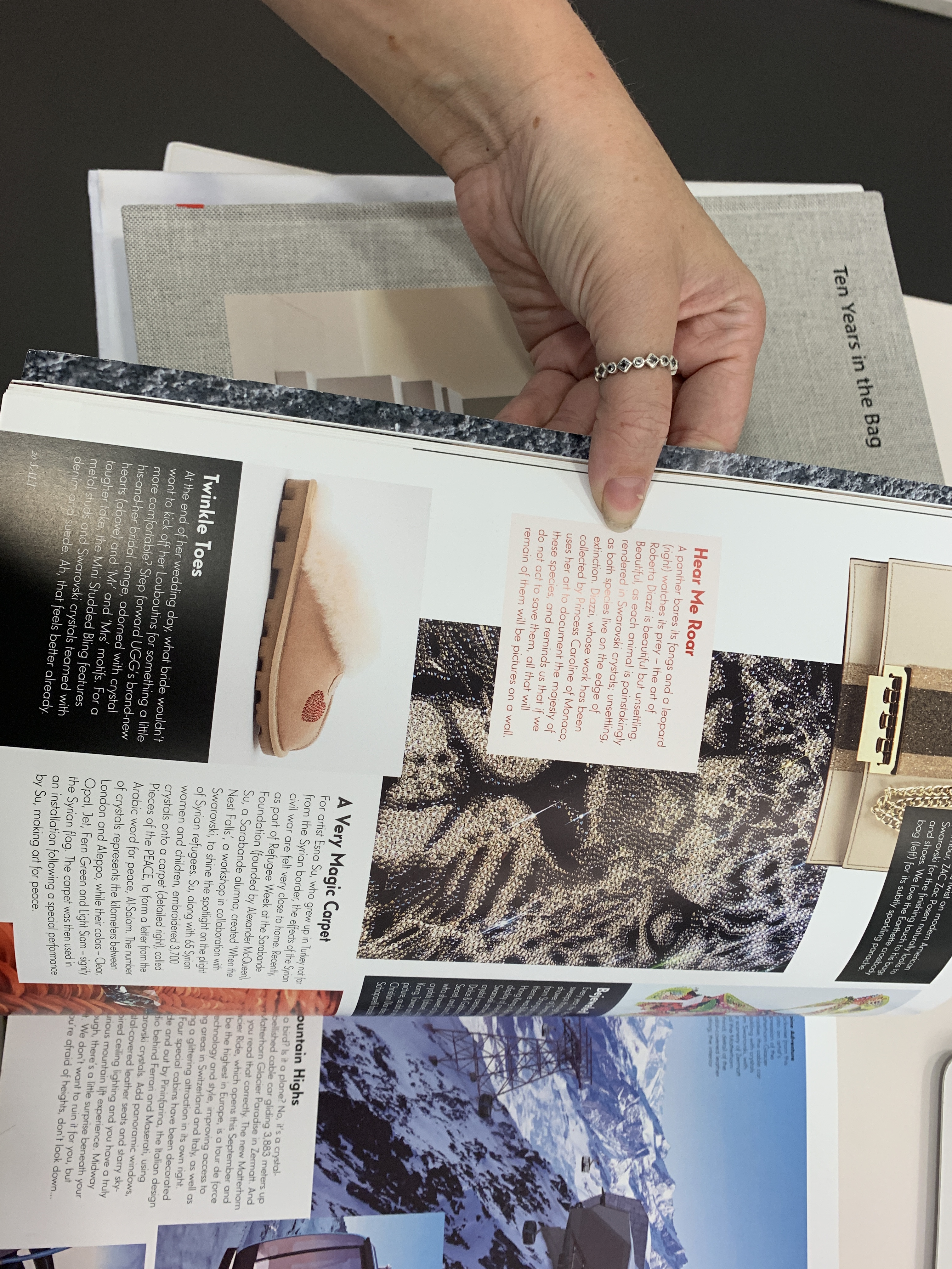
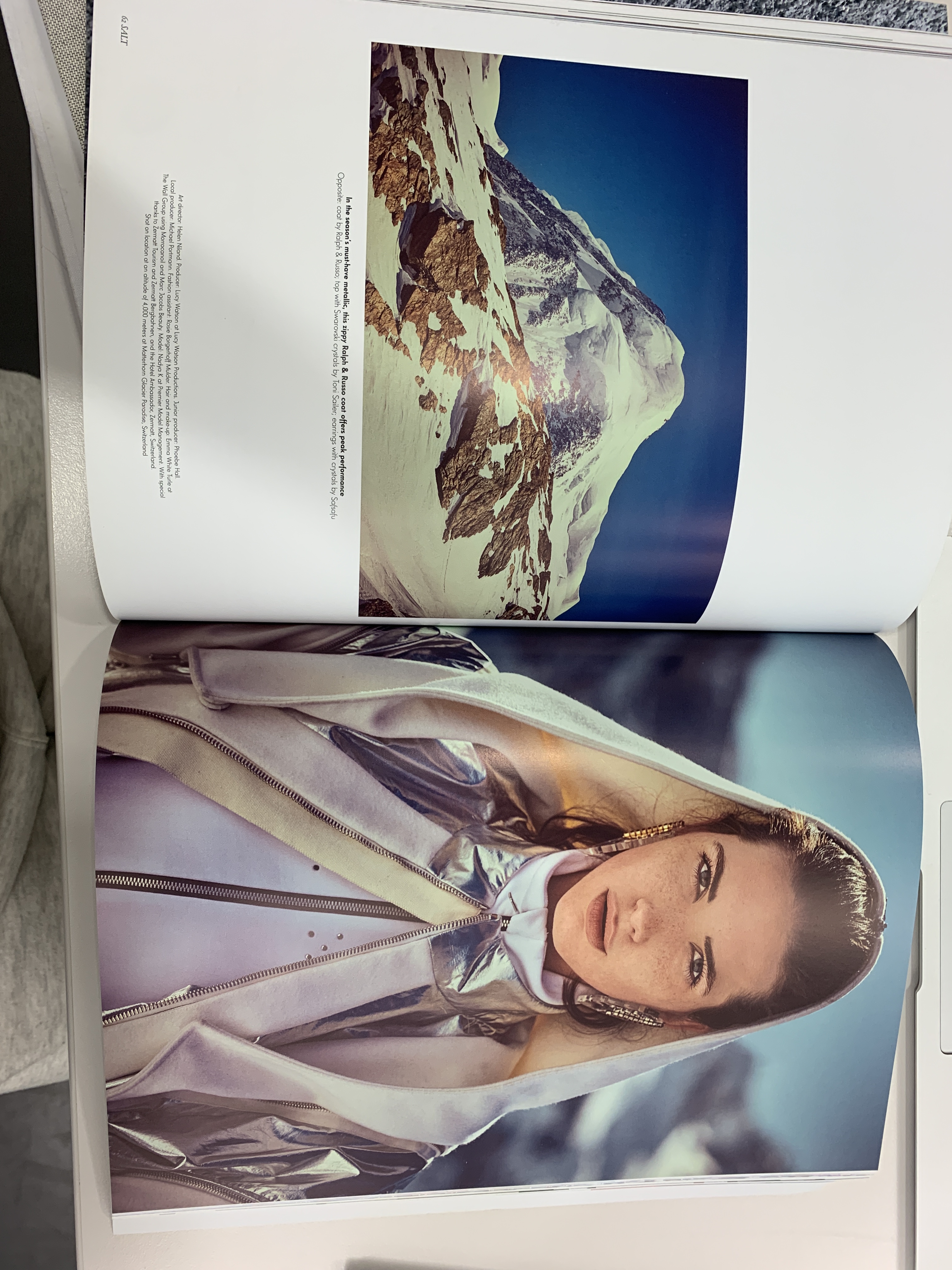
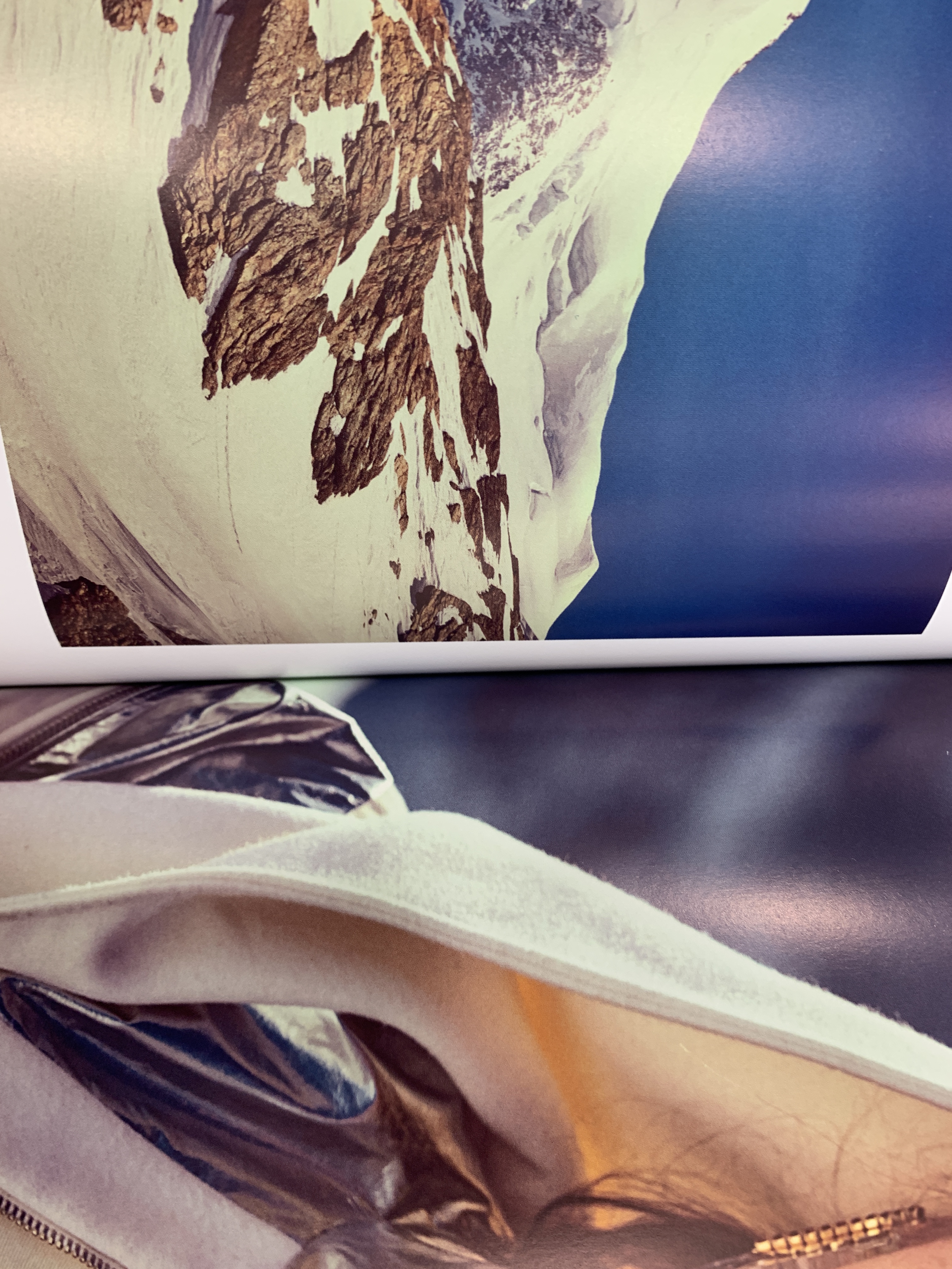
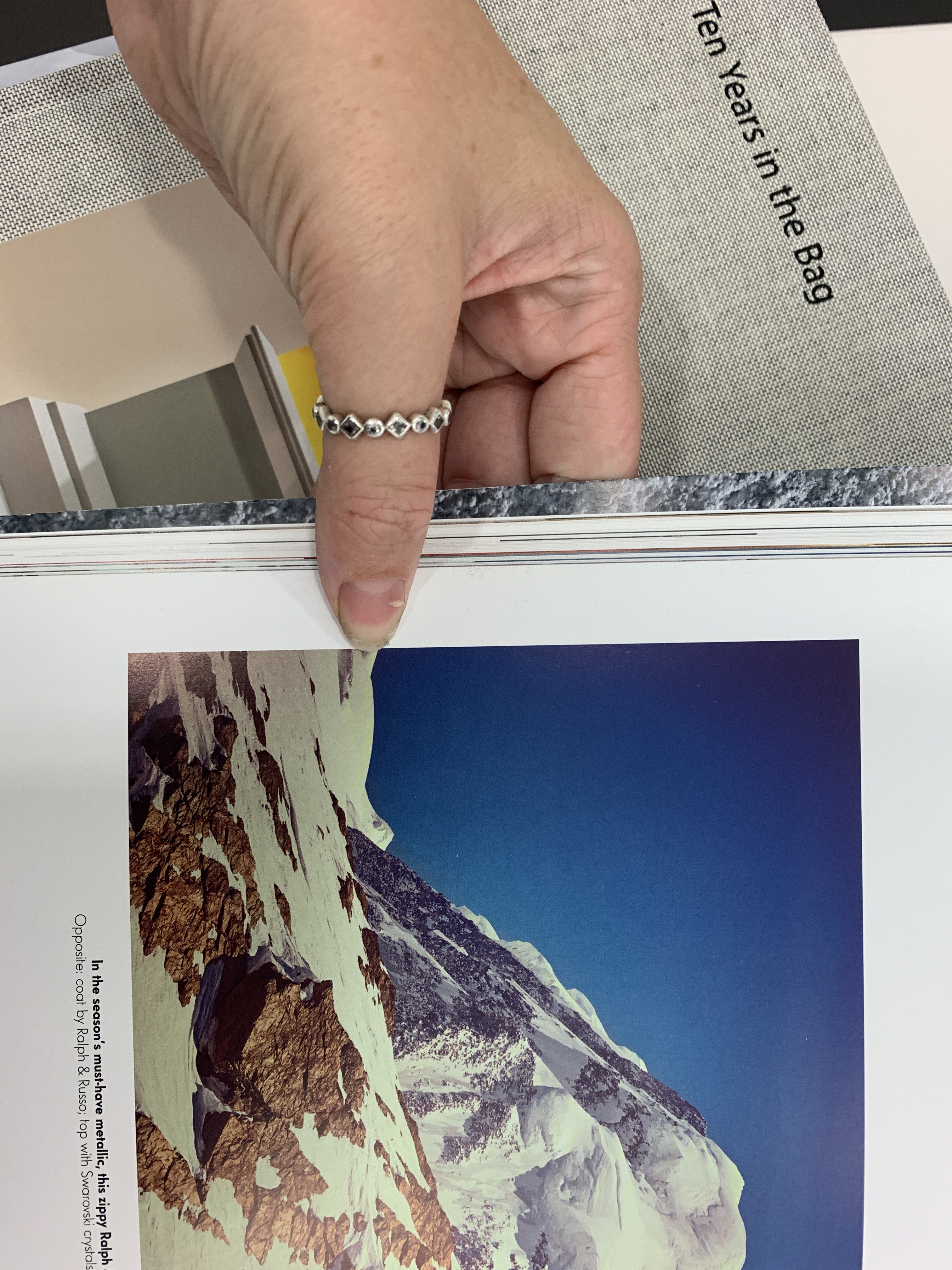
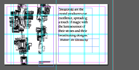
As seen above, I have researched into Salt magazines layouts, grids and margins in order to formulate spacing into how I will space imagery against the side of the publication as well as uses of spreads and negative spacing.

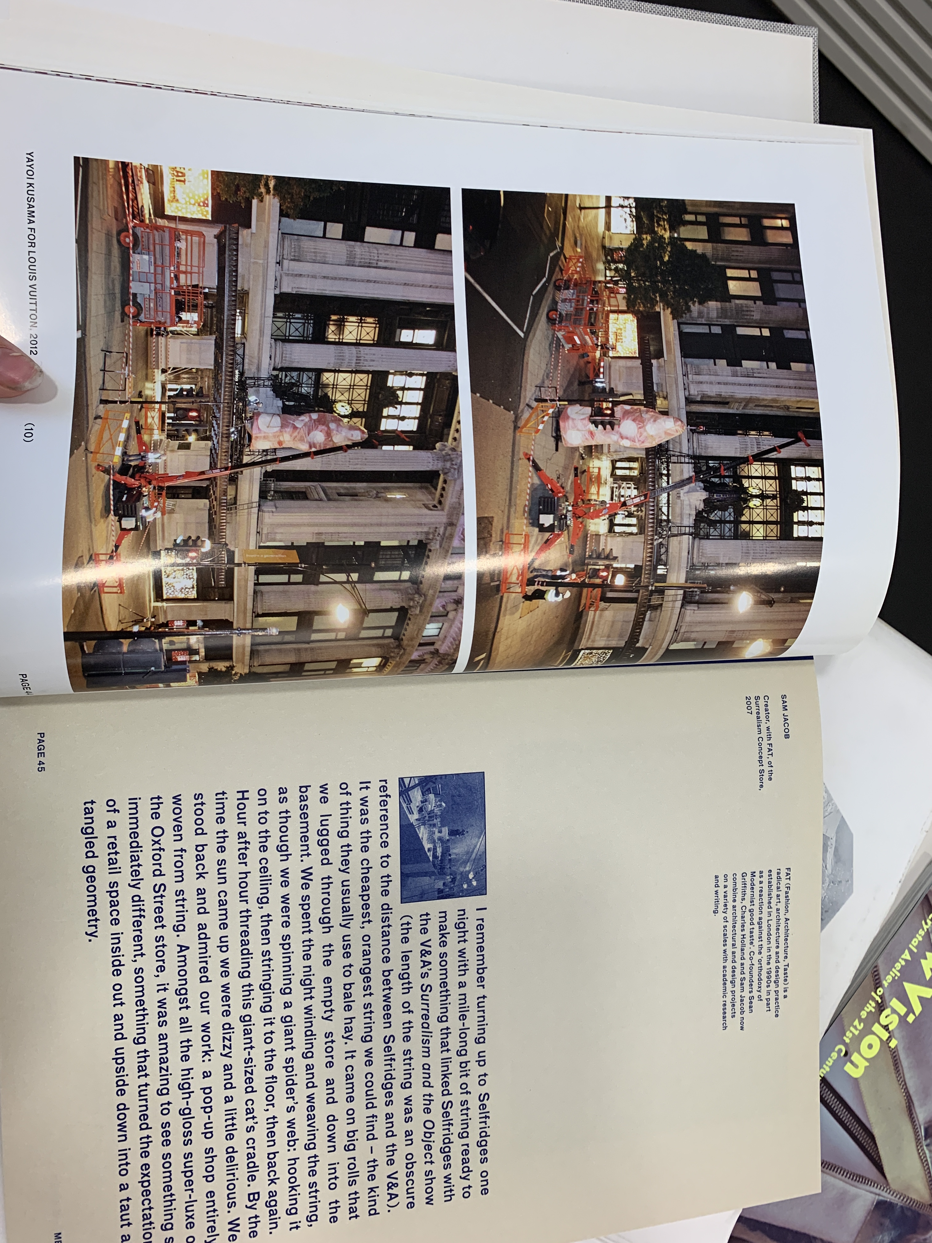
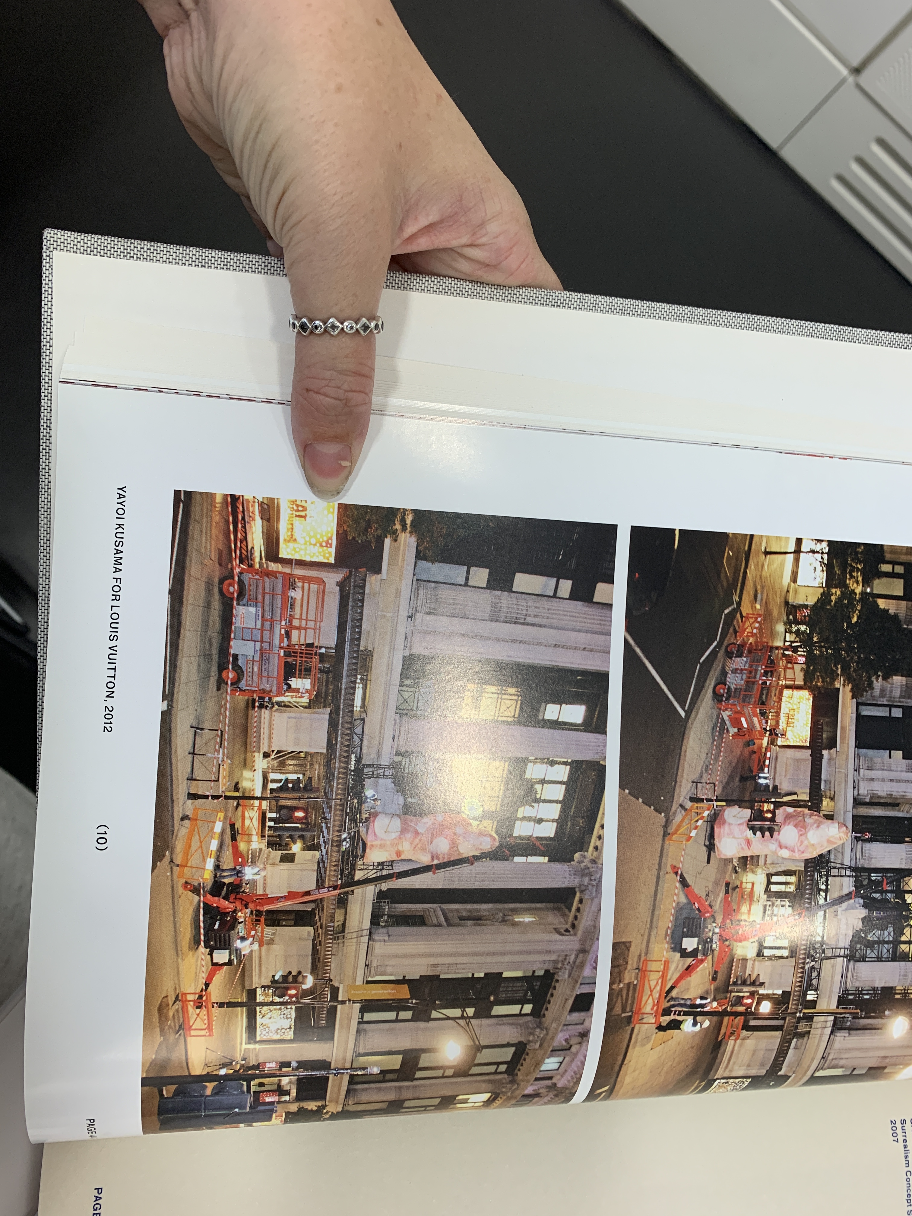
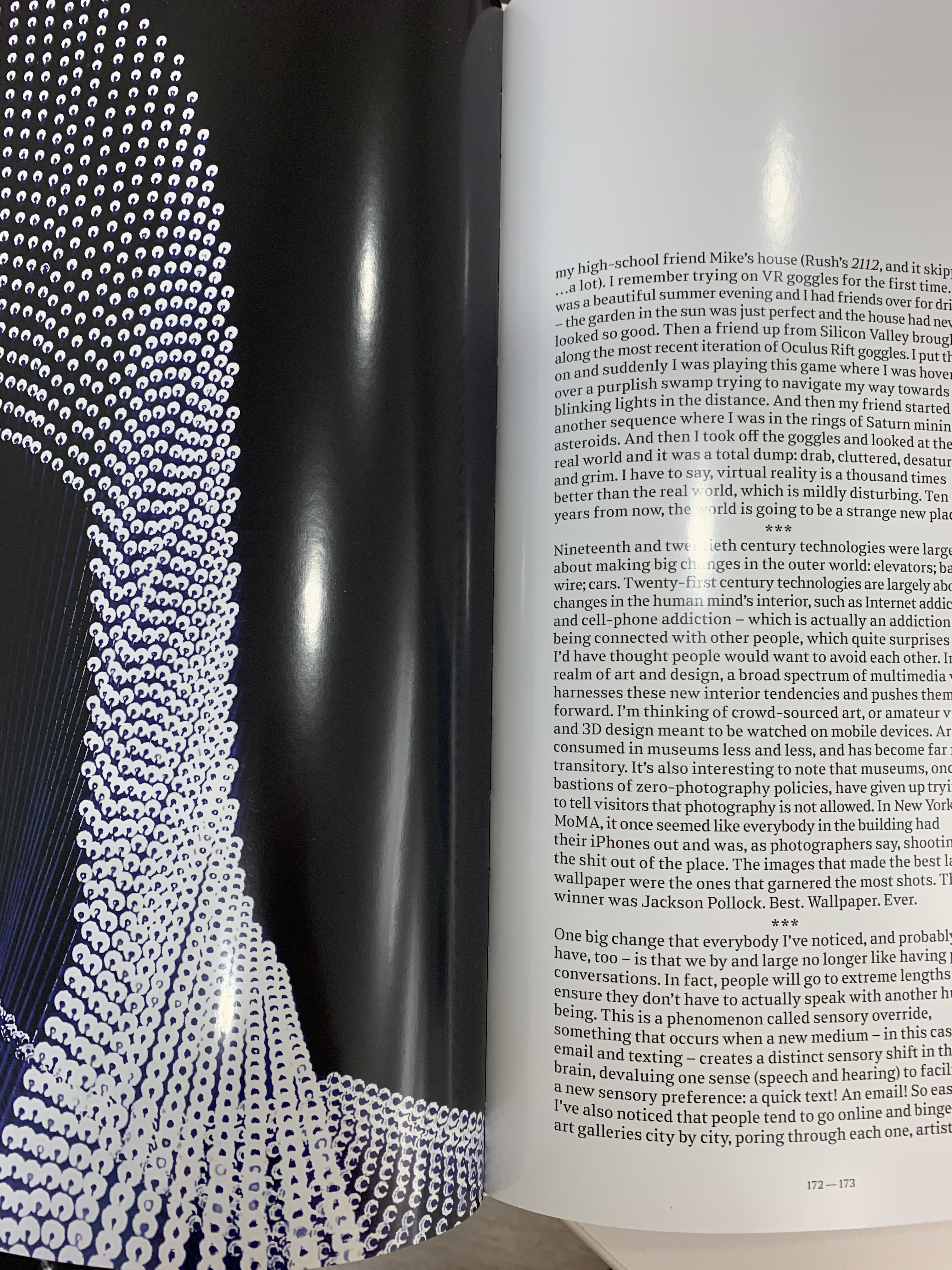
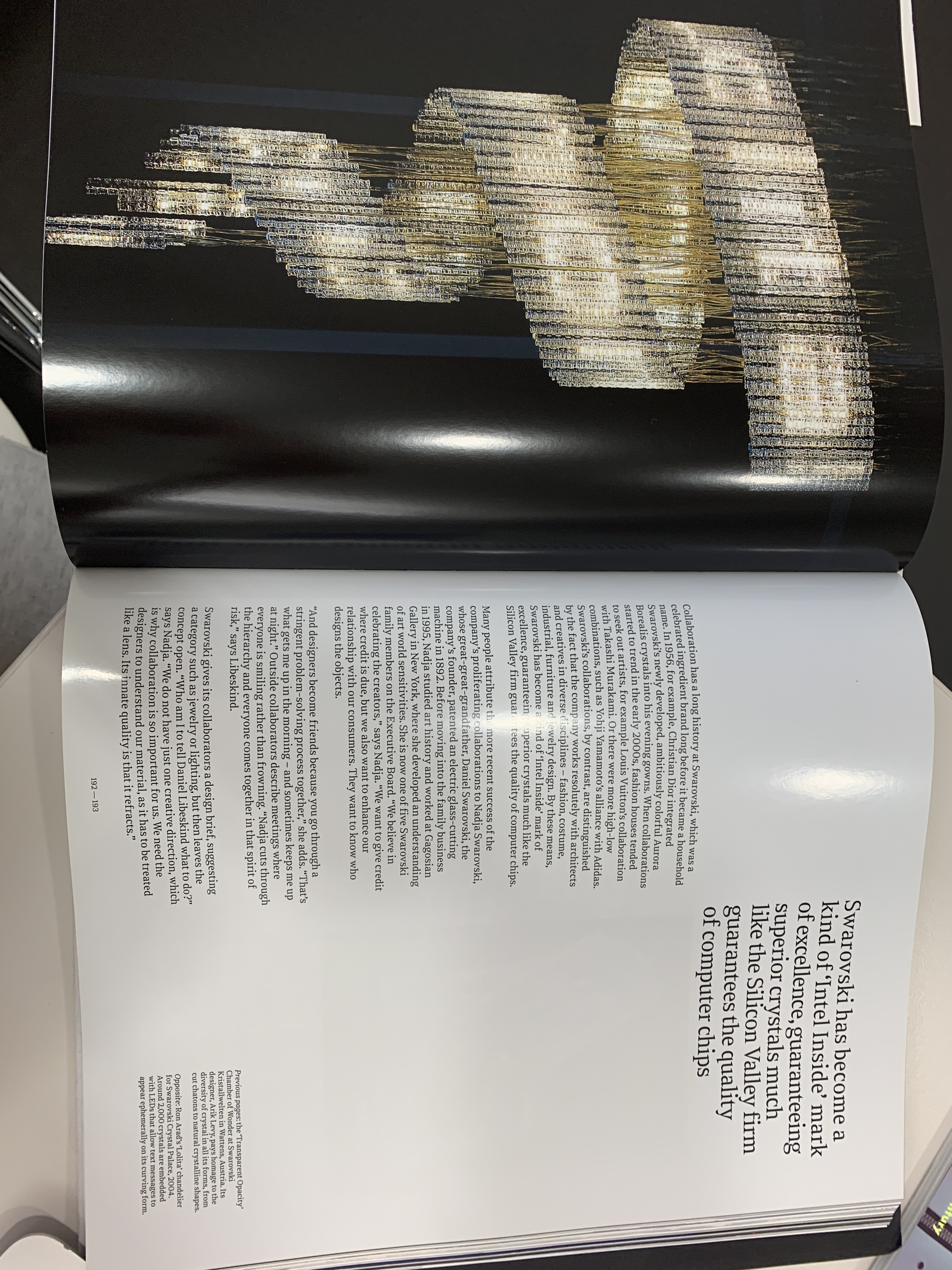
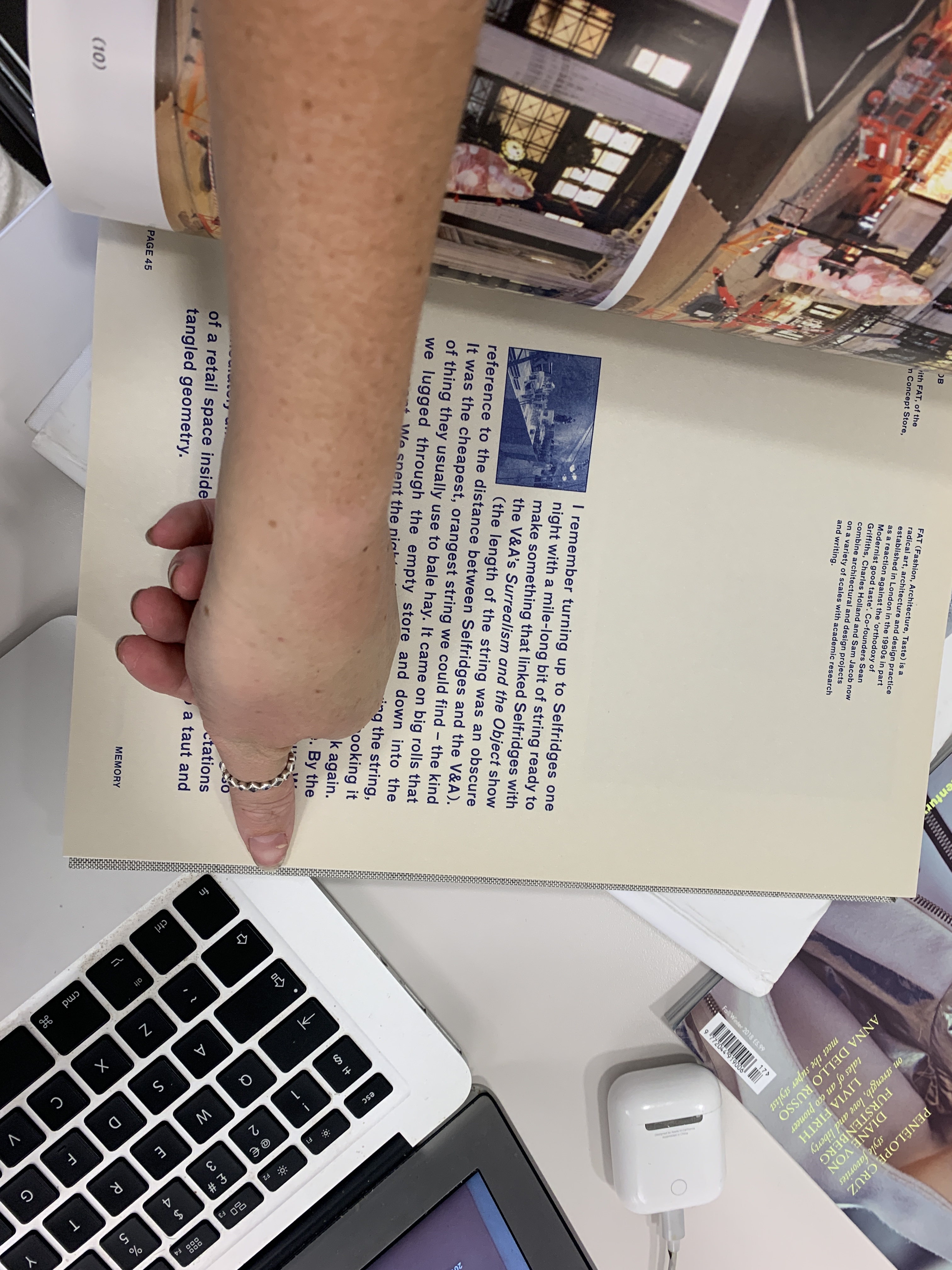
Here, Ten Years in the Bag, by Selfridges uses a bigger gutter and margin in their publication as well as using a much larger font size and their layout is a lot less minimalist. The size of the book is also a lot small than Emergence will be as it is A4- this isn’t something I am looking to take into Emergence as I think the large and bold text in the centre of the page takes away from the luxury aesthetic of Swarovski though Emergence.

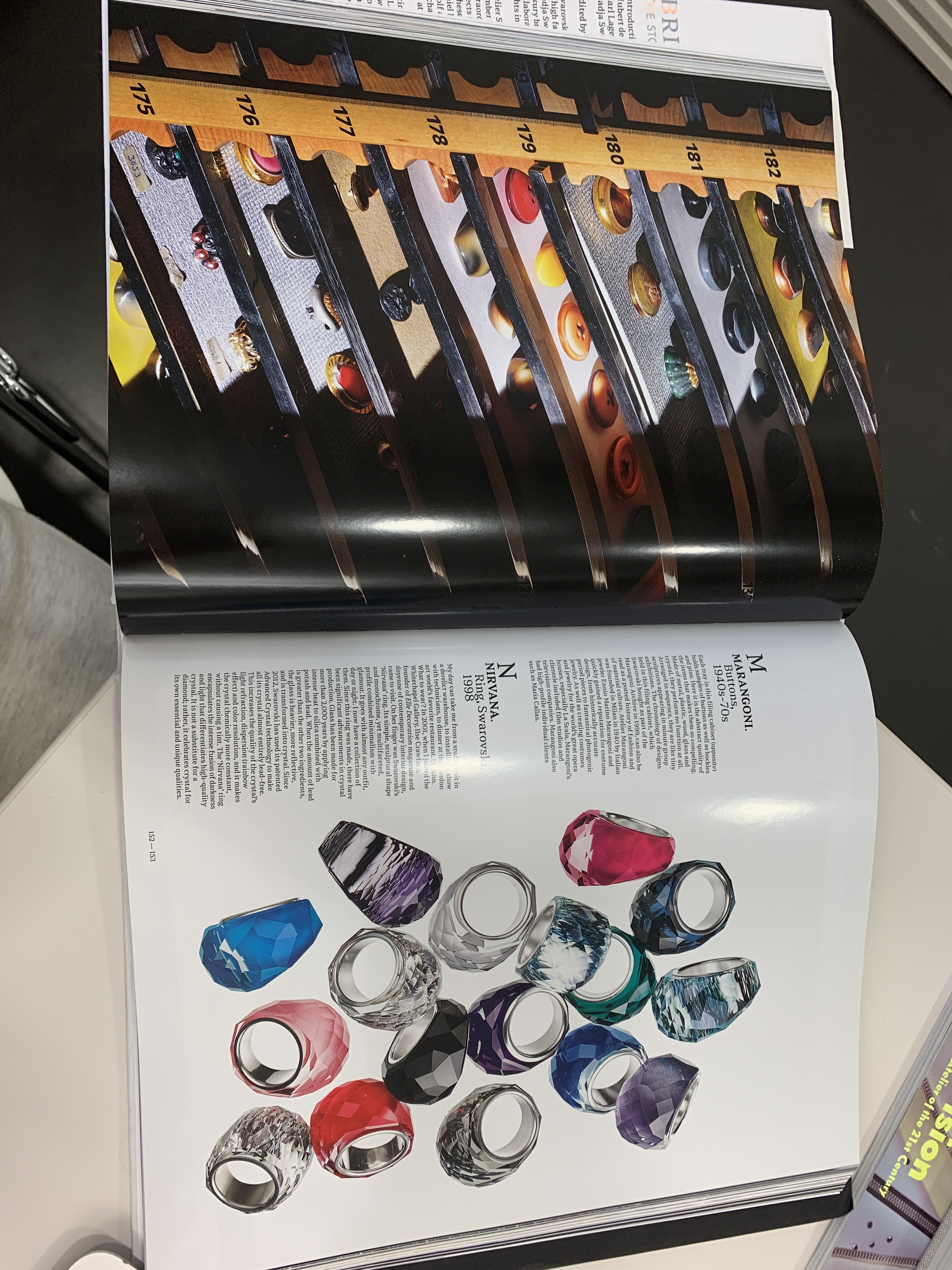
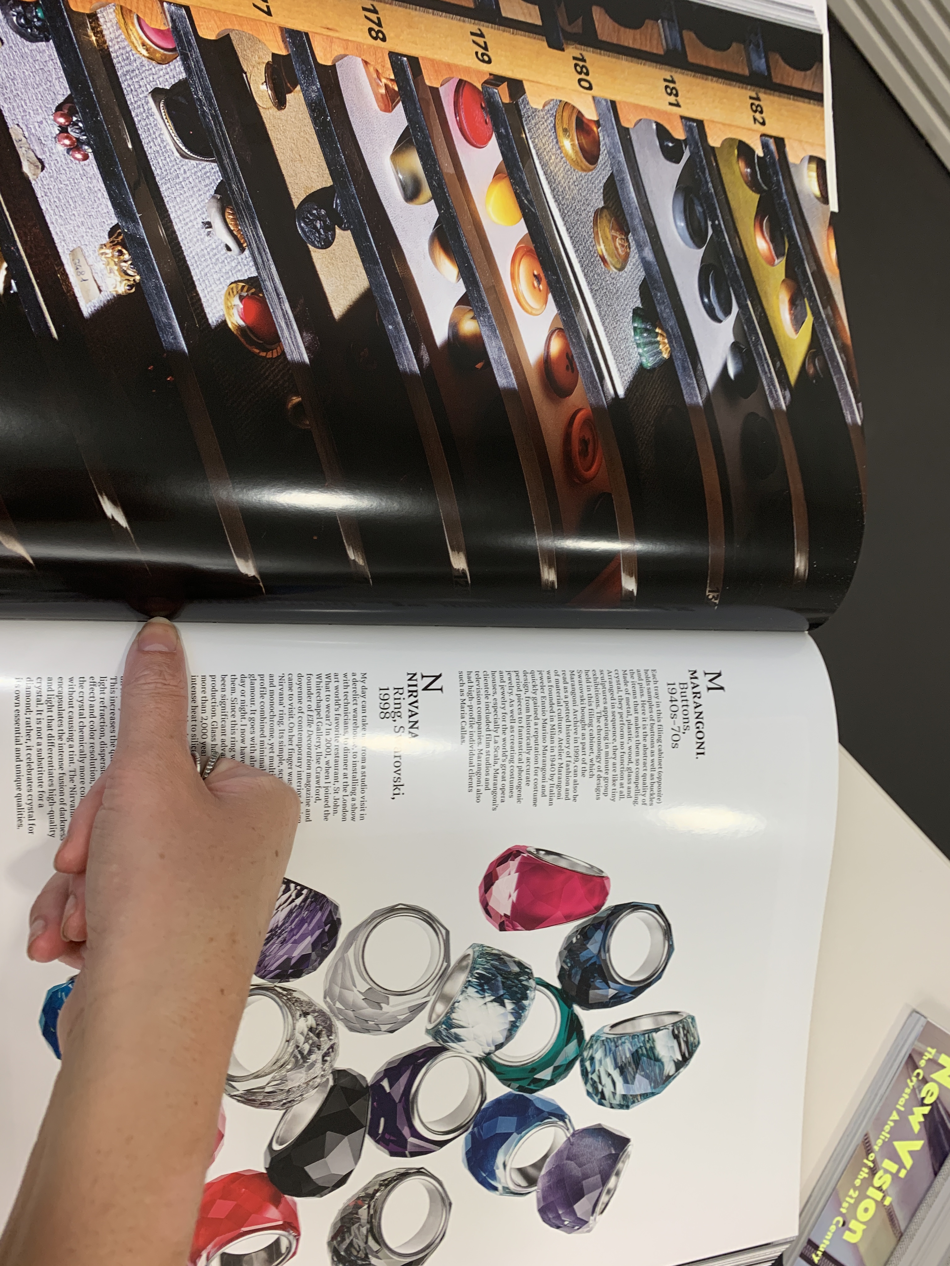
The Atelier Swarovski book is a main point of inspiration as I want to make sure they work hand in hand. The guttering here is smaller than the Selfridges book- it also provides a good grid on the page which is something I am trying to utilise within using grids in indesign to layout my text within. The juxtaposition of the large quote is a theme that I want to translate into Emergence, and the full bleed image next to a page utilising negative space works well due to the spacing of the negative space and text using the grids.

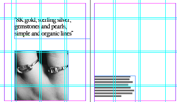
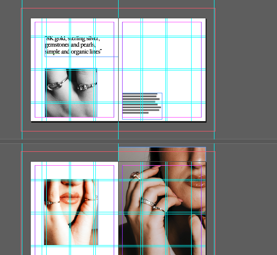
Within creating Emergence I have utilised full bleed and smaller imagery within grids to provide a greater use of negative space and layout- the use of the quotes against a full bleed image is inspiration taken from the Atelier book, as well as utilising a bleed against the imagery and a gutter provided through indesign to give a structured layout to the book.

Creating a luxury item

When creating a luxury publication it is important for me to decode why people want to invest and purchase a luxury item, or even an item that is a part of a luxury brand. People look to align with a luxury brand, a form of status and exclusivity. People want to communicate to others that they are a part of the brands ‘reference group’. My main point of thinking is that these are aspects that I need to intertwine into Emergence by Swarovski. Emergence has to be a publication that people want to keep on their coffee table in order to convey to their guests/ people that they are a part of this brand. 

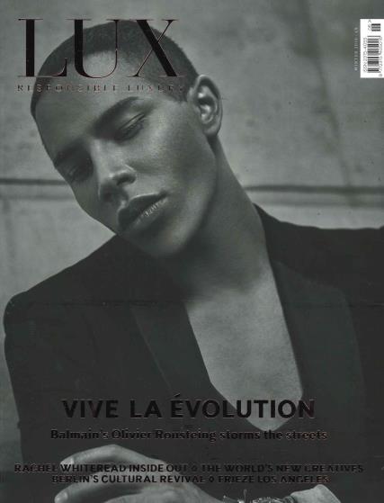
The way in which Emergence will communicate as a form of luxury is through the minimalist design and use of negative space inspired by publications such as Lux. Not only this, but the casing and cover will be hard cover and the collectors edition of the publication will be cased within a glass to elevate the idea of exclusivity as well as status that can be shown in owning the publication. Emergence will allow readers and consumers to align with the brand and want to own the publication through the communication of the support of the creative industries. 

In creating a collectors book edition I have considered all aspects, in the fact of the book sizing. In order for Emergence by Swarovski to be a collectors piece it needs to be on brand with other Swarovski books in order for people whom collect the books to be able to place them together. Emergence is therefore designed the same exact size as the Atlelier Swarovski book so the two can go hand in hand with a collector. In order for the book to be a luxurious coffee table book art piece the collectors edition of the book will be sold in a glass case in order to provide a point of art for the collector. In conversation with Darius Sanai, Editor in Chief of Condé Nast Contract Publishing he maintained it was important for brands to provide a work of art that collectors want to show off and be aligned with. Emergence aims to do this through its design, casing as well as encouragement of art and design within the pages.

Analysis of luxury publications

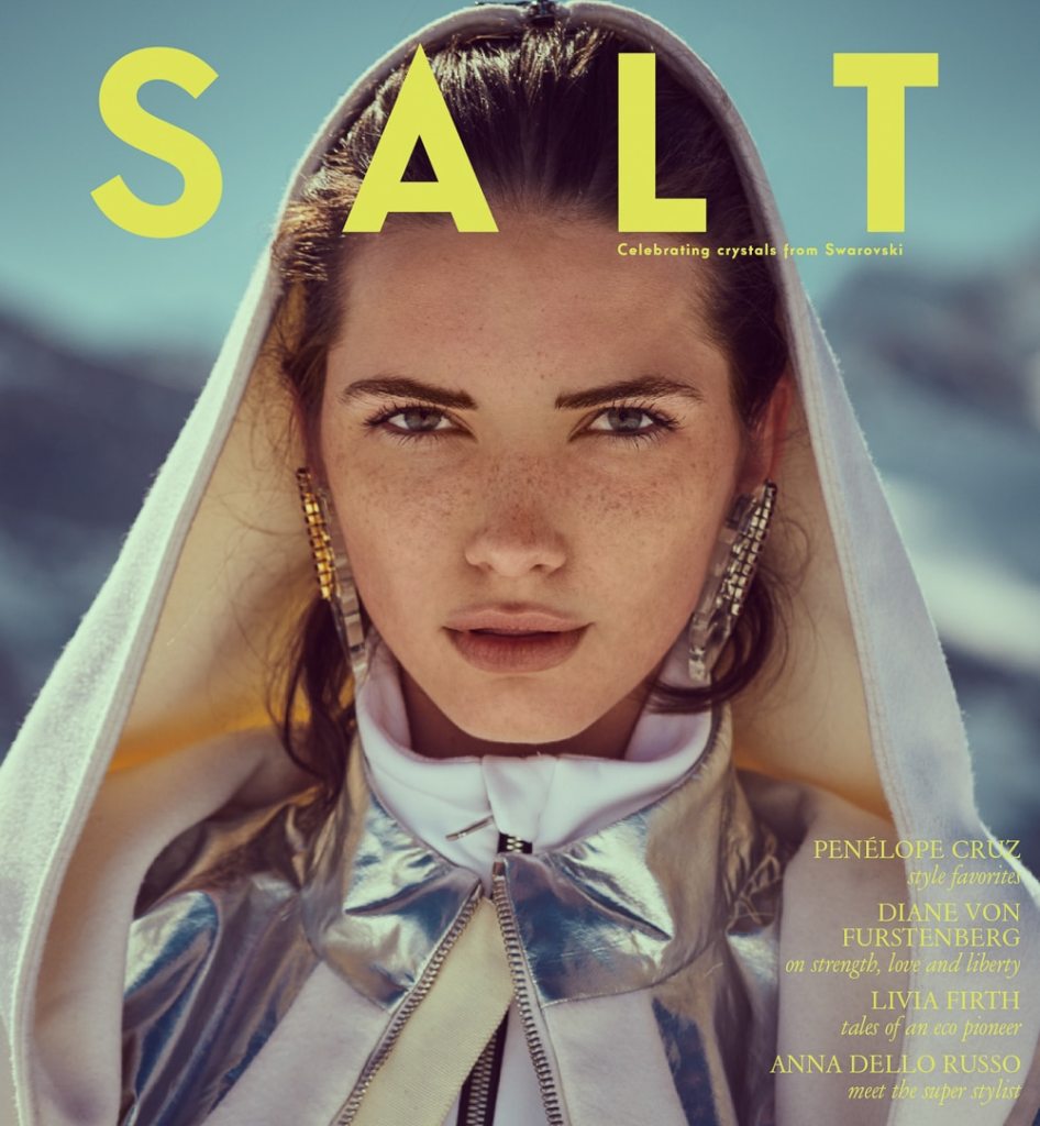
In creating and designing a luxury publication my main inspiration has come from my career aspirations of working within a luxury contract publishing team. I was powered through my underpinning of my dissertation research, as mentioned before, and in this I analysed in depth a luxury print publication, Salt Magazine for Swarovski. In doing so I found that through exploring luxury branded publications from a consumer perspective, in order to understand how they work as a communication method, that consumers wanted to learn something from the brand. I  also learnt through consumer research that the aesthetic was something they aligned to. Research showed that consumers were more loyal to the publication Salt than they were to Swarovski as a brand due to the design and information provided that people formed aspirations too. 

Going forward in creating my own luxury publication it is clear that luxury branded publications sit very differently from luxury publications. Publications provided for on behalf of a brand have a message to give, they are essentially by passing the editorial gatekeepers in order to communicate and elevate the most essential and best parts of the brand. Through using a contract publishing team to create these publications the normal roles of editors and editorial teams are bypassed and the brand is in control of their communications. 

In terms of luxury design, magazines differ from books- in analysing Salt it was clear the modern and designed editorial and pages drew in the reader and formed a feeling of accomplishment through learning, however, I believe that there are more subconscious levels to forming aspirations around branded publications. When a brand is in control of their communication methods they have the power and money to control what goes into a publication. The paper is therefore a better quality, the layouts are more dramatically considered and the cover is specifically designed on strong GSM paper. In design analysis it is clear that brands are buying into the idea of cultural capital through their publishing houses- for example, Condé Nast publish Salt for Swarovski and through this partnership, the brand is able to tap into the luxuriousness of a luxury publishing house through design, paper quality, imagery and editorial. 

Lux Magazine

Having worked on Lux Magazine myself before I understand the differentiation in this publication. Although it is not a branded publication nor a coffee table book the design elements of this publications is luxurious in the way it is presented and created. Aspects of this I will translate into Emergence. When working on Lux Magazine, I was able to learn and understand about layout options. Lux, in comparison to Salt, is a lot more minimalistic with a push of creativity however Salt is a lot more glamorous and art book looking. Both publications utilise matte 200gsm covers with spot uv used on the headlines. Lux paper is around 170gsm and Salt is around 150gsm paper. The aspects I like about Lux that I want to translate into Emergence is their push of creativity. The project I worked on with Lux was on young creatives and inspired this project so therefore the aspects of Lux and their luxurious look onto young creatives through their minimalistic luxury design layouts. I think the thick 200gsm matte cover works really well for luxury publications that want to communicate new millennial youth, so for my coffee table book I will push the matte paper in the design. 

In analysis luxury magazines can influence the way I design the luxury branded book through design aspects as well as the voice they use to carry their message of a combination of luxury and youth. I believe it is important to take inspiration of design and the luxurious voice from both publications- Lux communicates a much more minimalistic tone of elevating creativity however Salt is ultimately promoting the brand- aspects that both need to bought into Emergence

Hiccups are part of the process

So, today I have had a 2 hour long tutorial with Harriet, as hard as it was to process this late on in the term, on reflection I am grateful. After some tears and some realisation it was clear that the project I am putting my heart and soul (and every last fibre) into in order for me to finish my degree and prove I have worked hard and to progress into my dream career, there was still work to be done.

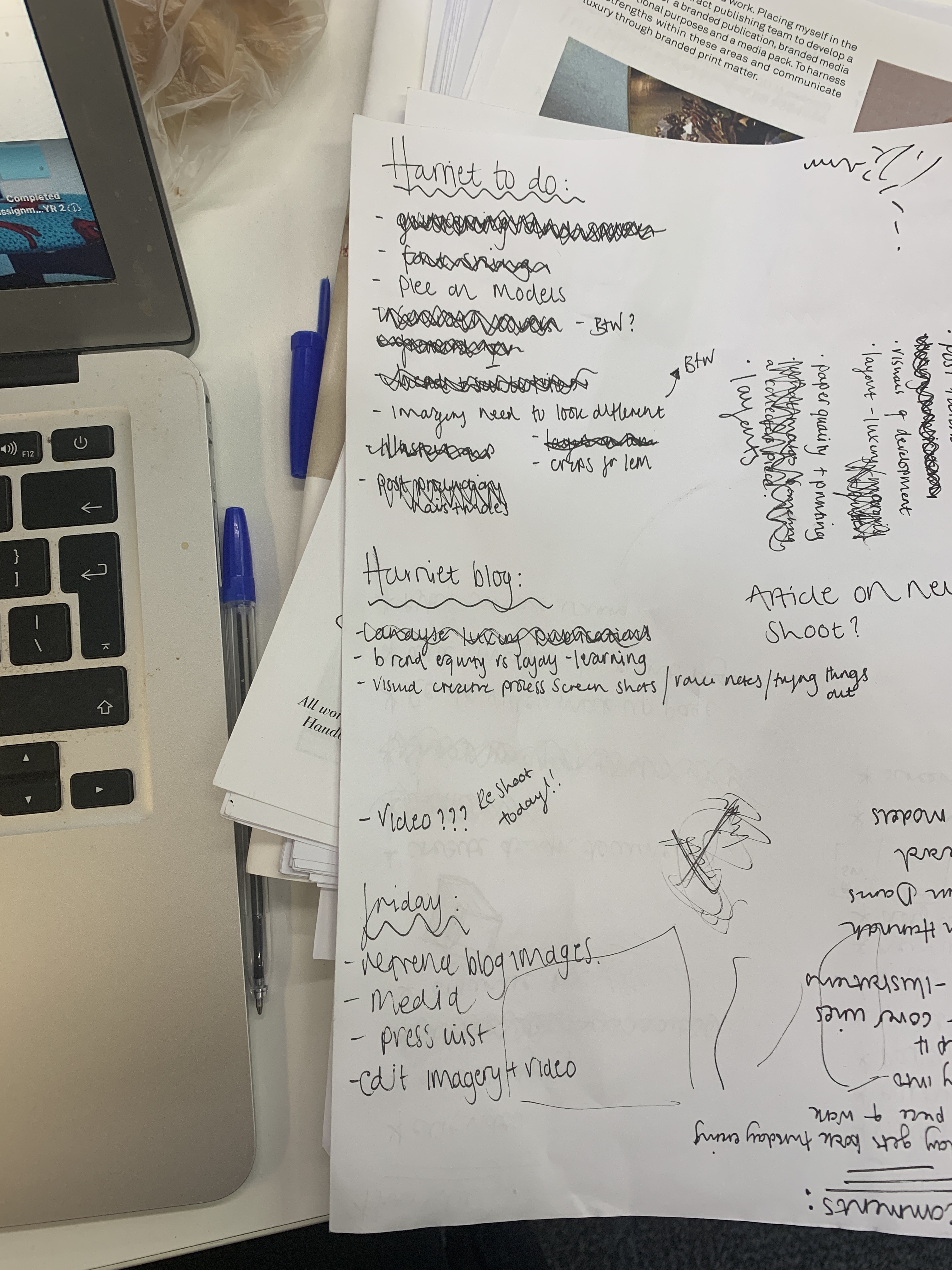
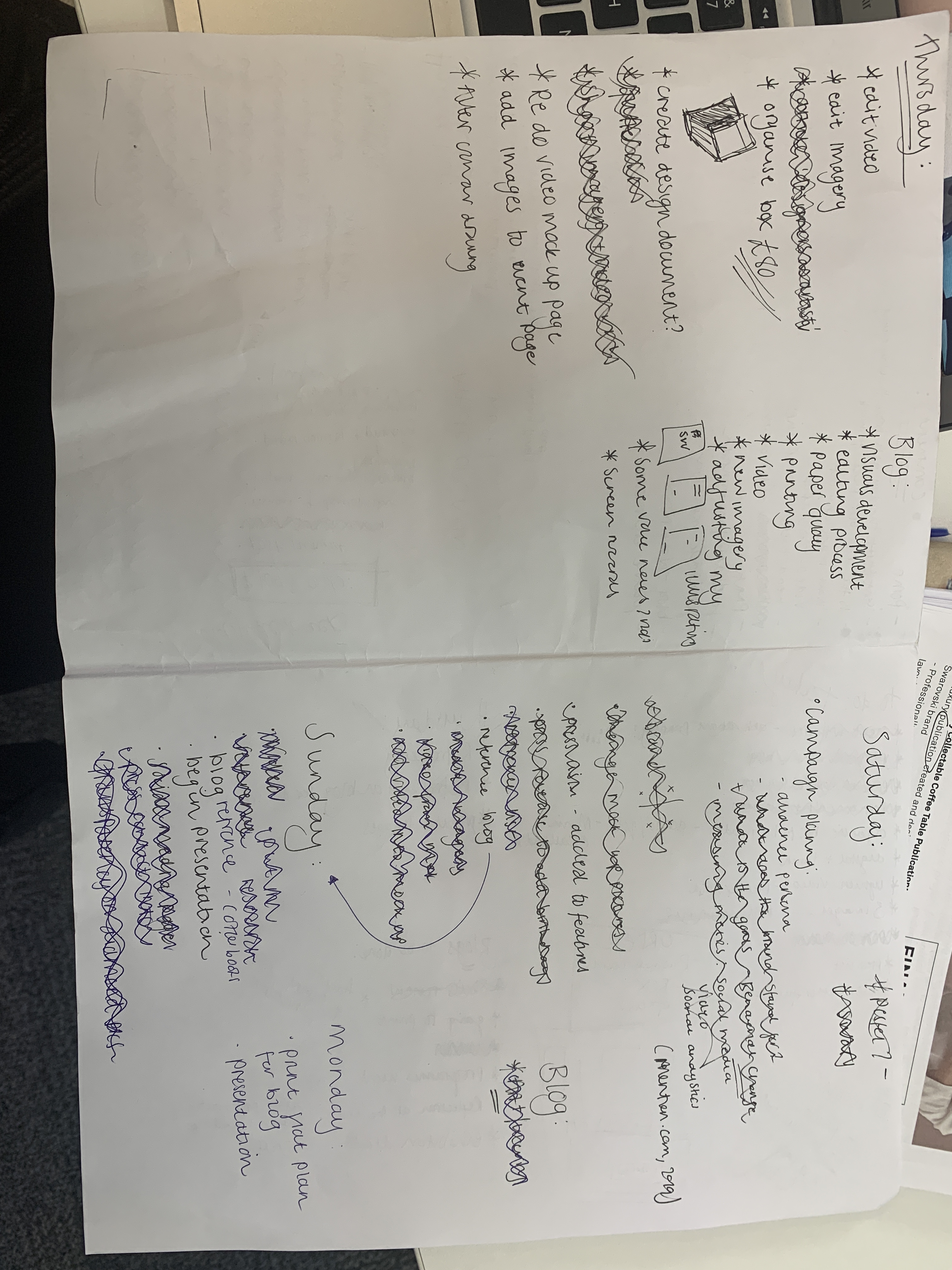
Post tutorial, after the overwhelming tears had flown I was able to write a list of everything that needed to be done to make this a piece of work that reflected me as a creative, my future career aspiration and my passions.

As crazy as these lists look, there is a method to the madness, working in lists allows me to be able to tick things off and feel as sense of accomplishment (which my anxious brain loves) and be able to note what needs to be done next. I was able to understand what needed to be done in order and prioritise.

My tutorial with Harriet has really allowed to think of pushing my project a lot further than it currently is and I am already planning another still life shoot and video to film for tomorrow to really get the best out of the project that I possibly can.

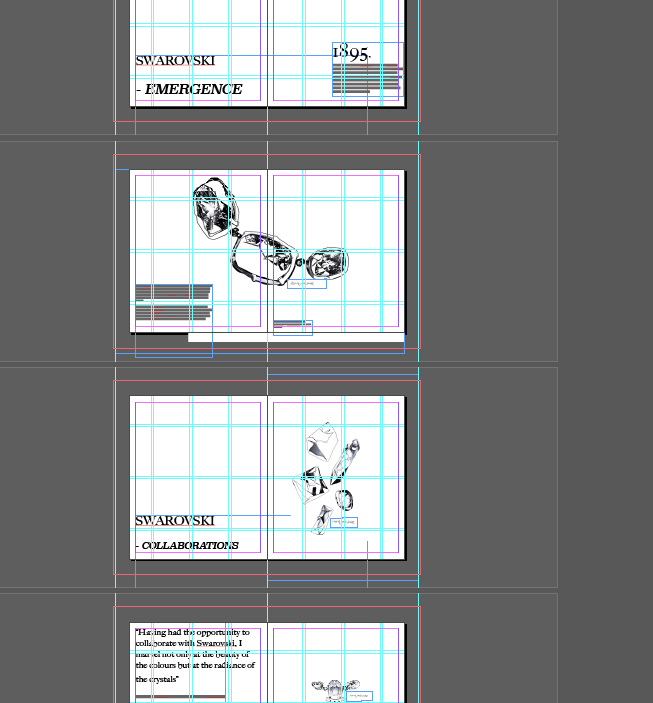
Tonight, I have really spent some time focusing on making my layout as polished as it could be and adding bleeds and gutters to my work to make sure the book, when printed, looks as professional as possible.

Here I have been experimenting trying to make the two main shoots I have done as different layout wise that I could to really show the brand as best I can- which is something that was lacking in the book prior.

It is really important for me from today to put all my efforts into taking this a step further and making this as polished as possible and to elevate the book as much as I can through the fine details like, imagery and layouts as well as adding another spread of imagery in and trying out a new video to compliment the book to the highest standard possible.

Video Progress!

I have just heard back from my video editor whom has sent me the edited version of the video clips.

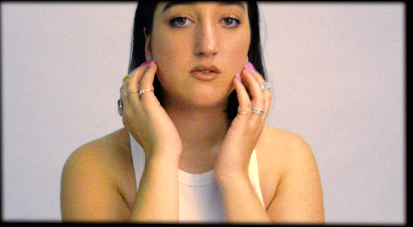
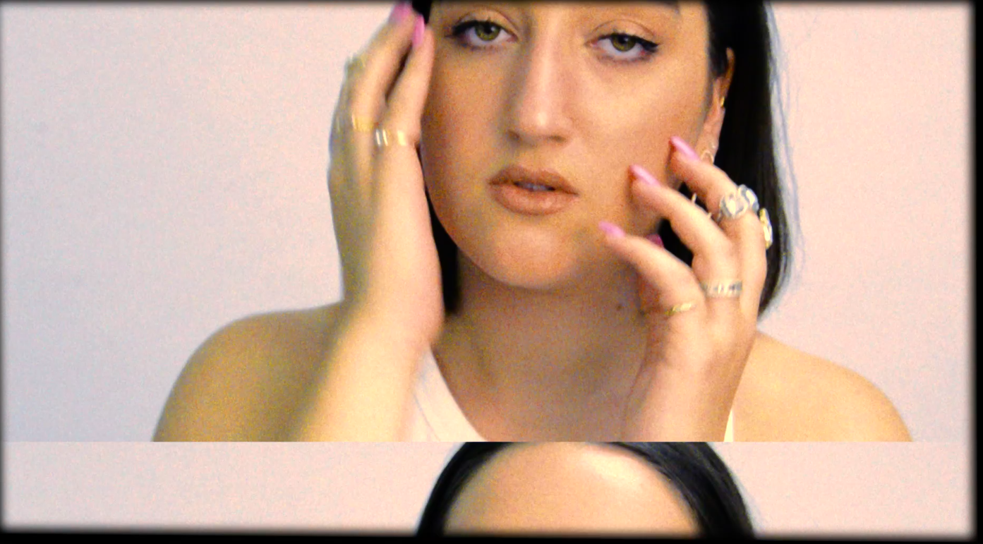
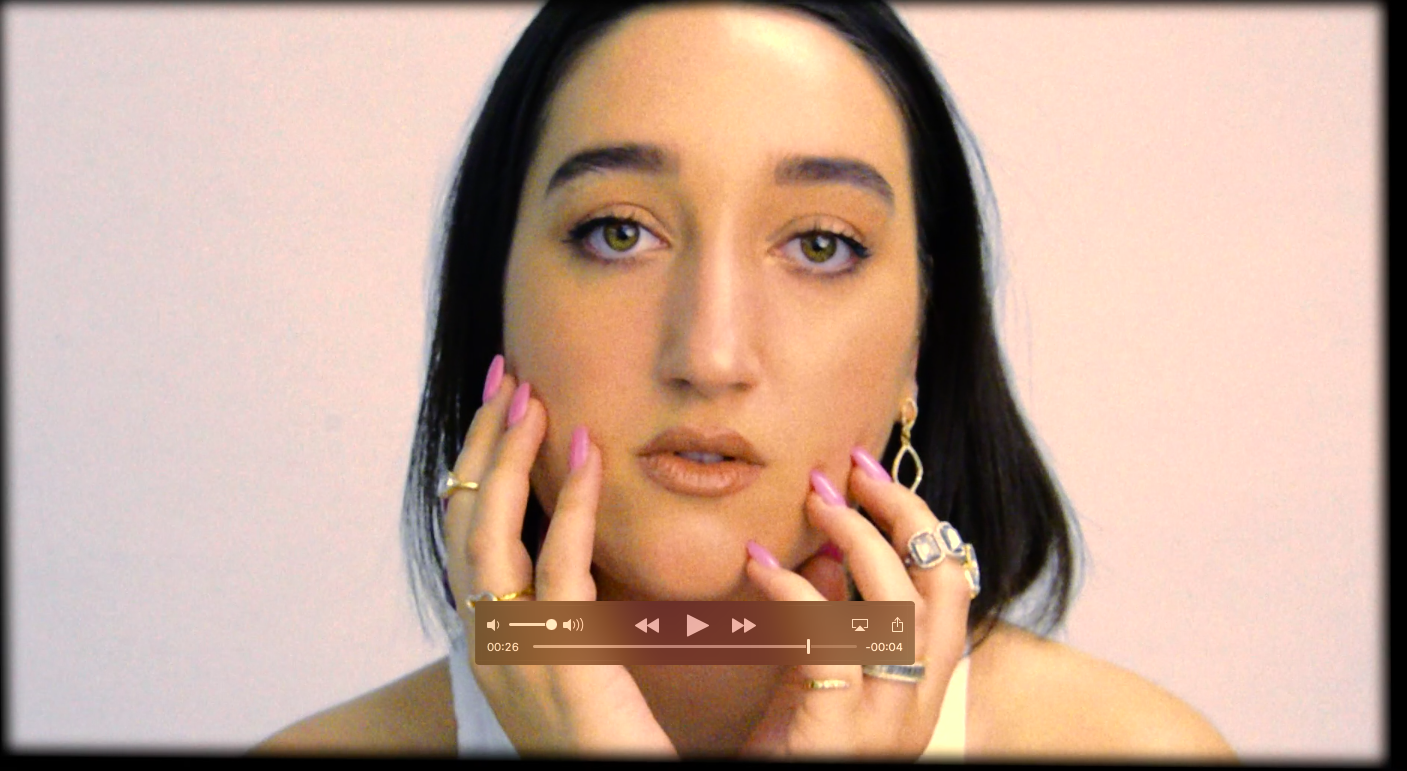
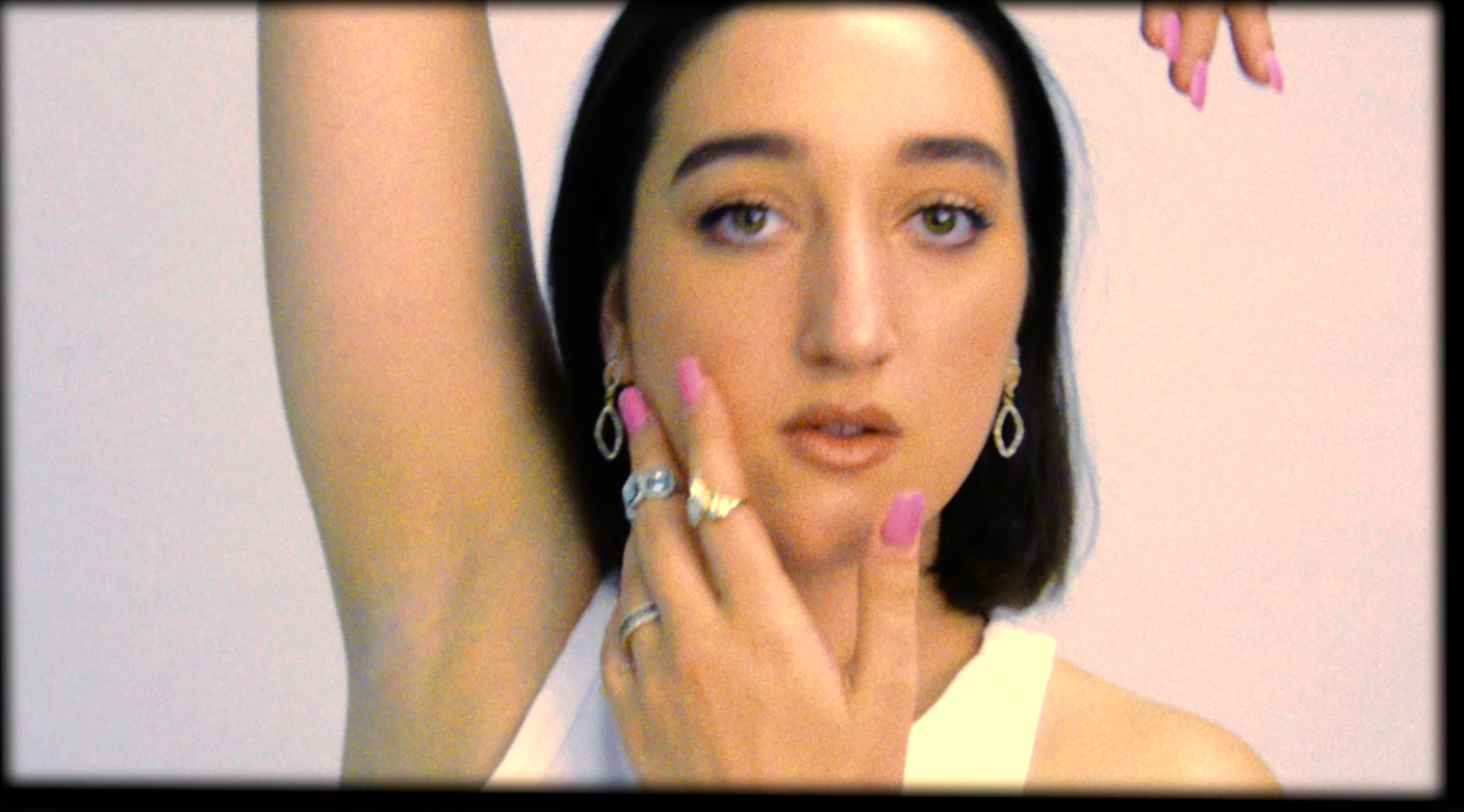
Melissa has managed to extend the video clips that were originally 20 seconds all put together to now being 30 seconds as a video. She has used overlaying clips, changed the pace as well as added a vintage roll theme to it. I think it works really well due to the fact it is communicated the theme of heritage and modernity together hand in hand, which correlates really well with the book itself. The video captures the jewellery really well and will work as an effective rolling video at the top of the Swarovski online page to grab attention towards Emergence.

On reflection, at the beginning of the project I was truly set on making sure I was in charge of everything, however, having Melissa as my video editor has really allowed me to understand editing and be able to get another perspective on the project which has been extremely rewarding and helpful. Commissioning a video editor has allowed me to be able to professionally work on something and delegate work and host meetings with the editor as a leader of a team which is a trait I have expanded on through this project and working with Melissa as my video editor.

Industry Aspirations

During this project I have tailored my project brief towards my aspirational career goals, as well as intertwining some skills I have picked up from past jobs, past experiences and talents. I have aimed to intertwine my creative, design and drawing skill into some PR skills as well as my dream career of working within luxury publishing.

This dream came about when I worked upon my IFCP project with CN Publishing, in doing so I was able to freely create something tactile for a luxury brand, honing in on all my skill sets. Through visits to CNP and Mason Assouline the dream career was set. These luxury publishing teams are of which I aspire to be within in the future and through this I have aimed to develop and hone my skill set to such industry.

My IFCP project has honed the following skill sets to align with industry practice within contact publishing:

  • Luxury Communication
  • Design
  • Concept Creation
  • Valuable Research
  • Multi Channel Approach
  • Launch and Event planning
  • Pitch creation
  • Editorial writing
  • Photography and Styling
  • Illustration
  • Partnerships

Utilising all the above skills for my IFCP project, I ave been able to align within industry practice that occurs within publishing teams today. In a recent meeting with Editor In Chief of CNP he was able to outline skills required within the practice, of which I have been able to transform into this final project.

Create your own website, free on WordPress.com.Create your own website.
Start free